Seam by For Brands
Opinion by Richard Baird Posted 12 December 2013

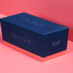
Polish design agency For Brands were recently commissioned to create a new visual identity for Seam, a distributor of luxury clothing brands, that would convey a sense of craftsmanship and an eye for detail. For Brands mixes classic typographic detail with contemporary customisation delivered across tactile material choices with hand finished detail, fusing urban, craft and fashion sensibilities.
Although the logotype utilises an increasingly familiar aesthetic (check out these), the absent stems of a classic serif is quick and effective way to establish a clear juxtaposition of (stencil cut) utility and high fashion statement and detail alongside a couple of proprietary sweeps in the A and M that appear appropriate for the brands that Seam stock. This contrast continues with a business card that combines a grey uncoated board, the perceived high quality of a black block foil print finish and the flourish of a hand-sewn cotton thread element. While lacking subtly this ‘seam’ is a detail that draws in the theme of craft and reflects the name in a communicative and unfamiliar way, neatly offsetting the more familiar elements of the design. The website’s concrete photography and distressed typography work well to build on the utility of the logotype and the colour and texture of the business card and add an on-trend urban decay.