Haverstock by Spy
Opinion by Richard Baird Posted 15 January 2014
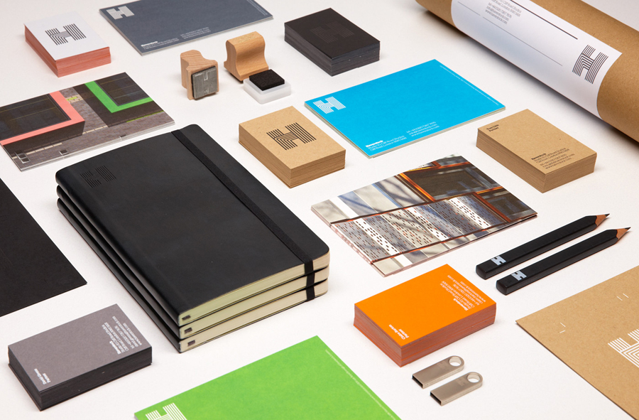
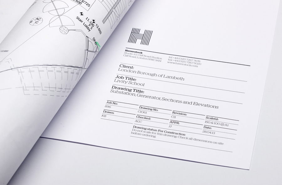
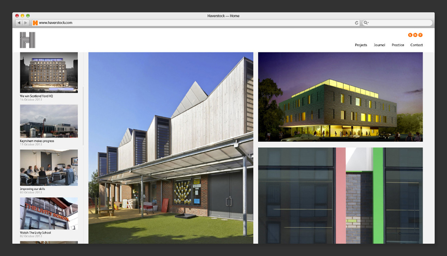
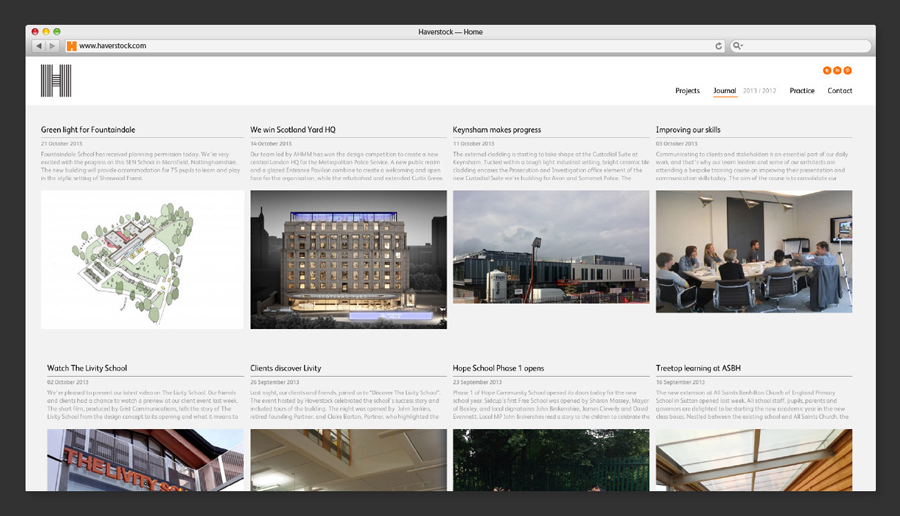
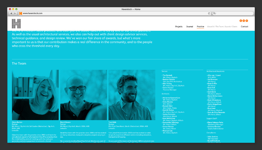
Haverstock is a UK based architectural practice that specialises in public-sector projects with a strong humanistic approach that enables “clients and the people who use the buildings to have a voice, and to shape the way their building ends up”. Following the retirement of Haverstock’s founding partners design studio Spy was commissioned to develop a new brand identity for the firm—which included a new logo, logo animation, website and stationery set—that would reflect a new era now led by “younger partners with fresh ambitions and perspectives”.

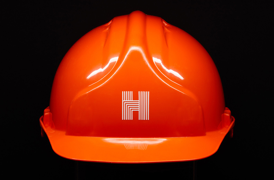
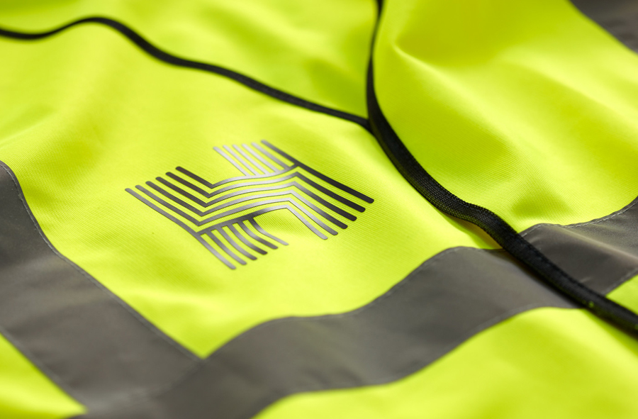
“Using the ‘H’ as multi-functional tool we devised a distinct marque that originates from one flat material. Once folded it manifests in lots of different ways, configurations and crops. A hallmark, a seal of approval. In conjunction with the brand’s other assets, this playfulness and use of tactile materials evokes a company that is moving into new era with the courage of its own convictions. We continue to help them with literature and digital collateral.” – Spy
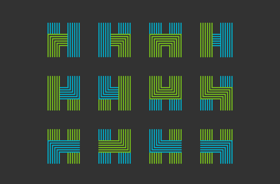
While I appreciate the construction of the mark, the variation in the way it folds, the lanes that the lines form (perhaps a nod to infrastructure and utilities), the softness the rounded terminals give to what is a cold geometric and structural form, and the relevance Spy attribute to this combination, it is the print work that really delivers communicative impact.
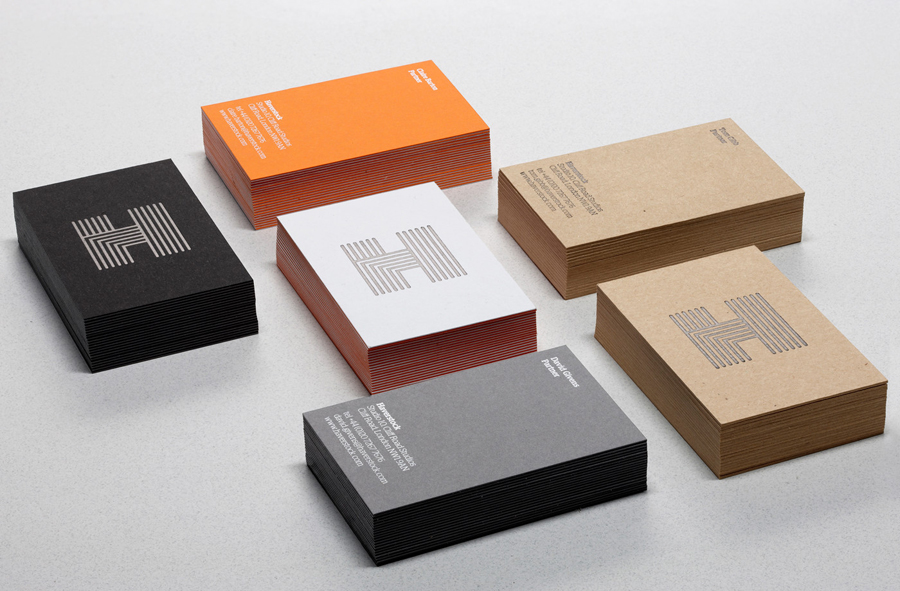
Public sector architecture for the most part will always be about how space is influenced and utilised by people, but rarely does this manifest itself through the identities of the studios that work within this field in such a cohesive manner. You typically get cold and modernistic (something that often works quite well) or bright and over-designed.
In this instance Spy has managed to take familiar architectural themes such as structure and material and convincingly sets these alongside the more personable through a combination of colour, substrate choice and print finish, delivering a clear duality with equal weight and cohesive aesthetic.
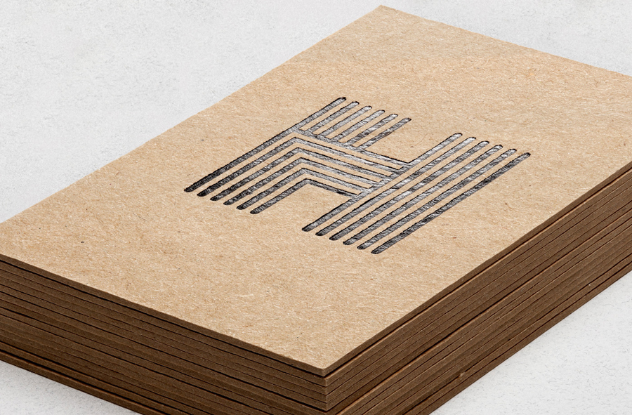
The familiar efficiency and reliability of heavy concrete grey and black boards and a grid based website layout sit comfortably next to the brighter and crafted sensibilities of orange, green and blue uncoated papers, a contemporary white foil, blind debossed journals, edge painted detail and a hand stamp tool. It is a simple resolution that places the public-centric collaborative nature of Haverstock to the forefront without undermining the efficiency and practicality expected by those that fund the projects.
