Puebla 109 by Savvy
Opinion by Richard Baird Posted 21 January 2014
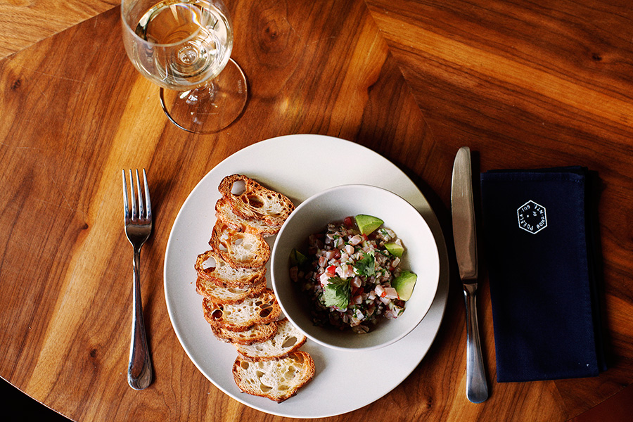
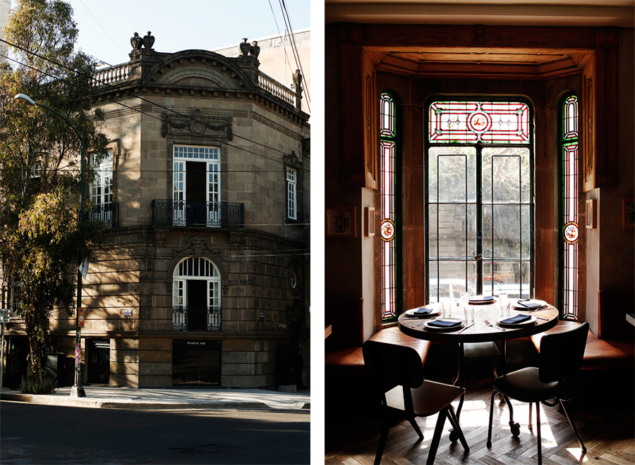
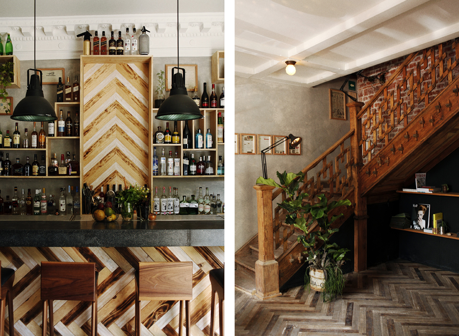
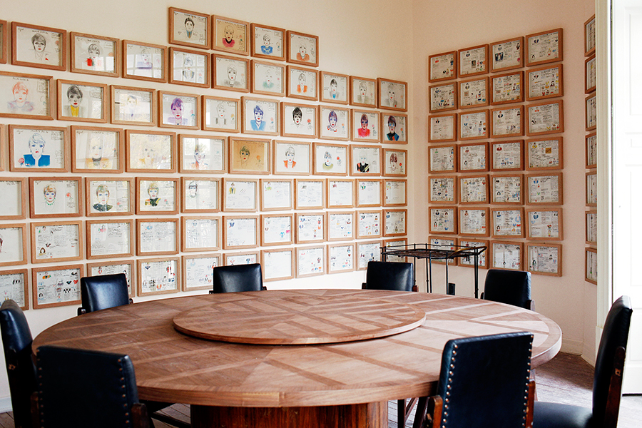
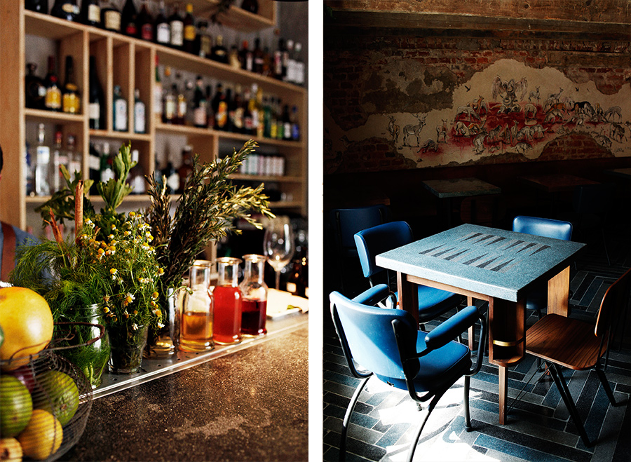
Puebla 109 is a three floor 20th century townhouse, located in the Roma Norte colonia of Mexico City, “where art, design and gastronomy converge” in the form of an evolving space utilised as a place to work in the morning, as a restaurant to eat lunch in the afternoon and as a bar to have cocktails in the evening.
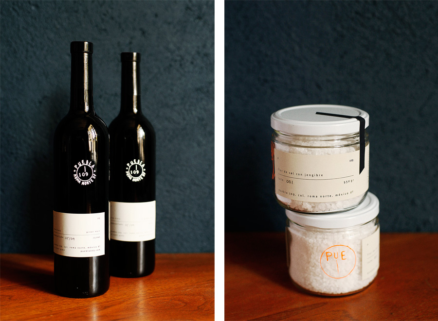
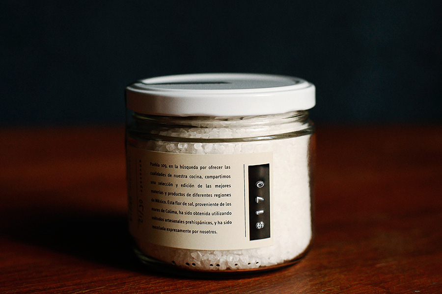
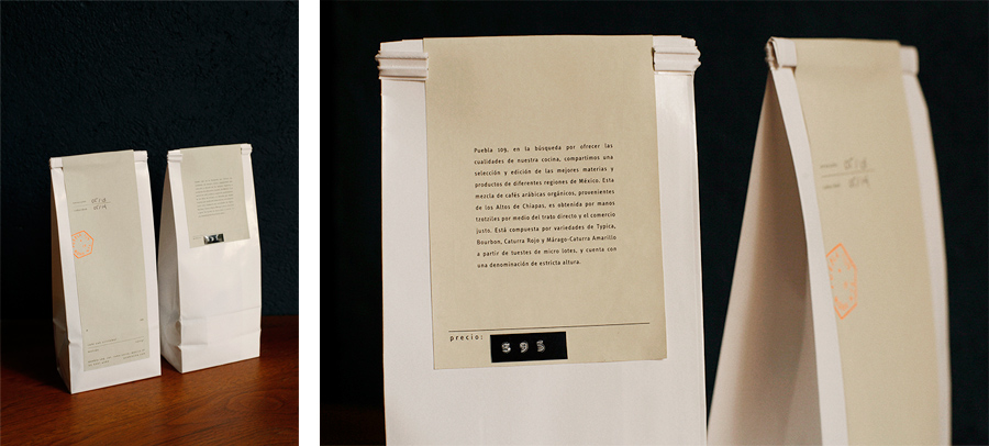
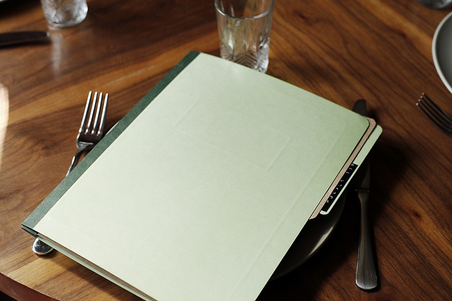
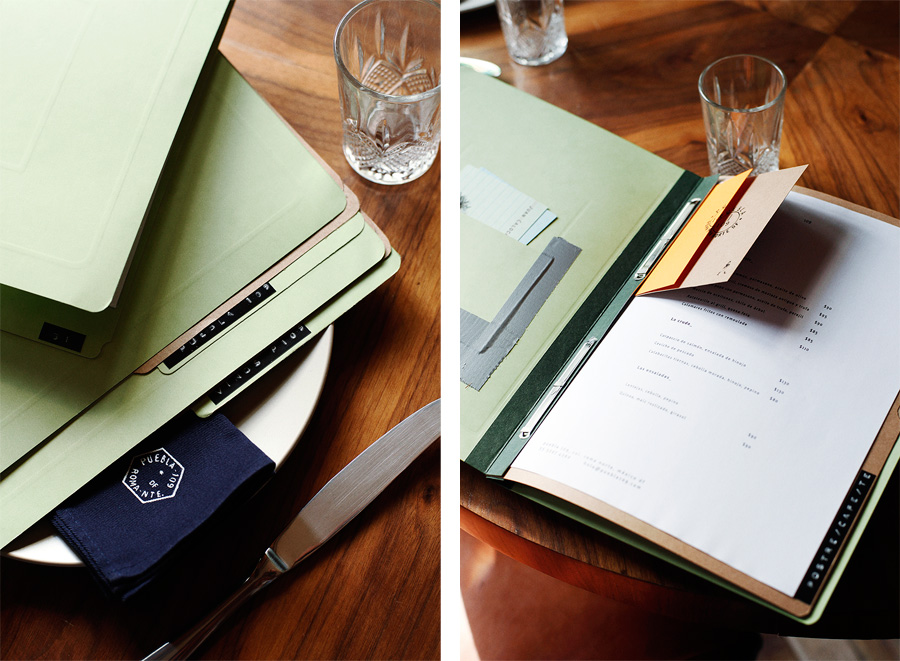
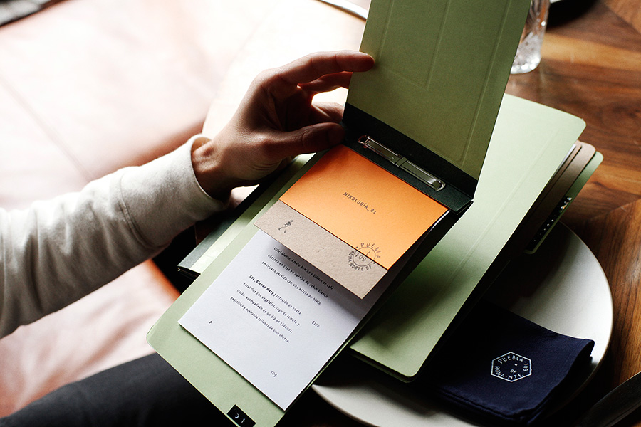
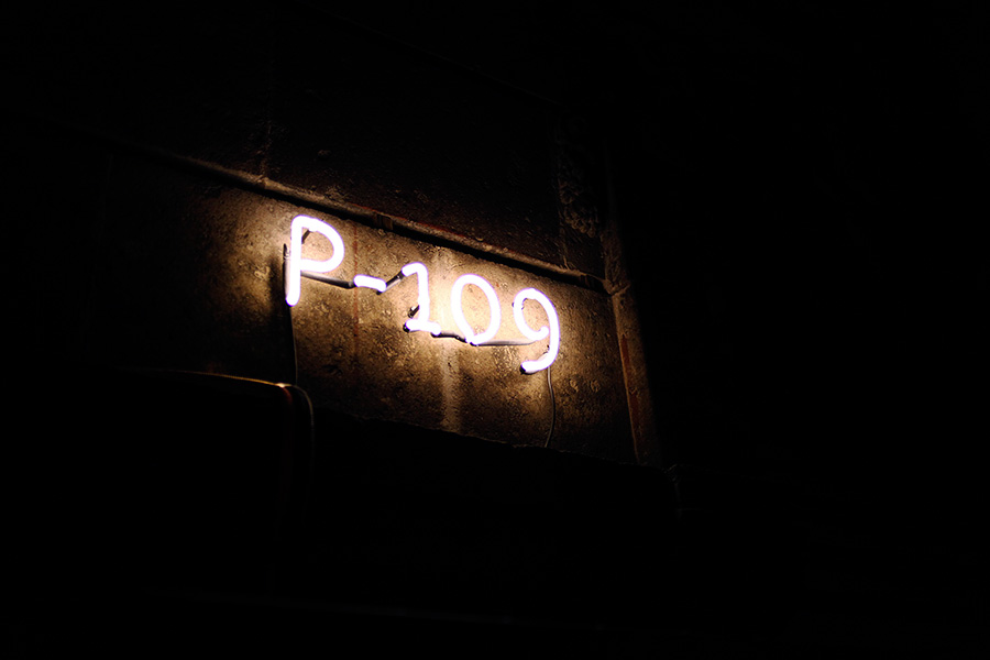
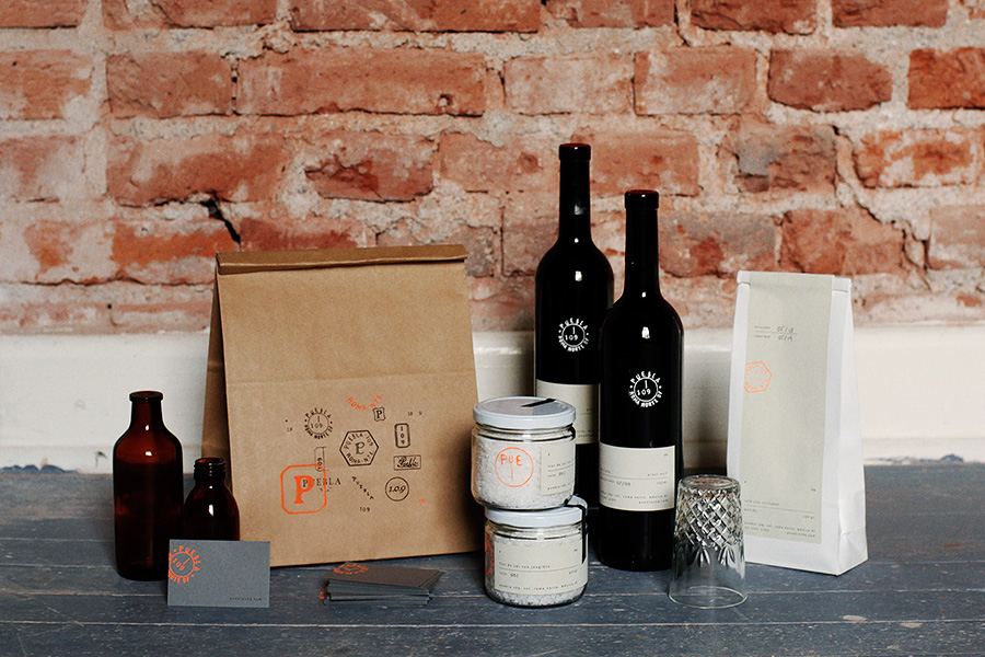
Puebla 109’s new brand identity—which includes a number of different logos, packaging and print, stationery and menus created by design studio Savvy—establishes a strong, on-trend and crafted sensibility through hand drawn typography, uncoated materials, stamp-based print finishes and punched tape label detail.
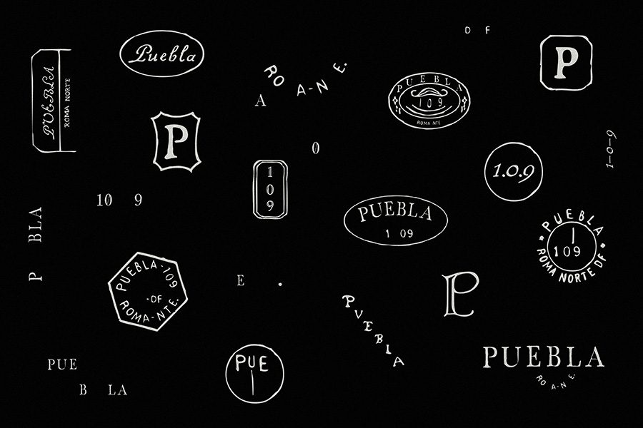
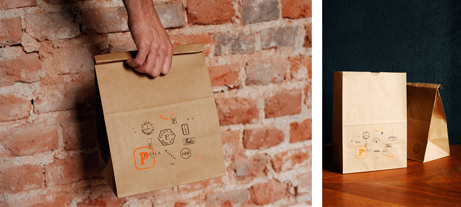
“The identity for Puebla 109 was developed around several symbols which draw inspiration from the classic age of Mexican philately. Each symbol works independently but at the same time shares an equal hierarchy when used together with the rest of the symbols that make up the graphic system. Unlike a more traditional approach to branding, there is no one symbol that bears the weight of the entire brand’s identity.”
“The applications are constructed upon basic or more industrial materials. They are contrasted with bold colours and classic typefaces that have a strong national character, together with a few other graphic elements which resemble those used by the postal service in the past, therefore alluding to the journey that an object undertakes before reaching its final destination.”
– Savvy
The stamp-based postal quality and loose but well rendered variation of the symbols is an neat approach. Their diverse but cohesive nature, rather than utilising a primary mark, appear collectively as a exploration page drawn out of a designer’s sketchpad, an in-process sensibility that resonates well with the theme of creative exploration as well as location.
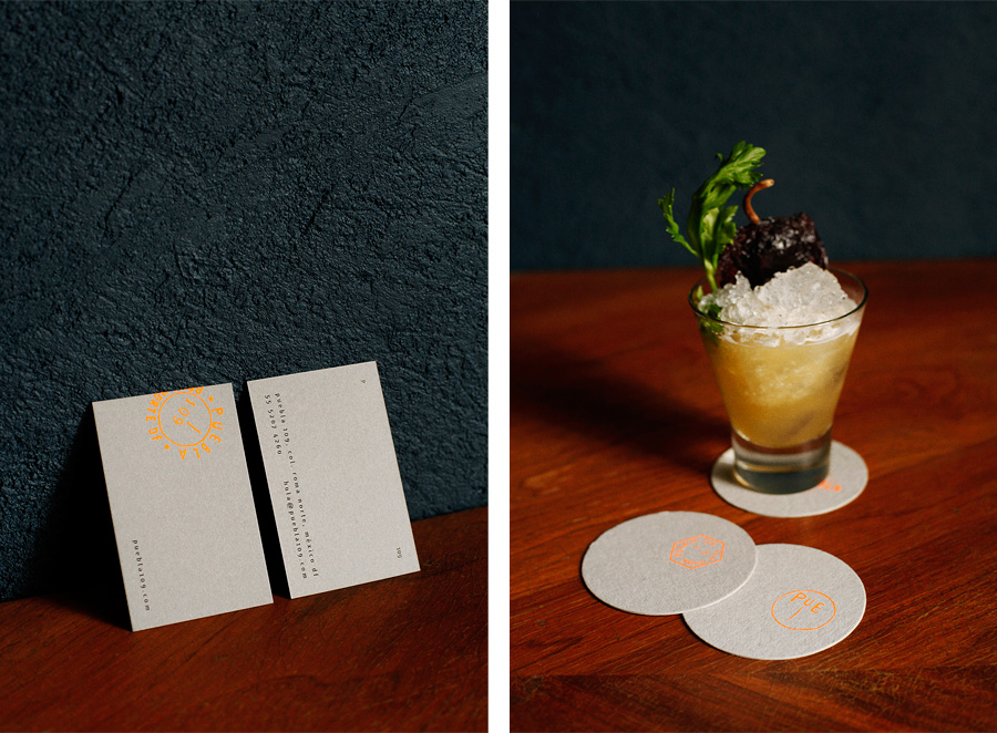
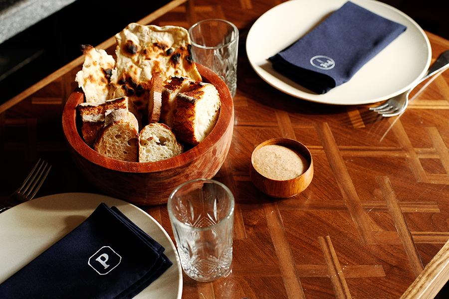
In print, like the symbols, there are a lot of little details which keep the project feeling small and crafted but diverse. Highlights include elements such as a fluorescent orange ink across unbleached boards, label tape with punched type, the folder-like aesthetic of the menus, the ample space and small type of the jar labels and the screen prints of the wine bottles. These are modular, easily remixed and practical in their application, make great use of papers, cards, inks and stickers, and although rough, rudimental and utilitarian in places these appear intentional and collectively well considered, neatly building on the Mexican philately inspiration.
Design: Savvy
Photography: Coke Bartrina
Opinion: Richard Baird
