Generation Press by Build
Opinion by Richard Baird Posted 29 January 2014
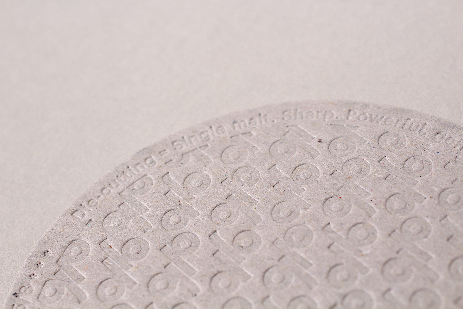
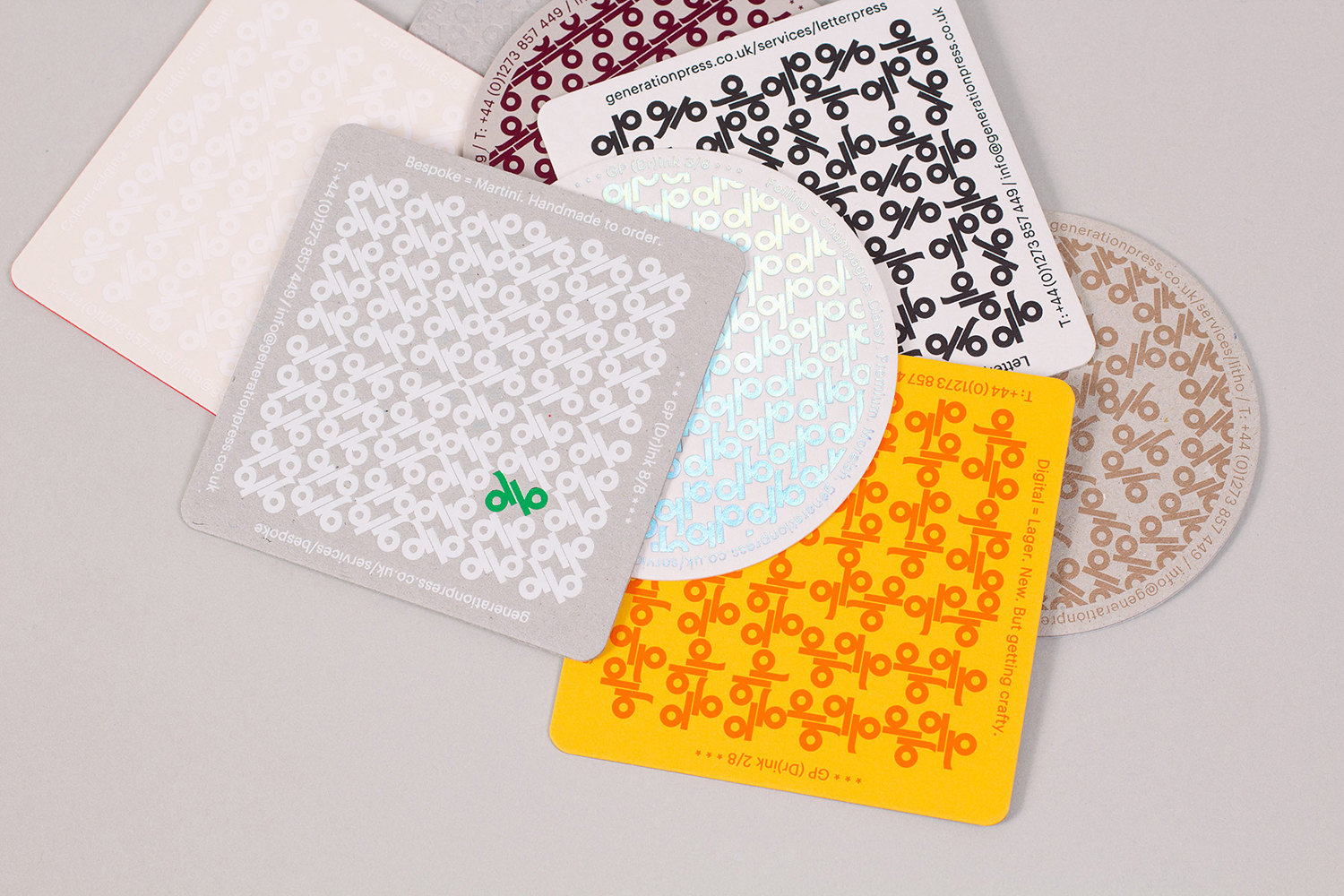
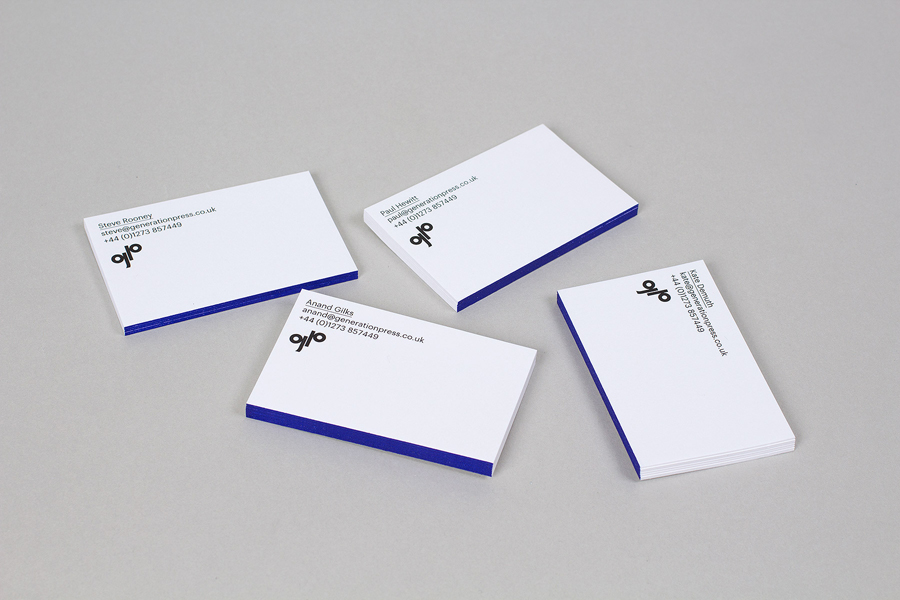
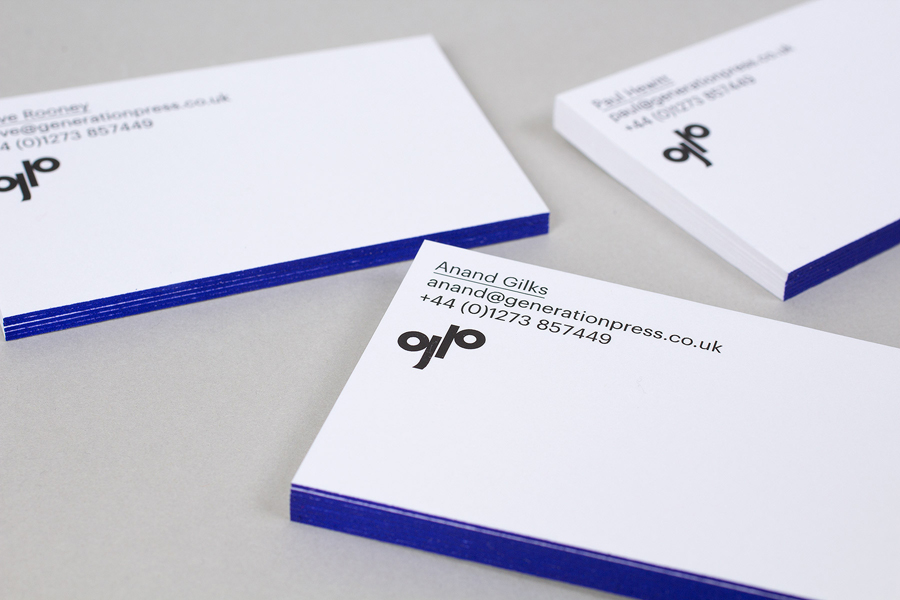
Generation Press is a UK-based print production studio that works with a variety of businesses including many of the design agencies featured on BP&O. Build, who were responsible for establishing Generation Press’s brand identity, have recently developed a new stationery set, promotional material and website with a “minimal stripped back brand style” that showcases some of the finishes provided by the studio.
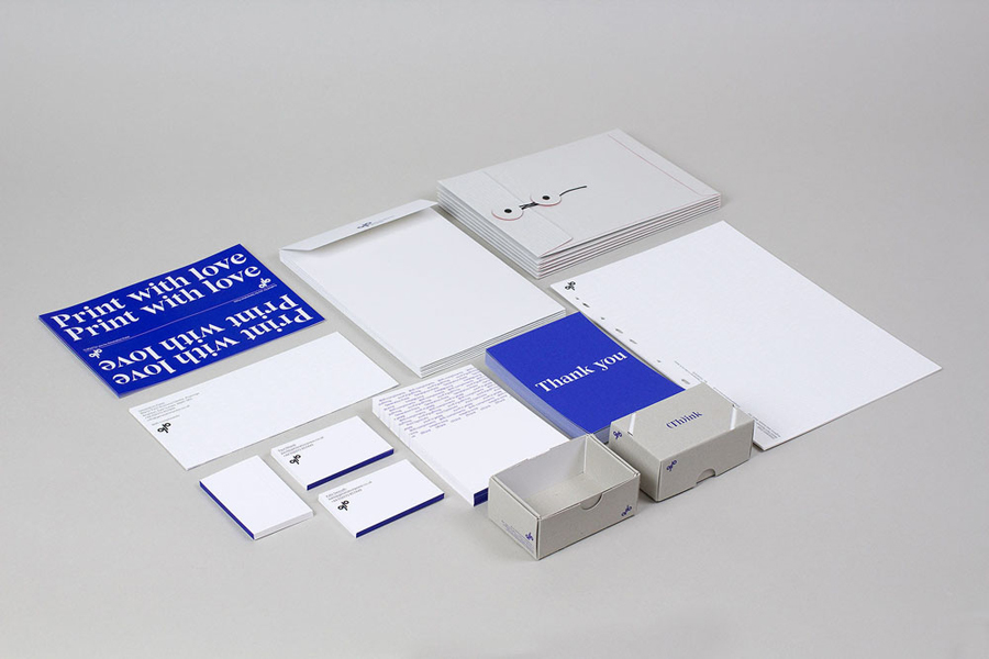
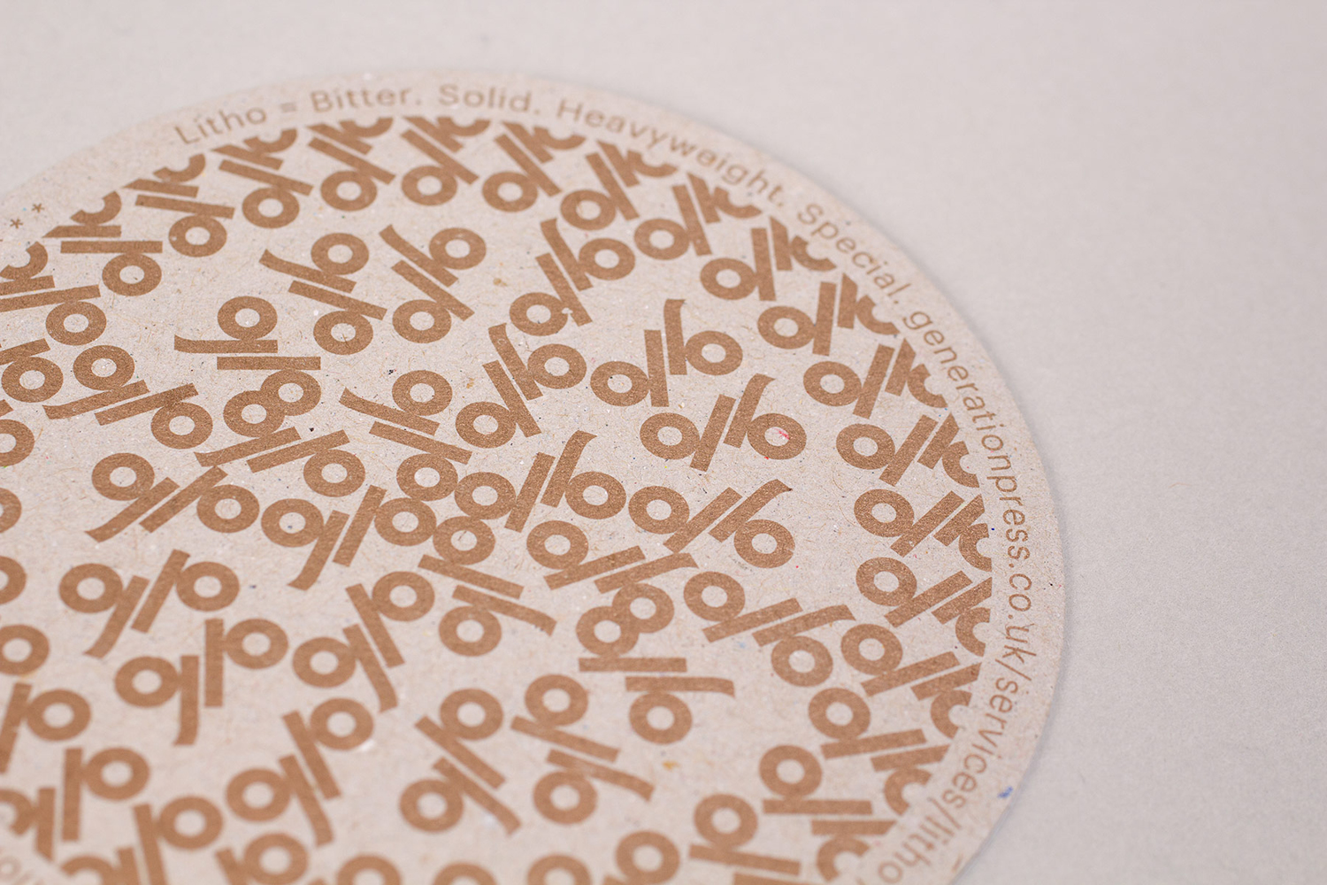
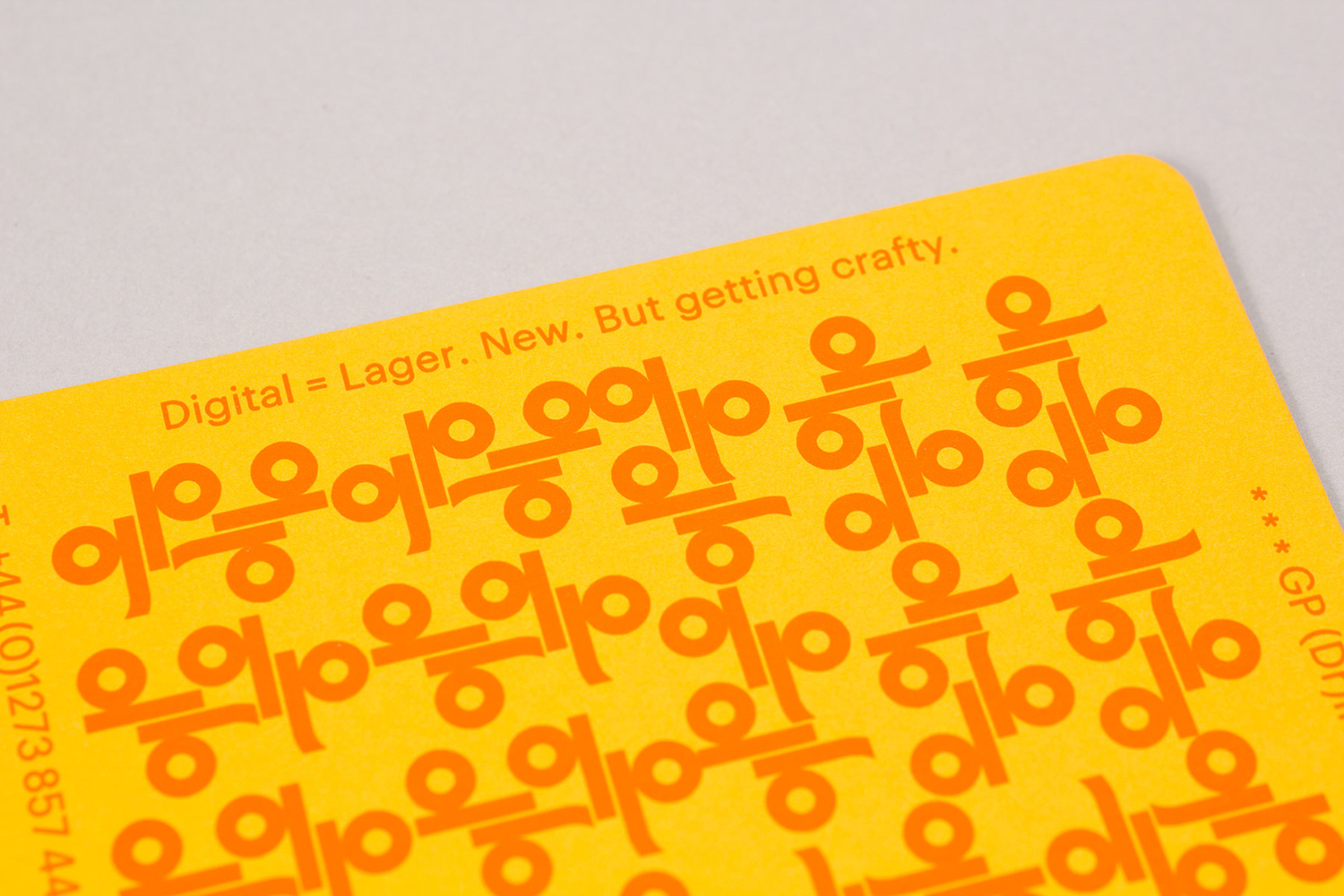
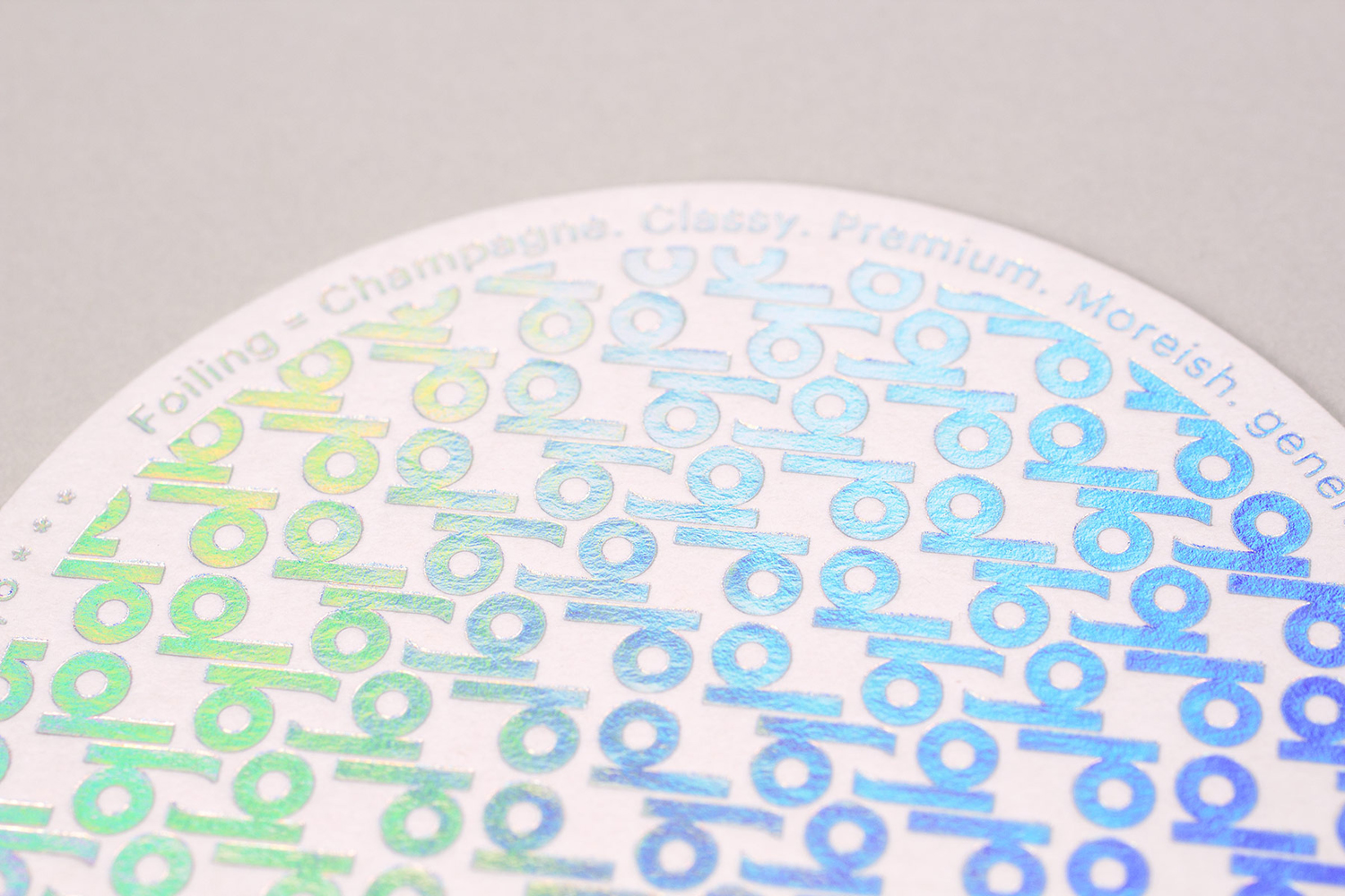
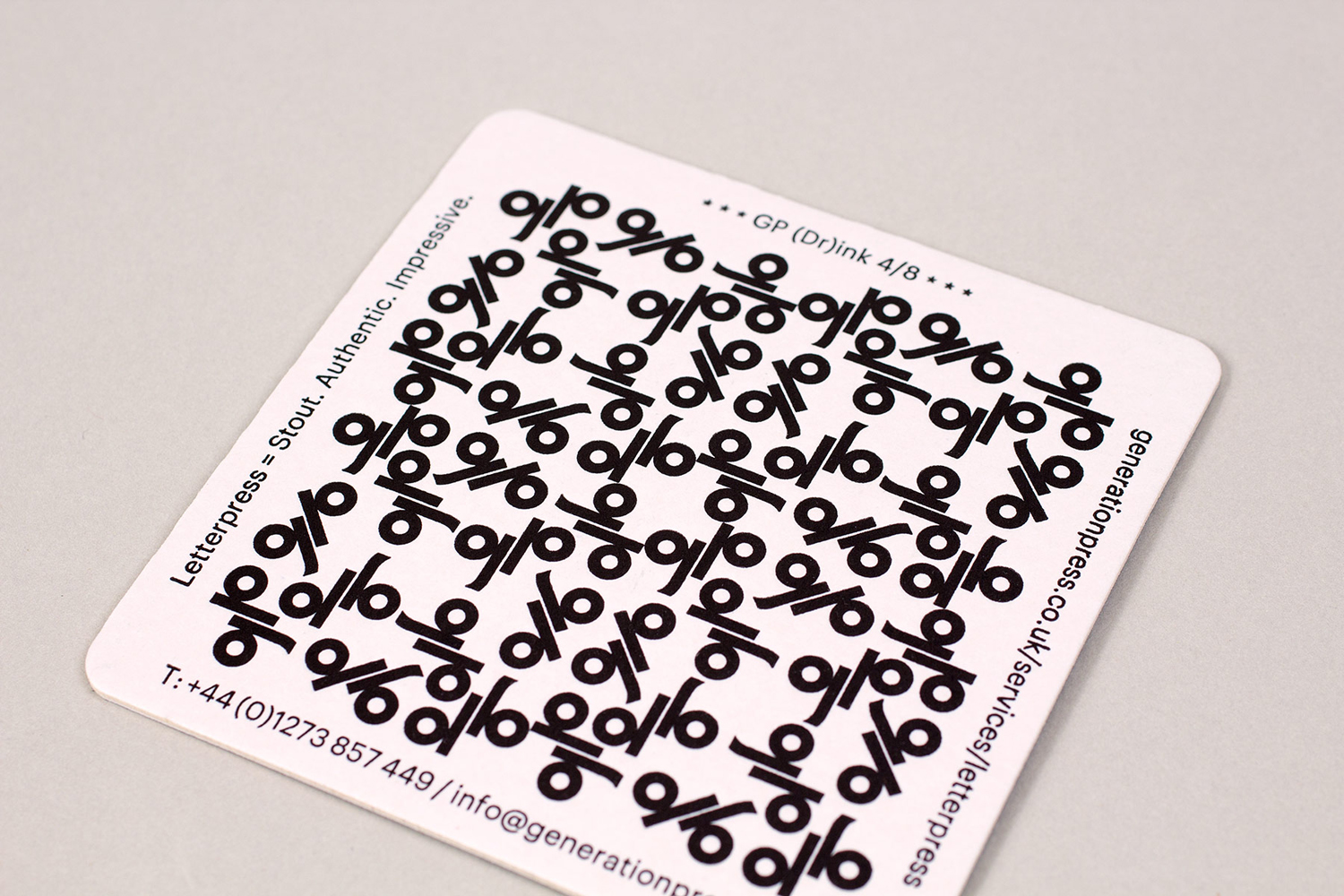
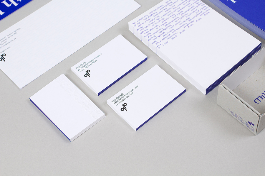
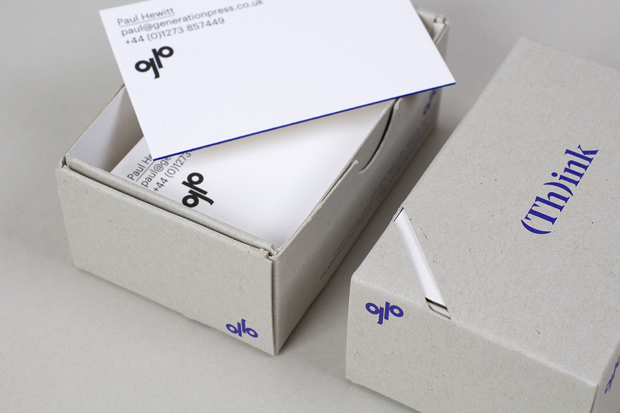
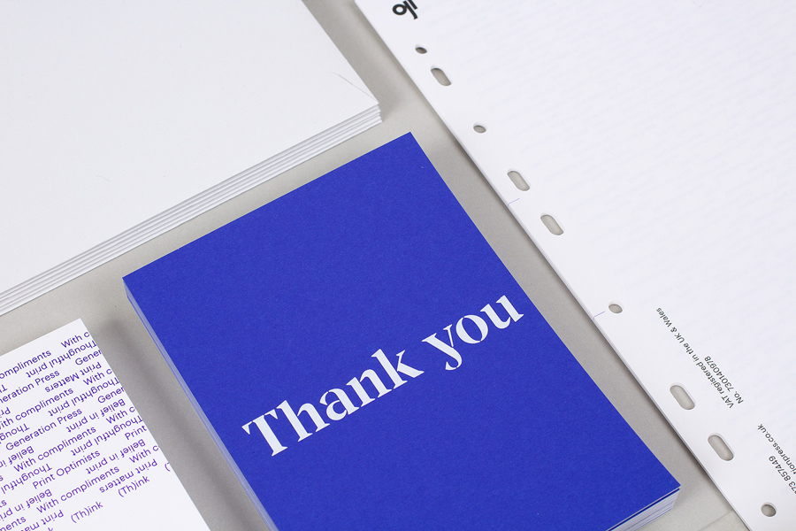
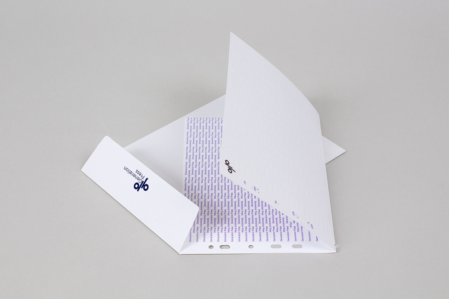
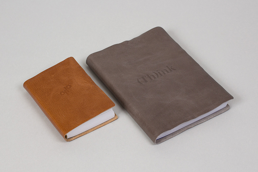
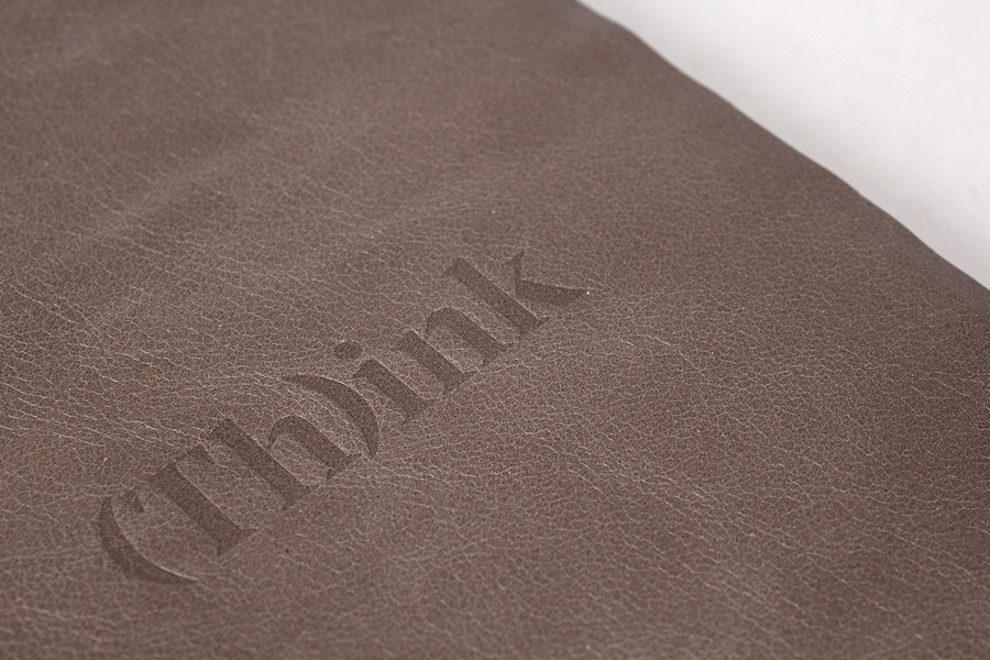
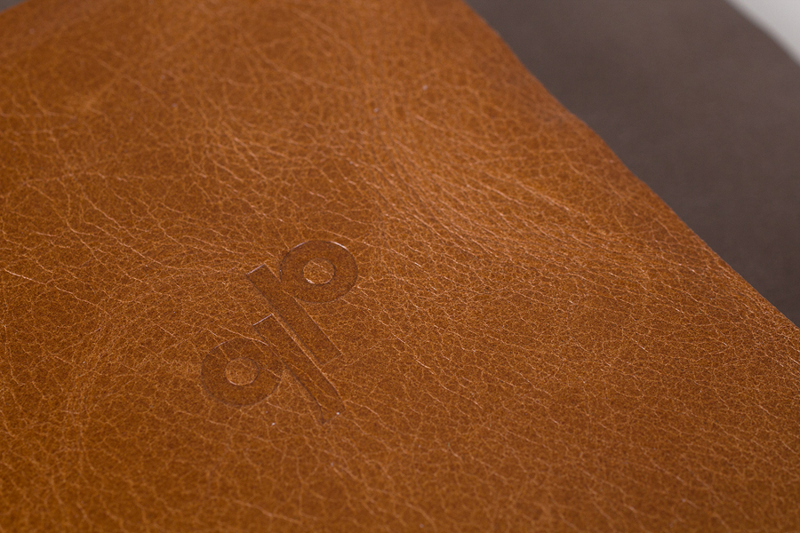
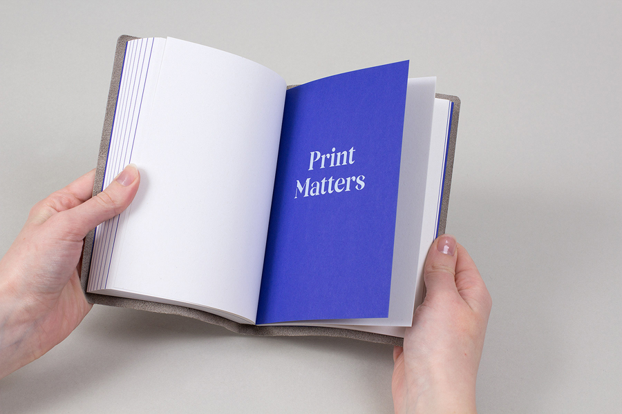
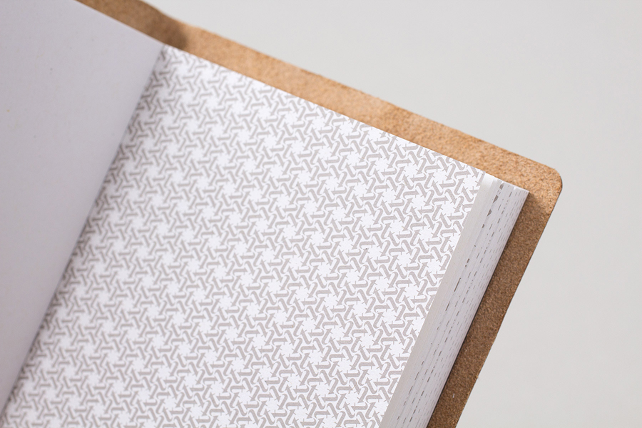
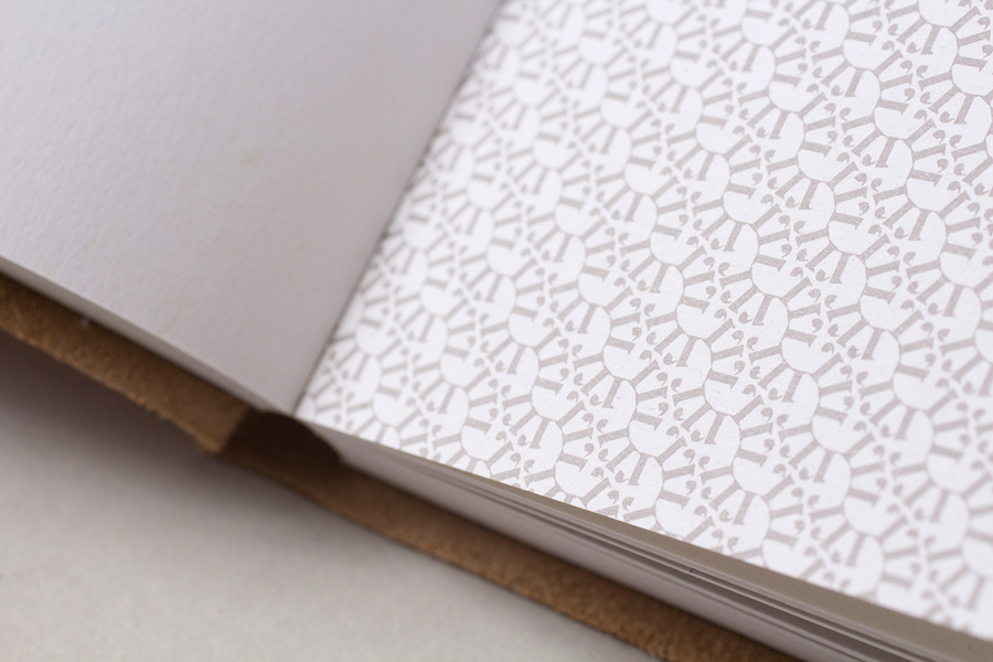
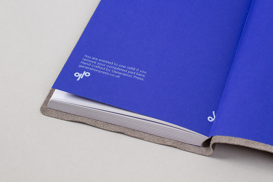
The refreshed brand identity retains Generation Press’s distinctive logo but places this within the communicative and creative context of a new stencil cut typeface, the contemporary economy of a bright two hue colour palette—enhanced by white board—and a mix of print finishes and material choices. These include a blind emboss, block foil edge painted detail, unbleached substrate, white ink and string-tied envelopes.
While there is a variety of techniques worked into the new stationery set there is a restraint in the use of two colours that keeps these cohesive, exemplary rather than flashy. The custom serif ‘Poynings Stencil’, created by Colophon Foundry specifically for this project, neatly reflects Build’s approach to the print work with a contrast of stencil cut utility and serif detail, a nice balance of functionality and flourish that works particularly well for business built on executing the creative work of others with an efficiency and quality.
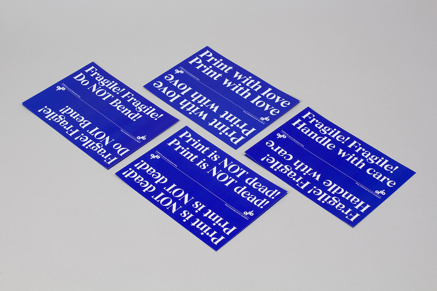
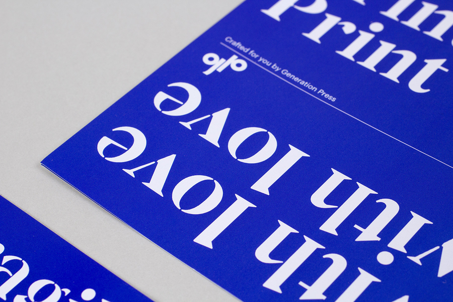
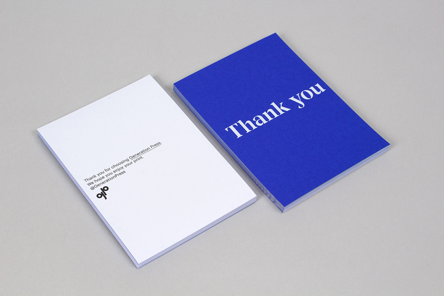
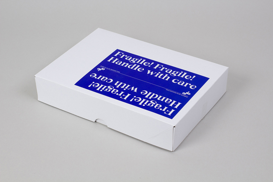
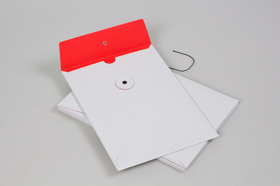
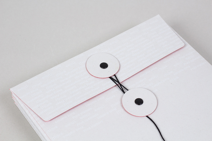
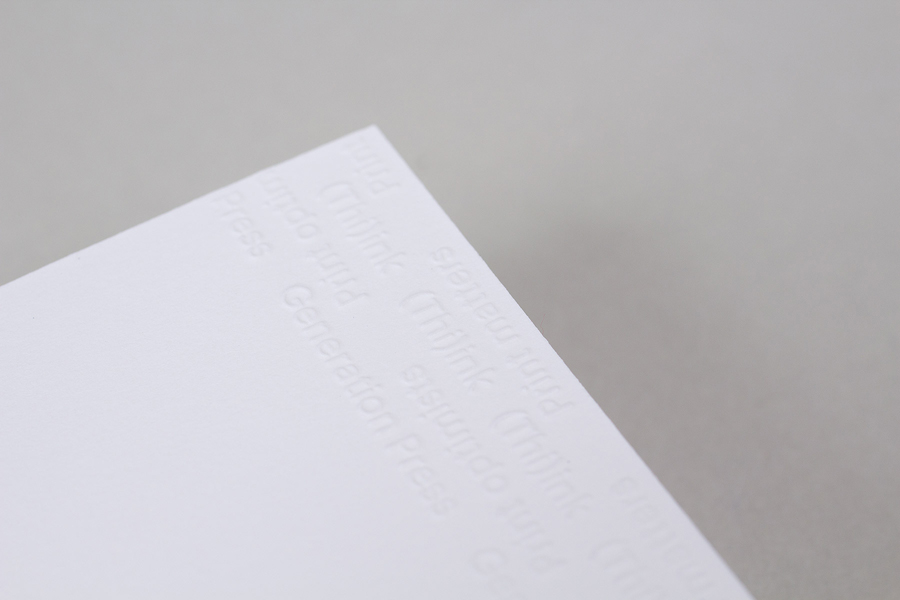
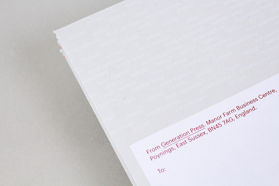
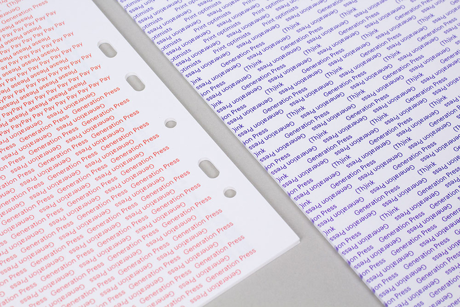
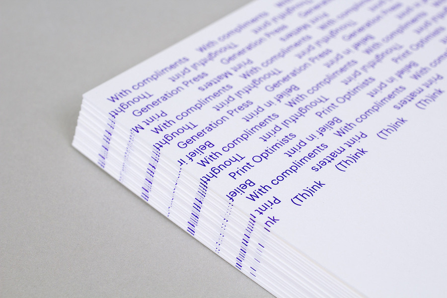
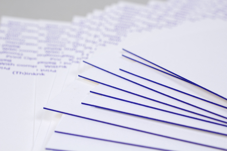
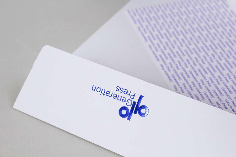
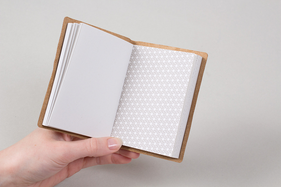
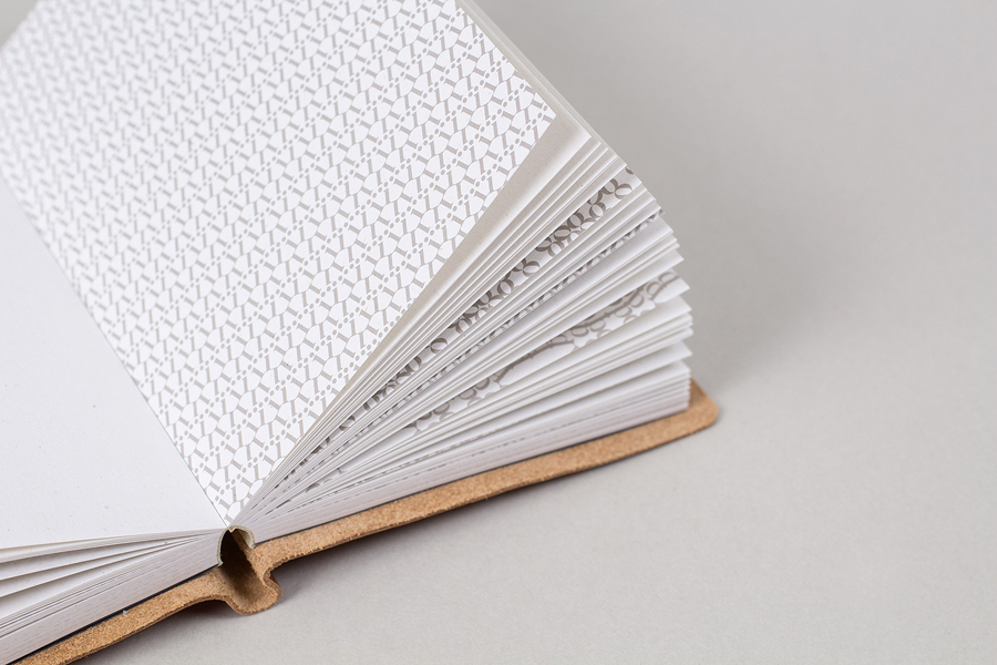
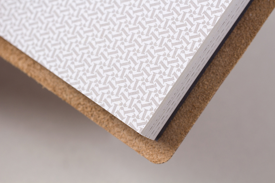
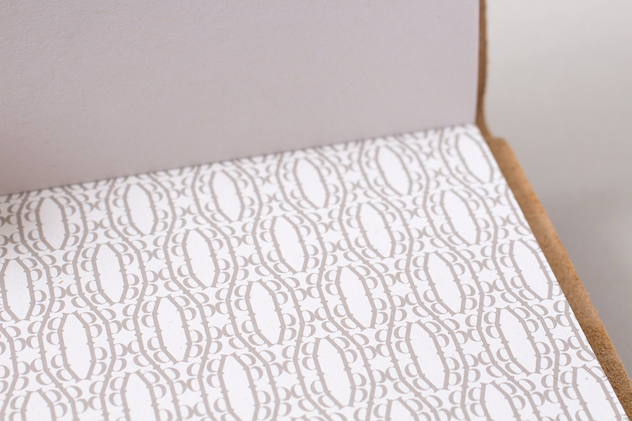
Generation Press Mail Campaign by Build
