Apartment A by Say What Studio
Opinion by Richard Baird Posted 30 January 2014
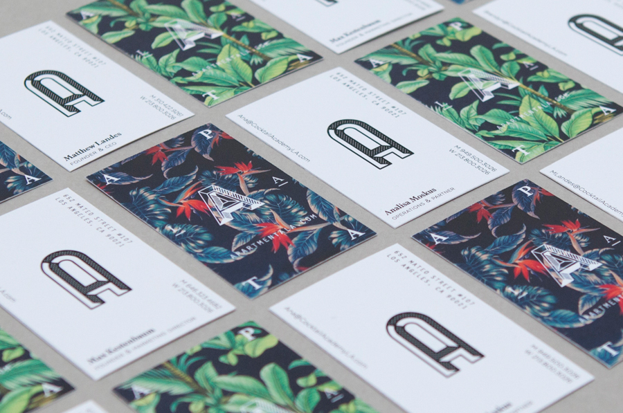
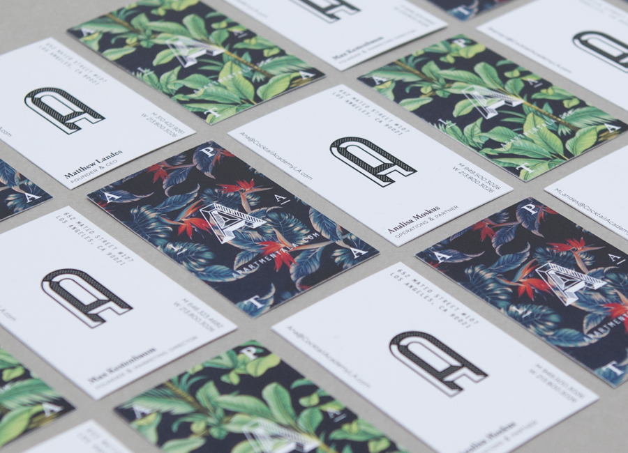
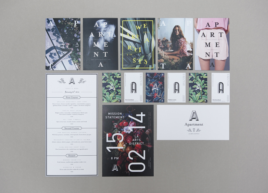
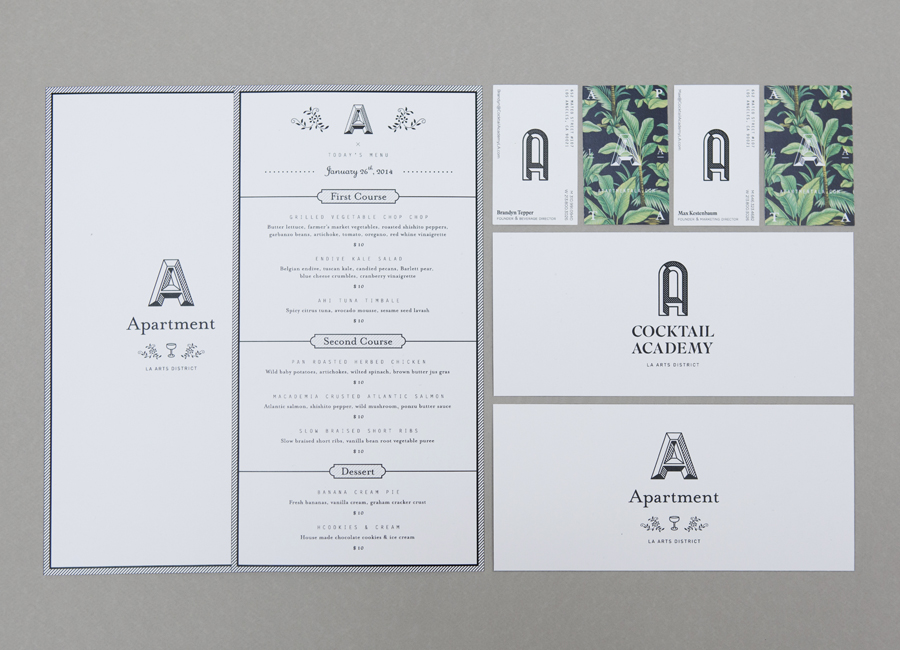
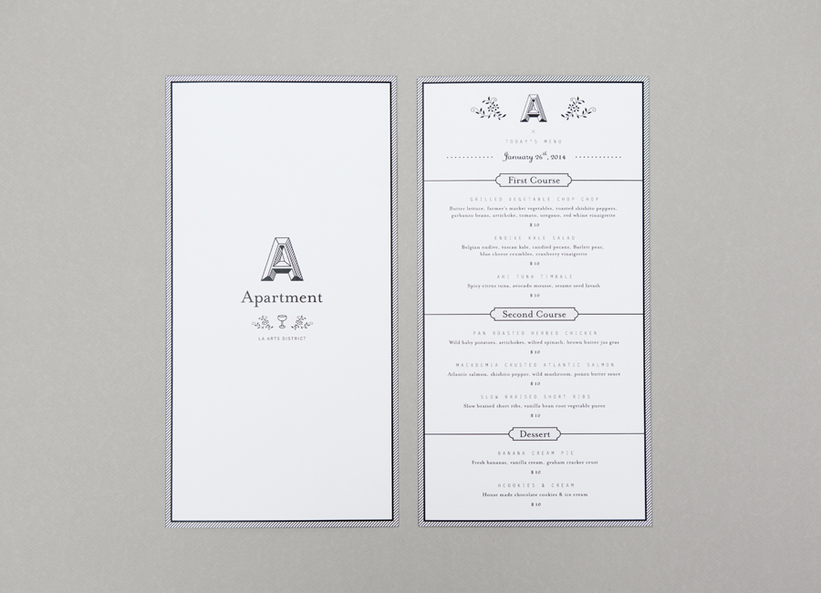
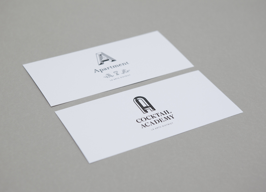
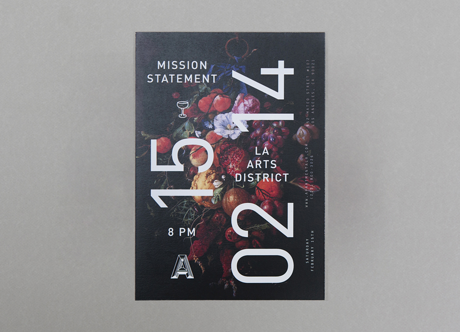
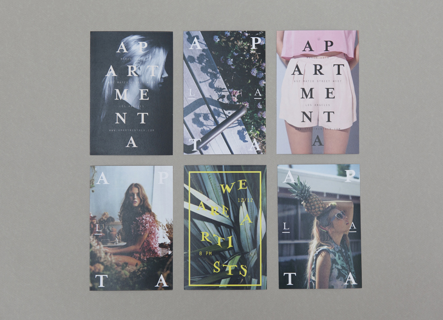
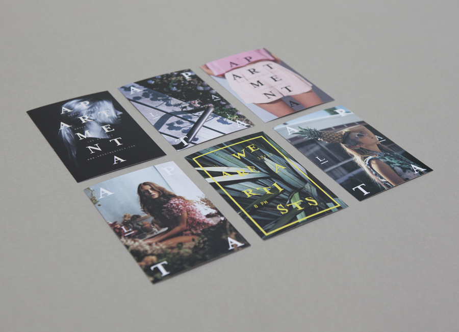
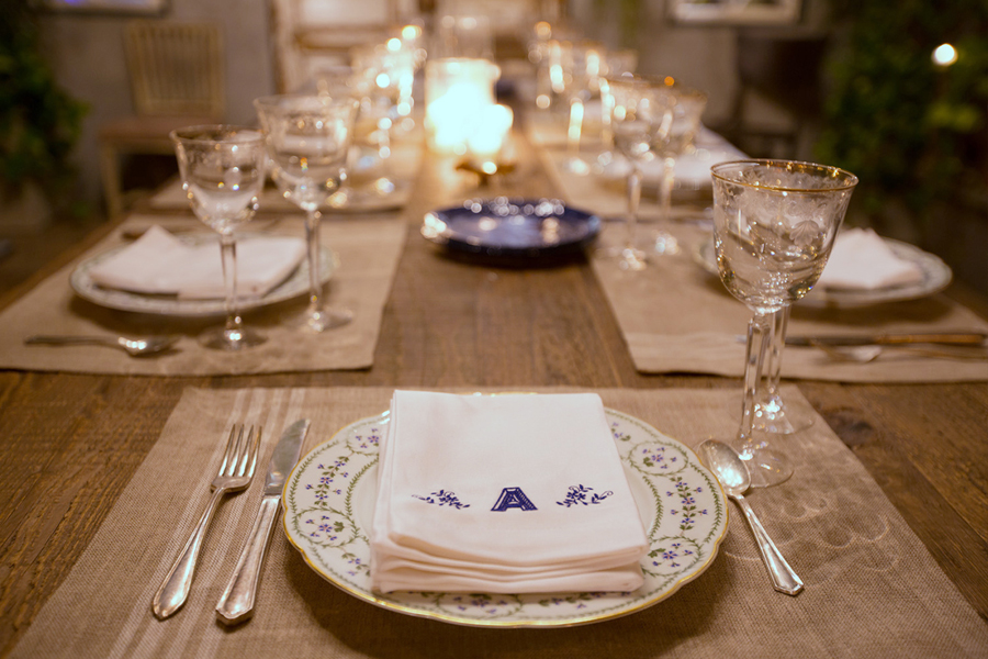
Apartment A is an art gallery, bar and cocktail academy, dedicated to the experimentation and development of cocktails, located in Los Angeles’ Art District. Apartment A’s brand identity—which includes two logos, print promotion and stationery, created by Parisian design agency Say What Studio—establishes a striking contrast of organic illustrative detail, plenty of space and structured typography, mixing a sense of methodology with the spontaneity and flourish of the arts and crafts.
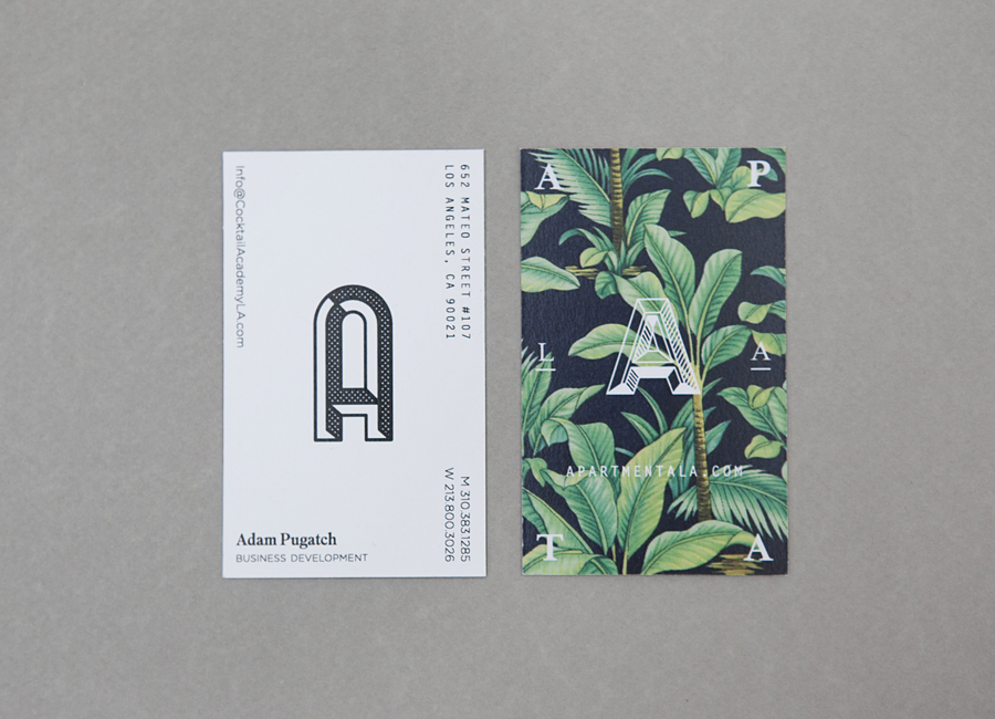
There is a clear and distinctive duality that exists throughout this identity. From the very obvious contrast of full bleed and dense images and unprinted space, a full colour and monochrome approach to ink and organic and geometric detail, to the more subtle differences in etched and half-tone shading of the logomarks, their shape, and the combination of serif and sans-serif typography.
Together these establish what appears to be a retrospective appreciation for the traditional hand crafted detail and flourish of the past and an on-trend austerity, structure and modernistic enthusiasm you might associate with the present.
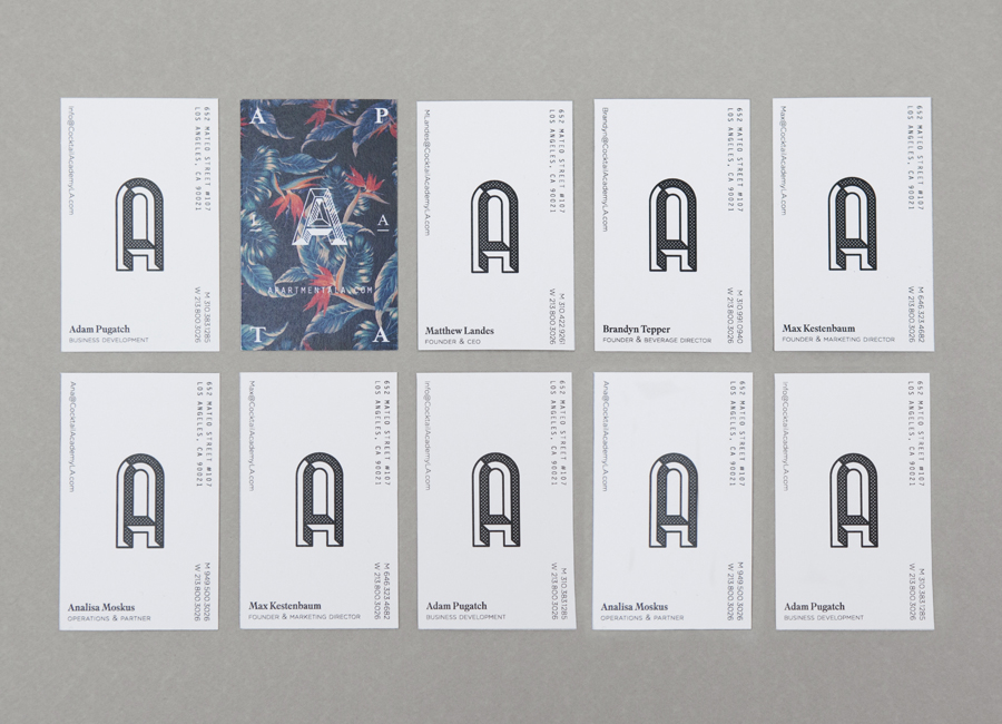
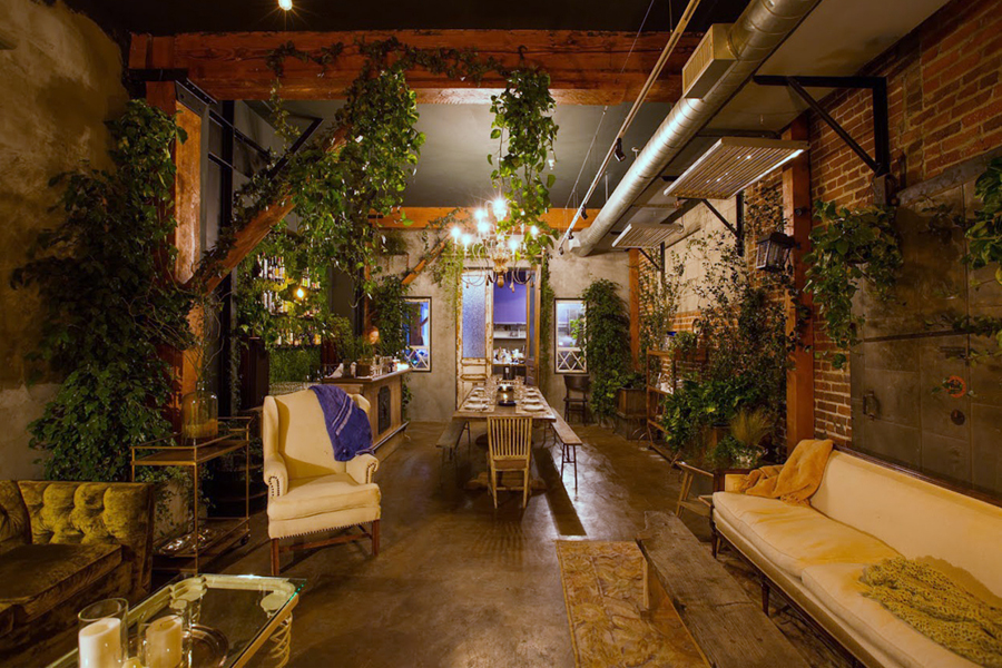
This contrast of aesthetic, which exist starkly across the front and back of the business cards and separately across the menus and promotional materials, is bold and communicative, and works well to draw together the multi functional aspects of the space, both the craft and methodology of cocktail making and an interior that juxtaposes foliage, wooden furniture and beams, classic ceramics and silverware and exposed brick and utilities.
