The Swedish History Museum by Bold
Opinion by Richard Baird Posted 28 February 2014
The Swedish History Museum is one of the country’s largest museums with a collection of over 10 million objects from a history that spans thousands of years. The museum also functions as a venue for lectures, concerts and a variety of activities.
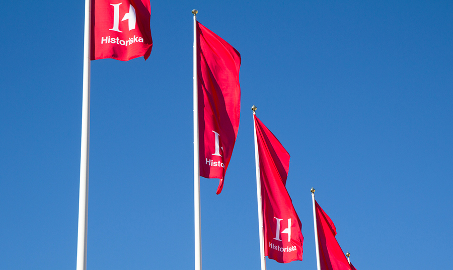
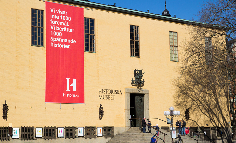
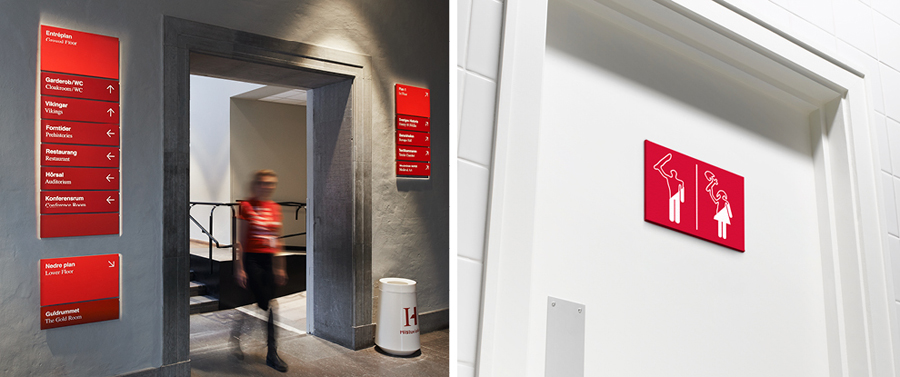
Stockholm-based design studio Bold were recently commissioned to develop a new brand identity for the museum that would revitalise the visitor experience, position it as Sweden’s number one storyteller and arouse curiosity and interest in Swedish history. The studio’s solution, which included a logo and logotype, pictograms, print communication, book and interior and exterior signage, is an acute juxtaposition of past and present achieved through the union of disparate type, image, colour and texture.

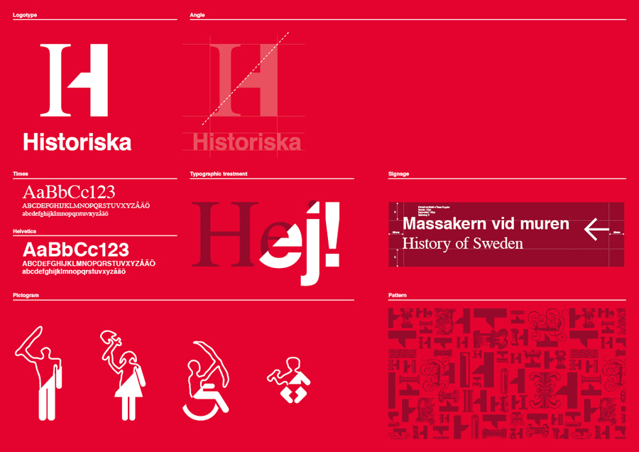
“We created a dynamic and playful identity inspired by the museum’s mission: to create curiosity and interest in history and to get the visitor to reflect on the link between our past and present. The logo is a combination of a classic serif font and a modern sans-serif font. The serif part can be replaced with historical artefacts giving the museum an opportunity to be playful in their visual expressions and display the museum’s breadth of exhibitions and activities. The combination of classic and modern is also applied as a graphical theme in the museum´s typography, symbols and imagery. The result is an inspiring identity that allows for endless communication possibilities.”
– Bold

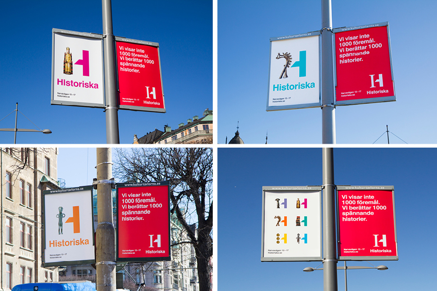
What it lacks in subtlety it makes up for in communicative clarity, there is no mistaking the fusion of past and present that exists throughout Bold’s approach, neatly reflecting, in a simple and concise way, the relevance history has on the present. The two type union while aesthetically uncomfortable, delivers impact and is well resolved through the contemporary restraint of its single colour execution in a number of applications.
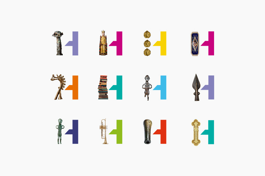

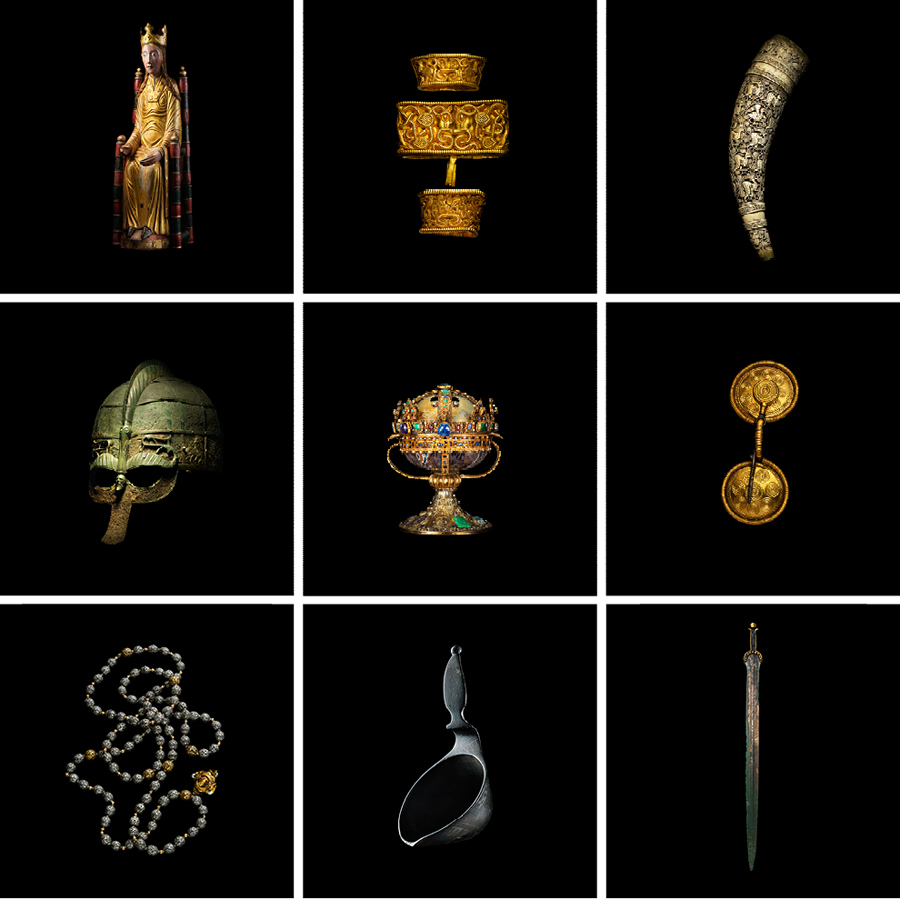
The use of objects, replacing the serif half of the logo, again lacks subtlety but in the service of a clear concept. These are playful, introduce a variation reflective of the diversity of objects and periods covered, and has an adaptability ideal for a growing collection and a mix of events. It is obvious but accessible and works particularly well as hero images in print and across the ads.
The visual discomfort of fusing two styles is perhaps most acute in the pictograms but these provide an interesting contrast of present day utility and an archaic past, a stark reminder of the significant and distant changes that have provided a foundation for today’s fast and almost imperceptible development.
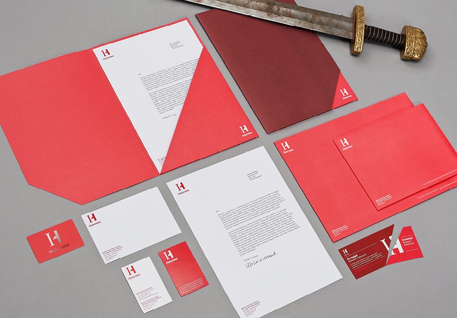
The diagonal line of the logotype extends into the stationery with die cuts and perforations, small details that bind these simpler pieces to the broader concept whilst establishing a more formal corporate restraint.
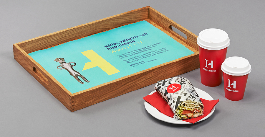
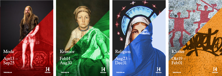
The exhibition posters’ contrast of full colour and single colour tints, mixed period artwork and photography, bisected by a diagonal line delivers both aesthetic and communicative impact much like the logo with room to court a little controversy. These are a good reflection of cultural and artistic diversity and similarity as well as their influence and integration into Sweden’s contemporary culture.

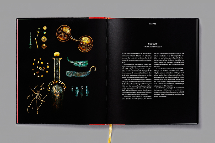
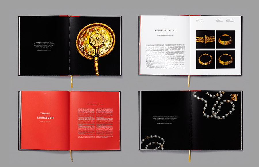
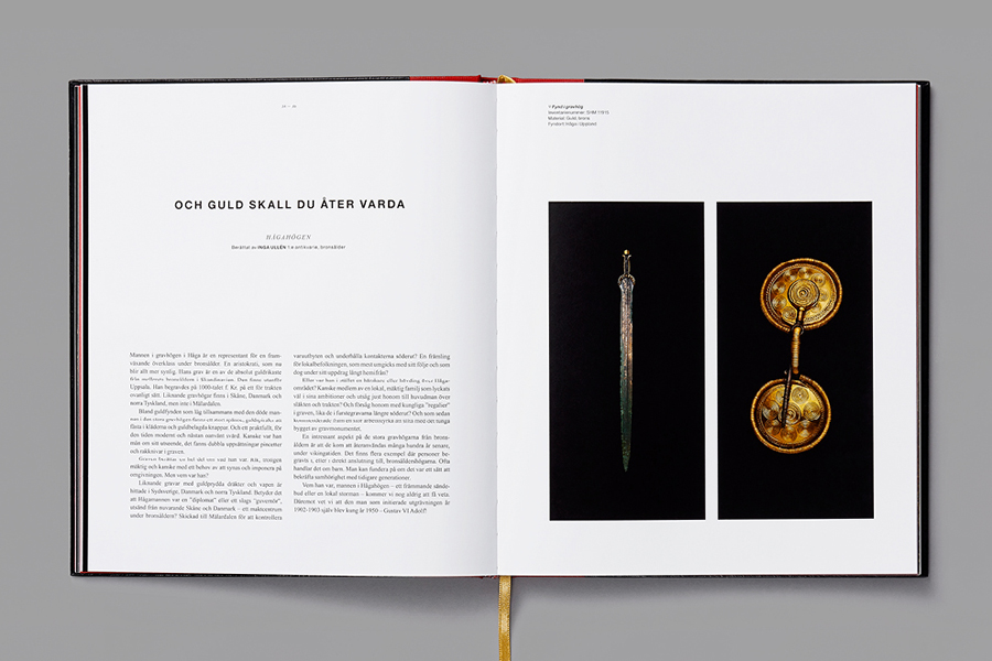
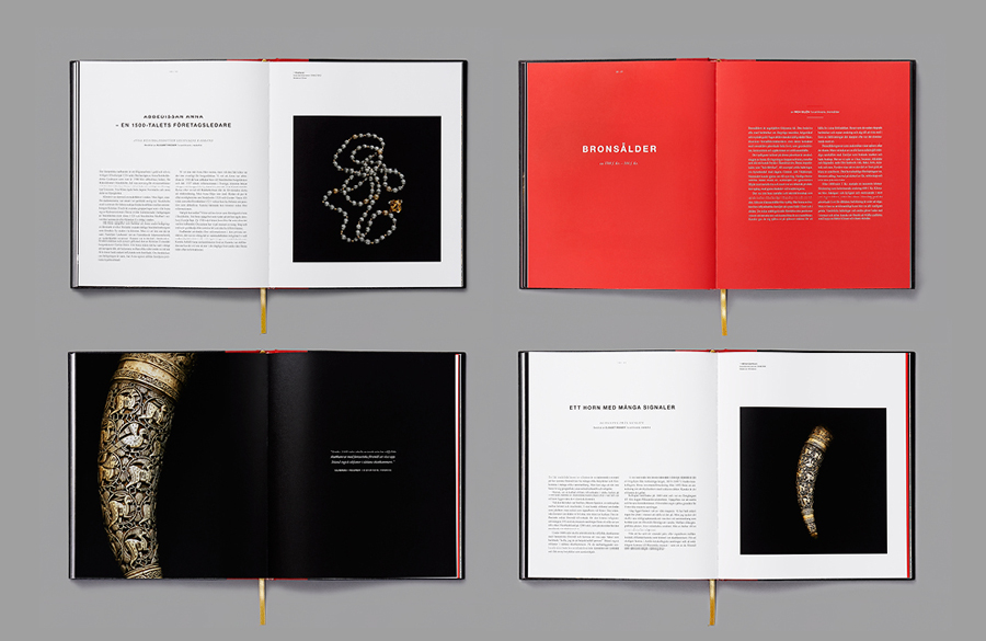
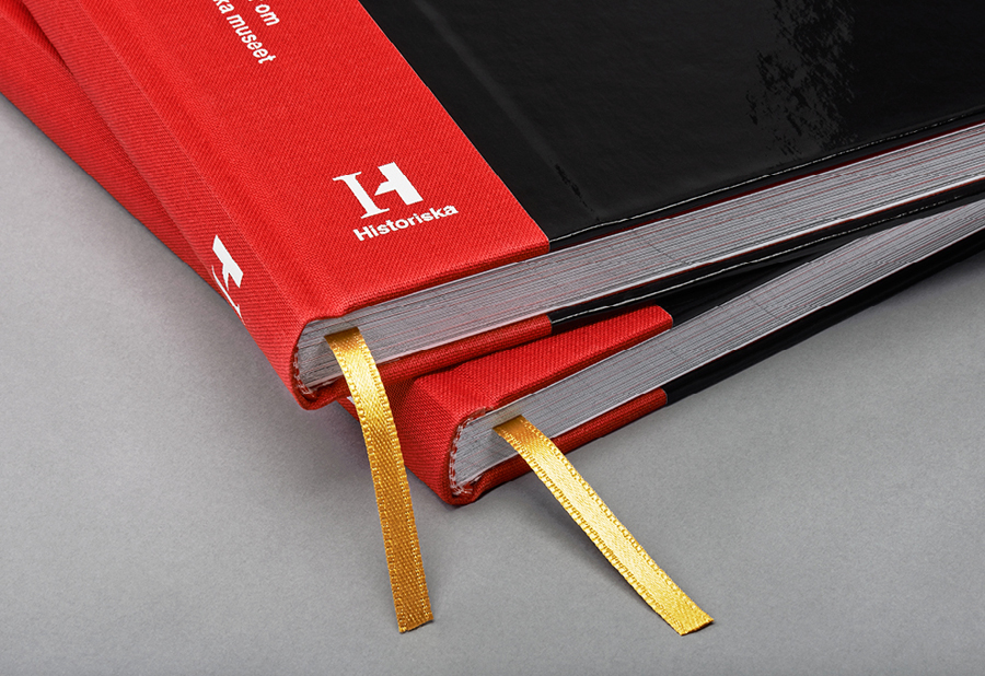
The bright red fabric spine, white foil, gloss black surface treatment, gold ribbon and detail of Pelle Bergström‘s photographs that make up the museum’s book ‘En sak till bara’ continues to utilises contrast but with a more sophisticated and subtle approach. It adds an academic and authoritative dimensionality to the bright colours and playful compositions of other print communication and the literal compounded nature of the logo.
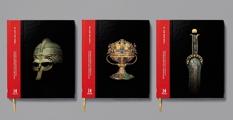
“The Swedish History Museum does not only exhibit Sweden’s precious artefacts but is also a museum full of exciting stories. But all of these would be lost if not for the people who can explain them. Inside the museum’s walls work archeologists, researchers, conservators, osteologists and antiquarians. From this insight we were asked created a book of some of the most interesting artifacts and their stories from the museum’s collection according to it’s own team of experts.”
“As the project unfolded there always seemed to be one more important thing to add, one more important detail to expand upon. ”En sak till bara” (”Just one more thing”) is a coffee table book (and an amazing collection) containing thirty-two stories by twelve of the museum’s experts. A collection of personal favourites.”
– Bold
