Molly Watson by Studio Blackburn
Opinion by Richard Baird Posted 25 March 2014

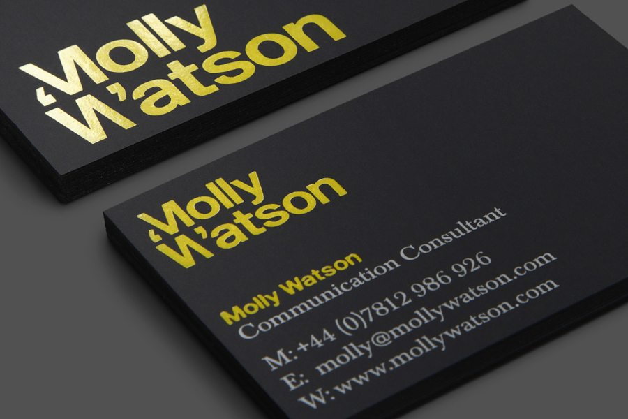
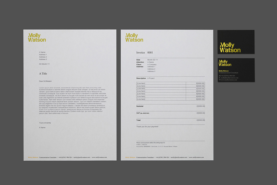
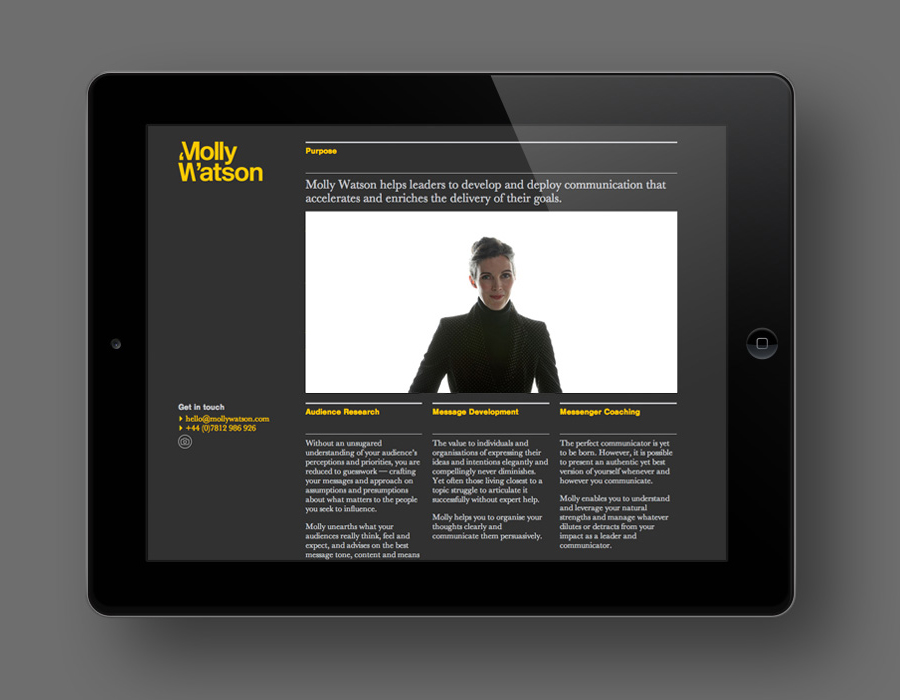
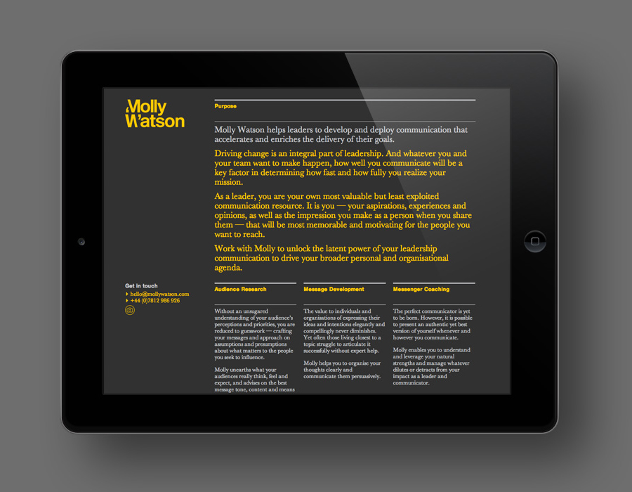
Molly Watson aids business leaders in the development and deployment of communication strategies that ‘accelerate and enrich the delivery of their goals’. Molly recently commissioned London-based design agency Studio Blackburn to help articulate this business proposition and to stand out through the creation of a new brand identity that included a logotype, yet-to-launch website, stationery, business cards, templates and CV design.
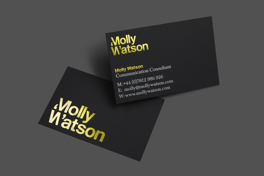
While limited in its scope, the approach neatly mixes the expected but communicative typographic clarity of speech marks, the functionality of a bold sans-serif and the detail of a traditional serif, with the more unusual and high quality contrast of a matt black board and the gloss of a yellow foil. It is a combination that manages to deliver visual impact, a confident corporate authority and experience, and hints at the communications agenda with very few assets.
