The Best of BP&O — March 2014
Opinion by Richard Baird Posted 31 March 2014
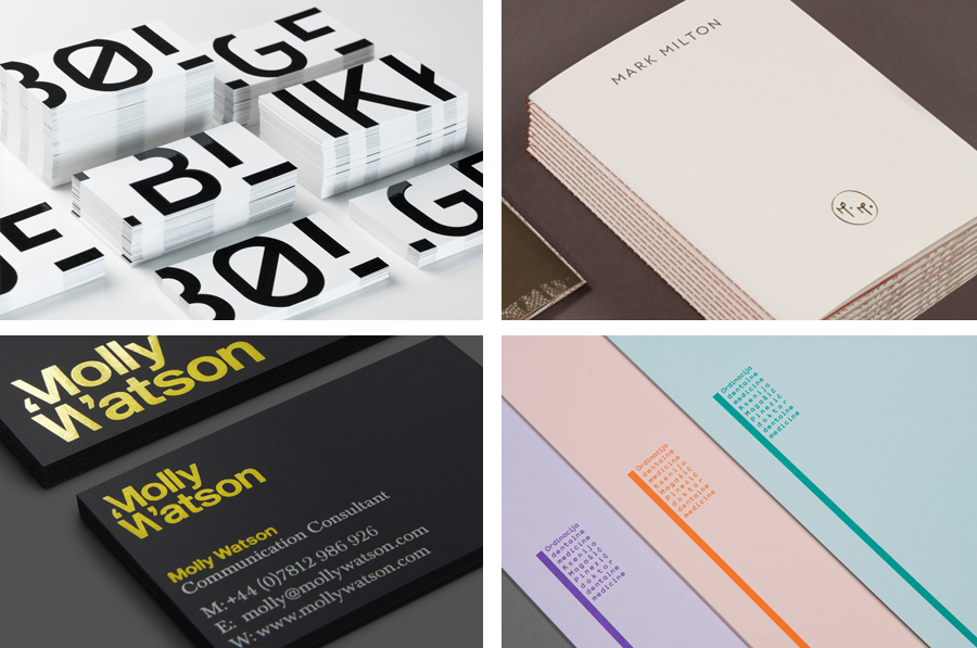
March has been a slow month for new work, however, there were five projects that really stood out for me that have made it into BP&O’s top five, a feature that brings together what I believe to be the most interesting for another opportunity to be seen and shared.
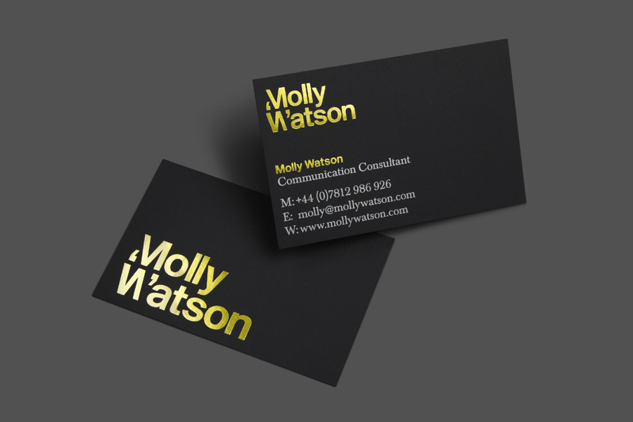
Molly Watson aids business leaders in the development and deployment of communication strategies that ‘accelerate and enrich the delivery of their goals’. Molly recently commissioned London-based design agency Studio Blackburn to help articulate this business proposition and to stand out through the creation of a new brand identity that included a logotype, yet-to-launch website, stationery, business cards, templates and CV design.
See more of the project here
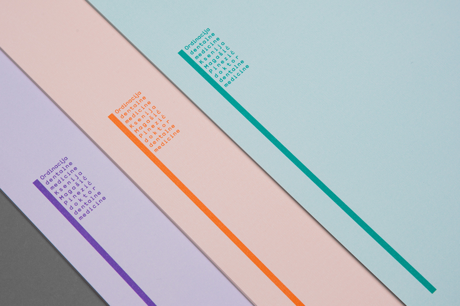
Dr. Ksenija Magašić Pinezić provides affordable dental services locally and to international dental tourists in a warm and friendly practice located in the Croatian coastal city of Rijeka. Design agency Studio8585 recently worked with Ksenija to develop a new brand identity solution—which went on to include a logo, stationery set and responsive website—that would take advantage of a lengthy name.
See more of the project here
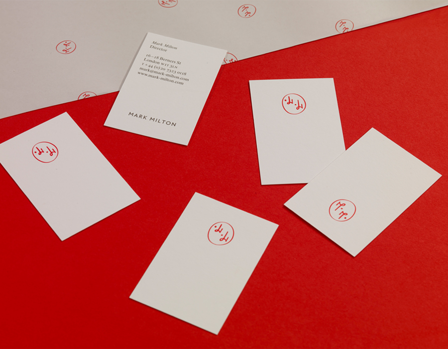
Mark Milton is a jeweller, with a family heritage within the industry that dates back to 1947, who carefully selects and retails a range of necklaces, earrings, bracelets and rings for women. Bound by the theme of curation, design studio ico developed a new brand identity solution for the brand that delivers a high quality communicative breadth through an asset architecture that includes a monogram, print and packaging, still-life and model photography, website and an editorial approach to blogging.
See more of the project here
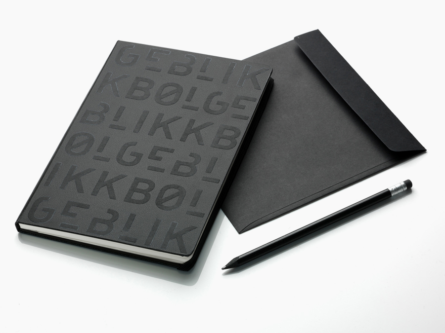
In response to a change in leadership and the acquisition of new staff, Norwegian architectural firm Ottar commissioned Tromsø and Oslo-based design studio Tank to develop a new name and brand identity—which would go on to include a logo, stationery set and responsive website—that would better reflect the quality, professionalism and scale of the firm’s work within the health and education sector, whilst maintaining an “innovative and modernist expression”.
See more of the project here
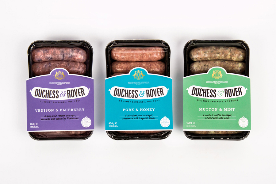
The raw meat sector within the dog food industry continues to grow and innovate, reflecting owner’s increasing support and understanding that it can provide a fresh, natural and convenient way for their dogs to receive the nutrients they need.
Recognising how unpleasant raw meat can be and looking to take advantage of the expanding market, design studio and now product development specialist Robot Food created, branded and packaged their own more appealing sausage range, flavoured using ingredients good for canine health, under the name Duchess & Rover.
See more of the project here

