Coma by Mucho
Opinion by Richard Baird Posted 14 May 2014

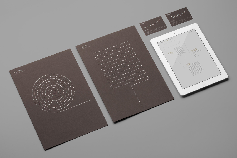
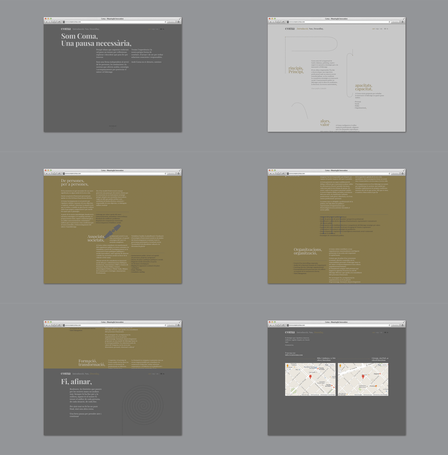
Coma is an independent analysis, strategy and executive coaching business located in Spain. It provides support to individuals, businesses and institutions with the aim of fostering talent and leadership. Coma’s philosophy is focused on forward momentum and progress. This philosophy is expressed by the firm’s new brand identity, developed by global design studio Mucho, through illustrative paths that finish on a comma. These link print communication and online presence.
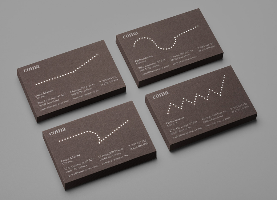
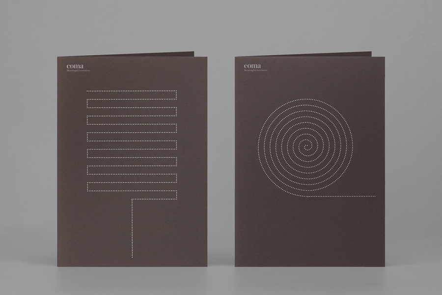
The illustrations work well to convey the dissimilar paths organisations take from setup to success, presents clearly the belief that ups and downs eventually deliver growth and, by using the comma, visualise the points at which Coma can provide positive change as part of an ongoing journey. There is a solid technical consistency in the way that these have been rendered, much like a dot matrix, that reflects technical and analytical abilities of the firm. Mucho has managed to extract a lot from such elemental forms, effectively balancing a proprietary aesthetic value—one that gets a little more playful on-line with drop caps—with a clear communicative intention.
The dyed, uncoated, brown board, silver print finish and serif of the business cards and folders offer a high and traditional quality that appropriately tempers the contemporary, almost technical and abstract nature of the illustrations and the current style of the website, a contrast that also exists in the all-lowercase stencil cut utility drawn out of the serif flourishes of the logotype.
Design: Mucho
Opinion: Richard Baird
