Miinus by Bond
Opinion by Richard Baird Posted 2 June 2014
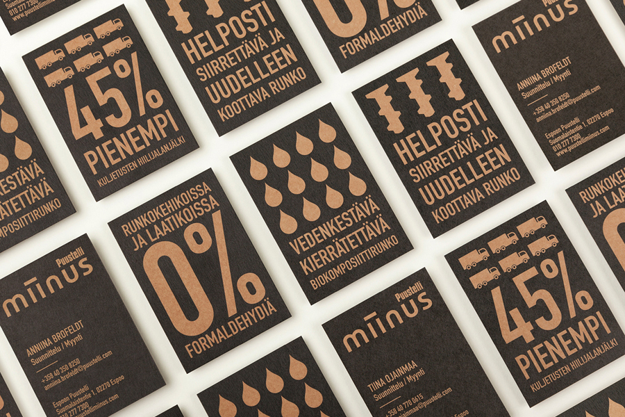
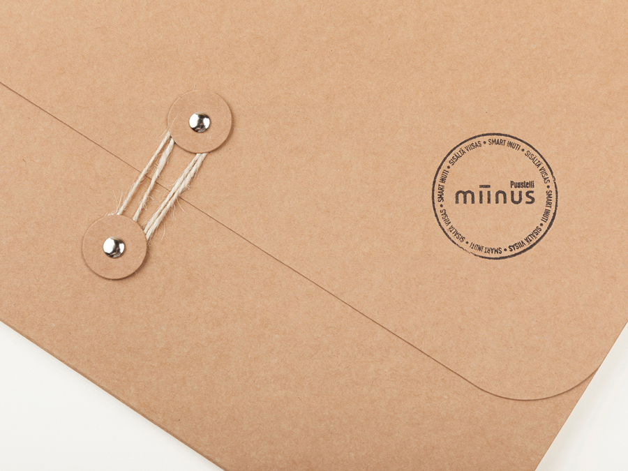
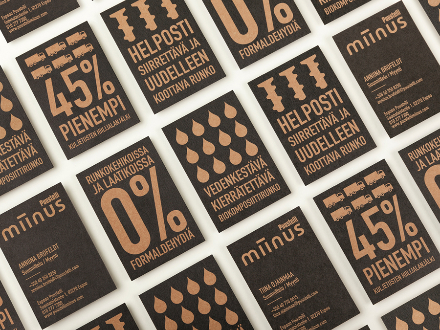
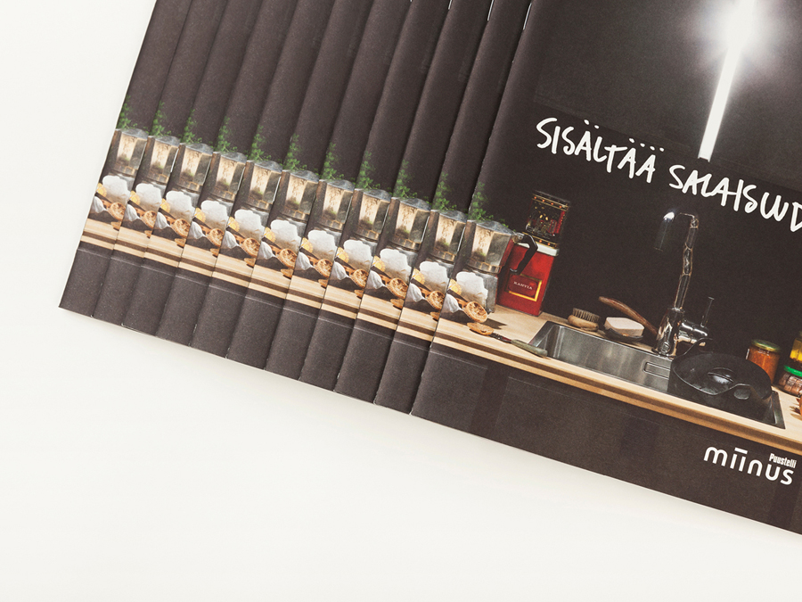
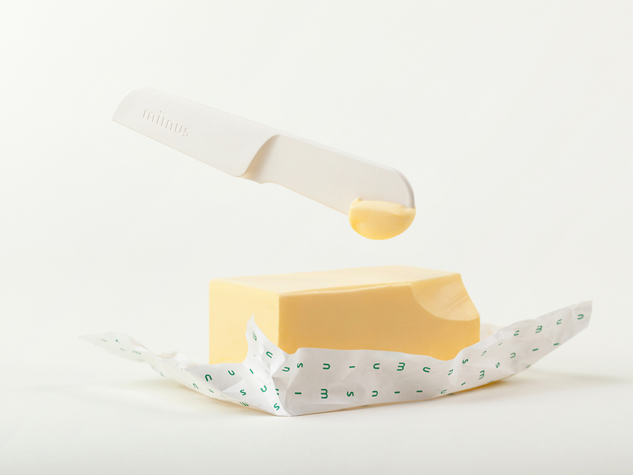
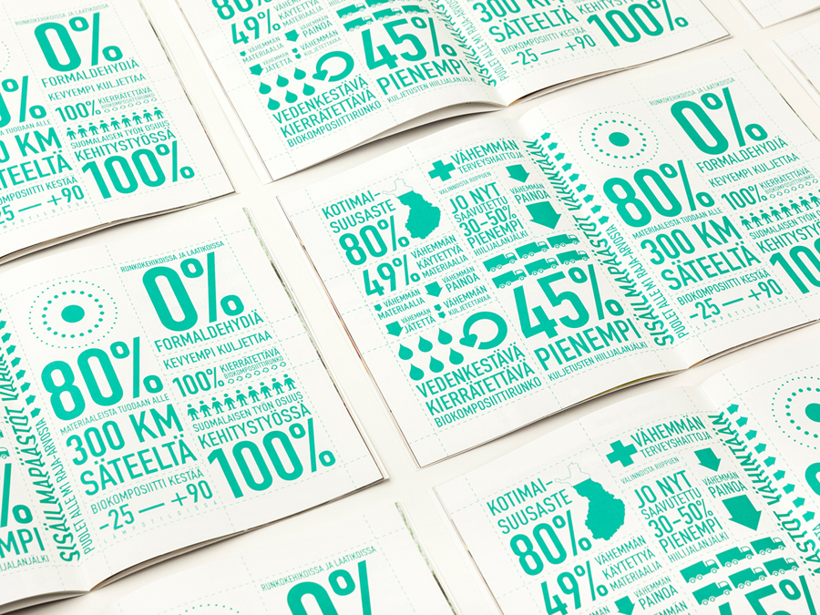
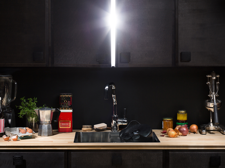
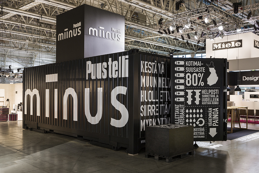
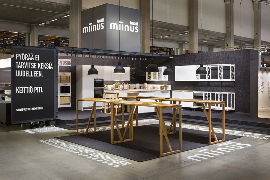
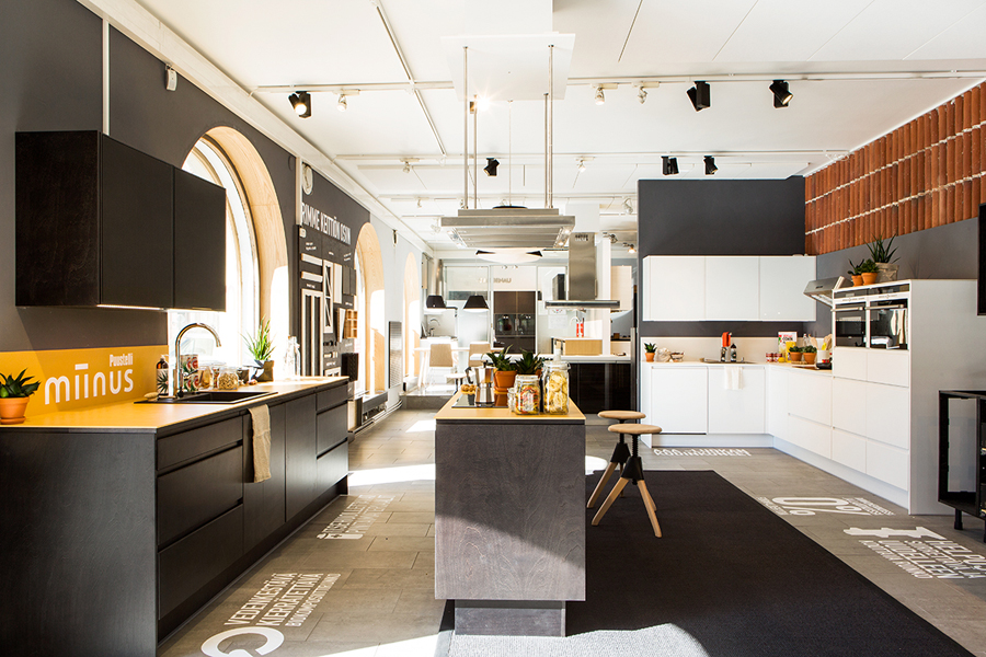
Miinus is kitchen created by Finnish furniture manufacture Puustelli. As the name suggests, Miinus was developed around the philosophy of reduction, the process of removing superfluous elements to leave only the minimum, most functional aspects intact. Helsinki based design studio Bond where commissioned by Puustelli to develop a brand identity for the kitchen that would extend across stationery, print, retail and exhibition spaces. By utilising uncoated and unbleached materials, an ink economy, a bold fact based typographic and iconographic approach alongside a more personal hand written script and photography, Bond’s solution effectively conveys the themes of robustness, lifestyle, high quality, natural material use and functionality with a communicative precision.

The logotype’s geometric repetition of form across the m, n and u, the structural quality of the ii, single consistent line weight, decent spacing, lowercase characters and grid based pattern in print appears as an apt reflection of the reductionist, modular and efficient nature of the kitchen. The repetition of form within typography often feels like a short cut, offering little aesthetic interest or character differentiation to aid legibility, however, here it appears well suited, drawing distinction and communicative value from what might be described as a typographic efficiency.
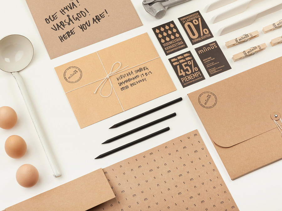
A condensed sans-serif used to deliver fact based information extolling the virtues of the kitchen’s manufacture and a hand drawn script with personable messages broadens the communicative extent and aesthetic interest of the project through contrast without undermining the logotype. These effectively fuse a hardwearing robustness and environmental credibility with an important humanistic dimensionality.
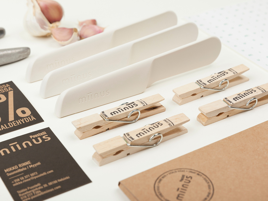
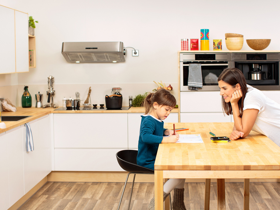
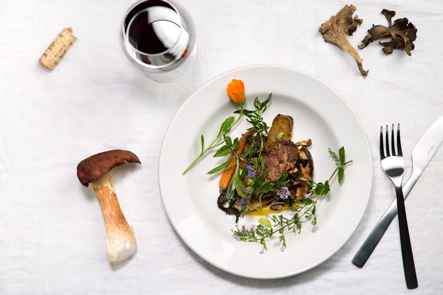
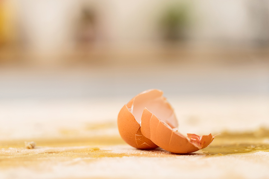
The contrast established by type continues through the economy and utility of limited number of inks and uncoated, unbleached substrate choices that resonate well with the exposed materials of the Kitchen’s build, to the hand stamped and string tied detail, and the warmth, colour and detail of lifestyle photography that intelligently mixes food, activity and family.
The result is built around clear communicative components that share the same philosophy that underpins the kitchen, address the human element expected to exist within its space and deliver its functional and environmental values directly with enough detail to appear distinctive.
Design: Bond
Opinion: Richard Baird
