Limelight Sports by Studio Blackburn
Opinion by Richard Baird Posted 5 June 2014

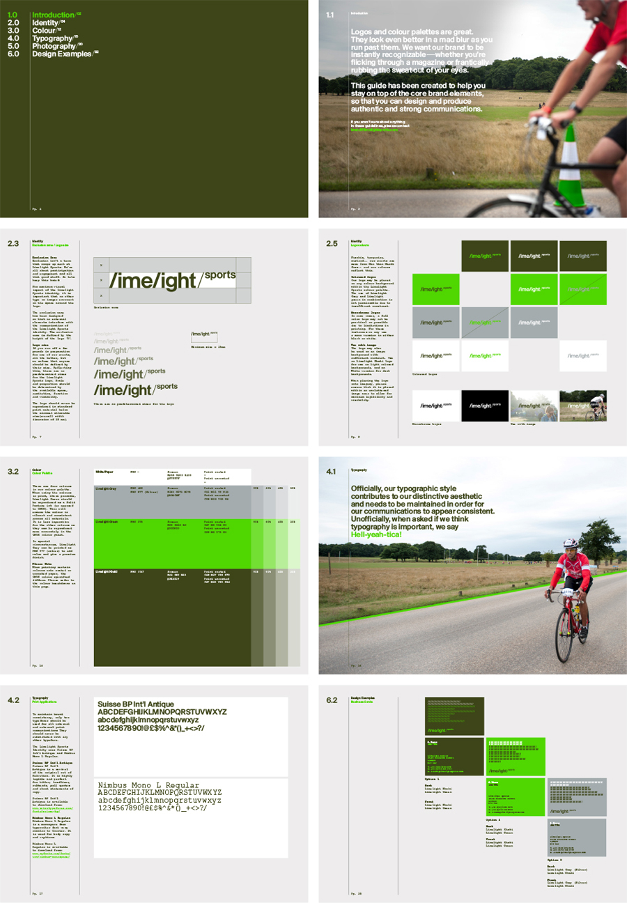
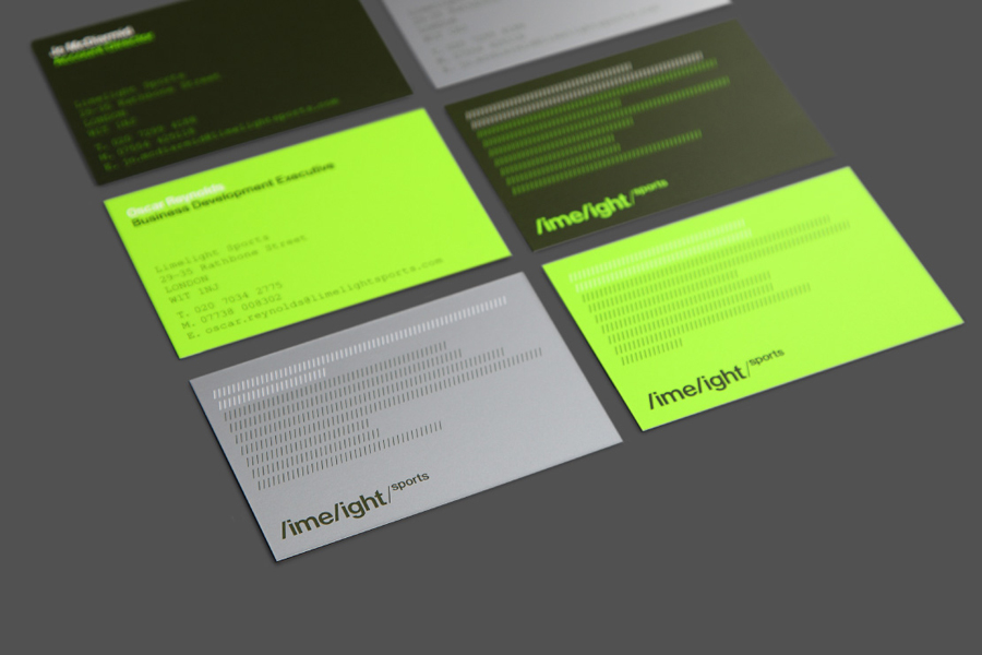
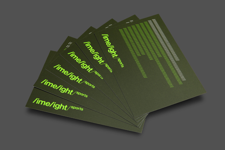
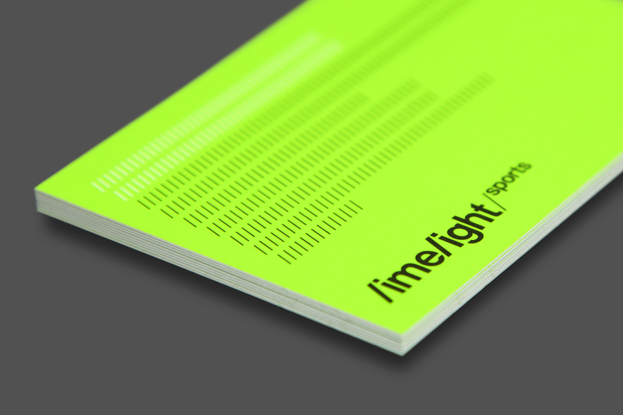
Limelight Sports is a London based agency that specialises in grass roots sports consultation, organises high profile events and campaigns such as ‘SwimBritain’, ‘Nike She Runs 10km’ and the London Duathlon, and creates programmes designed to engage with a mass audience by utilising mobile and location based technologies and social networking platforms to connect competitors and spectators during live events. Design agency Studio Blackburn where commissioned to create a new brand identity for Limelight Sports, which went on to include logo, website, stationery design and brand guideline development, that would better reflect what Blackburn describe as the sophistication of Limelight’s approach.

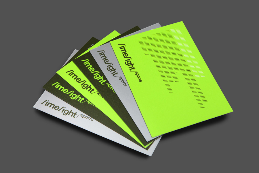
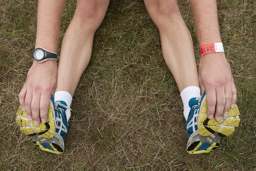
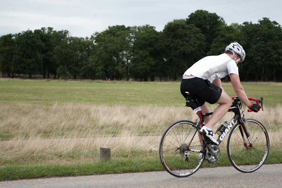
The studio’s use of neon and grass green inks alongside a cool grey neatly mix an urban and contemporary energy with an outdoor natural tone that feels appropriate for a variety of events and event locations, and delivers strong aesthetic impact. The familiar, accessible and near neutral all lowercase sans-serif characters of the logotype and the momentum and custom but slightly awkward flourish of its forward slash detail, the responsive build of the website and the informal, ‘in the moment’ tone of the photography, effectively balance the agency’s technological approach, a sense of activity, and a subtle corporate reliability with an important people-centric and personable sensibility.

Like many good brand identity projects Blackburn effectively utilise colour, type, image, digital experience and some degree of convention to deliver both visual and communicative value, touching upon the key values that underpin the activities and methods of the business, and although the logotype is a little much in the way it draws proprietary value from a common letter style it is clear in its fusion of movement and corporate stature.
Design: Studio Blackburn
Opinion: Richard Baird
Follow BP&O:
RSS
Facebook
Twitter
