The Palomar Restaurant by Here
Opinion by Richard Baird Posted 25 June 2014

The Palomar Restaurant is located at the heart of London’s Soho district with a menu that is described as being reflective of the foods of modern-day Jerusalem and influenced by the cultures of Southern Spain, North Africa and the Levant. Its interior features a zinc kitchen bar, mosaic marble and reclaimed parquet floors, marble surfaces, oak panelled walls, a skylight providing natural light and royal blue leather upholstered furniture.
The restaurant’s graphic identity, created by Here, intends to conjure up the “romantic and nostalgic feelings of bygone days” and draws its inspiration from and establishes a continuity with, many of the classic details of the restaurant’s interior, whilst also reflecting the crafted nature of its menu. This is done through the graphic detail of a hand drawn script and uppercase extended sans-serif typography, and materially using the texture of uncoated paper and the gloss and perceived quality of a gold block foil. This links a variety of assets that included menu design and coasters, neon signage and business cards. This post was updated December 2017 with images of The Palomar Cookbook, also designed by Here.

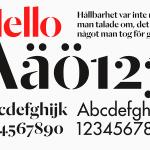
The script’s solid mix of calligraphic loops, ligatures and stroke contrast are well handled with a good sense of motion and slight variation in the arches and counters that emphasise its hard drawn authenticity. It appears to draw inspiration from the logotype of the famous LA Palomar Ballroom of the 1920’s that, while perhaps not widely recognised or remembered, references the glamour of the past.
The uppercase and extended sans-serif characters of Eurostile, both above and below, appear a little unbalanced in their arrangement and use of space around the script, largely due to the sentence case rendering of the script. The choice does, however, provide a useful contrast and a more recent but still retrospective period quality. The way the logotype divides the light and navy blue of the menu does not quite work but its broad block foil coverage secures impact and forms a clear continuity with new assets that include a cookbook.


The colour palette, like the logotype, utilises contrast effectively, balancing both a reference to architectural materials and interior detail of the past with what might be described as a current craft aesthetic through the use of white, pastel pink, light and navy blue uncoated textured papers and the gloss of a block foil. These draw directly from and complement the restaurant’s interior of marble, brass and dyed leather, reflect their classic high quality and period authenticity, and the care taken in building the restaurant’s menu. It is a shame to see little reference to the foods of modern day Jerusalem within the identity but this is perhaps better left to the experience of dining.
Design: Here. Photography: Helen Cathcart. Opinion: Richard Baird. Fonts: Bernhard Brushscript & Eurostile


The Palomar Cookbook