Eika by Mission
Opinion by Richard Baird Posted 26 June 2014

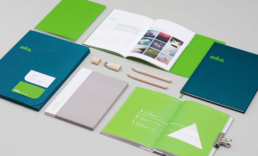
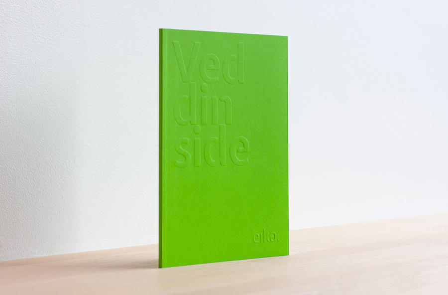
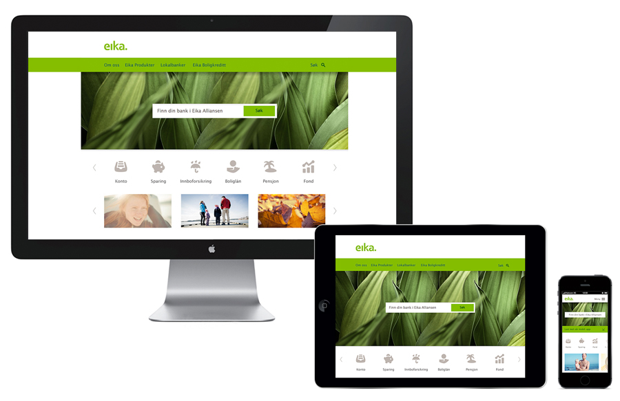
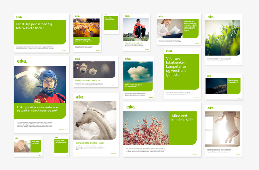
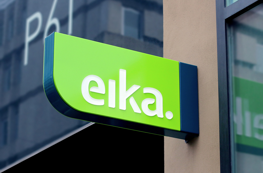
In response to the financial crash the Terra-Gruppen, a Norwegian financial group owned by and in alliance with 80 local banks, looked to take positive steps to reaffirm its commitment to local customers and the continued contribution it makes to the growth and development of the communities it serves. This came in the form of a rebranding exercise that led to the name Eika and the creation of a new visual identity system, developed by design studio Mission, that extended across print, digital and environmental experiences. While leveraging many of the corporate responsibility, accessibility and locality design cues that now saturate the industry, Mission adds a little craft into the mix with uncoated papers, blind embossed detail, a bright but limited number of spot colours and a bespoke typeface.
“Thorough research showed that the name and the position of the bank Alliance was associated with large banks and not reflected the close community with local banks and their customers as the Alliance actually stood for. A new name was introduced. Eika, [Oak] an icon with a long tradition in the Norwegian savings bank being and a friendly symbol which also signals a long-term perspective, financial strength, customer orientation and growth.”
“The identity program takes into account that the oak is supporting a brand and that any Alliance banks are independent local banks with local brand name. All of the touch points were redesigned, including signage, product literature, internal communication and websites so that the Alliance’s common identity is strong, both in the physical and the digital world.”
– Mission
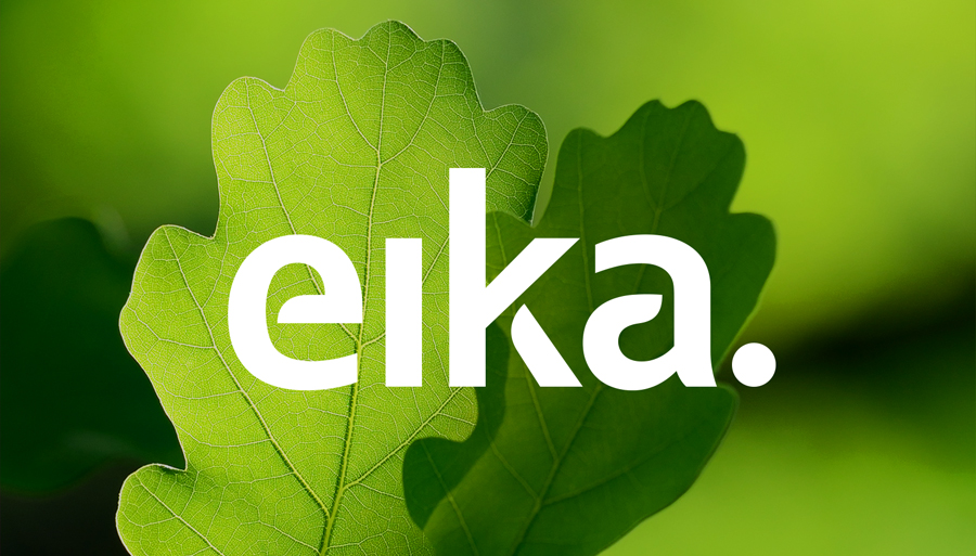
It is not often I publish corporate work, favouring smaller art, craft and design projects, however, this piece from Mission manages to draw a lot of communicative value from a similar crafted approach. Following in the footsteps of brands such as Nokia, Mission’s approach largely hinges on the proprietary detail of a bespoke typeface to deliver both direct and subtle pieces of communication and distinction, surrounds it with texture and colour, and the expected but broadly understood locality and accessibility of photography that mixes people and nature.
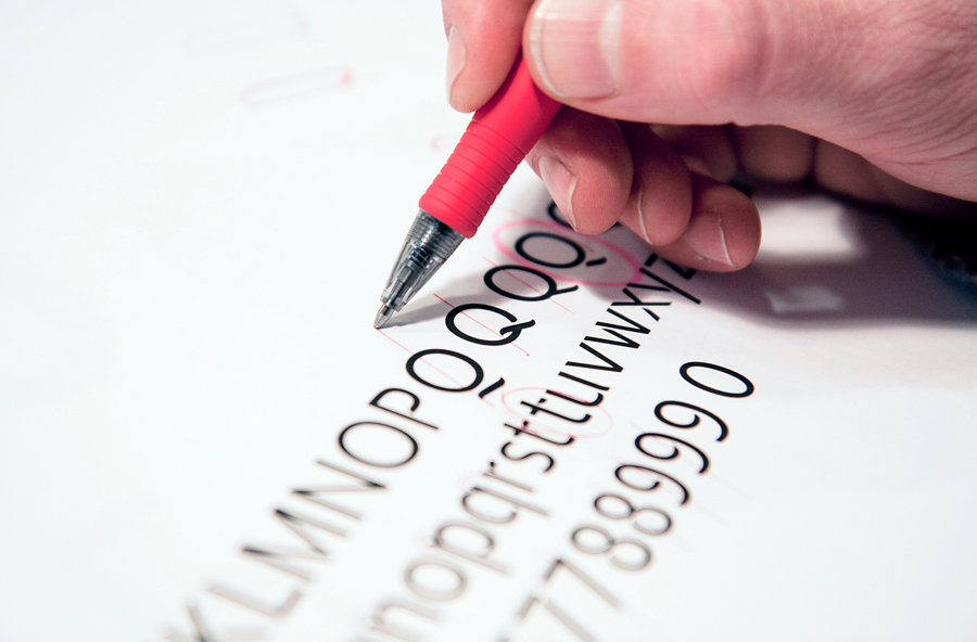
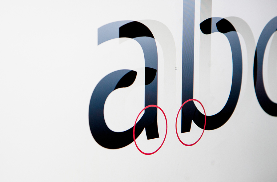
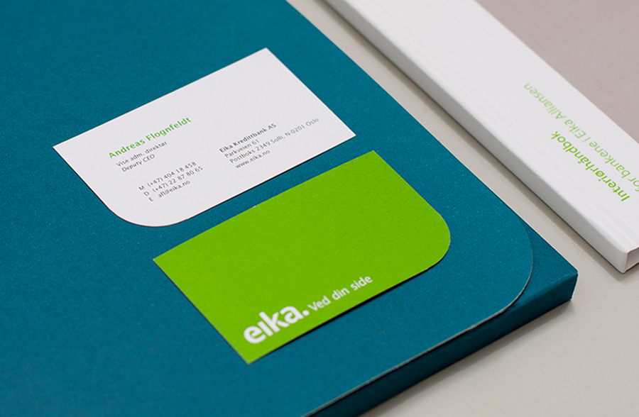
The world is full of nuanced or over styled, corporate or accessible typographical choices, to sit comfortably between these in a way that is understood by financial service users or the general public instinctively, rather than critically as a designer might, is difficult to manage but one achieved here. Eika Sans’ low stroke contrast, square terminals and absent tails establish a fairly common corporate formality whilst the leaf-like cuts introduce a softer proprietary character informed by the name and its strategic communicative origins. These details are neatly drawn out through leafy photography and die cut corners in print, and when reduced have a subtle and contemporary stencil cut utility.
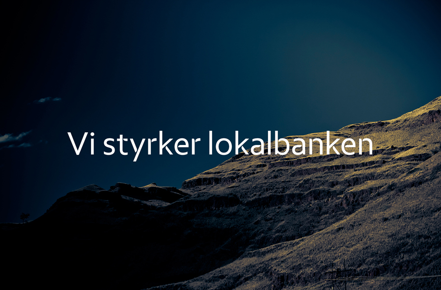
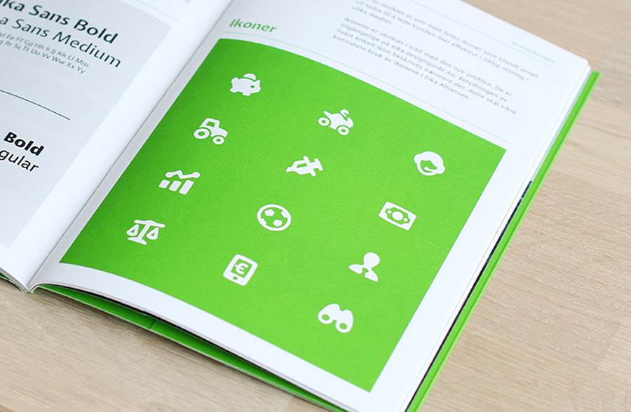
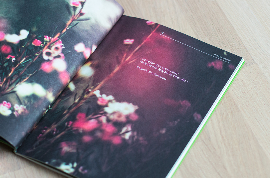
Eika Sans is paired with iconography, rendered with an unusually heavy weight making it appear very youthful as oppose to the on-trend favour of light line weights. And the impact and perceived economy/austerity of few but bright inks alongside what looks like wood USB sticks and pens that clearly express an environmental and community responsibility. Although what you might describe as corporate accessibility is delivered conventionally through people and landscape photography and video, the quality of these and their full bleed application in print manages to extract a uniqueness from what is a saturated technique.
Design: Mission
Opinion: Richard Baird
