Fort Standard designed by Studio Lin
Opinion by Richard Baird Posted 13 July 2014

Fort Standard is a New York based industrial design studio using long-lasting natural materials and traditional production methods in an innovative way to produce products, lighting and furniture with a simplicity, high functionality and an attention to detail. As the studio explain online, their ability to act as both designers and manufacturers not only informs their process, but yields smarter products that exemplify an understanding of materials and the balance between form and function. Built around a custom logotype, geometric logo, contrasting type and a multi-pass screen printed business card and letterhead, Fort Standard’s new brand identity, created by Studio Lin, manages to distill and reflect their philosophy through shape, material and process with few assets.
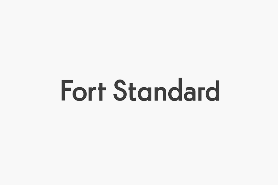
Founded on what appears to be the sans-serif characters of Futura, the logotype leverages the modernity of the early twentieth century and its Bauhaus influences to establish an efficiency and functionality. The absence of repeating character styles, obvious across the r’s and the a’s, less so through the d and t, enhance its geometry and draws individuality from uniformity, binding them with a consistent low contrast and horizontal and vertical terminals. These characters honour the origins and influences of Futura, clearly balance creativity and function, and establish a proprietary image without appearing superfluous or too quirky.
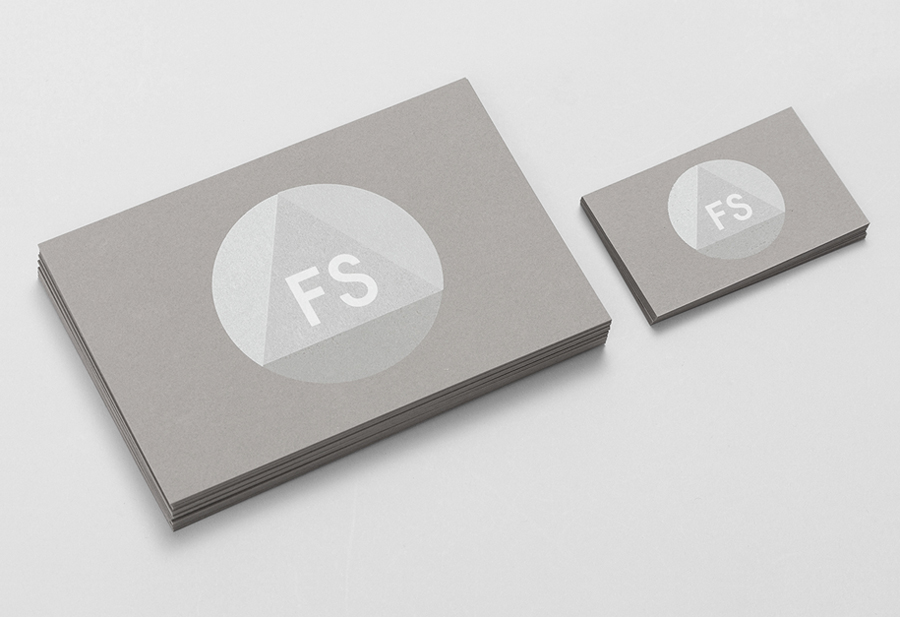
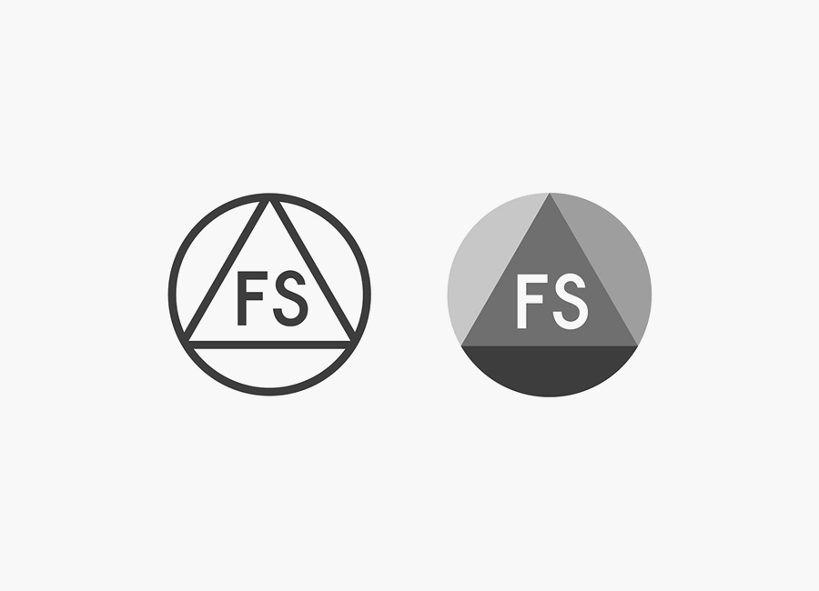
The two logomarks — an outline for stamping onto products and shaded for screen and print — have a similar communicative value as the logotype, combining sans-serif initials, perhaps a nod to the monograms and cyphers of the craftsmen of the past and a contemporary resurgence, with the elemental structural forms and robust perceptions of a circle and triangle.
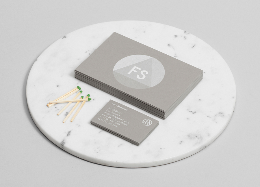
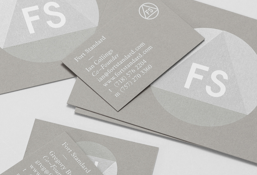
Created using four passes of a semi opaque white silkscreen to build up the logo, the business card mirrors the keen eye for communicative design, material choice and process that underpin Fort Standards values. The white ink and uncoated cool grey board unites the contemporary sans-serif of the front and the traditional flourish of a serif on the back. This typographical contrast provides both aesthetic and communicative value ideal for a company that describes itself as working with retrospective techniques in a contemporary way.
Together these elements work well as a shorthand for simple design principles such as a contrast of form, light and shade, structural integrity, process, material consideration and fine detail that is fitting for a business producing individually crafted pieces expected to last using traditional processes with a contemporary insight.
Design: Studio Lin
Opinion: Richard Baird
Fonts Used: Futura
