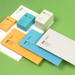
Kid O by Studio Lin
Opinion by Richard Baird Posted 16 July 2014

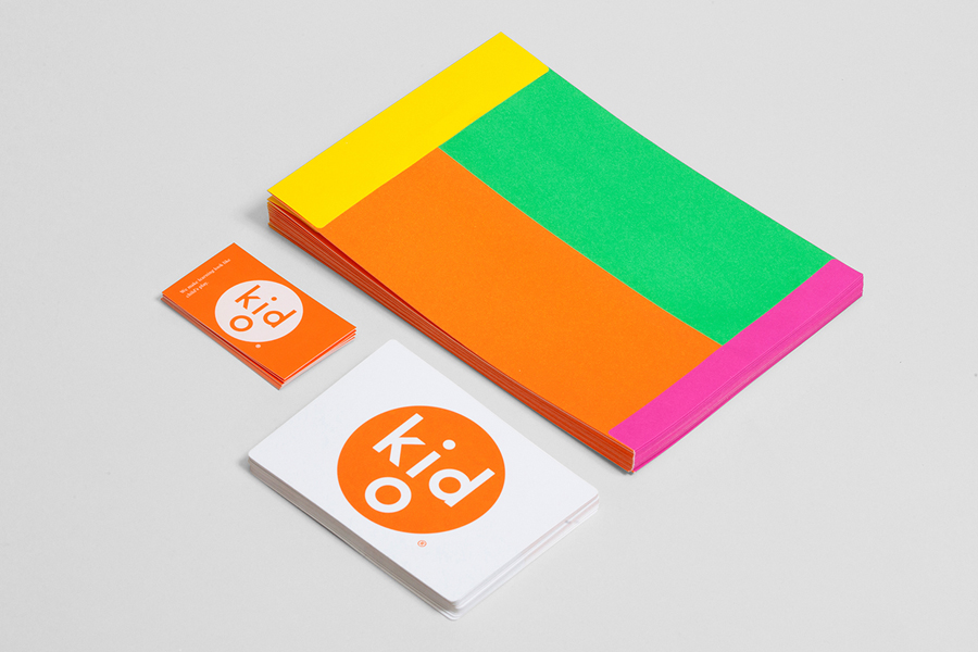
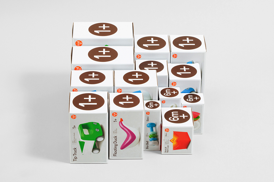
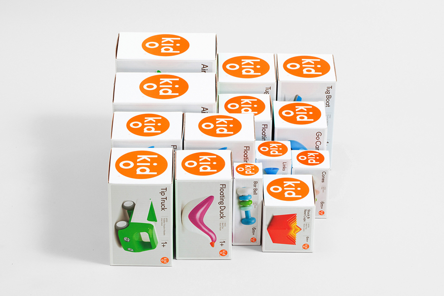
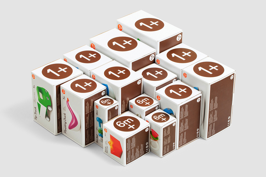
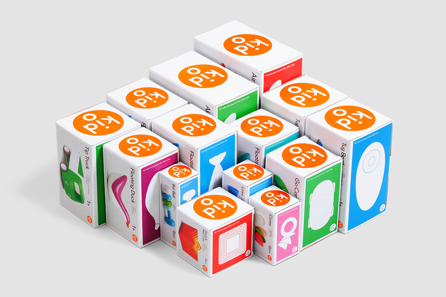
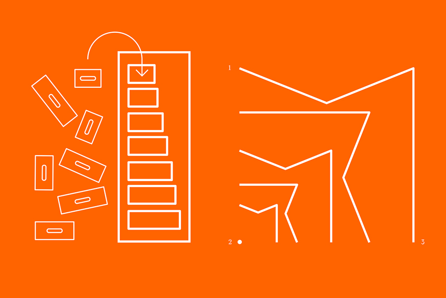
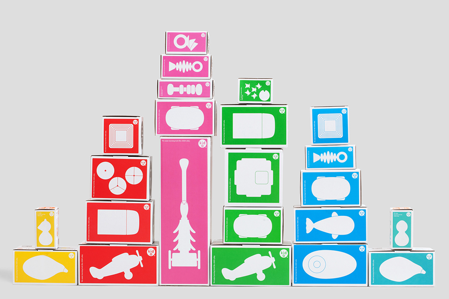
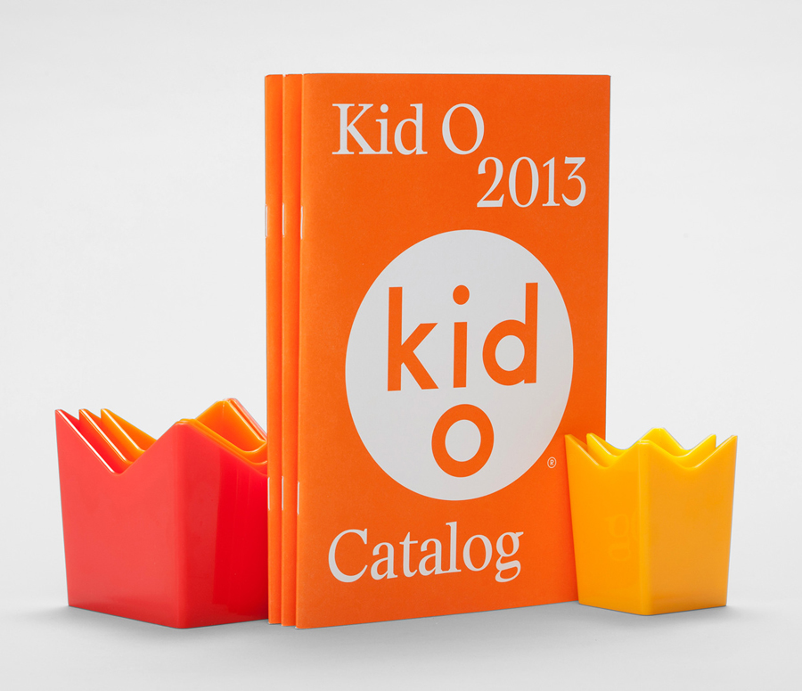
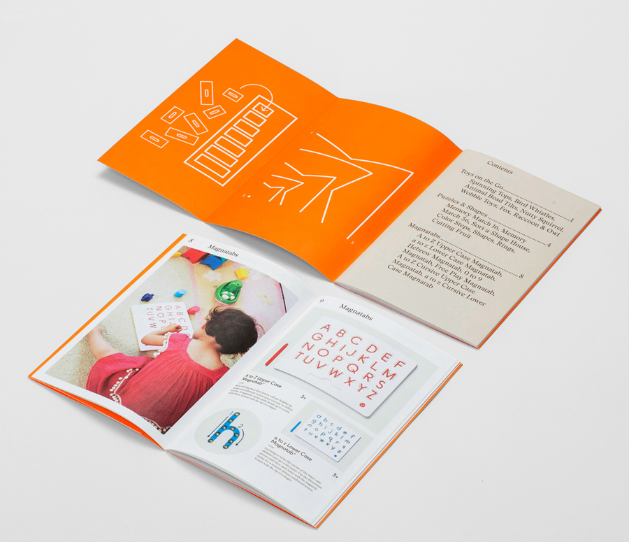
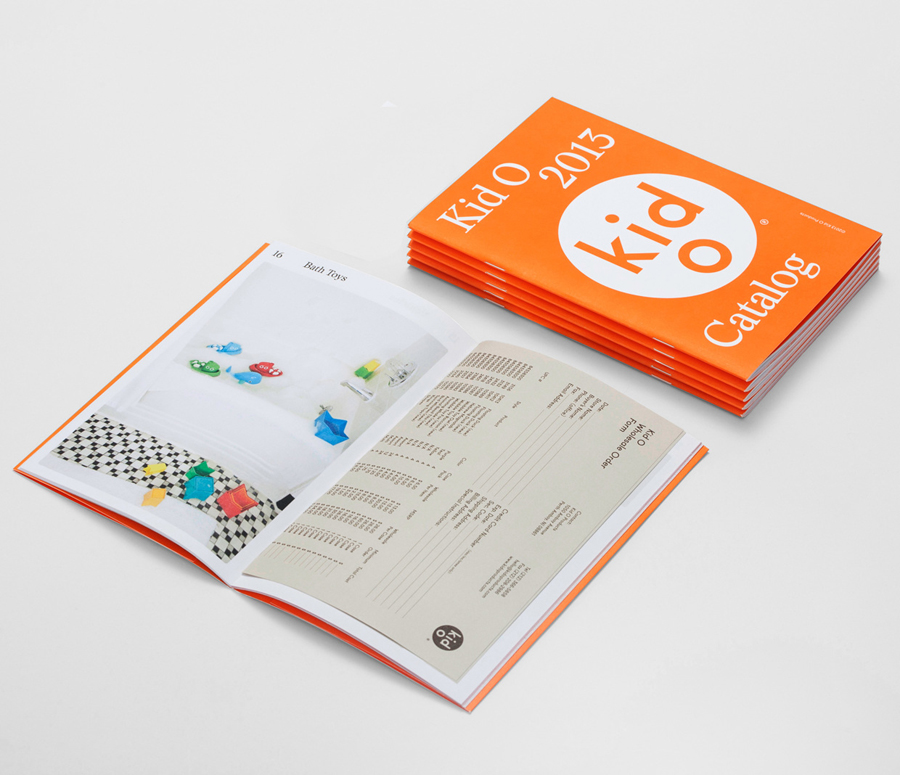
Kid O is a modern American toy company that creates products that engage and stimulate children through a rich variety of shapes, colours, and sizes. Designed by Studio Lin, Kid O’s new packaging treatment — which included over 50 boxes — takes the vivid colours of the industry, reduces these down to four, contains them within geometric boundaries and pairs them with a generous use of white and panels of brown, in a way that draws distinction from convention. Alongside good consistent product photography, the bold fill and light line weight of the illustrations, playful yet restrained logotype, a single consistent typographical approach and simple structural choices the solution delivers a brightness and a contemporary moderation that draws out the products, their age group and quality, and resonates with their elemental forms and colours.
