Scotland Can Make It! by Graphical House
Opinion by Richard Baird Posted 31 July 2014

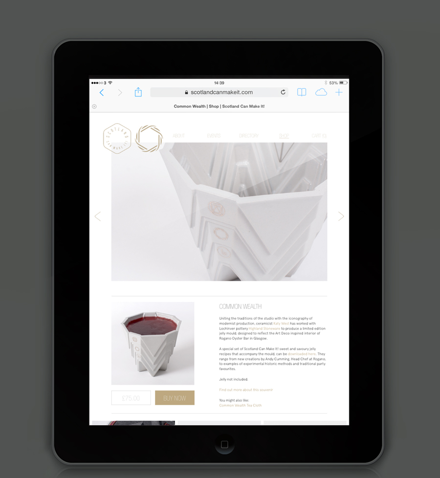
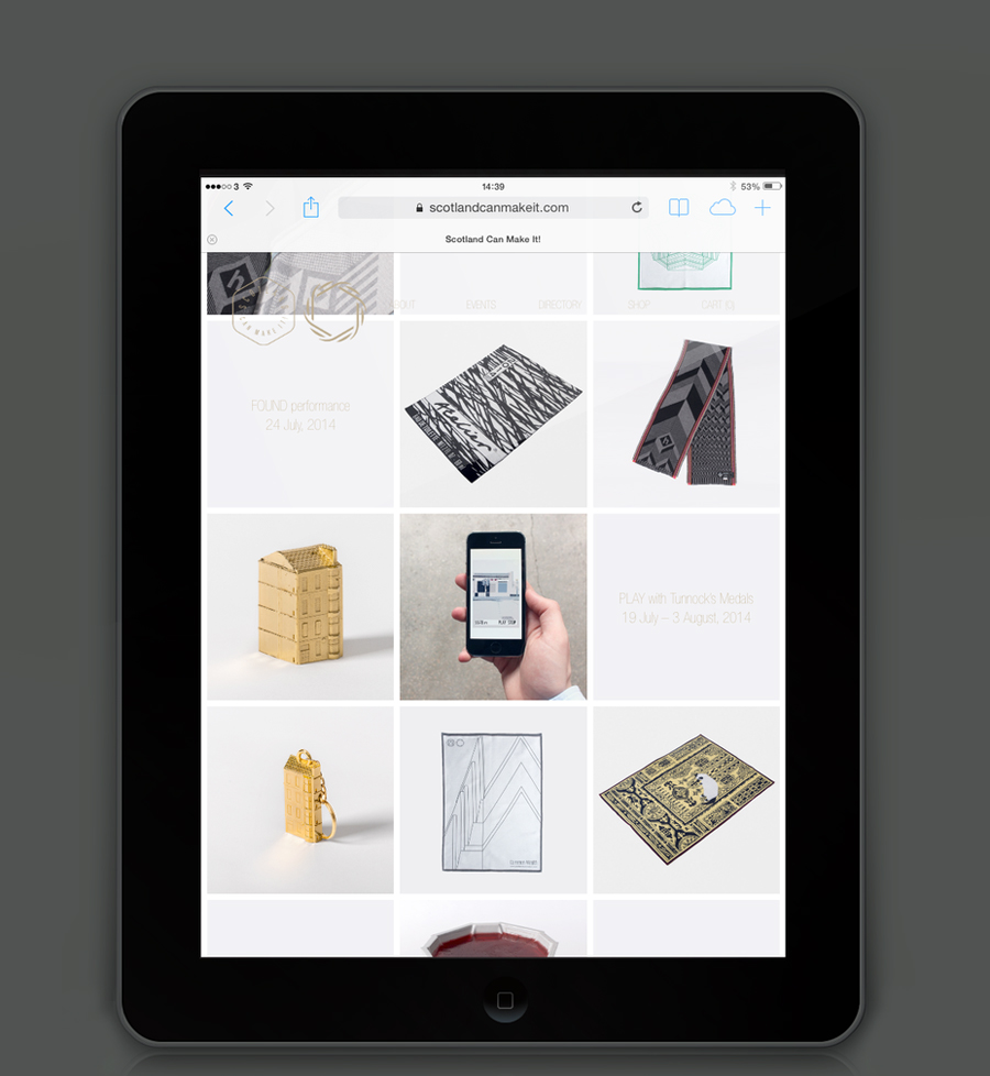
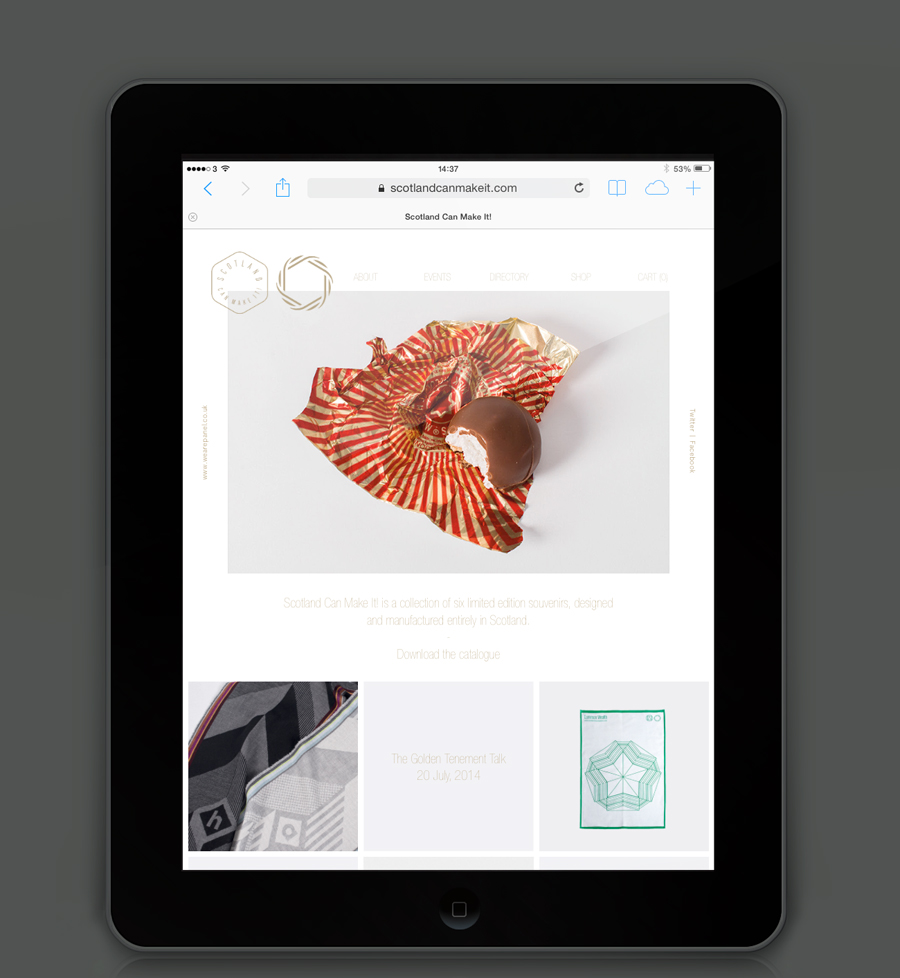
Scotland Can Make It! is a limited edition collection of souvenirs, created by leading Scottish designers and artists in collaboration with manufacturers from across the country, for the Glasgow 2014 Commonwealth Games. The souvenirs are described by Graphical House, the design studio behind the collection’s brand identity and website, as being part of a programme of events that celebrate ‘Scotland’s cultural heritage, creative practice, skill and production’, and are available online and from a pop-up shop located on Glasgow’s Osborne Street during the summer.
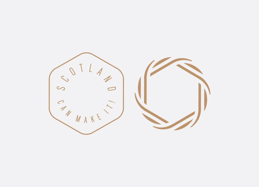
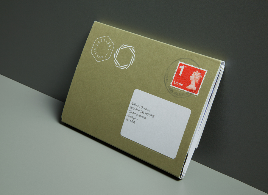
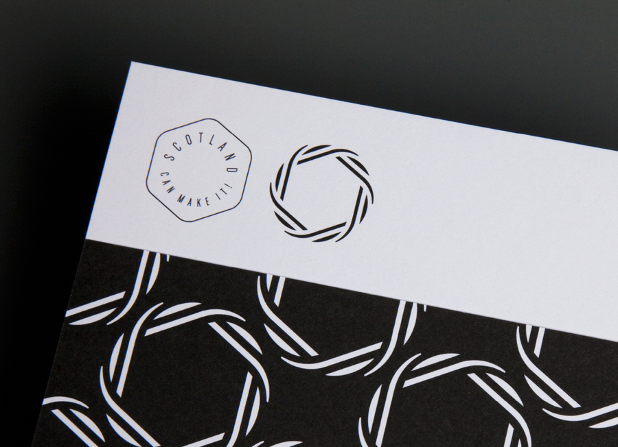
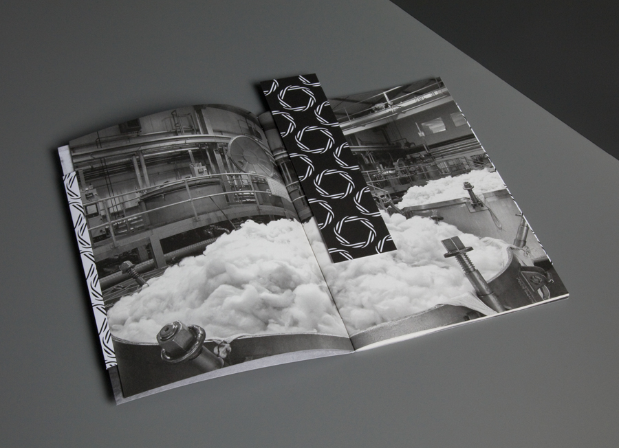
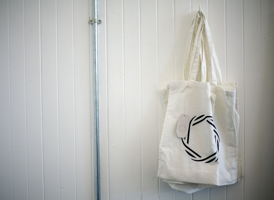
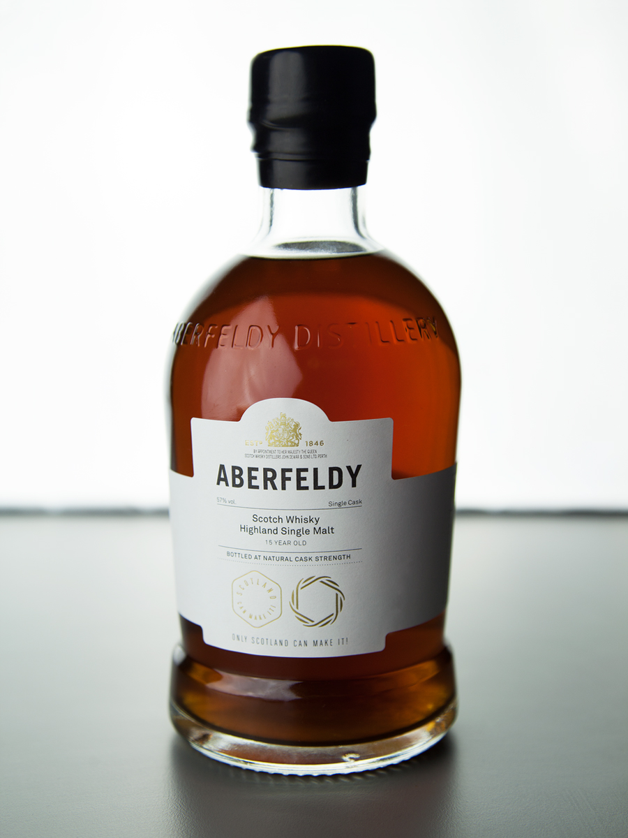
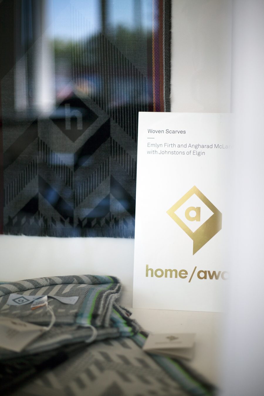
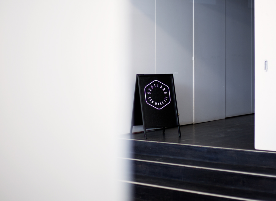
Graphical Houses’s approach leverages the Commonwealth Games without being explicit, this comes through in the duality of the name (success and manufacture), a gold print finish and the traditional craft and medal / wreath-like sensibilities of the logos. These are rendered with a contemporary retrospective appreciation with plenty of internal space that allows these to sit well over images online much like a craftsmen’s mark and repeat well as patterns. Contrast is used to good effect, mixing circular and hexagonal forms (a subtle nod to the six products) and condensed but generously spaced type to draw distinction from a widespread aesthetic whilst retaining communicative value.
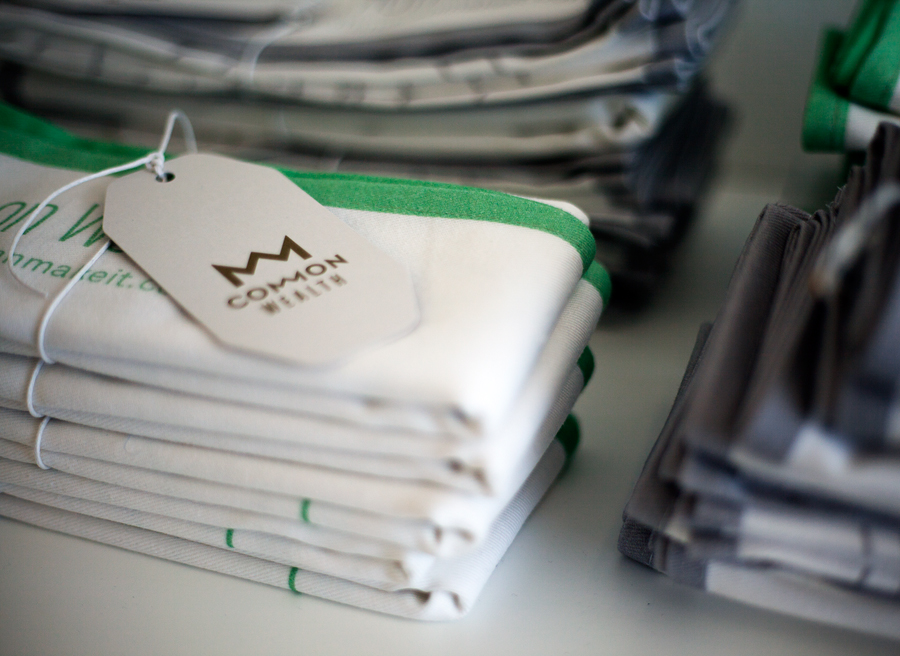
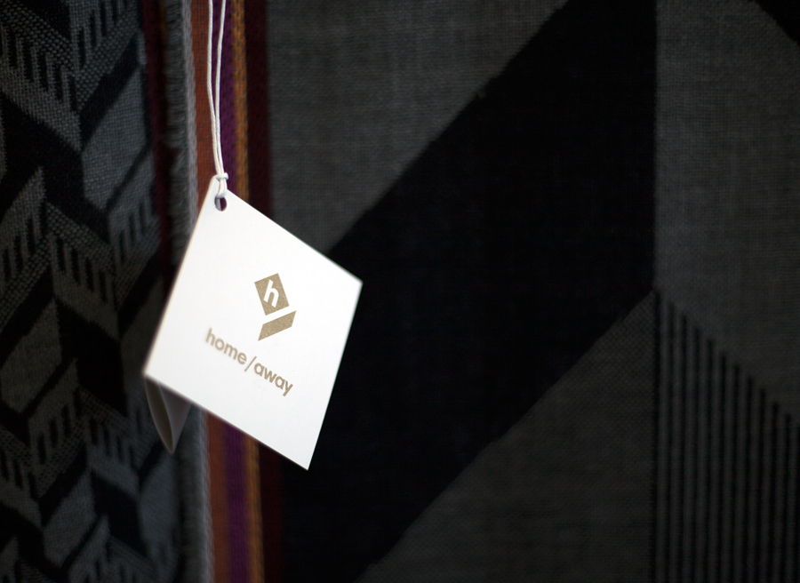
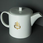
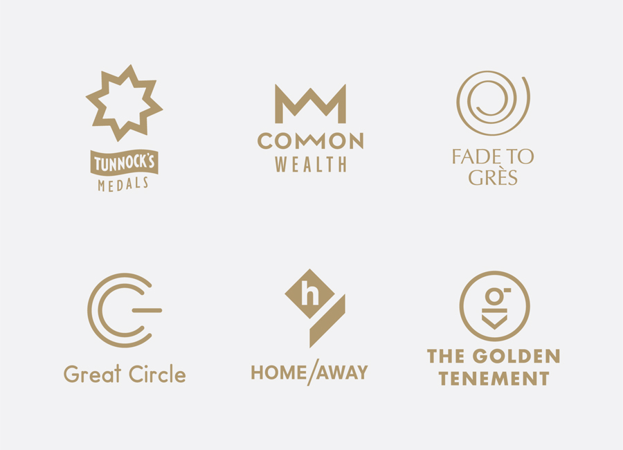
The souvenir logos offer variety in shape, type and weight, presumably informed by the nature, values or heritage that underpin the design and production of each product. These are largely abstract but are effectively bound by a shared sense of geometry and a gold ink print finish across a simple string tied white tag influenced by a current regional craft vernacular and the gold of the games.
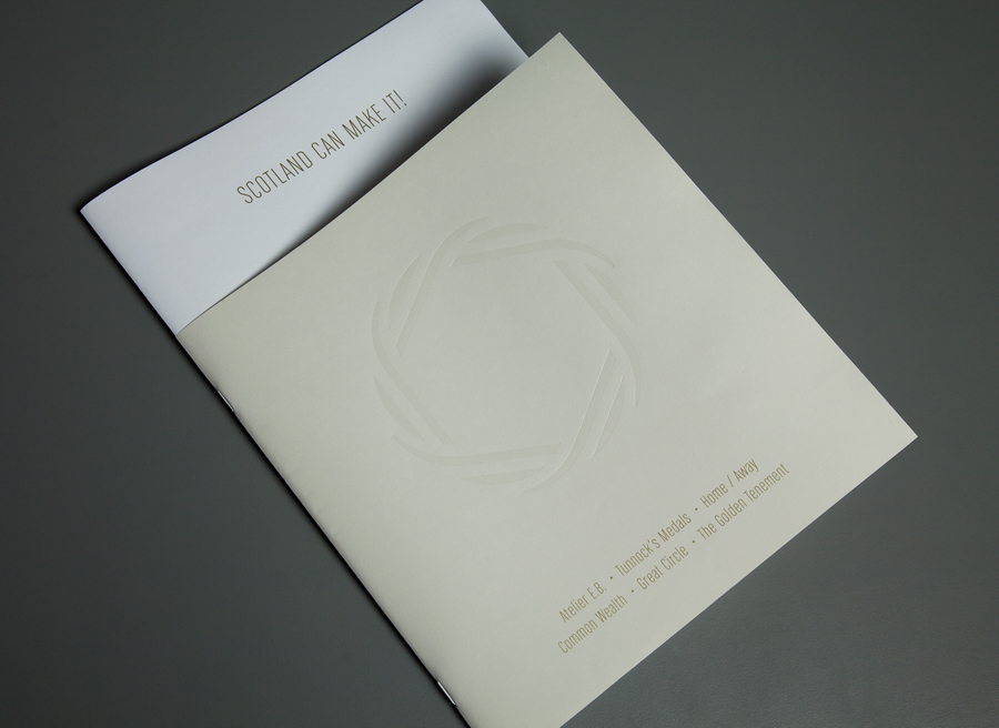
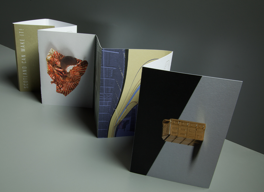
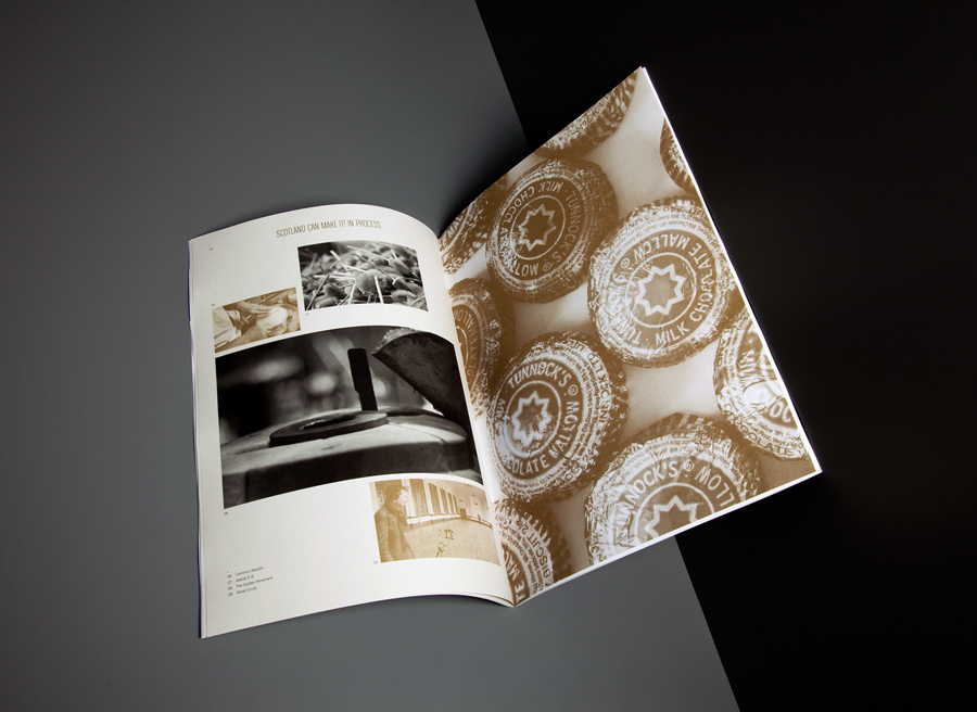
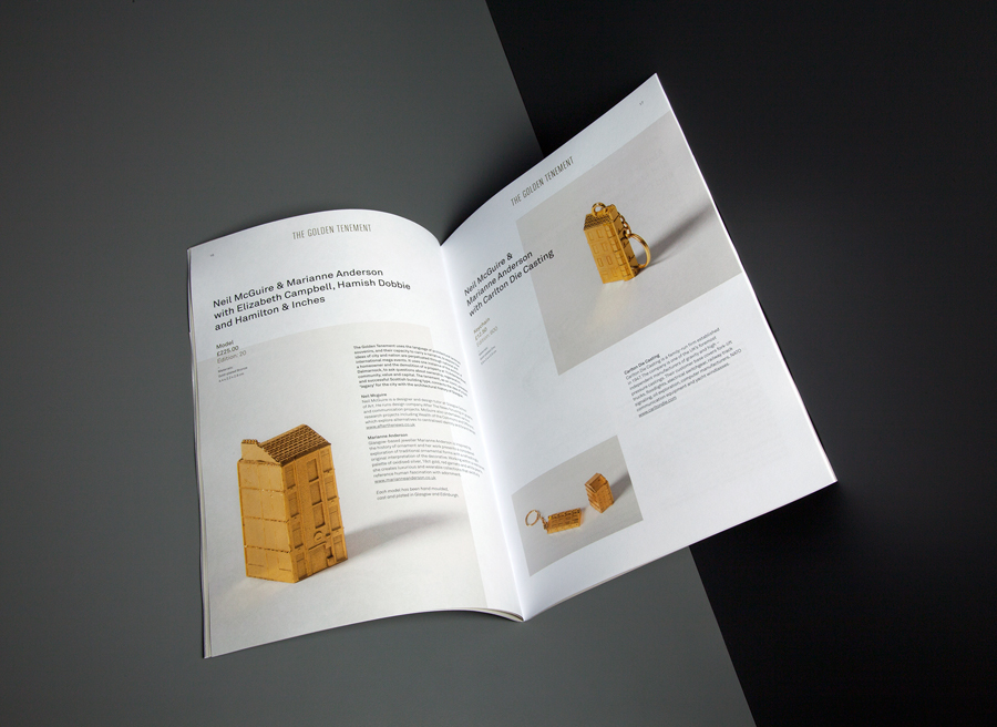
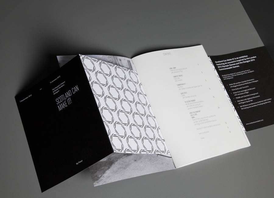
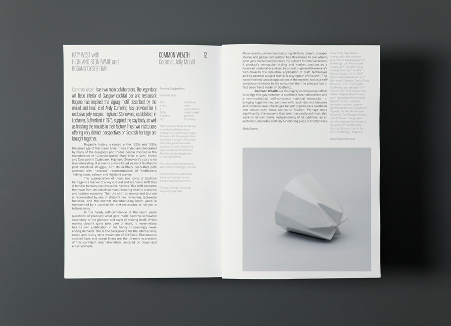
A clear foil embossed cover, a mix of folds, page sizes, paper choices, the use of perforations, irregular image layouts, tinted photography, approach to product photography, full bleed images and an adventurous combination of type that occurs in print builds on the name and aesthetic of the logos with a modern gallery-like programme layout that effectively mixes art, craft, design and industrial heritage, a hint of the games, and a clear sense of continued legacy.
Design: Graphical House
Opinion: Richard Baird
Fonts Used: Akkurat & Chalet Comprime, Milan Sixty
