Passport by Passport
Opinion by Richard Baird Posted 6 August 2014
Passport is an independent Leeds based brand identity and print design studio founded in 2012 by Jonathan Finch and Rosalind Stoughton. The studio’s approach is informed by international destinations and design culture, and looks to create thoughtful and effective visual identities that strike a balance between classic and contemporary aesthetics, and crafted and unconventional material choices and print processes. This philosophy is reflected in a revised brand identity treatment, designed to coincide with the studio’s second anniversary, that included new business cards, stationery set and responsive website.

Like any good studio identity, Passport’s effectively utilises a distinctive contrast of material, colour, type and print finish to highlight communicative and aesthetic opportunity, and convey some of their values and philosophies to clients and new contacts.
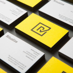
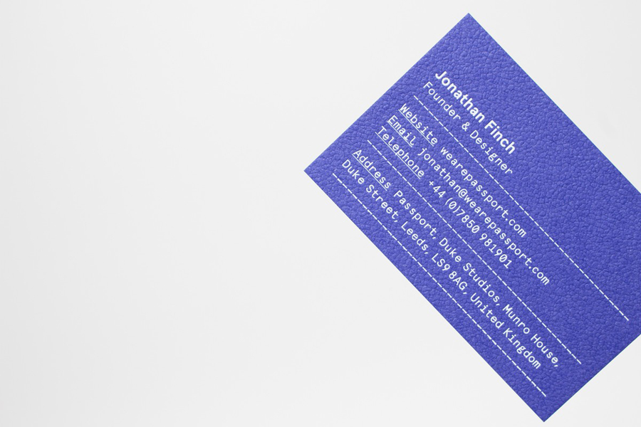
The business card’s juxtaposition of the mechanical monospaced type of Apercu Mono alongside the uppercase serif of the logotype, Colorplan Royal Blue alongside Vellum White, and the use of both gold and white foil print finishes, are distinctively disparate but hold together conceptually under the duality of the partnership, the classic and contemporary nature of their approach and the shared weight and surface treatment of the boards.


The high quality of embossed Colorplan board and two block foils is tempered slightly by the low-fi tone of the salmon pink, and unbleached and uncoated papers of the stationery, their hand stamped print finish, and the tinted international photography of the postcard. These assets resonates well with Passport’s name, global influences and craft values.

As the machined produced quality of the business cards is juxtaposed alongside the small-scale crafted tone of the stationery, the crafted tone of the stationery is met by the contemporary technology and restraint of a responsive website with plenty of white space, single type colour, grid based structure and, like the stationery, hints at a duality in the contrast of Sabon LT Std Italic and Apercu Bold.
Together these provide Passport with a communicative breadth and aesthetically rich solution that mixes technique, aesthetic and conceptual ideas, that favours diversity over logo-centricity, clear in its values and avoids any sense of post-rationalisation.
Design: Passport
Opinion: Richard Baird
Fonts Used: Sabon & Apercu