Carin Wilson by Studio Alexander
Opinion by Richard Baird Posted 11 August 2014

Carin Wilson is a renowned furniture maker, sculptor, design educator and leader of the New Zealand craft movement throughout the 1970s, 80s and 90s. As well as precisely crafted functional furniture, Carin also creates pieces that look to explore narrative through alternative form — check out his work Royal Pain in the Arse — and are influenced by his Maori heritage.
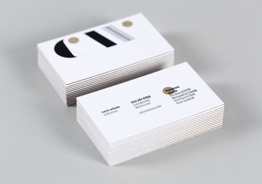
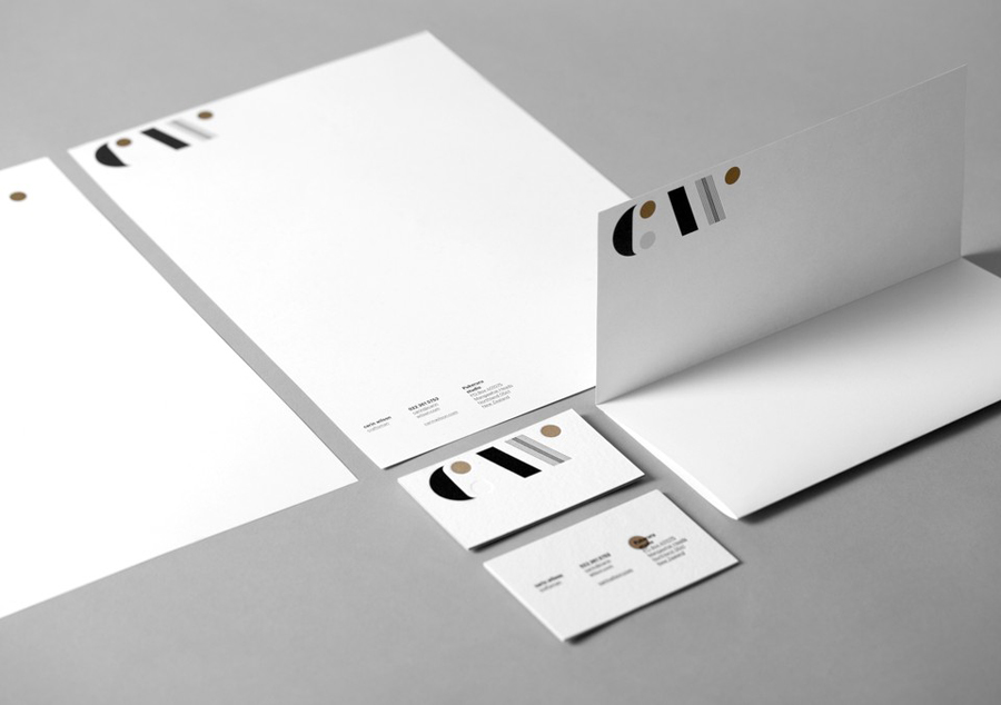
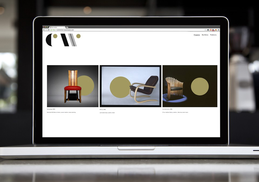
Carin Wilson’s new brand identity was designed by Auckland based Studio Alexander and recently announced as a finalist in this year’s Best Awards. By leveraging the traditional values typically associated with the craftsman’s monogram and using a contrast of heavy fill and fine lines, type size and weight, colour and the absence of colour, material choice, print finish and bilingual background online, the solution neatly resolves the heritage, craft and functionality of Carin’s work.

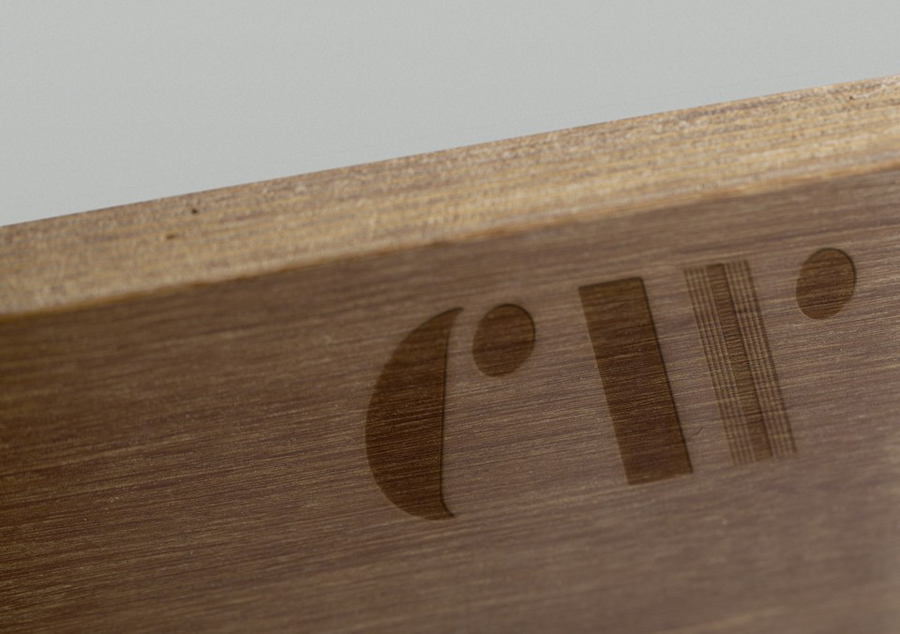
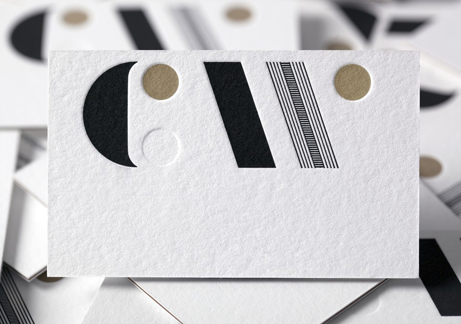
The monogram effectively takes the craft values of the past and delivers these with a contemporary restraint through reduction and simple geometric form. The contrast of bold fill, fine lines and two colours, provides it with an unusual distinction and level of detail, one that perhaps might be described as being reflective of structural practicality and carved detail, and the convergence of functional furniture maker and artist.
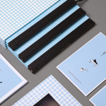
The combination of glued uncoated boards and the deep impression of black and metallic bronze inks and blind deboss, establish a clear crafted sensibility that mixes utility, high quality and tactile detail without going overboard, and gives what could be perceived as a logo-centricity communicative breadth.
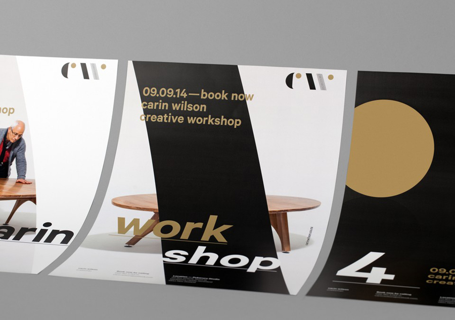
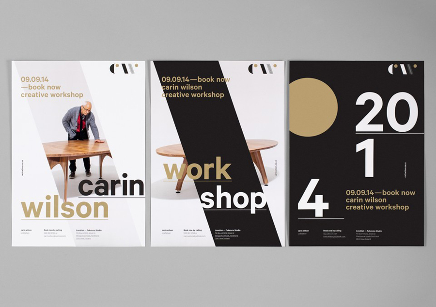
The contrast established by the monogram and stationery continues across the workshop posters. The bold forms and fills of the monogram, cutting through or containing the crafted detail of furniture photography, and large sans-serif type with a fine underline alongside distinctly smaller type, bound by a consistent all lowercase single font style, deliver a familiar but contemporary design sensibility.
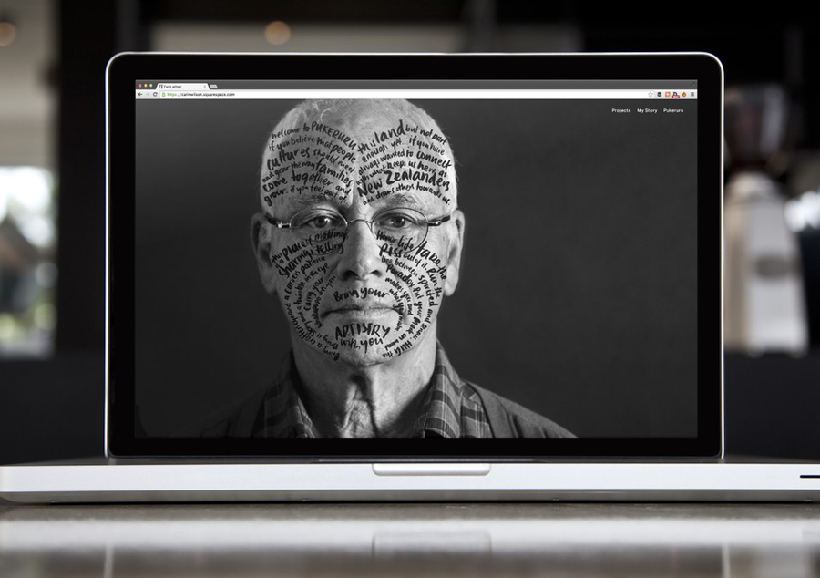
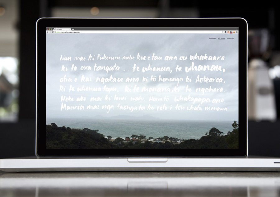
The website introduces a cultural element alongside furniture and sculpture, highlighting Carin’s ancestry in the form of a brand story, written in Moko English and Maori. Illustrated with a brush script around a profile picture of Carin and across landscape photography, this is a small detail a little hidden online but adds a very clear personal quality.
Design: Studio Alexander
Opinion: Richard Baird
Images via: Best Awards
Fonts Used: Proxima Nova & Aktiv Grotesk
