Tamarindo by La Tortillería
Opinion by Richard Baird Posted 26 August 2014

Tamarindo is a kitchen and bar with an international menu due to open in October 2014. Located in Ourense, Spain, Tamarindo was created as a refreshing alternative for local walkers who are used to traditional bars and restaurants, and is described as a place with two distinct moods and spaces, the casa cocina or house/kitchen, a place for coffee and a quick snack, and a bar for beer and tapas. The interior, created by architects and husband and wife team Ruben D. Gil and Gretta R. Valdés, features a combination of light wood ceilings, adobe walls, dim lighting and steel furniture.
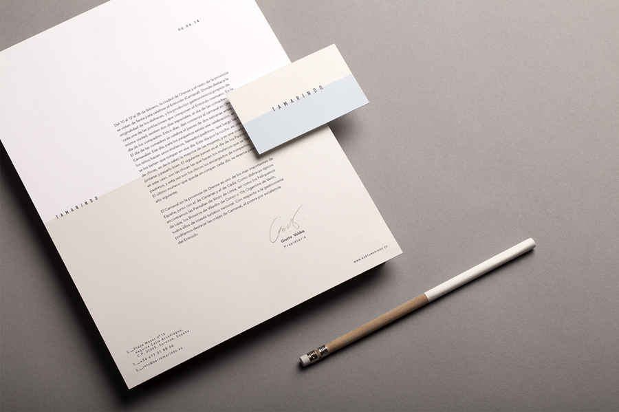
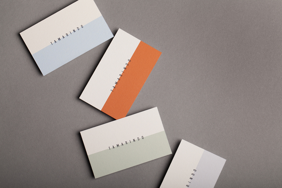
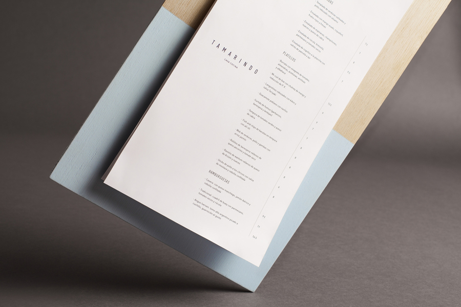
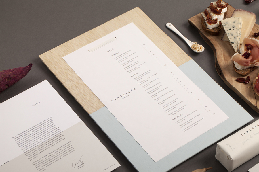
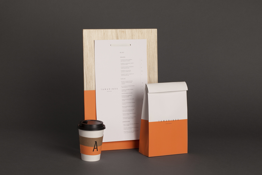
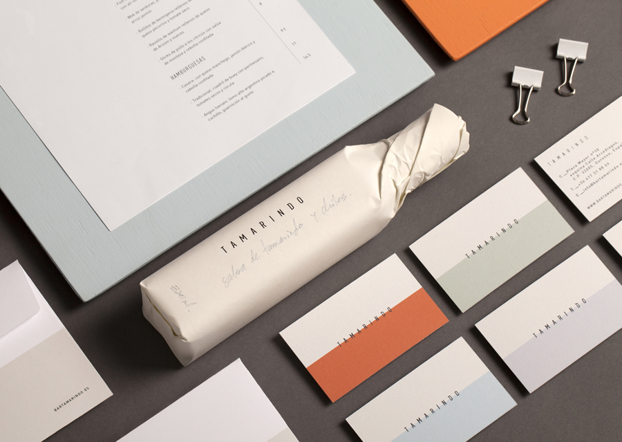
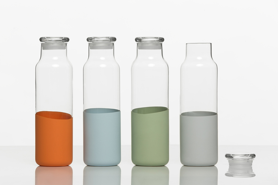
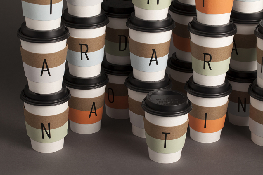
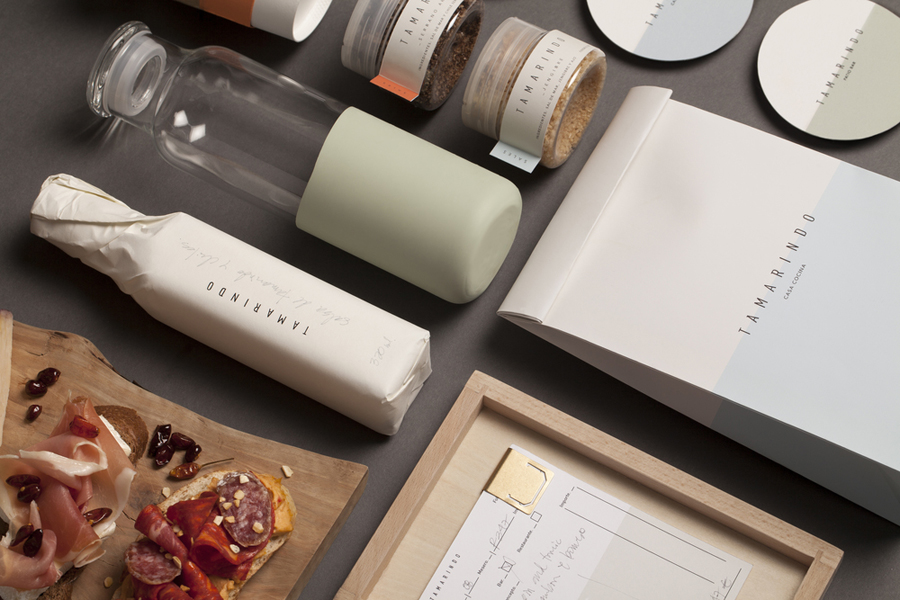
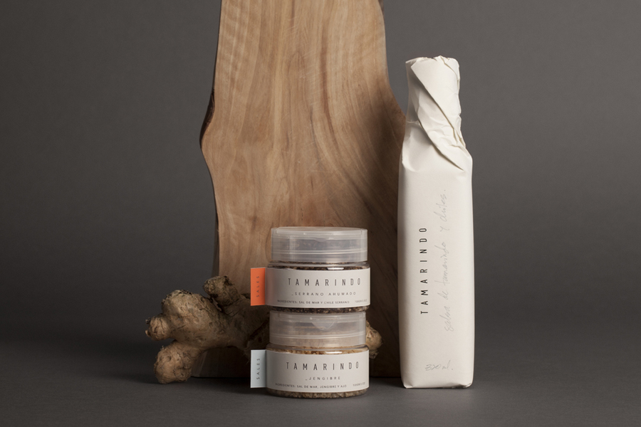
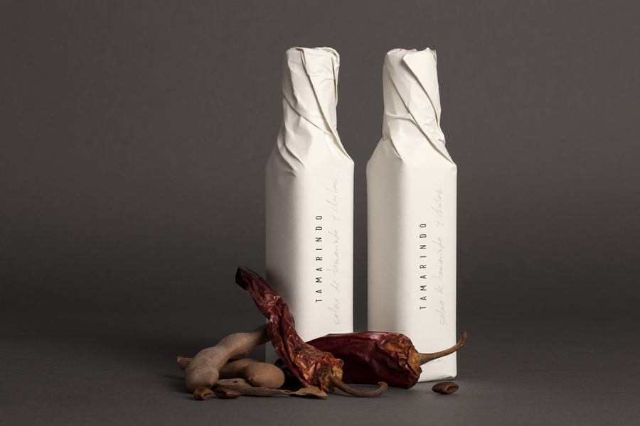
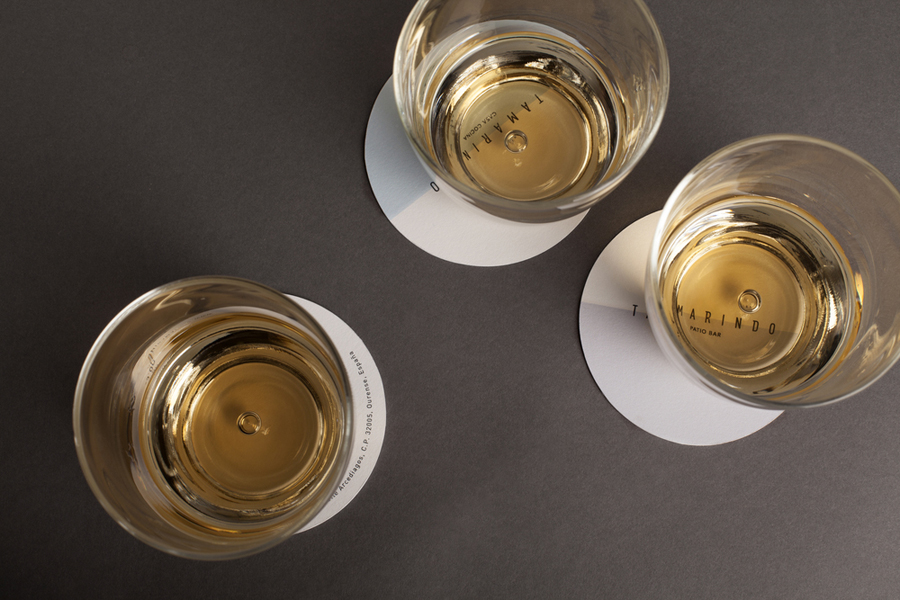
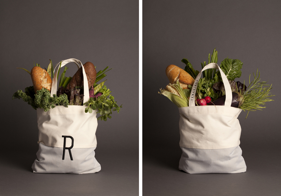
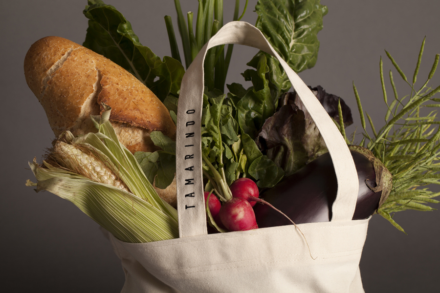
This contemporary interior and the dual nature of Tamarindo’s space is distilled down into its visual identity designed by Mexican studio La Tortillería and extends across a variety of collateral including business cards, stationery, packaging, menus, coasters, tote bags and custom glass bottles.
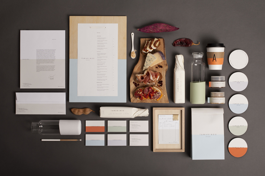
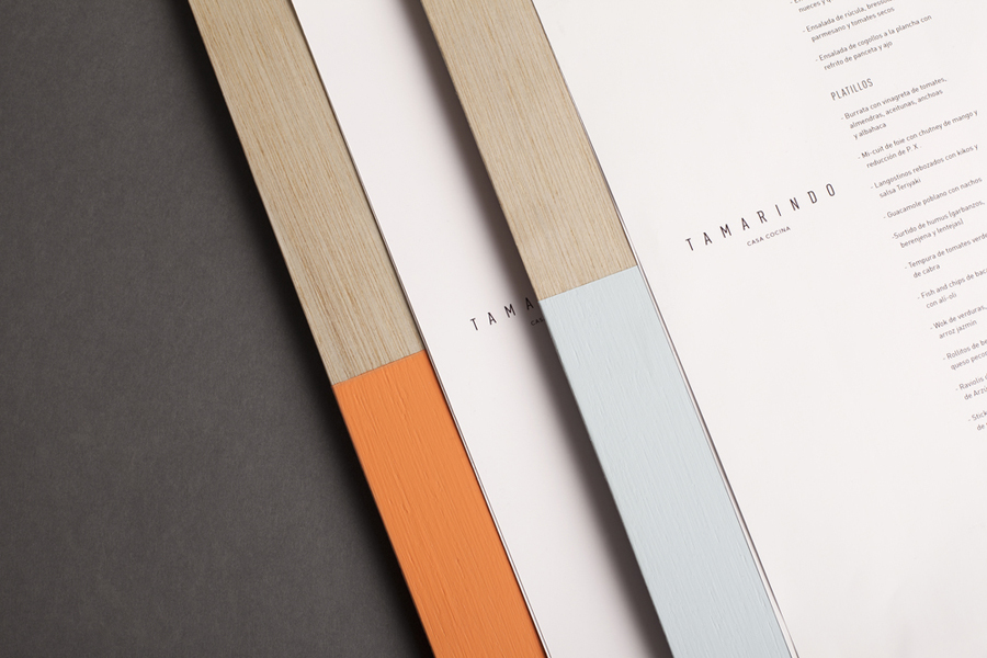
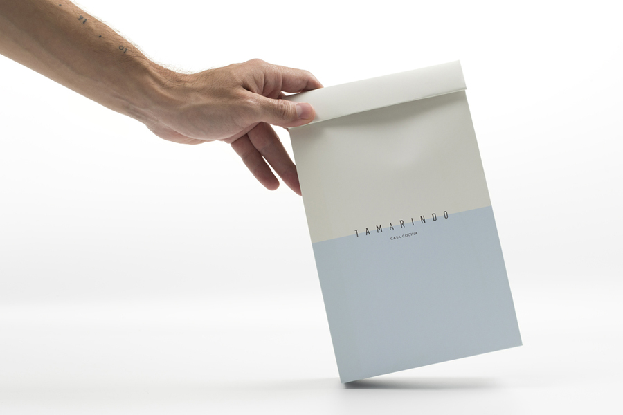
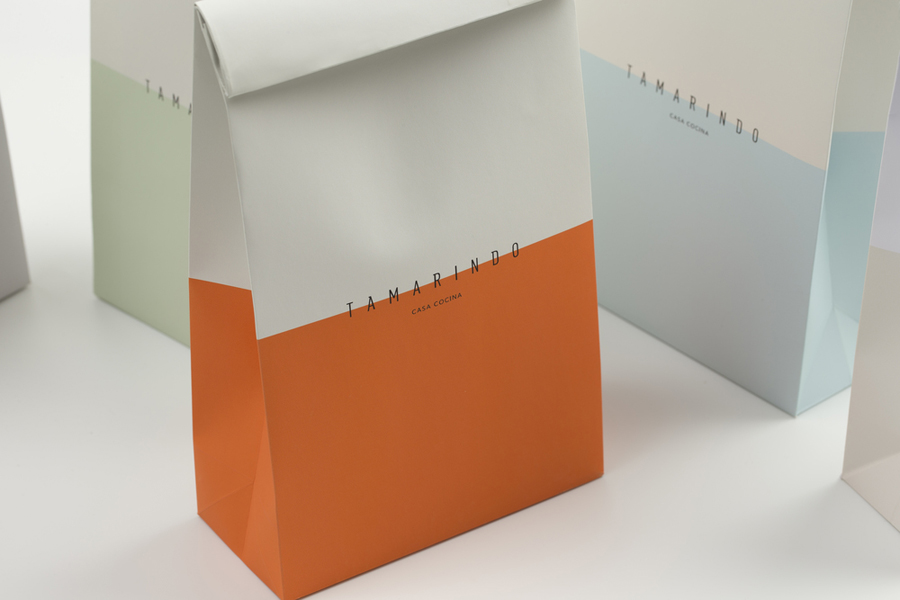
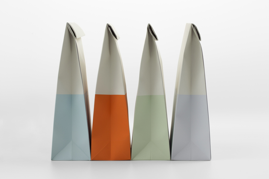
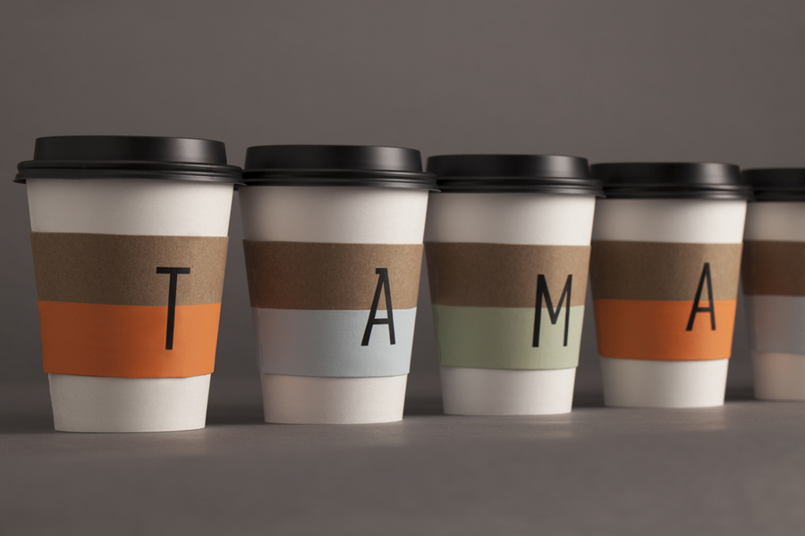
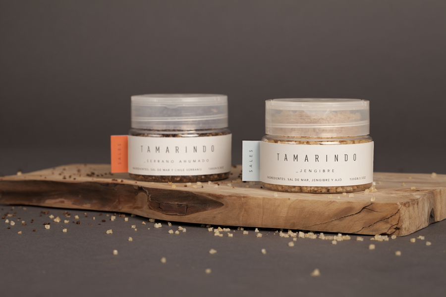
The horizontal contrast of colour and the absence of colour, made up of the three pastels, a bright orange and white board, perhaps reflective of relaxed afternoons and warm vibrant evenings, makes for a distinctive yet simple aesthetic neatly founded on the dual nature of the restaurant and effectively binds print and packaging. The strong sense of consistency established by the contrast of colour — even running across what is often the underserved basic utility of the receipt — is punctuate by a material variety, presumably mirroring some of the qualities of Tamarindo’s interior space. This includes the light wood of the menus, the linen of the tote bag, the glass of the jar and the unbleached board of the coffee cups.
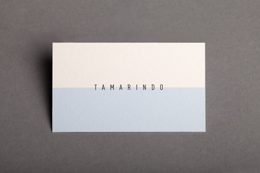
While the duality of the restaurant is boldly delivered through the contrast of colour, it also appears as a subtle detail in type and layout. For example, the broad spacing of a condensed typeface, custom serif detail applied to sans-serif characters, a horizontal logotype and vertical split of the menu and the letterhead, uncoated paper coated with paint, bleached and unbleached board and the gloss of glass and matt paint. This use of paint rather than ink manages to mixe a small scale crafted sensibility with subtle architectural qualities.
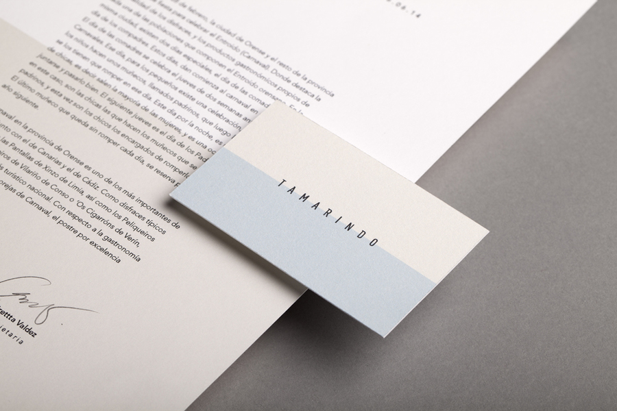
La Tortillería’s approach manages to draw both simple bold distinction and subtle variety from the familiar concept of duality and contrast, and build on this with an architectural reference and material diversity, giving the result a tactile breadth, a good sense of quality and contemporary restraint. It is not layered with meaning but establishes a recognisable identity which is appropriately informed by the venue it serves.
Design: La Tortillería
Opinion: Richard Baird
Fonts Used: DIN
