Studio Aves by Build
Opinion by Richard Baird Posted 2 September 2014

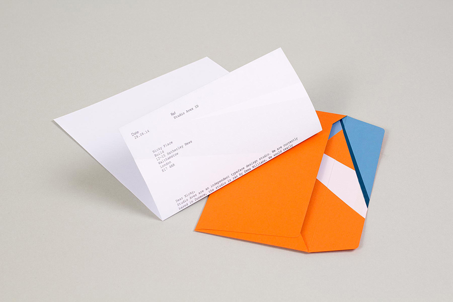
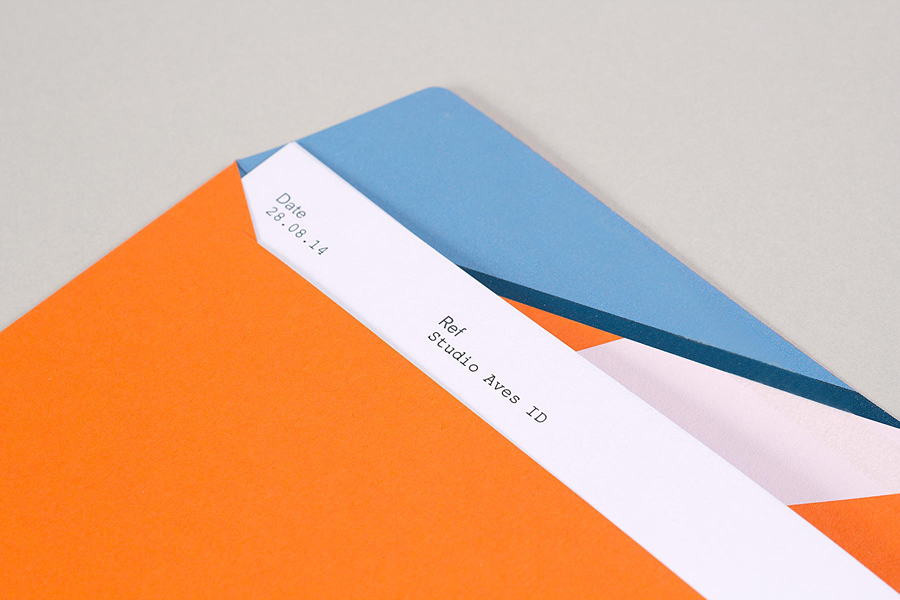
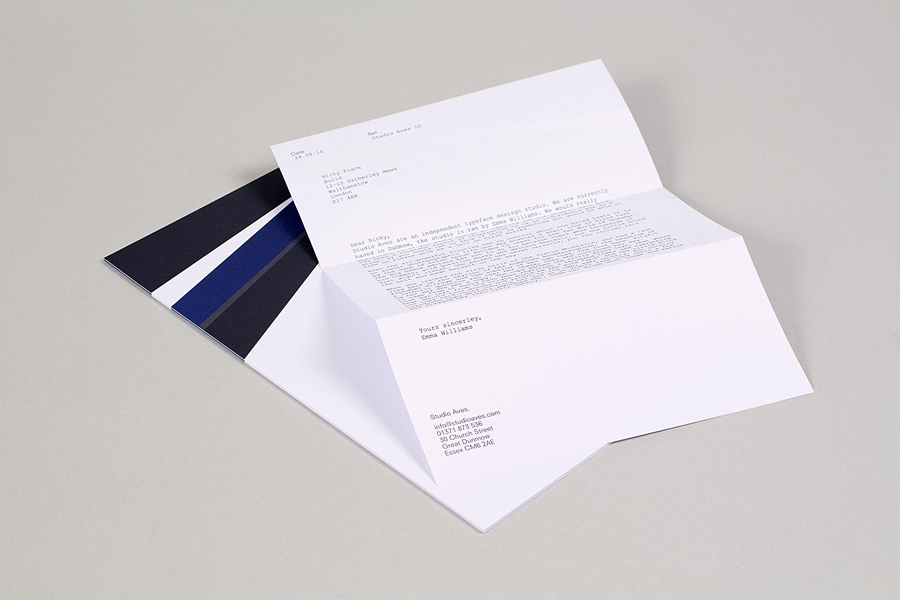
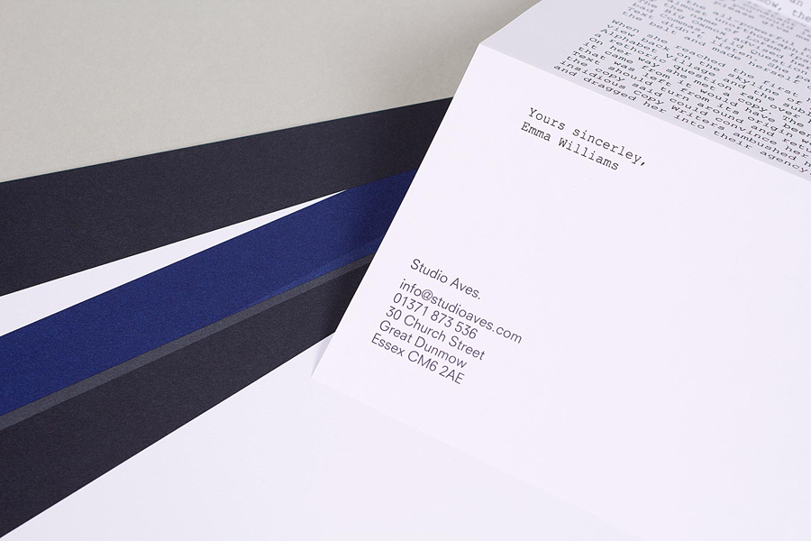
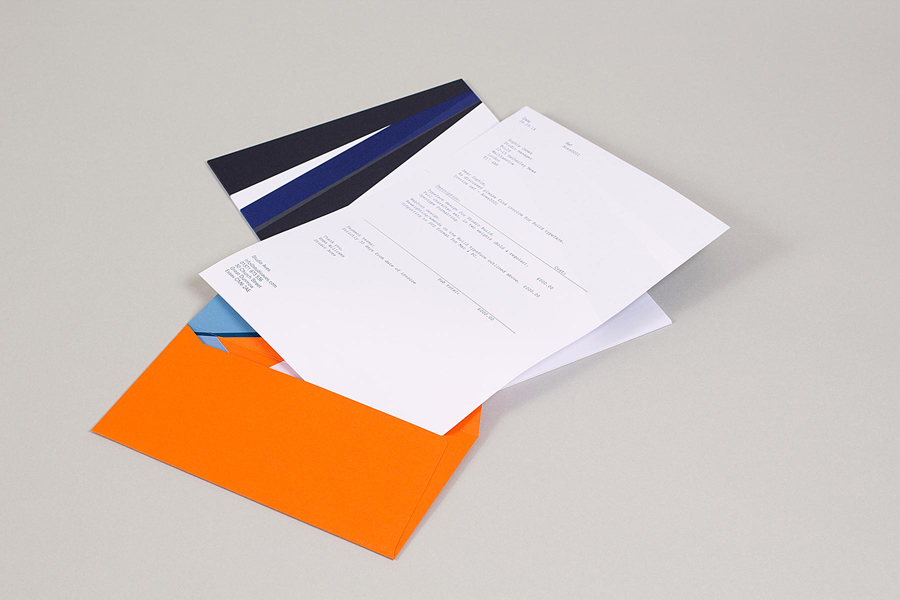
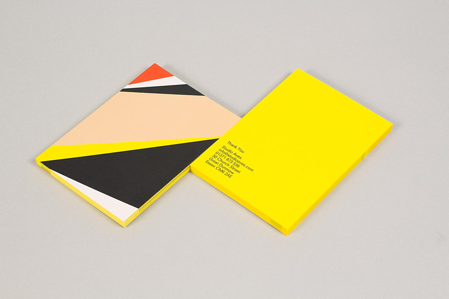
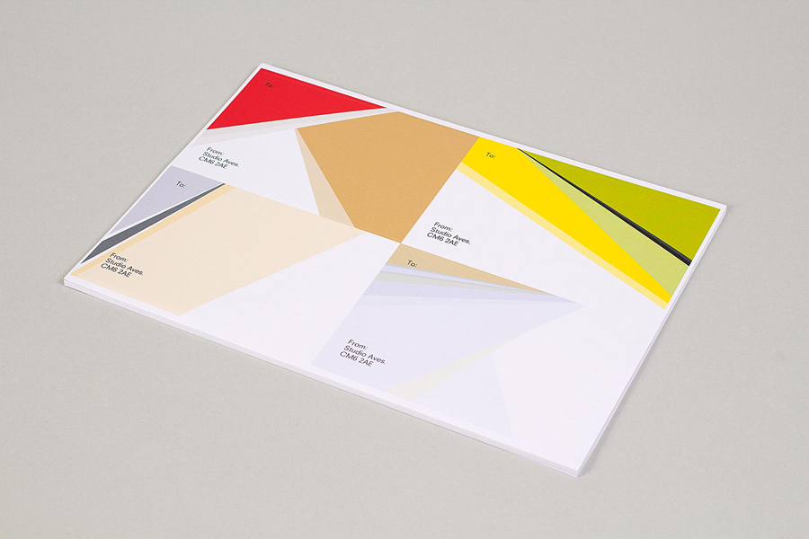
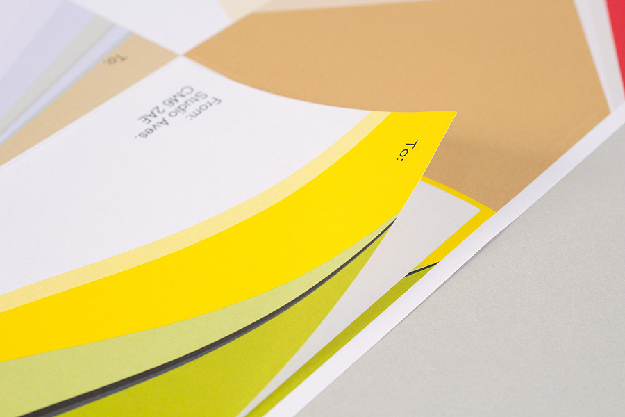
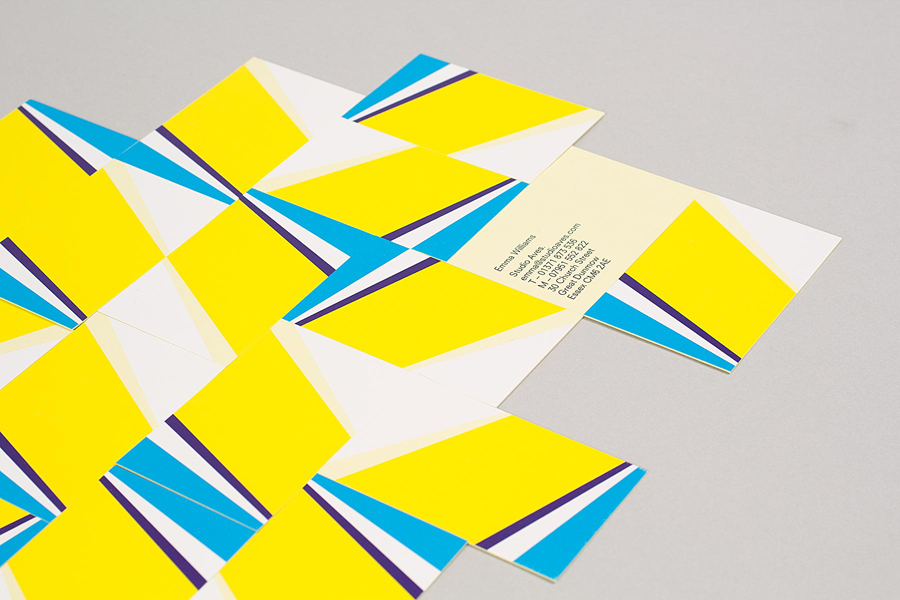
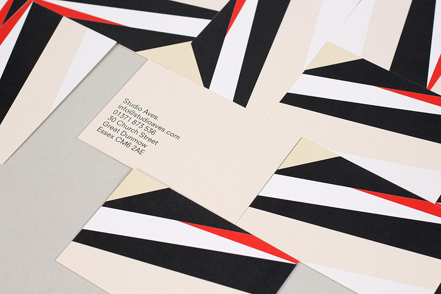
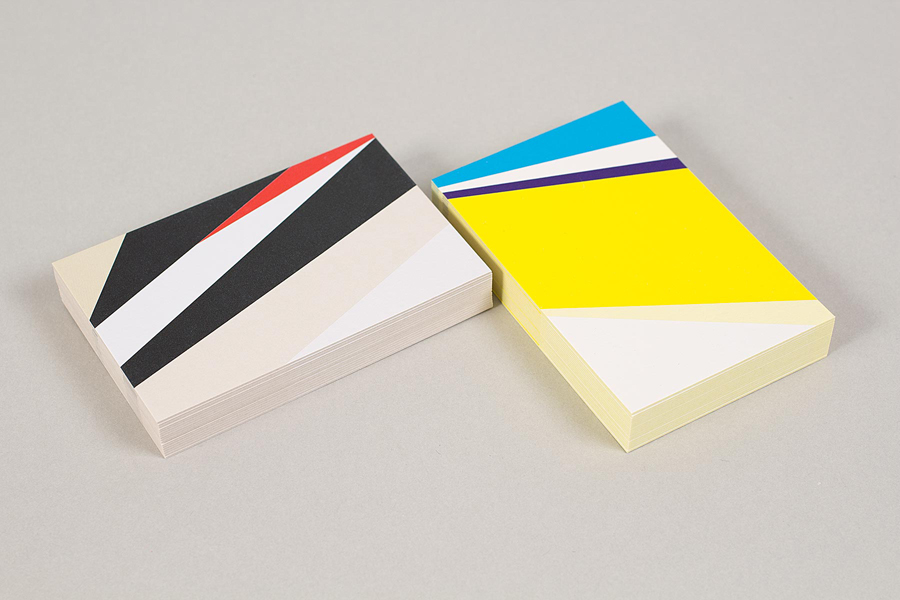
Studio Aves is a soon to launch UK design practice that will specialise in typeface and typographic design. Its visual identity, based around a high contrast colour palette drawn from the markings of British birds — a reflection of the name and inspired by blue tits, goldfinches, magpies, robins plus many more — was recently created by Build. The identity runs across a variety of printed collateral, including business cards, letterhead and stickers, digitally printed across Colorplan stock, and designed to look and feel hi-spec but with low production costs.
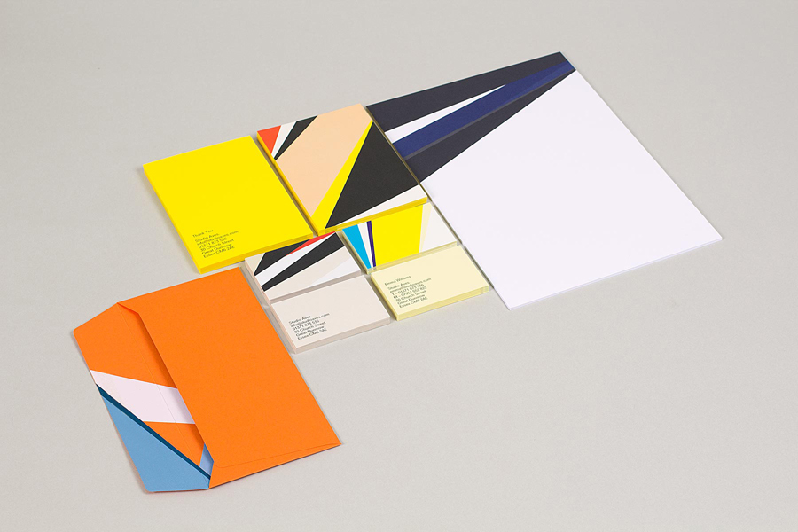
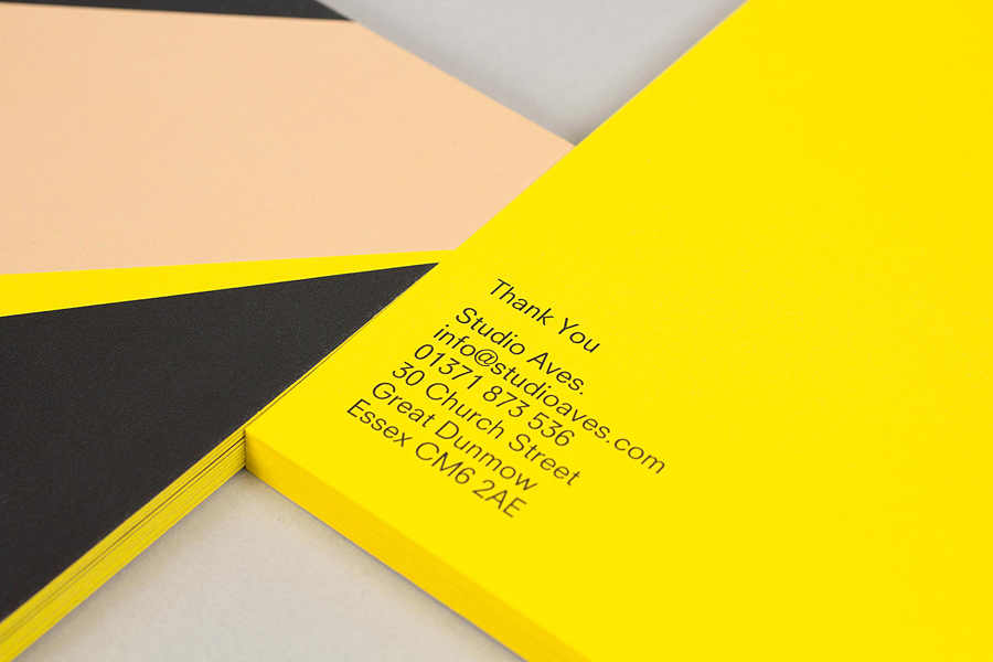
The result is aesthetically beautiful, drawing distinctive value from a good contrast of colour and basic geometric form founded on a simple but abstract ornithological concept linking it to the studio’s name. The work appears here on BP&O due to the absence of convention, the expectation of distinctive and diverse type samples within the context of a typographical studio never materialises, nor does the logotype appear at all proprietary. Instead, the mechanical qualities of a monospaced slab and sans-serif characters offer a stripped down functionality alongside the edge-to-edge flourish and striking excess of colour. This contrast of typographical practicality and rich aesthetic detail is mirrored in the print’s balance of economy and the perception of high quality it achieves.
There is no clear pervasive concept that ties identity to studio proposition or values beyond a good sense of style, or offers much in the way of communicative variety of depth. However, its aesthetic, the rejection of the obvious and smart approach to print, which is simply in service of distinction, may well be enough.
Design: Build
Opinion: Richard Baird
Fonts Used: Neuzeit S
