Ridley by RE:
Opinion by Richard Baird Posted 19 September 2014
Ridley is a pioneer of digital architectural services and operates as a central hub from which builders, developers and architects can collaborate. Originally established, and continuing to operate as an architectural documentation specialist, Ridley, from its premises in Australia and the Philippines, has also grown to become a leader in Virtual Design Construction. This is a practice that involves attaching live data to every aspect of a 3D model in order to provide a comprehensive overview of a structure, the process of its construction and significantly reduce the cost of its development.
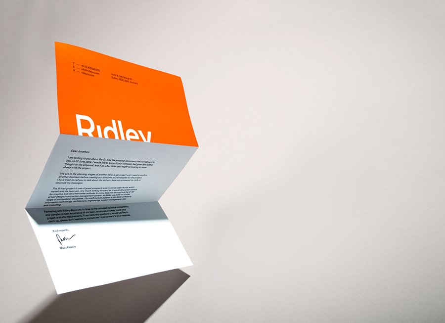
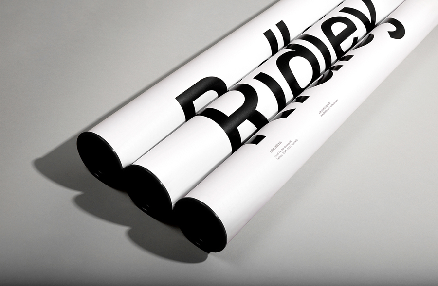
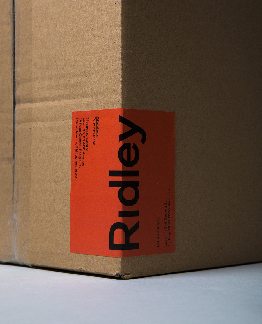
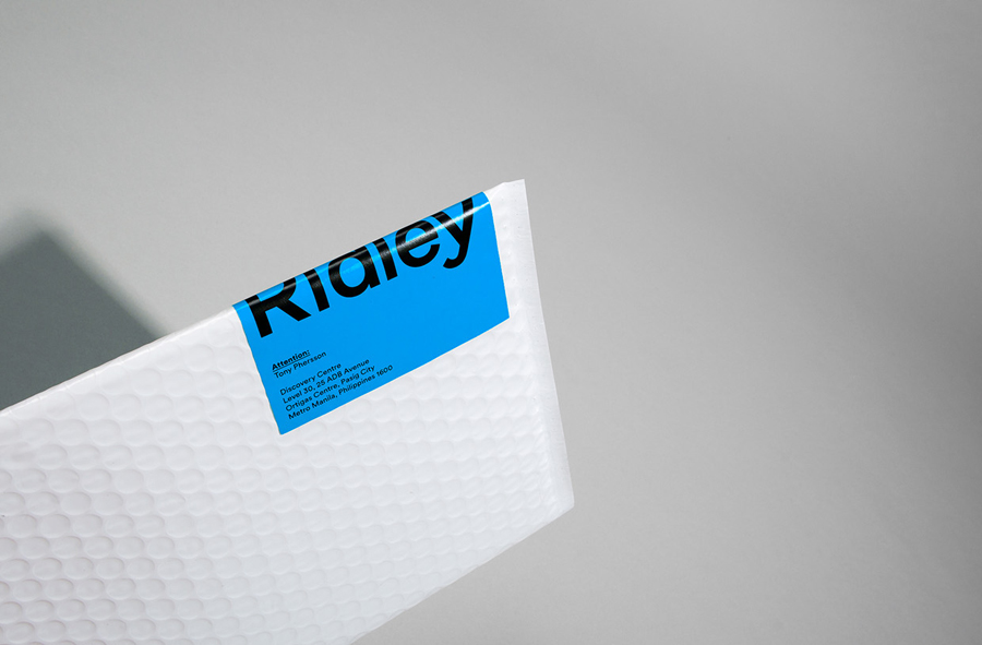
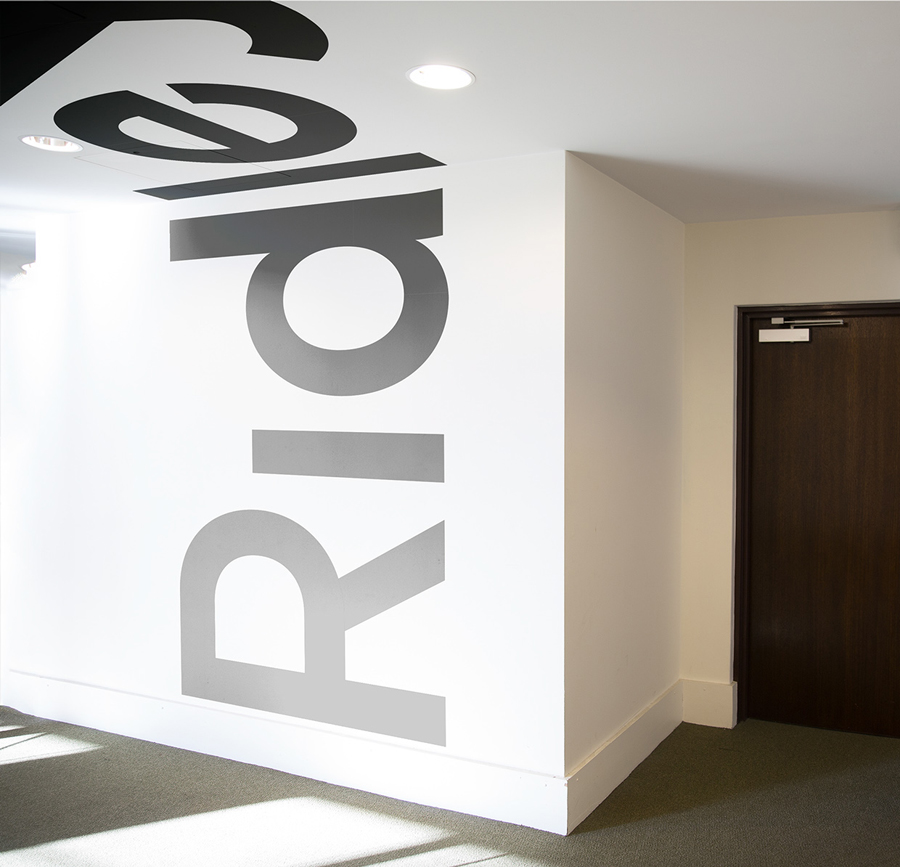
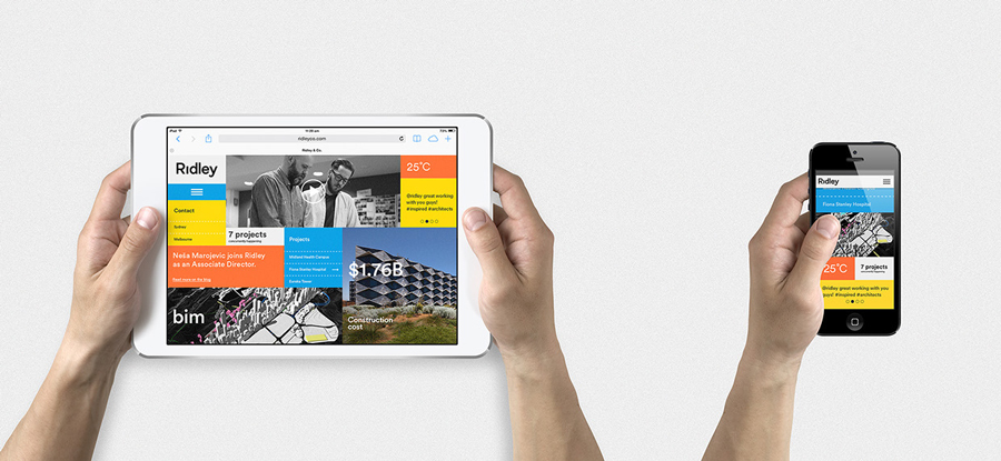
Designed by RE:, Ridley’s new brand identity is based around the concept of seeing the bigger picture through a variety of individual elements, the character, culture and people of its business, and its architectural practices. This is visualised as a variety of cropped, cut sans-serif logotypes, animated logo, a bright colour palette, human-centric data, and type that runs across multiple planes.
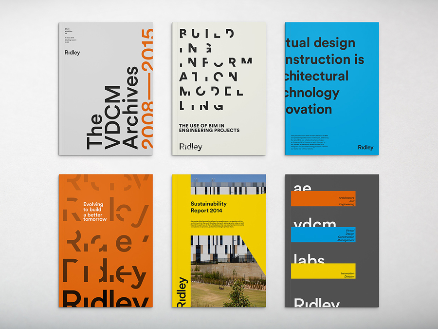
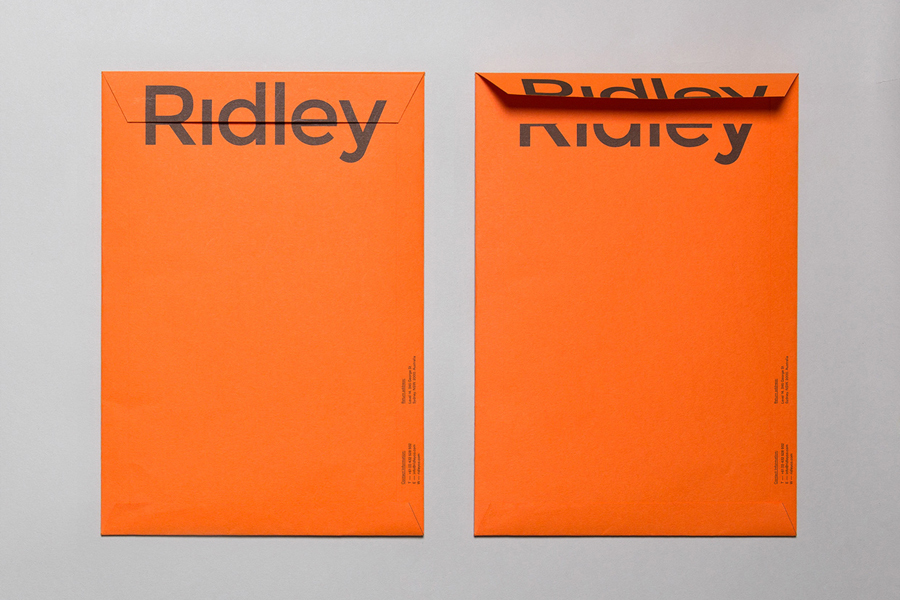
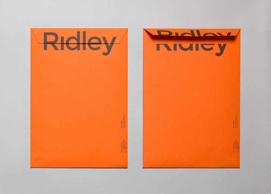
The crops, cuts and partial views of a sans-serif logotype and its application across walls, as stickers applied to curved and box packaging, ink over the surface of stationery, running off the edge of corporate brochures and as a parallax animation, draws plenty of variety, aesthetic impact and communicative value from what is a simple and fairly neutral choice of characters. It is a familiar concept but not often done so well. Each challenging people to see different and individual elements come together as a whole by adjusting their viewpoint. This approach effectively plays with three-dimensional space, both literally as wall decals, and suggestively, running off the sides of print work.
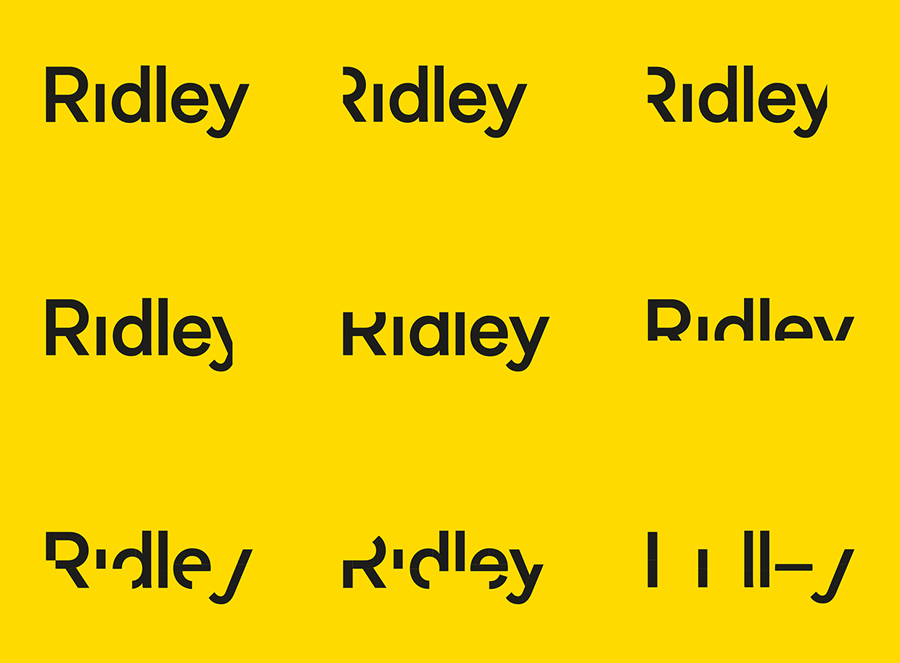
Contrary to current and popular architectural identity conventions such as light and dark concrete grey boards, white inks and foils, blind embosses and grid pattens etc, RE:’s solution is bold and vibrant, combining bright dyed boards and papers, oversized type and a single ink economy. It confidentially blends the accessible, playful and humanistic (culture) with the cold and functional (data). The black ink across yellow board has a strong construction sensibility while other colours appear simply in service of brand character and as a reflection of a positive and energetic brand culture.
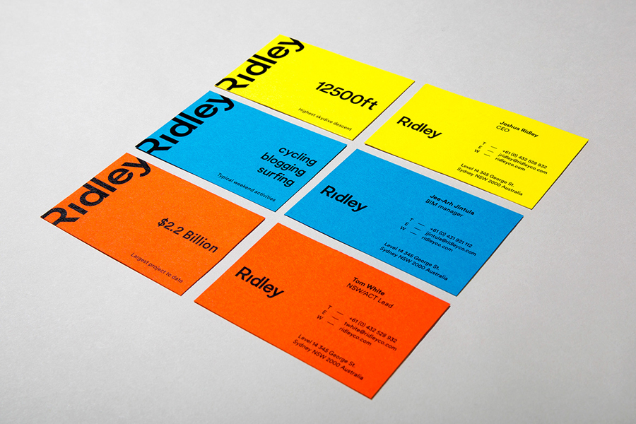
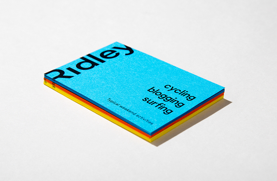
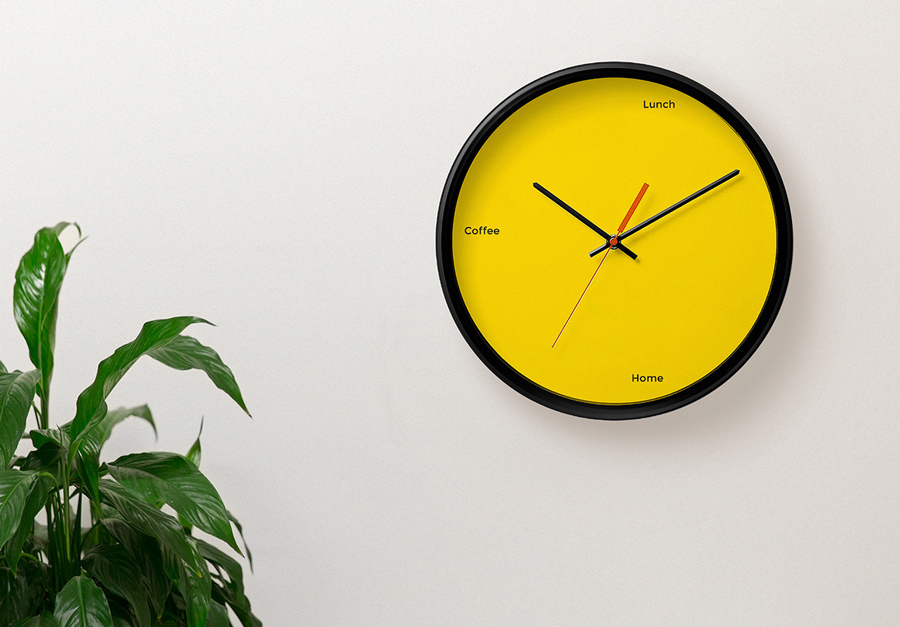
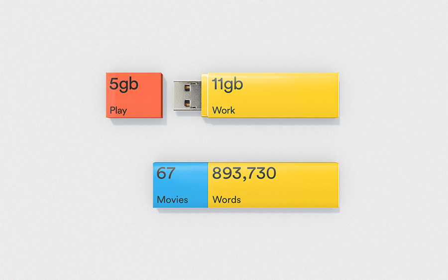
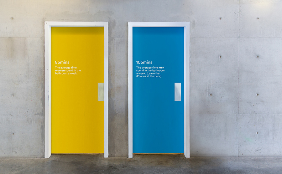
The colour choices make it clear that Ridley is as much about people as it is about the technology that underpins its virtual architectural proposition. This furthered by the introduction of what RE: describe as human-centric data placed throughout the office and across the collateral as a way to help those who engage with the brand better understand the company, projects and the people who work there. This neatly blends corporate data with the activities of its staff across business cards, clock faces, USB sticks and door decals, and is the detail that really gives the project its personality and multidimensional quality. These are clever and like the logotype, have a variety, are well executed and neatly bound by the colour palette.
Design: RE:
Fonts Used: Circular & Montserrat
Opinion: Richard Baird
