Sim Smith Gallery by Spin
Opinion by Richard Baird Posted 7 October 2014
Sim Smith is contemporary art gallery that specialises in the representation of emerging British artists. The gallery, having established relationships with curators and collectors, complements its exhibitions with artistic projects developed in collaboration with design studios, arts and cultural festivals, as well as charities, national institutions and global retail brands. The gallery’s brand identity, designed by Spin, takes the open white spaces and black inks often associated with those of contemporary galleries and inverts it. This then links a variety of assets that include business cards, tote bags, programme and bookmarks.

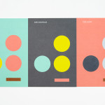
Spin’s approach leverages a well used but effective framing device to both hint at gallery space and the containing of artworks. While not clear here, this particular detail emerges across PDF interviews as the frame expands to contain artist information and sit over sections of their work. The logo’s single line weight, few flourishes, vertical stacking and horizontal spacing, structure and dynamic nature, changing across each application, is current and well executed. While the majority of the characters appear largely neutral it benefits from the distinctive curves of Brezel Grotesk across the S without undermining the utility of an art space. Athough the secondary typeface used across the stationery is absent these small details, it is good to see Brezel Grostesk utilised more broadly on-line.


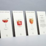
The logo appears straightforward in its application across the compliment slip and envelopes, the changing nature of the characters introducing variation and perhaps hinting at curation. The identity starts to look a little more interesting across the business cards, bookmarks and mailers, with black uncoated papers and boards appearing as a consistent and high quality foundation for lighter inks and foils. Rather than broad unprinted panels of white card in print and pixels on-line, this convention is inverted, giving it a more unexpected quality. To invert the ink and board lends the identity an urban, slightly subversive sensibility and distinction within the context of a white gallery space, whilst being absent the detail that would detract from the artwork and exhibitions it is used to unite.
Design: Spin
Opinion: Richard Baird
Fonts Used: Brezel Grotesk