Merchants of Beverage by Manual
Opinion by Richard Baird Posted 8 October 2014
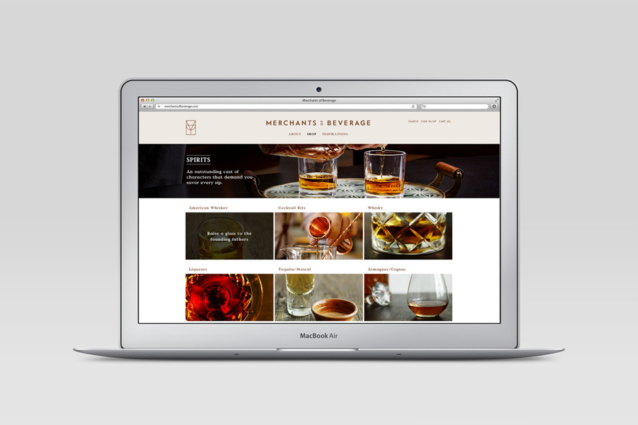
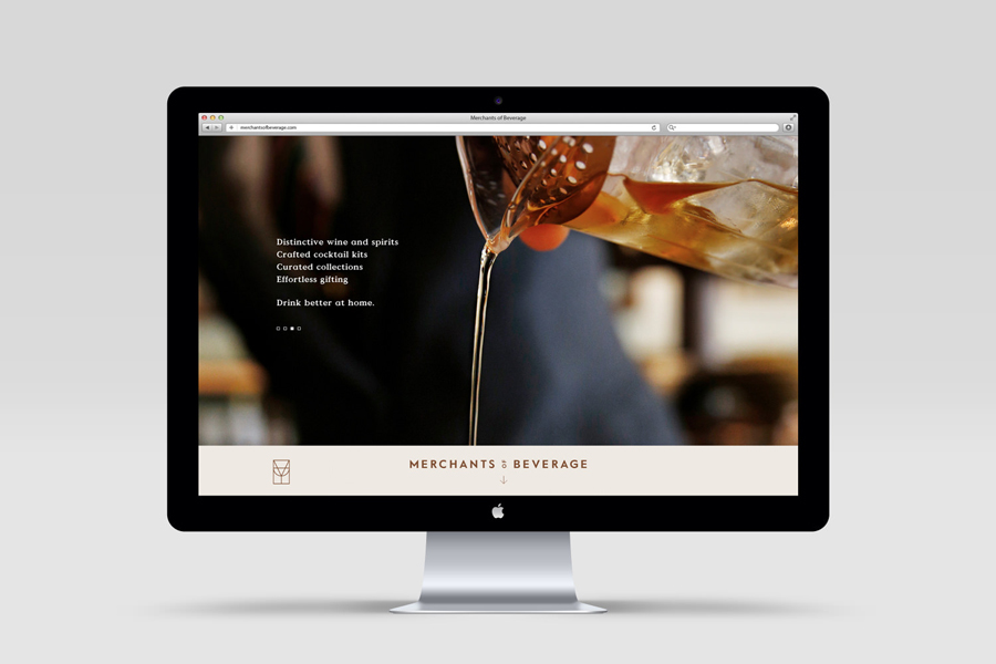
Merchants of Beverage is an online service that aims to make buying and gifting luxury items easy. Products include wines, spirits and Champagne’s, as well as hand-blown crystal stemware and professional barware. Each item has been handpicked and curated by a team of experts and sourced from a variety of international artisans. The service’s new brand identity, which included monogram, logotype, stationery and packaging design, art direction and e-commerce website, and features photography from Doron Gild and illustration by Sharon Hwang, was managed by San Francisco based Manual.
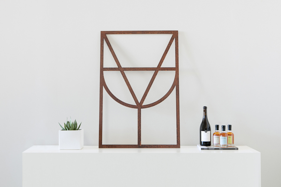
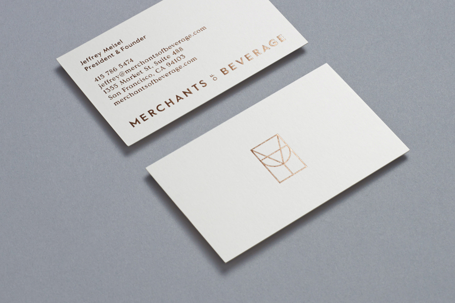
Manual’s brand identity direction exudes a style fitting of a service that wishes to establish itself as the destination for the discerning customer searching for sophisticated gifts or looking to create a home bar worthy of Don Draper. The monogram, constructed from glassware silhouettes, and its accompanying uppercase sans-serif wordmark, are well-built and suited to the curated nature of the service and catalogue. The font choice, Value from Colophon, has the right amount of idiosyncrasy whilst still feeling sophisticated, and given distinction by rotating the ‘OF’, allowing it to stack well on two lines and be more compact on one.
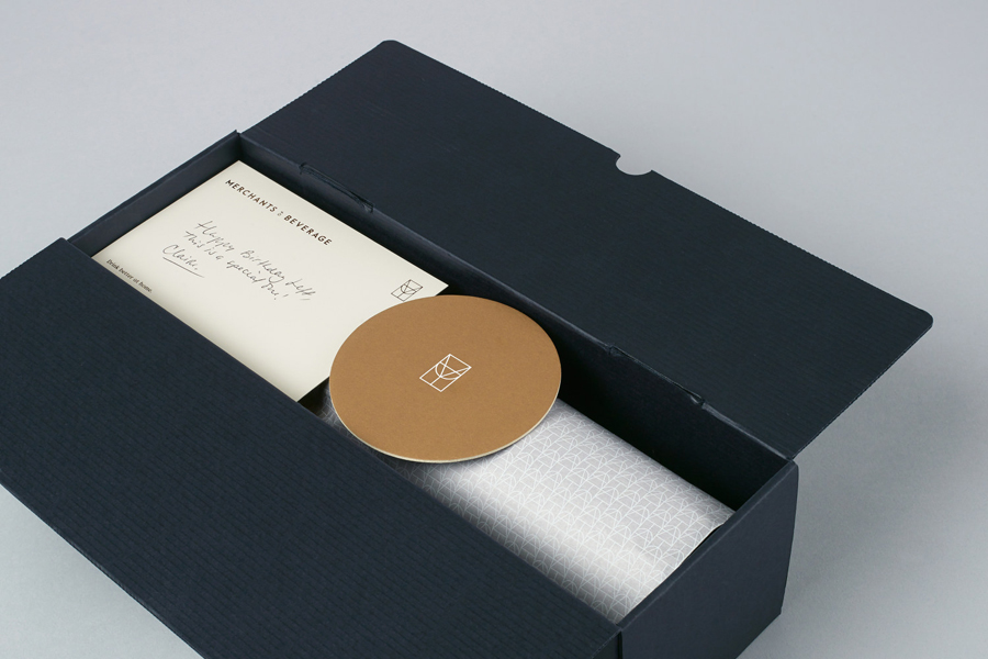
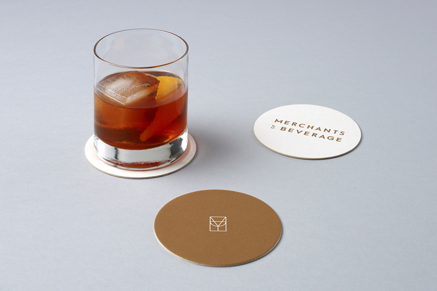
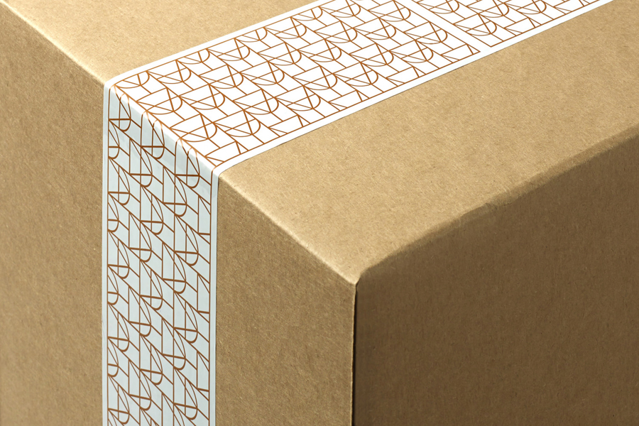
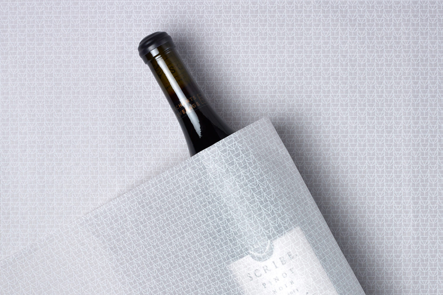
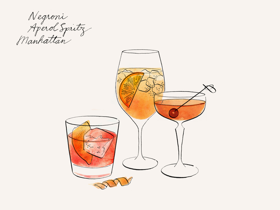
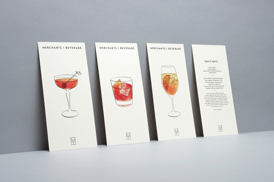
Where the brand identity really comes to life is in its different touch points. These could have easily been done unimaginatively or rigidly applied, however Manual have executed these with a flexibility evident in the use of patterns, separate monogram and wordmark, and to a high standard through packaging that features dyed uncoated boards and tissue paper, and stationery with a copper foil print finish over coated stock. Sharon Hwang’s retro flavoured illustrations echo a mid-century style and introduce a warmth and personality, and reflect the artisanal nature of Merchants of Beverage’s products.

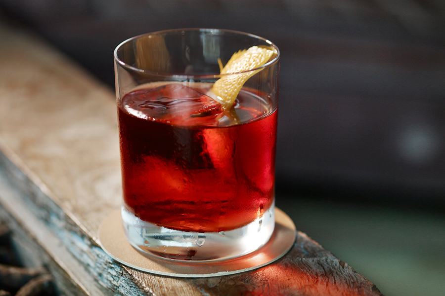
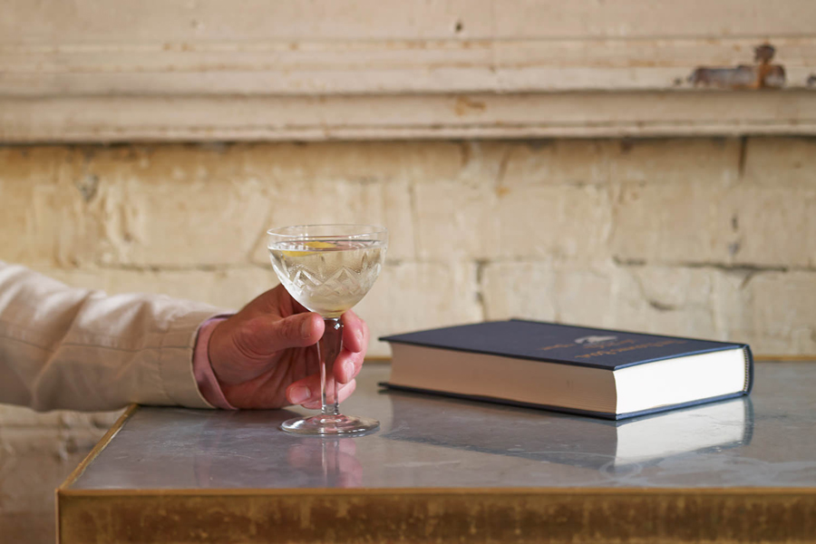
The website feels current, appropriate and makes good use of photography beautifully shot in aspiring settings by Doron Gild. The choice of traditional furnishings and classic glassware harmonise well with tone of the identity and the service’s intended customers. The muted colour palette of copper on a neutral backdrop of beige on-line holds all the elements together and works as great canvas to draw out the detail of the photography.
The monogram and wordmark might tread familiar ground but their execution, implementation and the use of illustrative and photographic detail alongside these lifts this identity well above the rest, appearing premium and very well-considered.
Design: Manual
Photography: Doron Gild
Illustration: Sharon Hwang
Opinion: Robert Holmkvist
Fonts Used: Value
