The Adventurous Blends of William Whistle by Horse
Opinion by Richard Baird Posted 24 November 2014
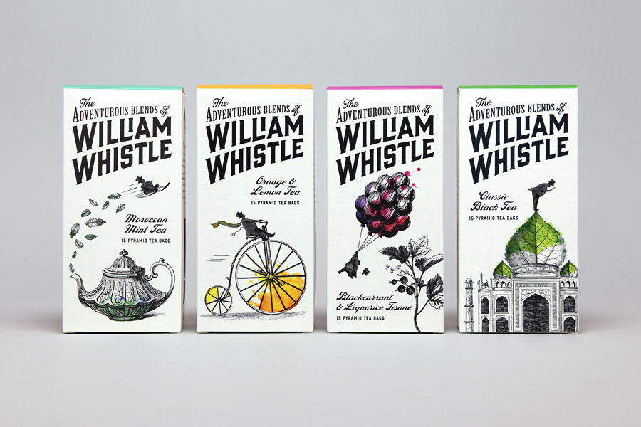
The Adventurous Blends 0f William Whistle is a small tea and coffee merchant crafting exotic flavoured teas, coffees and tisane from the highest quality ingredients sourced from across the world using an approach that is described as bringing together the very best discoveries of the past with the expertise of the present. This philosophy, as well as the merchant’s well-travelled and eccentric English nature, informed the direction of their brand identity, naming strategy and packaging treatment created by UK based multidisciplinary design studio Horse.
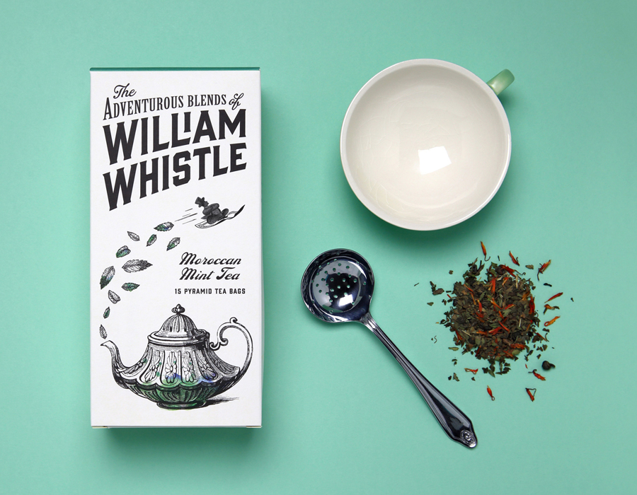
Horse’s solution, inspired by the 18th and 19th century public enthusiasm for expedition, one that reached its peak during the Victorian era, provides a solid vehicle for both communicative opportunity and aesthetic impact. It would be difficult not to acknowledge the frequency in which the visual vernacular of this era has been leveraged across a variety of categories, yet it is an appropriation that, when paired with a few other ideas, manages to secure proprietary value.
The themes of travel and discovery, as personified by the William Whistle character, and whose fictional expeditions to source the best ingredients reflects the company’s own and very real travels, is a familiar but sensible concept that exaggerates reality as a way of securing a distinctive and multi-dimensional brand character and resolving a wealth of communicative intentions. These include, but are not limited to, ingredient curation, provenance and quality, traditional values and contemporary flavour and a British eccentricity that spans both image and copy.
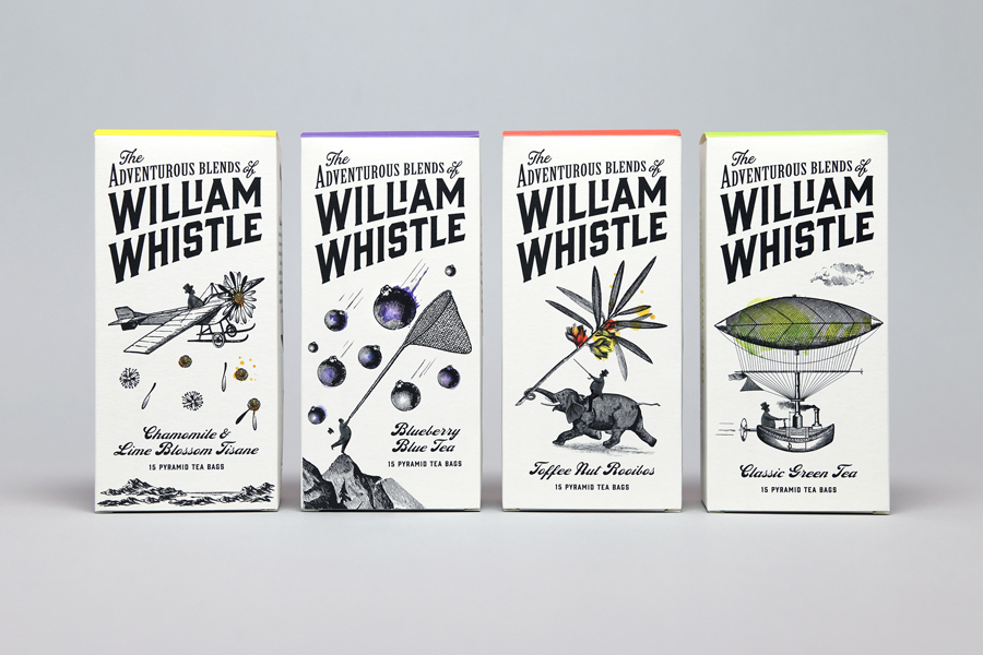
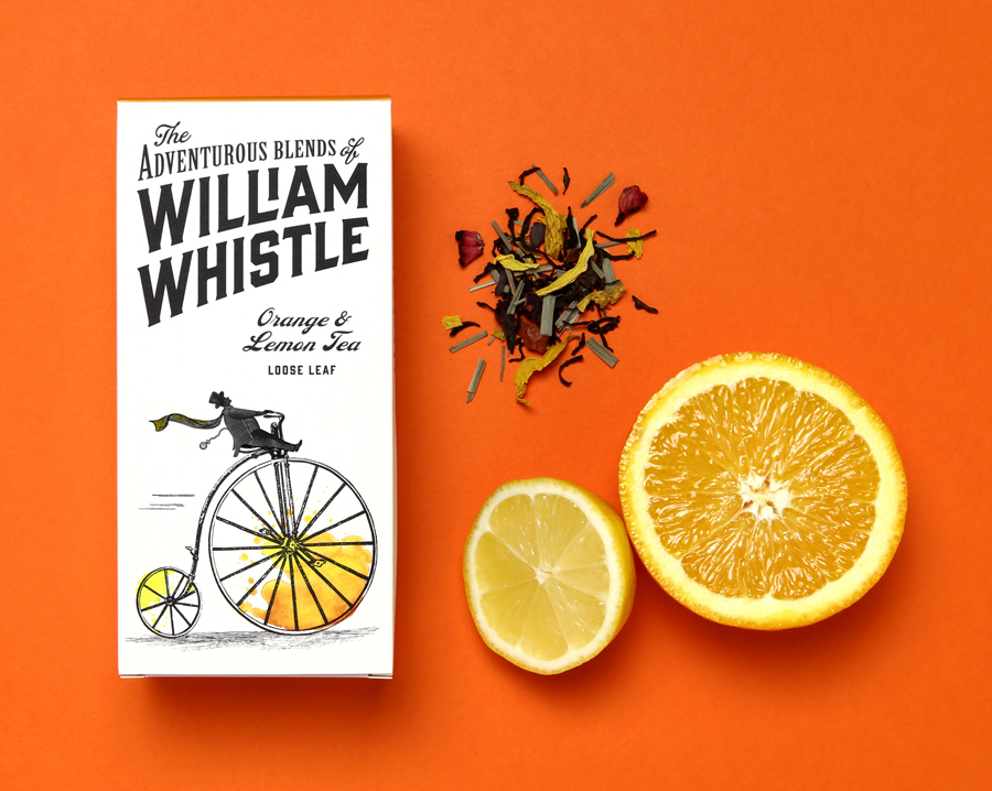
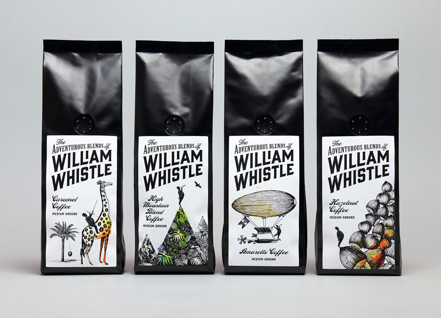
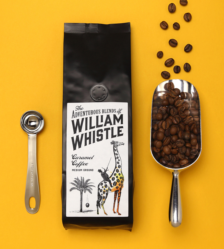
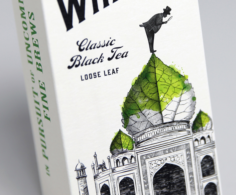
The illustrations are well executed, and comfortably exist somewhere between a current favour for hand drawn pen work and the traditional process of etching. Each has plenty of fine detail, a good use of line density to create light, shadow and depth, and are loose enough to appear as an authentic, personal and of-the-moment journal entry or musing.
Although these leverage a familiar and well established stylistic and communicative approach they benefit from a well-founded and smart duality. The objects, structures and botanical detail across the range are well-chosen, and unite references to the lengthy traditions of tea drinking in Britain, provenance of ingredient, travel and destination with a creative wit. These combinations appear unforced, playful, full of motion and quirky in their odd proportions, appearing as the embellishments of an eccentric months away from civilisation.
Their rendering and choice of reference are clearly retrospective but contemporary in their multi-dimensional communicative agenda, consistency and high quality, and very much grounded in William Whistle’s philosophy of discoveries of the past and expertise of the present. Highlights including penny-farthing spokes as orange segments, flowers as propeller blades, coffee beans as giraffe patterns and small details such as a magnifying glass hinting at curation.
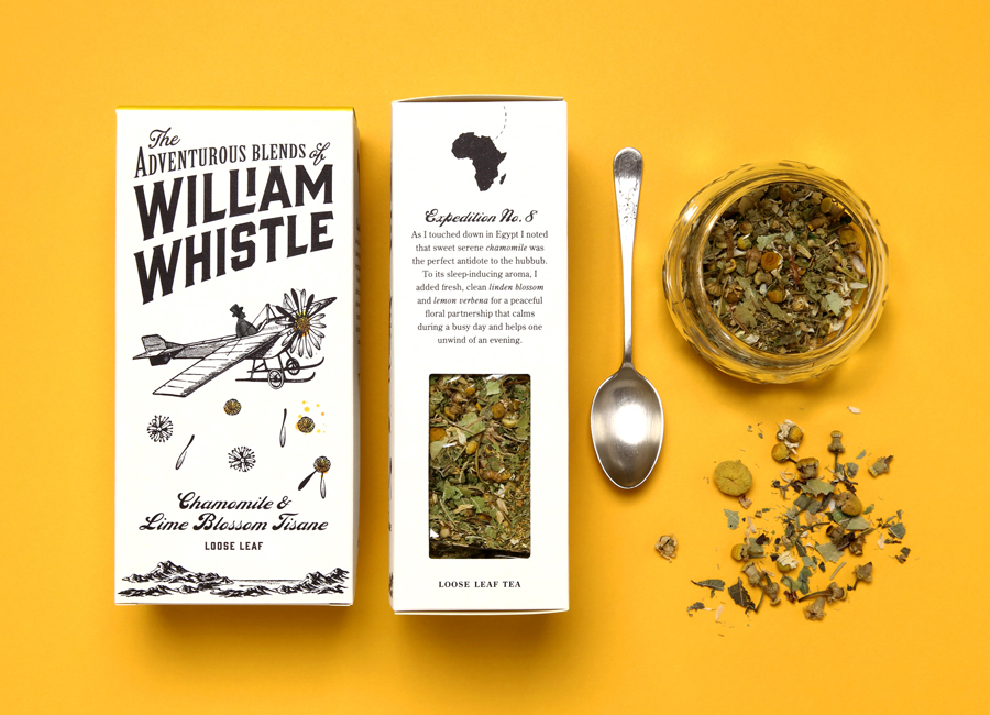
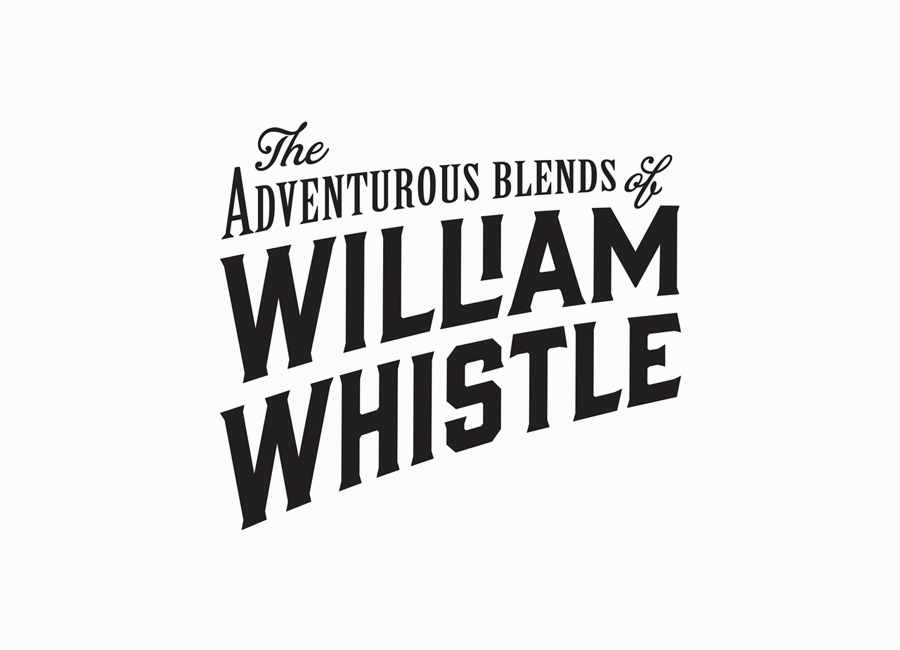
The logotype has been built with a sweeping sense of motion through the characters, achieved through a simple curved baseline, and has the bold typographical sensibilities of posters from the Victoria-era. Its combination of script and condensed letterforms with carved serifs introduce contrast to the loose hand drawn rendering of the illustrations, have been well spaced and proportioned, and apart from an awkward stepped ‘I’, are locked-up considerately. The secondary script, one that picks out flavour type, has plenty of hand written character and a very nice mix of line weight, especially across the caps. Although disparate in structure and detail, both type and image are clearly bound by period influences.
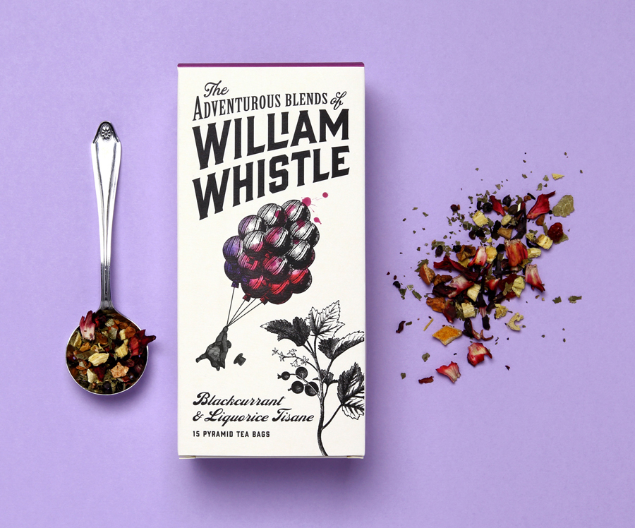
The fluorescent spot colours are bright and contemporary but used sparingly, appearing as flat panels of colour across the top and as watercolour highlights across the illustrations. These are enhanced by plenty of white, reinforce flavour profile, and effectively mix aesthetic impact and functionality with an artistic flourish. Alongside the black pen work, the drops and splashes of colour emphasis the crafted quality of the range as well as the small-scale nature of the brand.
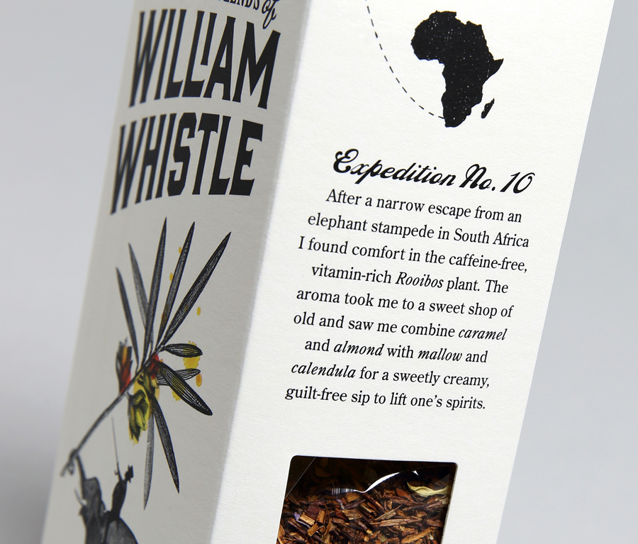
The narrative of the illustrations is paired with a journal-like approach to copy. Much like the illustrations, this is communicative and playful in its approach, mixing provenance, ingredient and travel, while the use of the first-person works in service of the William Whistle character. Unfortunately, the above does not appear as convincing or as well written as it could have been, which is largely due to its heavy-handed introduction of ingredient descriptions which read as a clunky advert rather than something grounded in the pages of journal.
Although the treatment is familiar, it is very well suited to William Whistle and rarely executed with such detail and consideration. It is cohesive and consistent in its contrast of type choice and image detail, colour and absence of colour, successfully blends tradition and modern expectation, leverages character without contrivance and has a creative and communicative intelligence that is firmly rooted in the values and approach of the brand. More from Horse on BP&O.
Design: Horse. Opinion: Richard Baird
