The Best of BP&O — November 2014
Opinion by Richard Baird Posted 1 December 2014

November’s highlights included Can I Play’s brand identity and interior design solution for Mr Big Stuff and Melt, Mytton Williams’ illustrative approach to their work for construction contractor Bray & Slaughter, Kokoro & Moi’s visual identity for Streat Helsinki and Counter Press’s new letterpress business cards. However, there were five projects that really stood out and have made it into BP&O’s top five, a feature that brings together the most interesting of each month for another opportunity to be seen and shared.

Ninjaplast designed by Kurppa Hosk
Ninjaplast is a Swedish plastic food wrap product with a unique packaging solution that addresses the difficulties often associated with cutting similar products effectively from a roll. Rather than a serrated card bar, Ninjaplast comes with a built-in and safe to use cutting blade that makes wrapping food a “fumble free” experience. The close relationship between product and packaging is enhanced by, and communicated through, a distinctive visual identity treatment developed by Stockholm-based Kurppa Hosk.
See more of this project here


Attention: Craft designed by Snask
Attention: Craft was an exhibition of innovative and experimental art created by eleven leading Swedish and Norwegian artists, and part of an annual programme run by and held at Stockholm’s Liljevalchs, the first independent public museum for contemporary art in Sweden. The exhibition took place between June and September this year and featured artists such as Karin Bengtson, Linus Ersson and Hanne Friis. The exhibition’s visual identity, which included a copper, stone, wood and ceramic logotype, large format posters and guide, were designed by Snask.
See more of this project here

The Adventurous Blends of William Whistle designed by Horse
The Adventurous Blends 0f William Whistle is a small tea and coffee merchant crafting exotic flavoured teas, coffees and tisane from the highest quality ingredients sourced from across the world using an approach that is described as bringing together the very best discoveries of the past with the expertise of the present. This philosophy, as well as the merchant’s well-travelled and eccentric English nature, informed the direction of their brand identity, naming strategy and packaging treatment created by multidisciplinary design studio Horse.
See more of this project here
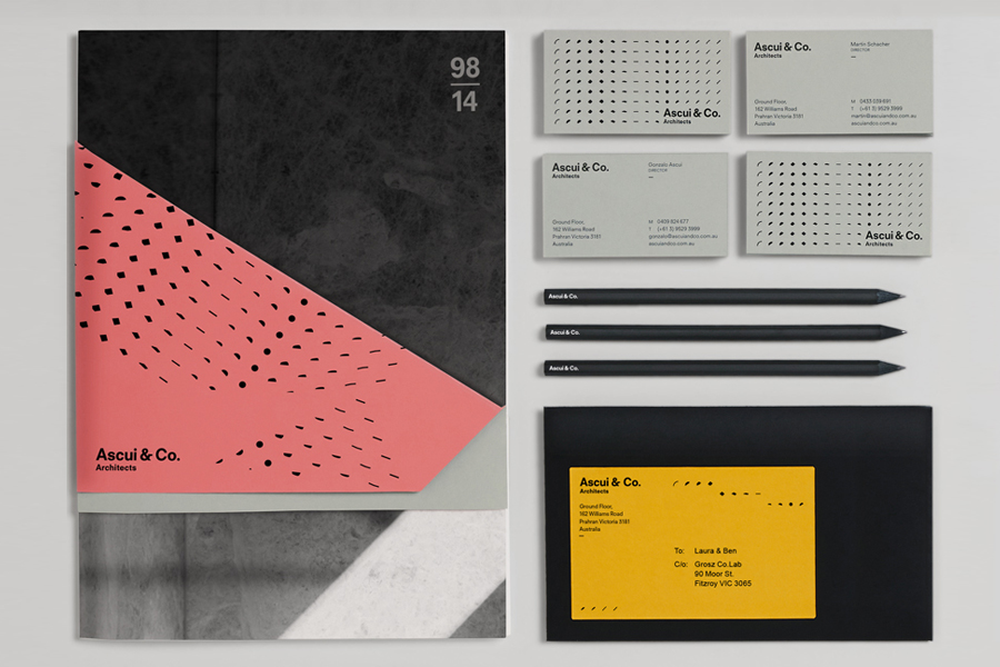
Ascui & Co. designed by Grosz Co. Lab
Ascui & Co. Architects is an Melbourne-based studio with a rich history, depth of experience and a vision they describe as being a true perspective rather than one founded on intuition. Their projects are considered smart and environmentally sustainable, unexpected yet grounded by purpose, and range from residential additions to multimillion-dollar commercial developments.
Anchored in the concept of Process & Possibility — a maxim that refers to the rhythm and harmony, beauty and functionality of Ascui & Co.’s work — Grosz Co. Lab designed a flexible brand identity system that celebrates the studio’s creative and progressive nature through a visual language of morphing patterns and an ever-changing ‘temperature’ based colour palette.
See more of this project here

Cafe Royal designed by Pentagram
Once recognised as having the greatest wine cellar in the world and understood to have introduced French gourmet food to London, Café Royal, located on Regent Street, has been described as being the place for the avante garde to meet and dine for over a century. This year, to coincide with its reopening and reposition as a luxury five-star hotel and private members club, Pentagram, led by partner John Rushworth, was commissioned to develop a new brand identity that would reflect Café Royal’s history and its recent renovation by architect David Chipperfield.
David Chipperfield’s renovation, a testament to his modernist rigour and sensitive reinterpretation of historical material, ornamental features and colour, informed John Rushworth’s approach. The dual notion and disparate attitude of grandeur and history and a more recent architectural minimalism, is neatly resolved as five illustrations by contemporary graphic artist Kam Tang inspired by engravings and exterior architectural elements of Regent Street, and the Regency palette of Café Royal’s interior.
See more of this project here