Atelán by Firmalt
Opinion by Richard Baird Posted 22 December 2014

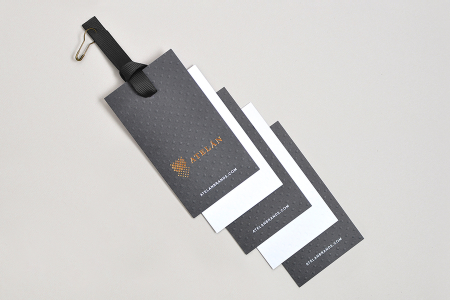
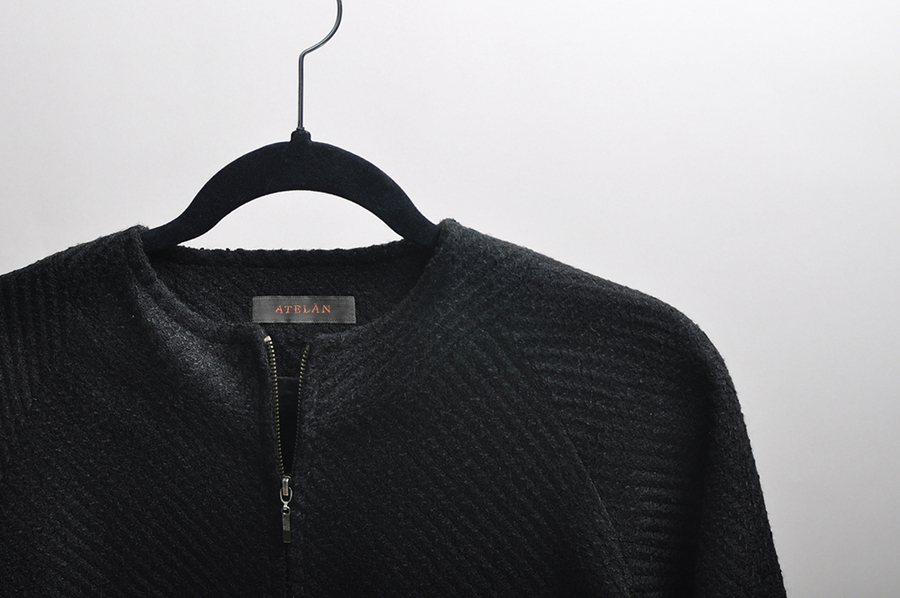
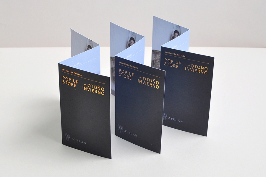
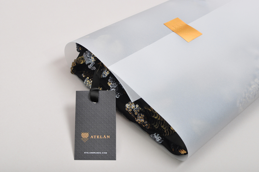
Atelán works within the luxury fashion industry and are constantly searching for new emerging talent with a unique style and vision. They work with photographers, models, stylists, hair and makeup artists to create unique environments, events, exclusive retail opportunities and brand awareness campaigns for local and international designers looking to enter or grow within the Latin American market. Design studio Firmalt were commissioned by Atelán to develop a brand identity treatment that would capture their dual nature as a representative of an exclusive community of designers and of those looking to find and buy into new fashion brands. The project included swing tags, labels, business cards, promotional cards and packaging.
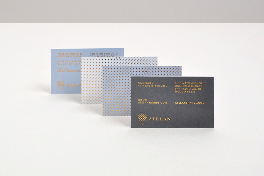
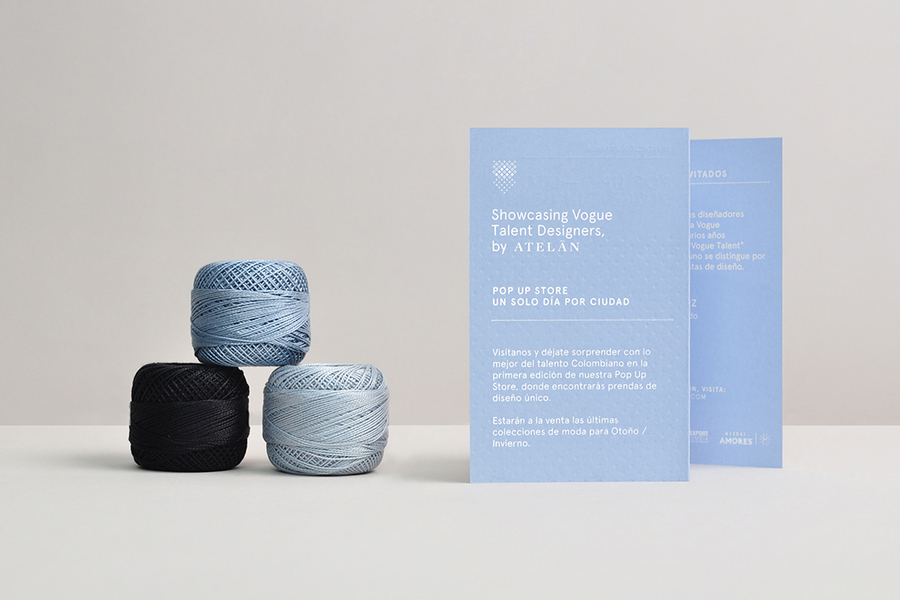
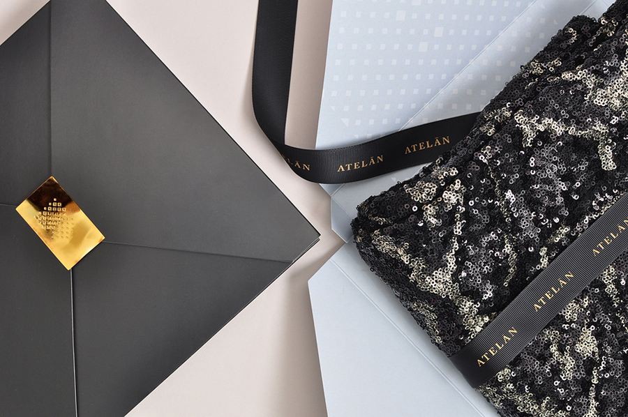
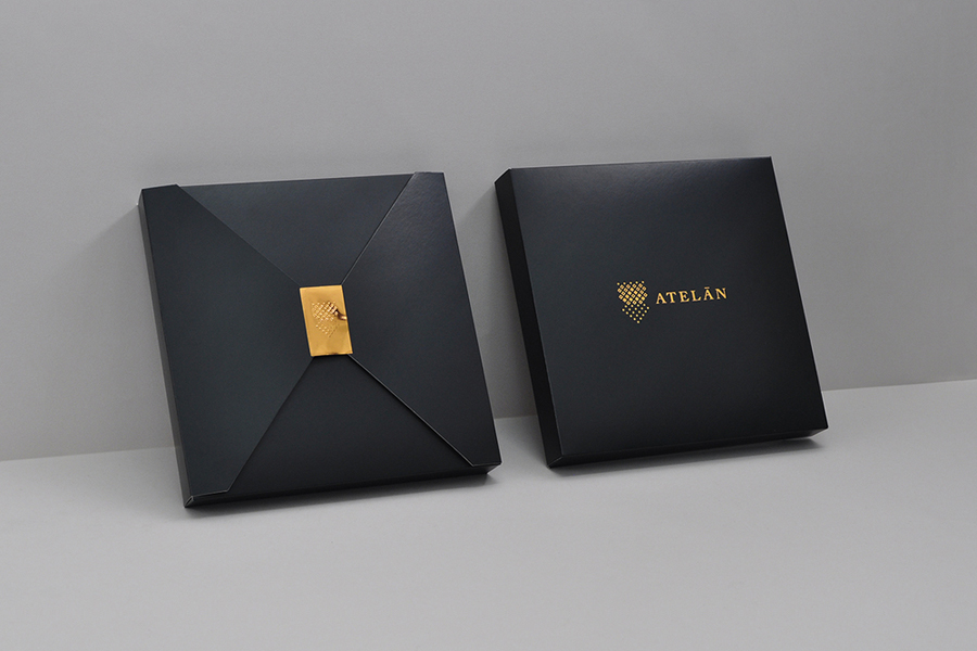
Firmalt’s concept and execution draws a well-founded and largely well-finished fashion aesthetic from the process of garment design and construction. It acknowledges those that recognise the visual vernacular of production but also those more familiar with high fashion marketing and retail convention. This is achieved through a juxtaposition of assets. A pattern inspired by thread interlacing, a symbol influenced by the form of a female mannequin and practical sans-serif effectively draw on creation while the gloss and perceived high value of a foil over uncoated material choices, a deep blind emboss, fashion photography with large white borders, ribbon and the classic flourish of a serif all feel appropriately reflective of finish.
In essence, the visual texture of repeating geometric forms, the changing density of the symbol and the structure applied to type in print are very much in keeping with the theme of process and production, while tactile physical texture and print finish draw on the fine material detail of completed garments.
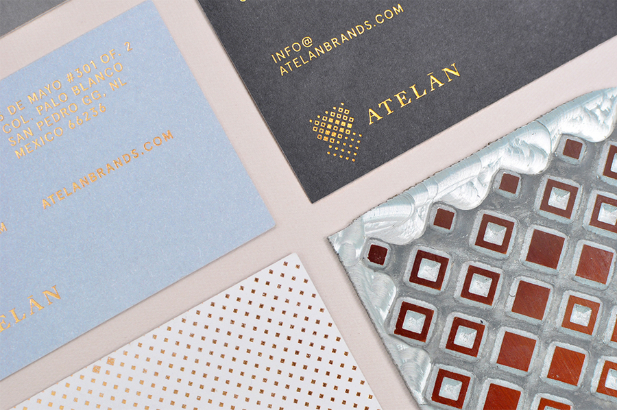
The dual nature of the business and of Firmalt’s solution is perhaps best observed within the symbol. Its mix of reductive feminine form and heraldic shield, something typically perceived as representing heritage and high quality, as well as the contrast of geometric form and traditional typographical detail, confidently plays with juxtaposition and ambiguity, past and present, modern production and traditional craft practices. It does not feel explicit in its communicative intentions which works in its favour.
Small details such as panels of ink rather than dyed board, a heavy and frequent use of blind emboss and foil finish, and a rather gaudy copper sticker, are perhaps not as high quality or as restrained as they could of been, however, conceptually, Firmalt have done a good job of addressing Atelán’s two markets without undermining either.
Design: Firmalt
Opinion: Richard Baird

