Antéoise by UMA
Opinion by Richard Baird Posted 20 February 2015

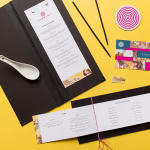
Antéoise is a creme dacquoise range from Anténor, a Japanese patisserie established in 1966 that creates French style cakes, cookies, tarts and variety of other confectionery. Antéoise’s brand identity and packaging treatment, developed by Osaka based graphic design studio UMA, draws on the range’s flagship positioning, high quality ingredients and the craft employed in its creation, the heritage and experience of Anténor, the streets of Kobe, and the theme of past and present. These are visualised through a considered balance of type and structural choice, visual and physical texture, illustration, process, colour and print finish.

UMA’s approach is an interesting mix of familiar and traditional high quality detail and an urban subtlety. This is delivered through the logo’s etched illustrative detail, the heritage and heraldry associated with flags and banners carried by horseback infantry – the symbol of Anténor inspired by general from Greek mythology – type choice and the use of a cream, rich brown and gold foil alongside a bright blue highlight, diagonal die cuts and a background texture inspired by the stone pavements of Kobe.


This stone pavement texture, appearing as a ghost pattern, forms a consistent yet background detail throughout the range. As a symbol of the past and future history of Anténor it is a touch abstract, however, it works well to add a proprietary visual texture tied to provenance, where other premium brands favour reduction. Through the process of stamping square blocks UMA introduces an element of hand craft, a product of human rather than mechanical or digital creation, that shares a little in common with patisserie.

The serif type choice, a departure from the sans-serif associated with Anténor, its spacing, some unusual letter shapes, the etched illustrative rendering of the flag by Akiko Fukunaga and the banner of the infantryman, appear as an authentic period representation of heritage as well as prestige, which is then enhanced by a gold foil. As applied to the packaging, each of these elements is well-balanced with enough detail to appear as a distinctive and separate proprietary identity but one that draws a little from Anténor without undermining it.

An uneven print treatment and slightly worn visual texture over the tactile physical texture of the substrates, add something between a handcrafted and an aged quality, while a good mix of structural shape, heavy and robust material selection, trays and sleeves enhance perceived value and aid product protection. Choices well-suited to a luxury flagship product from a brand with heritage, and in line with the communicative intentions that underpin the graphic assets. More from UMA on BP&O.
Design: UMA
Illustration: Akiko Fukunaga
Photography: Yoshiro Masuda
Opinion: Richard Baird


Antéoise Summer Gift

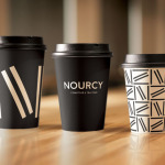
UMA continue to work with Antéoise, following up their packaging for the creme dacquoise range with boxes for a limited edition Fruit Sorbet, Jersey Milk Puddings and Jellys for the summer. Bright gradients replace the earthy tones, and find a meeting point between fruit flavour and summer warmth.