Confectionery Packaging

Drumroll by Gander
Donuts are one of life’s simplest pleasures, but they haven’t historically been the healthiest choice. Vegan – sorry ‘plant based’ – donuts are nothing new (Krispy Kreme’s been selling some non-dairy alternatives for a while now, and very nice they are too), but until now, we weren’t aware of donuts that also boast high-protein, low-sugar, gluten-free credentials. That is, until...
Chilli Bomba by New Genre
Based in what’s been optimistically named London’s ‘Design District’, New Genre is a pretty youthful studio that’s racked up an impressively broad range of projects and clients in its short life. Just shy of two years old, the studio has thus far worked across fintech, a non-profit art organisation, a pub, a beauty brand, and a campaign for Jamie Oliver...
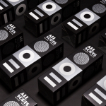
Allsorts Black & White Edition by Bond
Bond continue to work with Scandinavian confectionery brand Cloetta, owner of liquorish brand Allsorts, on the packaging for their Allsorts Black & White edition. The packaging for Allsorts’ originals range looked to bring the distinctive shapes and colours of the liquorice to the forefront using geometric forms and bright colour, enhanced by the black background of a simple card box. It was an approach rightly described...

Bombonería Pons by Mucho
Bombonería Pons is a family owned Barcelona based business, established in 1960, dedicated to producing the finest handcrafted chocolates. With a desire to engage with a younger consumer Bombonería Pons worked with international graphic design studio Mucho to develop a brand identity that would be sensitive to its traditional values and history yet give it a contemporary appeal. This extended across packaging, brochure, stationery, business cards and...
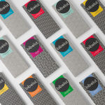
Bibelot by A Friend Of Mine
Bibelot is a luxury European-inspired dessert boutique in Melbourne with a coffee bar, chocolate shop, high tea salon, gelaterie and artisinal patisserie. It features an interior of long marble counters, a light spotted stone floor, spot lighting, cornicing, black and white walls, as well as bronze and tiled detailing. Informed by the sense of place and the permanence that underpins Bibelot’s...
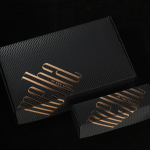
Melba at The Savoy by Pentagram
Melba is a pâtisserie and cafe, located on the corner of The Strand and Savoy Place in London’s North Bank, and is one of nine places to eat and drink at The Savoy hotel. The patisserie is described as offering a glimpse into the exclusive and luxury world of The Savoy, and is the first time that the hotel, accessed via private...
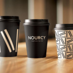
Nourcy by lg2boutique
Nourcy is a delicatessen that has been creating fresh, home-made and original products for thirty years from its location in Quebec City. While providing a contemporary dining environment Nourcy also offers catering services and lunch boxes to customers who have come to expect restaurant-quality at work and at home. In conjunction with a new menu of pastries, an expanded chocolate selection, exclusive gourmet delicacies and the development of a...
Antéoise by UMA
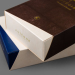
Antéoise is a creme dacquoise range from Anténor, a Japanese patisserie established in 1966 that creates French style cakes, cookies, tarts and variety of other confectionery. Antéoise’s brand identity and packaging treatment, developed by Osaka based graphic design studio UMA, draws on the range’s flagship positioning, high quality ingredients and the craft employed in its creation, the heritage and experience of Anténor, the streets of Kobe, and the...

Allsorts by Bond
Lovely new packaging design by Helsinki based studio Bond for liquorish confectionery brand Allsorts that brings the “distinctive shapes and colours of the liquorice into the forefront of the design” with simple, iconic geometric illustrative detail and a bright colour palette, enhanced by the black background of a card box structural solution. An approach described by Bond as resulting in a “bold...

Tingz by B&B Studio
Launched by natural chewing gum brand Peppersmith, Tingz is a new, two flavour confectionary range that uses Xylitol, a natural wood sugar, to add plaque reducing properties to the sweets. Developed by London-based B&B Studio the packaging for Tingz builds on the quirky personality of the Peppersmith brand by illustrating two wide-mouthed characters, a contrasting white and bright colour palette and subtle texture to establish a healthy...
Bermellón by Anagrama
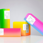
Bermellón is a Mexican confectionery shop that specialises in the premiumisation of traditional spicy treats typically sold on street markets. The shop’s identity and packaging, designed by Anagrama, fuses a bold and intense fluorescent colour palette with the fine detail and craft qualities of an adhesive label....
Caramela by Anagrama
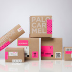
Caramela is a Monterry-based chocolate boutique and caterer that creates traditional treats inspired by European pastries. Their identity, designed by independent design agency Anagrama, is an unusual but striking mix of a sweet neon pink and clinical white, a subtle 80’s retro-fashion polkadot pattern, the practical/industrial and craft aesthetic of an unbleached and uncoated substrate, adhesives and white screen print, finished with a simple but...