Fosnavåg Konserthus by Heydays
Opinion by Richard Baird Posted 2 March 2015

Fosnavåg is a city on the island of Bergsøya, situated off the west coast of Norway not far from the Altantic Ocean. It is home to a variety of maritime businesses including fishing, logistics and shipbuilding, and now the location of Fosnavaag Cultural Centre, a new concert hall founded by the local community.
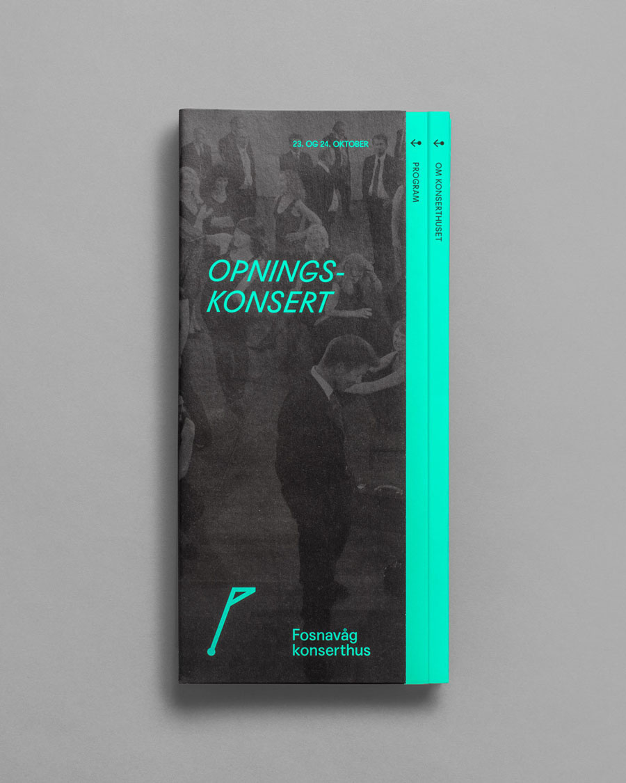
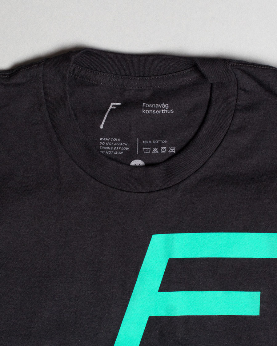
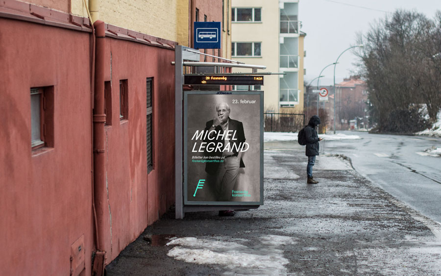
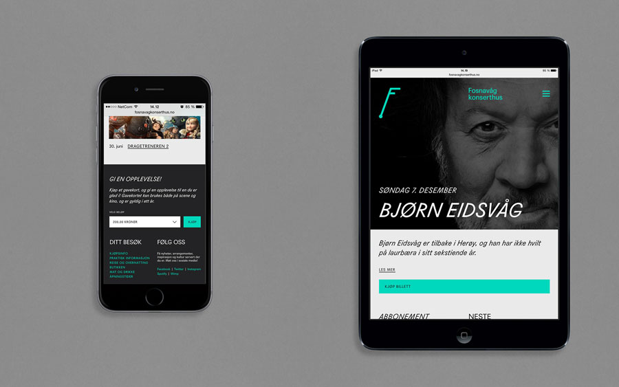
Fosnavaag Cultural Centre’s brand identity, created by Scandinavian graphic design studio Heydays, explores the relationship between Fosnavåg and the Atlantic Ocean—the foundation of local industry and culture, the point at which old weathered buildings meet a precise and contemporary structure, technology and innovation, and the convergence of sea and music. This was visualised as an identity system that included dynamic animated logo and interactive signage, illuminated interior displays, t-shirts, badges and business cards.
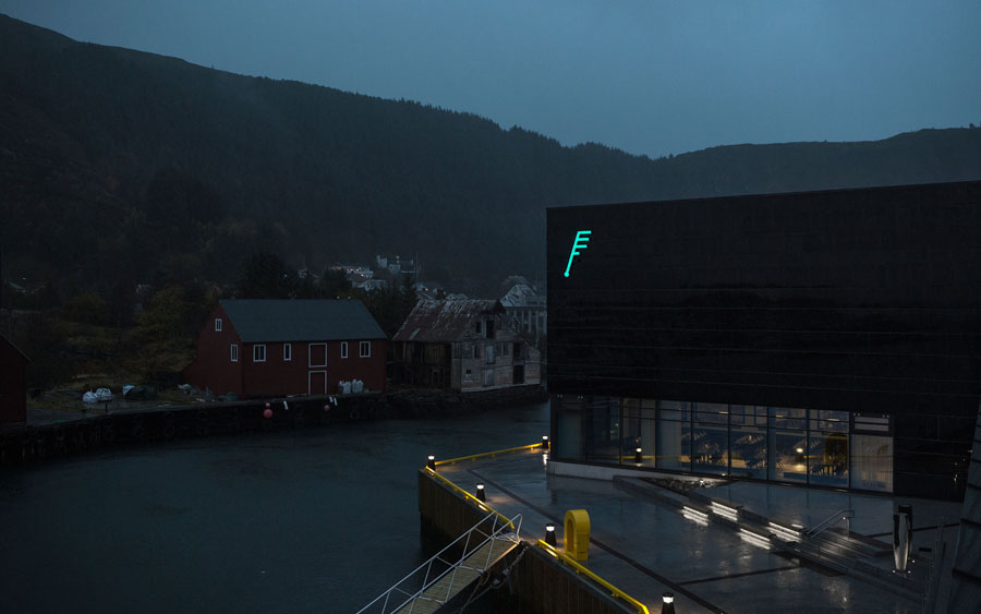
A contemporary structure of geometric lines and smooth dark tiled glass surfaces, the technology of the performance space, and art confront the harsh natural climate brought in by the Atlantic Ocean and are in opposition to the worn woods of old maritime premises and a landscape of rock and pine. It is an acute yet compelling meeting point where aesthetic, functionality, culture and industry are juxtaposed, but are integral to community, and provide a rich foundation from which to establish an identity system.
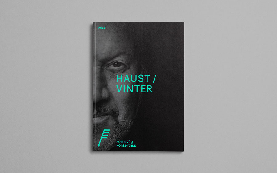
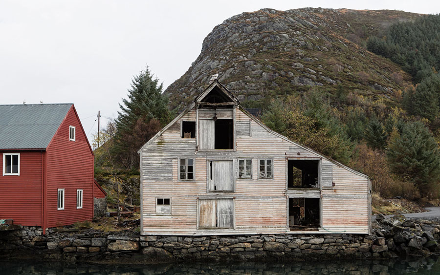
Regional history, community, regeneration and climate comes through well in the photography with plenty of weathered and worn textures, dereliction and traditional buildings and materials. These set tone and highlight a Scandinavian an appreciation for heritage, nature and modern architecture.
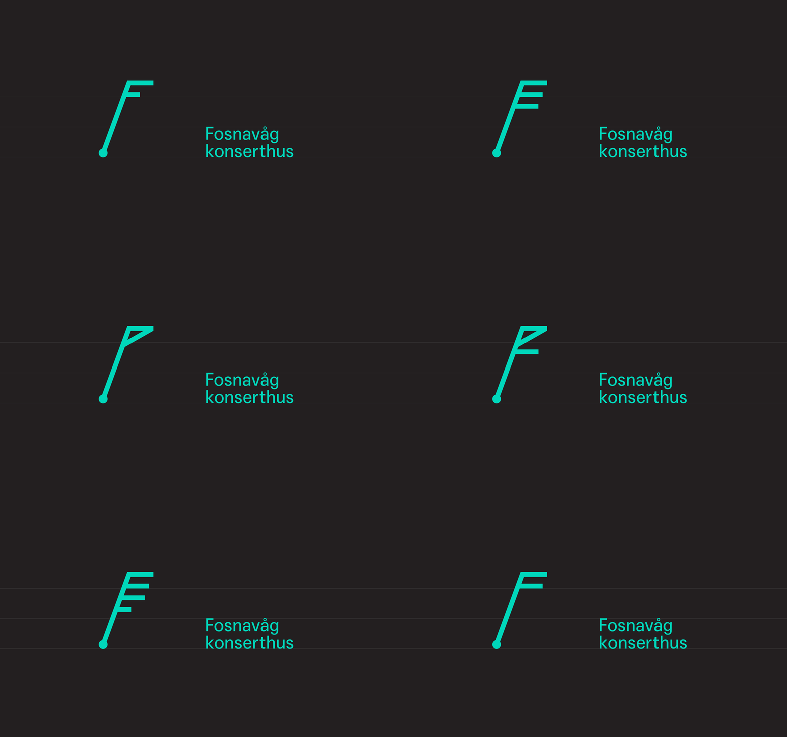
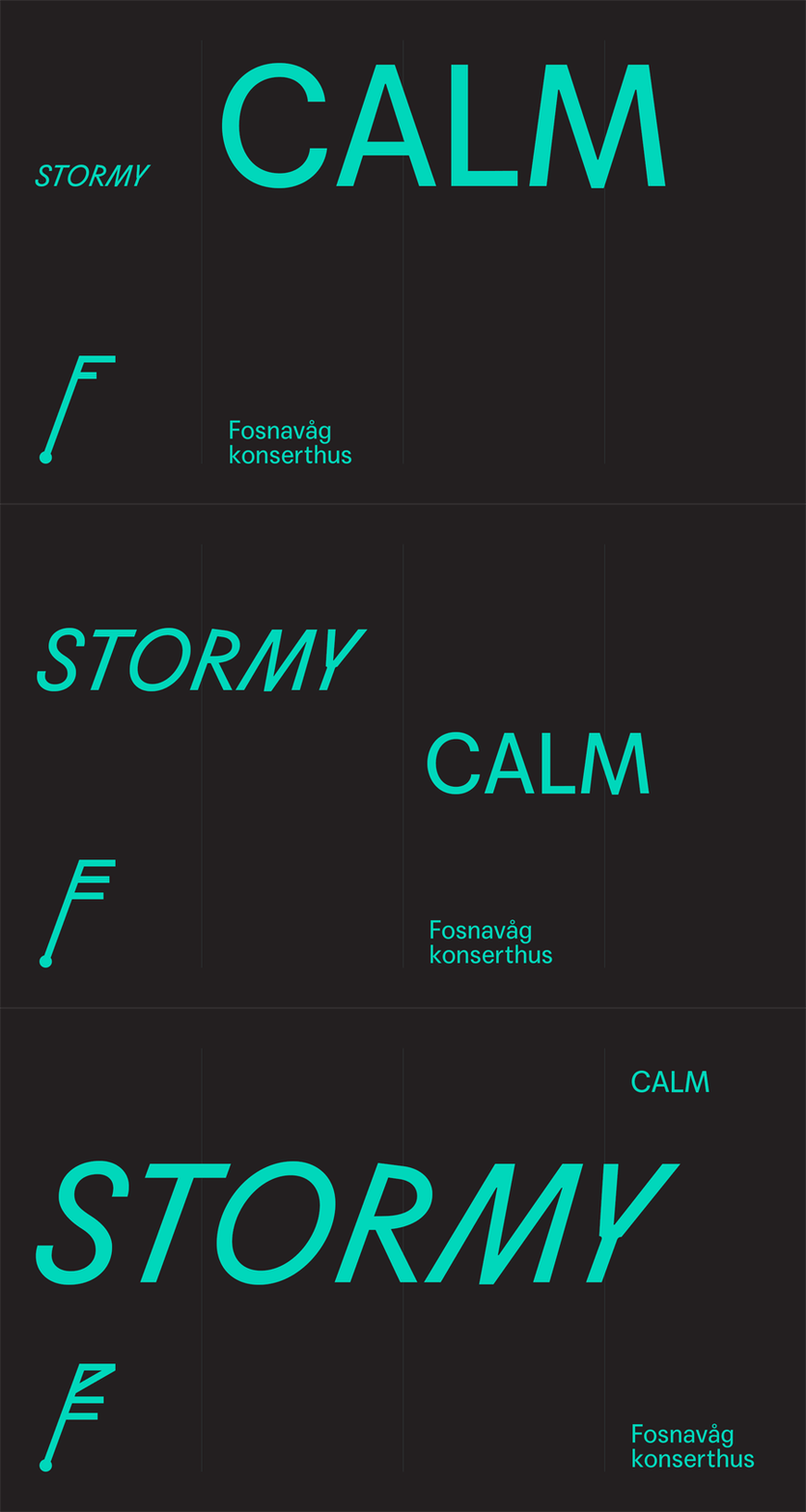
Based around the Beaufort Scale—a measure of wind at sea but applied here as a measure of sound intensity, and rotated to look like a note and F—and through onscreen motion, interactive external signage and static variation, the logo establishes a neat relationship between the music of the concert hall and its location.
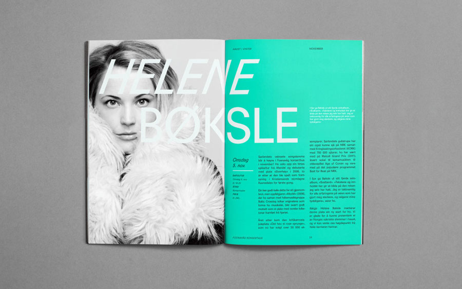
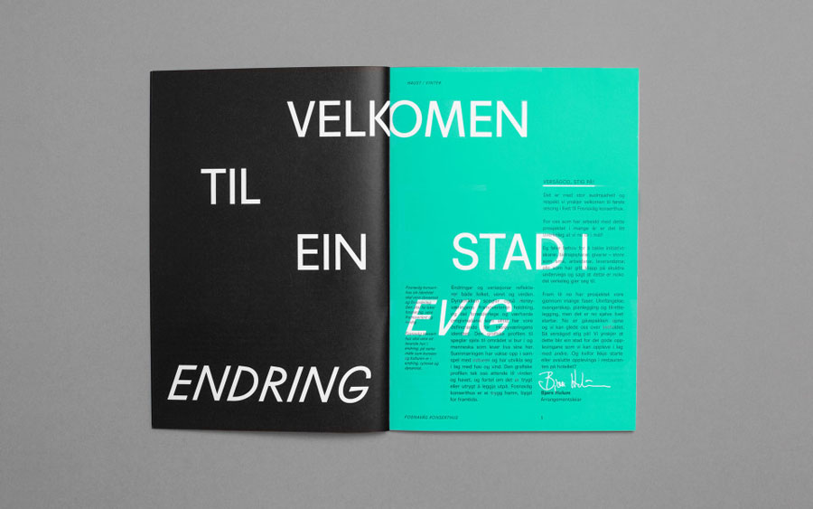
This is built upon through the blustery qualities that come through diagonal and horizontals strokes, stacked and animated elements not far removed from a graphic equaliser, and the ubiquity of the musical note. The monolinear aesthetic, while on-trend, appears as a fair and current reflection of the modernity and innovation of the concert hall’s build and sound management.

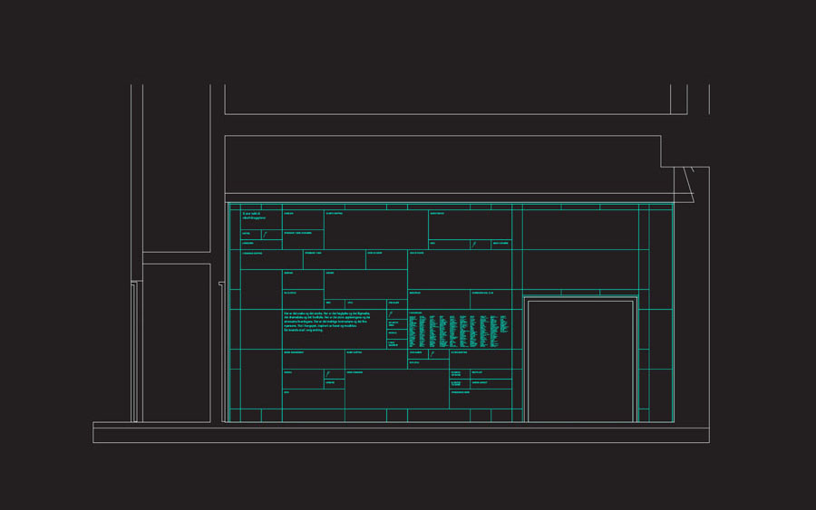
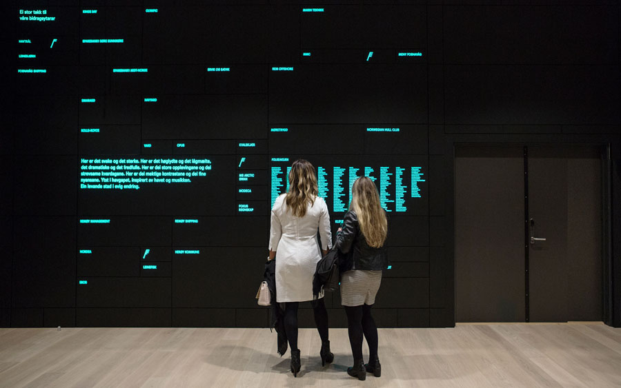
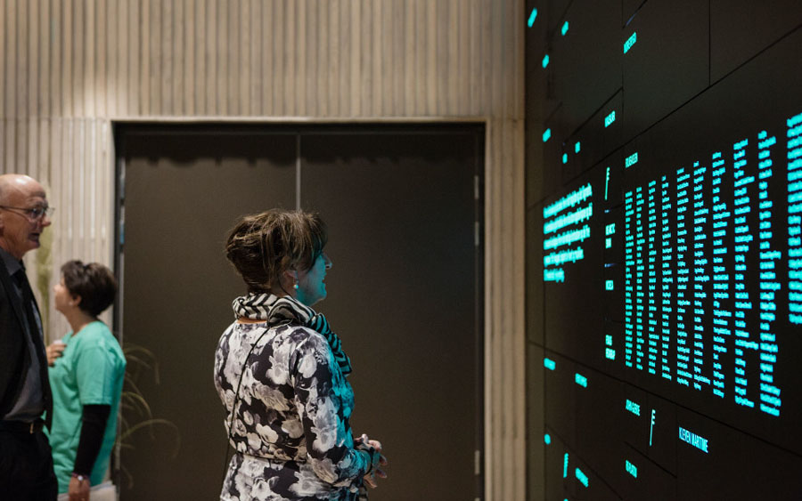
The themes of technology, windy island community and music are further explored through colour, signage, type and and image. This includes a dark grey and neon green colour palette, monolinear and geometric iconography, the illuminated display panels of the interior which draw focus to local funding and sponsorship, the windswept qualities of italics, website responsiveness and the interactivity of exterior signage — an external reflection of internal sound, from quiet early morning violin rehearsals to full house performance. More from Heydays on BP&O.
Design: Heydays. Opinion: Richard Baird. Fonts Used: Agipo
