Designed by Heydays
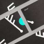
Fosnavåg Konserthus by Heydays
Fosnavåg is a city on the island of Bergsøya, situated off the west coast of Norway not far from the Altantic Ocean. It is home to a variety of maritime businesses including fishing, logistics and shipbuilding, and now the location of Fosnavaag Cultural Centre, a new concert hall founded by the local community. Fosnavaag Cultural Centre’s brand identity, created by Scandinavian graphic design studio...
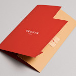
Skovin by Heydays
Skovin is Norwegian, high-end, solid wood floor specialist that combines ancient craftsmanship with modern technologies. By mixing a wood veneer business card and a traditional name drawn from the old word Skøyen, the area in Oslo where the company was founded, with geometric shapes and die cuts, panels of flat colour and sans-serif typography, Skovin’s identity, designed by Heydays, intends to...

Intu by Heydays
Intu is a Norwegian accounting and consultation firm and real-time technological solutions provider located in the town of Bodø. Design agency Heydays developed a new brand identity solution for Intu—which included naming, logotype, business cards, print communication, custom typography and website design—based around the link between the firm’s two key services and the software it uses to deliver these efficiently....
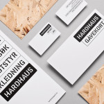
Hardhaus by Heydays
Hardhaus is a Norwegian specialist mountain sports retailer located in the alpine municipality of Sykkylven. Based around the concept of ‘technical durability’, Heydays developed a new brand identity solution for Hardhaus—which included a logo, stationery and website—that juxtaposes the utility of a heavy uppercase and stencil cut sans-serif—bold and ‘oversized’ in its execution in print—and the robust and hardy aesthetic of chipboard imagery, with...

Mellbye by Heydays
Mellbye is a Norwegian architecture firm founded in 1954 with a “mindset anchored in modernism”. Design studio Heydays created a new brand identity for the firm based around a geometric M symbol built from the initials of their two main services, architecture and interiors. Executed as a combination of blind deboss and die cut detail across a earthy and urban...
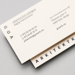
Goa Arkitektkontor by Heydays
Goa Arkitektkontor is an Oslo based architecture studio, established in 2012 by Johannes Ludvigsen Goa, that provides planning, regulation and architectural design services. The studio has a philosophy that sees restrictions such as economy, building regulations and social attitudes as opportunities, believes in simplicity and, a little unusually, is not afraid to be banal. These ideas are neatly resolved through...
O Architecture by Heydays
O Architecture is a small, Lille-based multidisciplinary studio whose practices extend beyond traditional architectural services to include artistic installations, educational courses and editorial work. Their visual identity, ‘a solid circle with a disruption that creates a triangle reminiscent of an A’ – created by design agency Heydays – , unites the broad remit of the studio under a simple symbol with a revolving, holistic quality that...
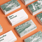
Filmfaktisk by Heydays
Filmfaktisk is a Norwegian team of film producers—with a strong focus on locations—that produce both commercial and fictional pieces work. Their visual identity, created by Oslo-based design agency Heydays, cleverly leverages the physical limitations of sign making and turns it into a positive and distinctive asset that visualises—through a simple line detail that connects the stems and the tittles of the i’s...