The Promontory by Dan Blackman
Opinion by Richard Baird Posted 7 April 2015

The Promontory is an American bar, restaurant and entertainment venue located on Chicago’s Lake Park Ave. It has an interior that mixes urban details such as neon signage and concrete floors with the industrial qualities of exposed beams and utilities, the earthy textures of freshly cut logs, light wood tables and dark wood panelling, and the craft associated with traditionally made furniture. The restaurant also features a modern hearth of brick and stainless steel. This interior is a reflection of the restaurant’s menu which is described as being made up of “contemporary American food highlighting historic dishes cooked in a wood-fired oven”.
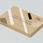
The Promontory’s brand identity, created by New York based Dan Blackman and extending across menus, coasters and signage, draws on the cues set by the interior design through type contrast, but also introduces a current sense of craft through paper choice, hand stamped finishes, material texture and illustration.
The broadly spaced and engraved origins of the logotype’s serif characters, the double border and vertical dividers, alongside a sans-serif choice and illustrated brick symbol, and within the context of a deep brown across the website and the furniture choice and wood panelling of the interior, are quick to establish a period quality that draws on the long tradition of hearth cooking. It is a visually rich piece of communication that touches upon concept and interior, and where contemporary identities often favour reduction, this has a period authenticity in its layers of detail.


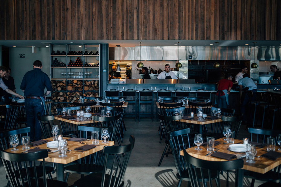
In opposition to the logotype but in conjunction with steel surfaces, lighting, exposed utilities and black beams, the bright red neon signage and condensed sans-serif characters set a more contemporary urban quality, utilise an element of craft, appropriately draw on music venue conventions, but is tied to the restaurant through a brick motif.


Dan Blackman’s visual identity takes a lighter and brighter approach whilst retaining many of the traditional design cues of the environment. The physical bricks of the hearth and the neon tubes of the signage are instead loosely rendered and used to create a distinctive logomark, add texture in print and draw character from restaurant concept. Brightly coloured, pastel, and earthy unbleached and uncoated papers effectively mix past and present, and punctuate and compliment an environment of earthy tones and emphasise craft.

Like the interior’s juxtaposition of warm wood detail alongside the cool modernity and practicality of steel, and the menu’s more recent interpretation of classic dishes, font choice in print similarly works to build in an element of duality and leverage contrast, setting the engraved serif flourishes of the logotype alongside the mechanical monospaced characters of Pitch.

Where the interior transitions smoothly between disparate elements of utility, modernity and traditional crafted flourish, the identity is more explicit and acute, distilling the richness of interior down into a distinctive identity treatment of typographical and colour contrast bound by the bricks of the hearth, whilst also adding personality and colour.
Design: The Studio of Dan Blackman
Photography: Clayton Hauck
Opinion: Richard Baird
Fonts Used: Pitch & Sackers