The Best of BP&O — April 2015
Opinion by Richard Baird Posted 28 April 2015

April’s highlights included new packaging for coffee roaster Beanworks by Paul Belford, Bond’s brand identity for Sushi & Co., Spin’s work for contemporary furniture business Simon Pengelly and Maud’s bold brand identity for The National Institute of Dramatic Art. However, there were five projects that stood out and have made it into BP&O’s Best of Series, a feature that brings together the most interesting and unusual projects published on the site each for another opportunity to be seen and shared.

Hustler & Rose designed by Post
Husler & Rose is an online boutique and occasional pop-up store that retails thoughtfully designed, carefully constructed and long-lasting furniture, homeware and lifestyle objects sourced from across the UK and Europe, professionally and sensitively restored by owner and furniture maker Ben Rowland.
Inspired by Herbert Bayer’s Bauhaus posters and the jazz record sleeves of Duke Ellington, London based design studio Post created a new brand identity treatment for Husler & Rose that included logotype, postcards, business cards and promotional pieces. These capture the crafted and considerately designed nature of the store’s curated catalogue through the high quality finishes of white ink and black block foil, hand stamped detail, geometric patterns and a contrast of serif, script and sans-serif typography, across dyed papers and unbleached boards.
See more of this project here


Finchtail designed by Believe in
Finchtail is dedicated to the design and manufacture of simple, useful and sustainable solutions to everyday problems. Its first product, a low-cost, flat-packed card tablet and mobile phone stand, features a distinctive brand identity and packaging design treatment developed by Believe in. Monospaced type and corrugated card sit alongside die cut detail, white ink, a bold pattern and a bright dyed board, carefully balancing moments of utility, quality and aesthetic flourish. Alongside visual identity and packaging design, Believe in went on to create point-of-sale, website, marketing materials and a stop-frame video in collaboration with Thank You Mam.
See more of this project here

Room Essentials designed by Collins
Room Essentials is a line of modernist home furnishings created and sold by American retailer Target. The range covers over 2,000 products across 60 categories, and includes items such as blankets, lighting, chairs, tables and tableware.
While securing significant revenue for the retailer, the range has, over the last five years, experienced a downturn in sales generated by its Millennial demographic. With this in mind, and with the intention of recapturing the enthusiasm for and interest in the range, Target commissioned New York based Collins to reimagine Room Essential’s brand identity.
See more of this project here

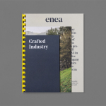
Enea designed by Clase bcn
Enea is a contemporary furniture manufacturer with a site in the Basque Country. Collaborating with designers Josep Lluscá, Gabriel Teixidó and the trio Lievore Alhterr Molina, Enea has developed a catalogue of versatile, comfortable, durable and functional products for the private and commercial markets.
Seeking to differentiate itself from its competitors and avoid cliches of the industry, design studio Clase bcn developed a distinctive brand identity treatment for Enea that reflects the company’s Basque origin in a distinctive and contemporary fashion and, using a striking spartan style, references industrial manufacturing. This was visualised through type, colour, image contrast and print, and launched alongside Enea’s latest range which coincided with the Milan Furniture Fair.
Read more of this article here

Markus Form designed by Lundgren+Lindqvist
Markus Form is a contemporary furniture company, founded with the intention of revitalising Sweden’s furniture industry, and with an ambition to produce relevant, practical and easy to match designs that are durable and sustainable. The company’s furniture will also draw on a significant Swedish and Scandinavian design culture and heritage that unites ergonomics, functionality, craftsmanship and a good working knowledge of materials, whilst also being individualistic. Markus Form describe their philosophy as one that takes on greater challenges than those posed by form and finish, and acknowledges furniture as an architectonic component that has to handle scale and other spatial conditions and addresses everyday needs.
These values are the basis of Markus Form’s brand identity, developed by Lundgren+Lindqvist, and expressed using reductive, geometric, typographic shape and its consistent application, an appropriate use of space, proportion and layout, detail and the absence of detail, print finish and the distinctive and contextual qualities of unusual product photography.
See more of this project here