From Babies With Love by Paul Belford Ltd
Opinion by Richard Baird Posted 4 June 2015
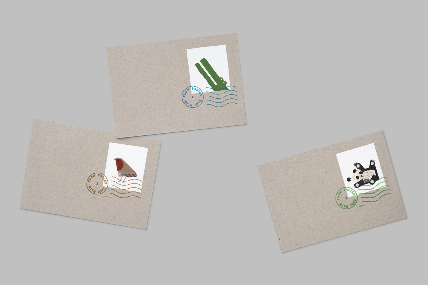
From Babies With Love is an organisation that sells organic baby clothes, blankets and accessories, as well as a range of greetings cards online. The money raised from the sale of these goes to SOS Children’s Villages, a scheme that supports babies who have lost parents to war, famine, disease or poverty, by placing them with families and within communities that are safe and stable.
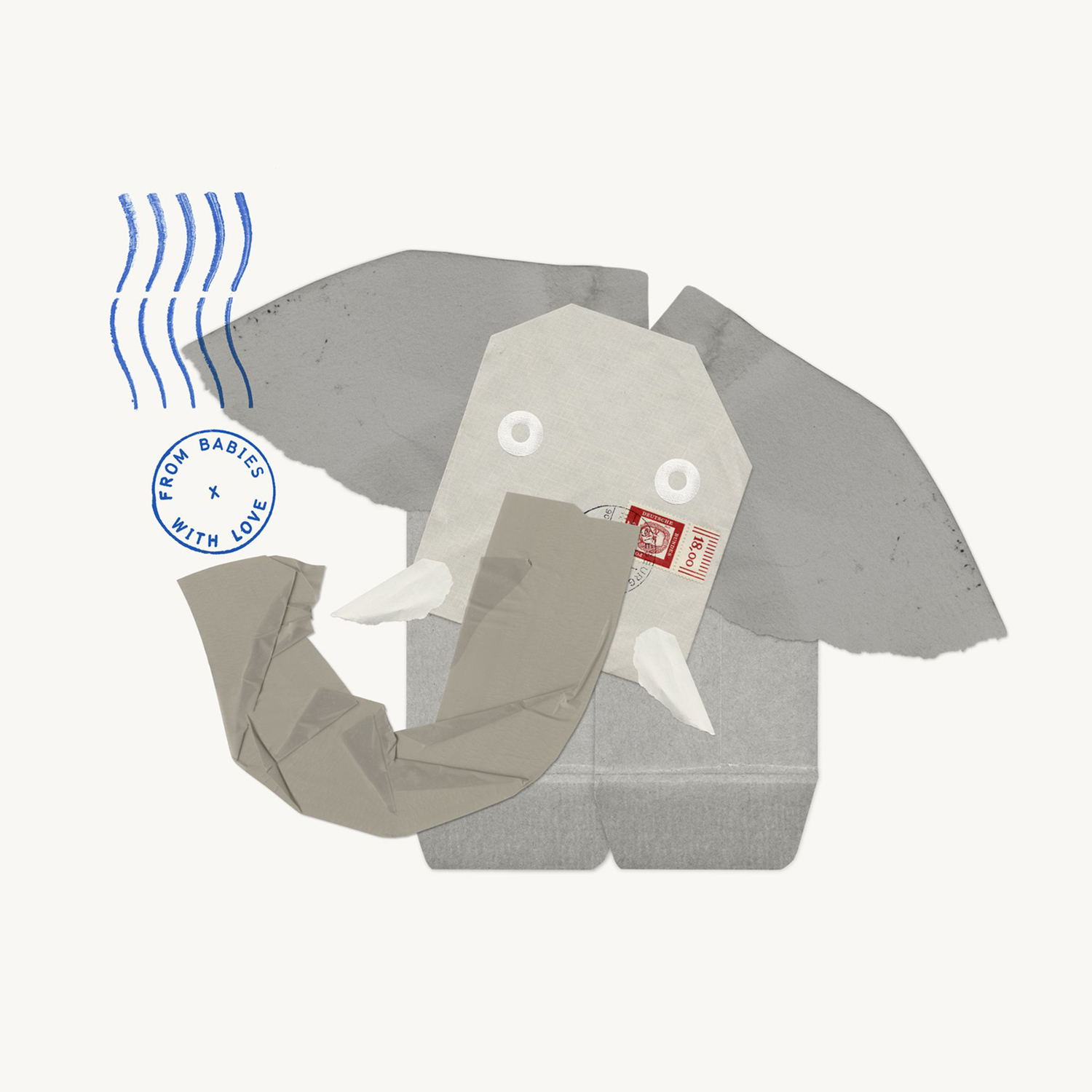
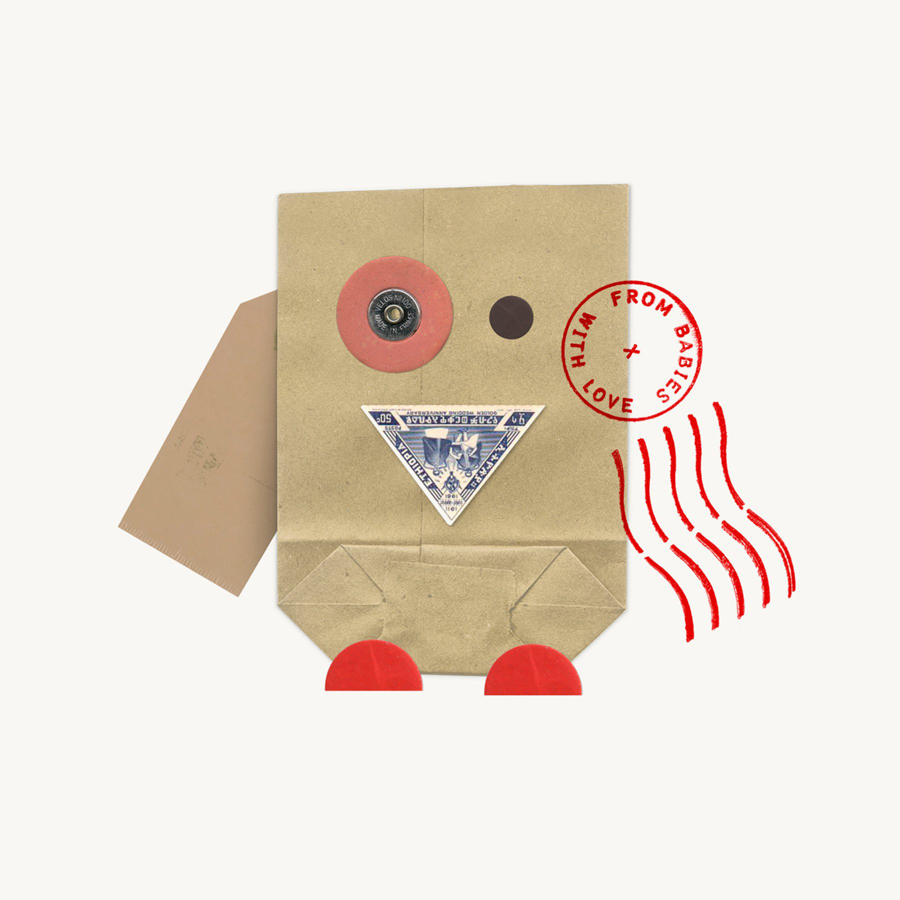
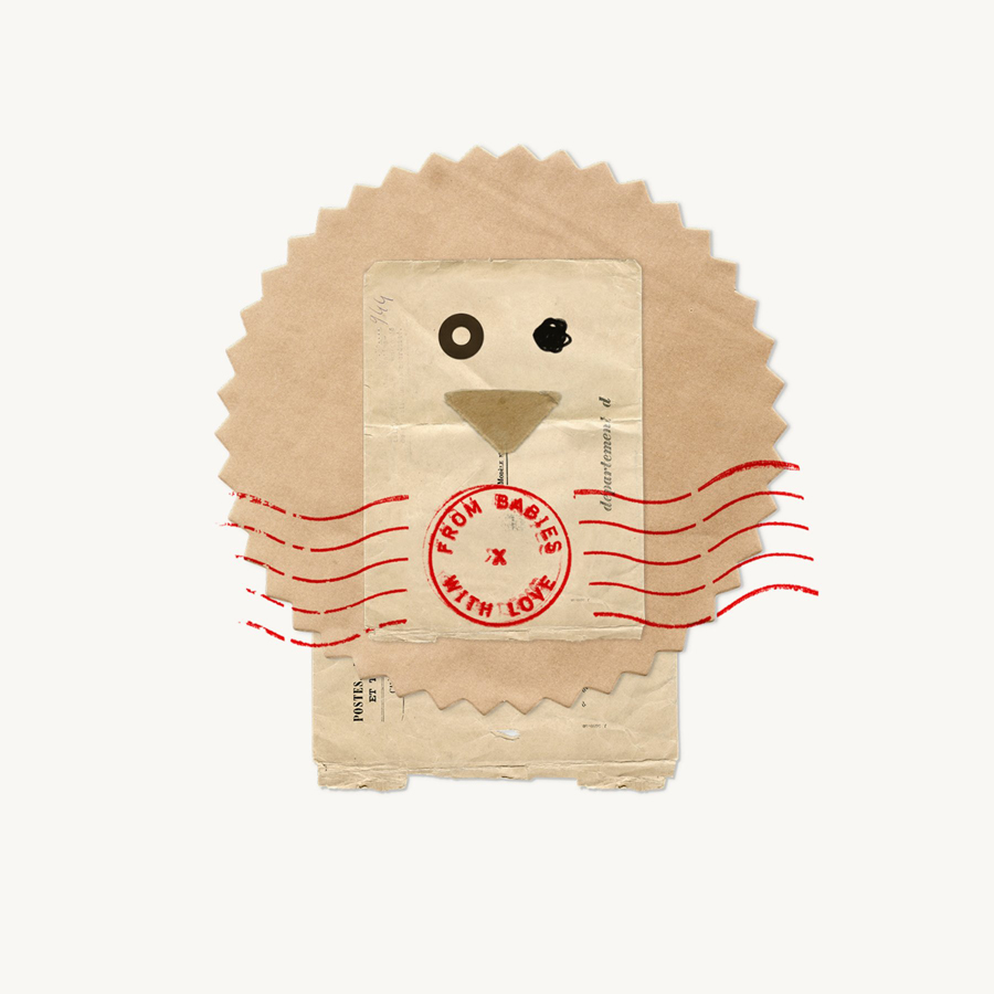
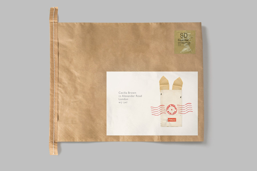
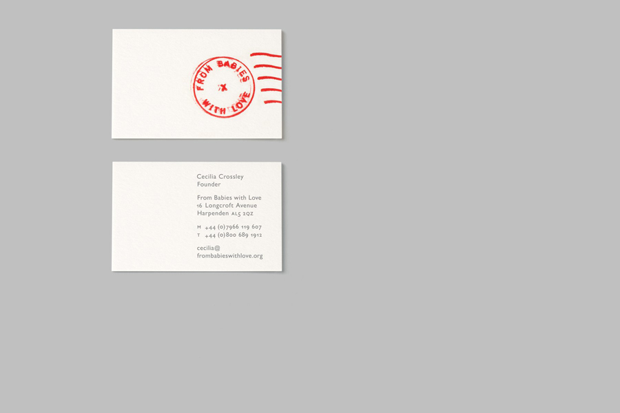
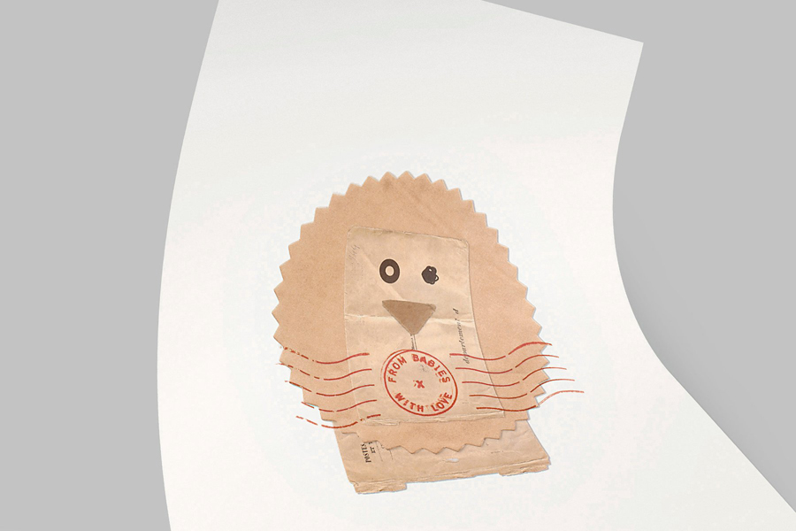
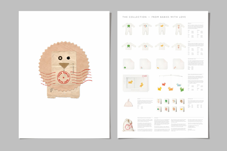
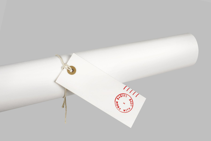
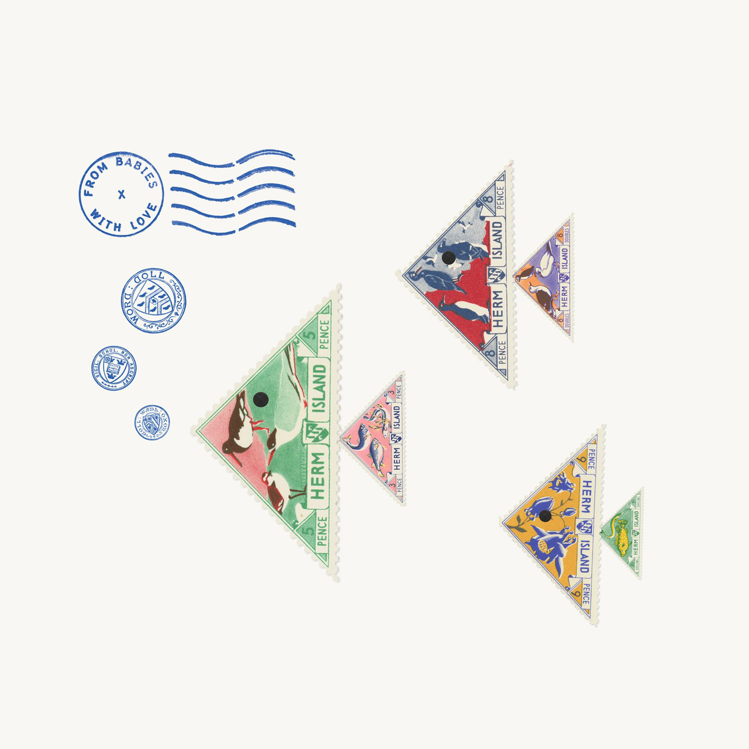
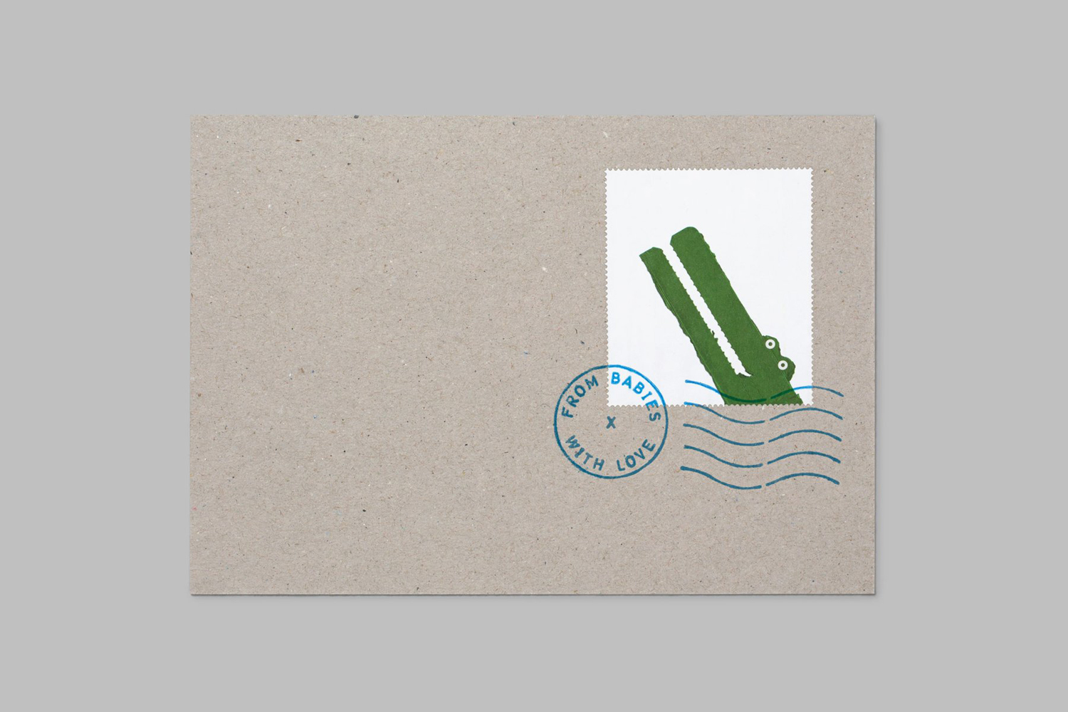
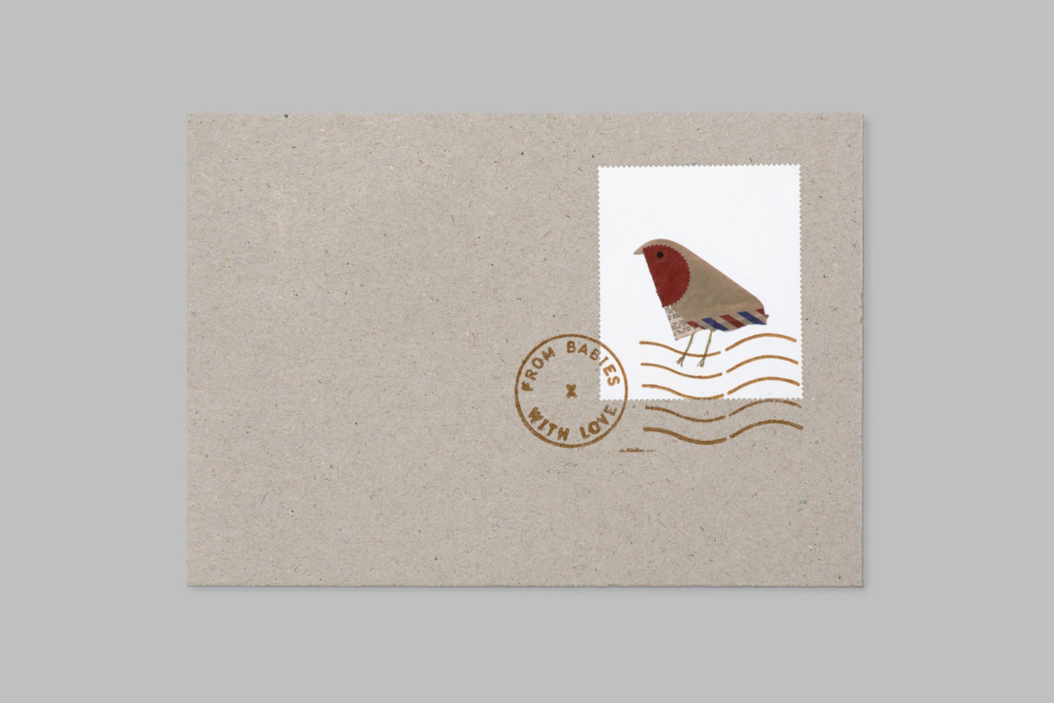
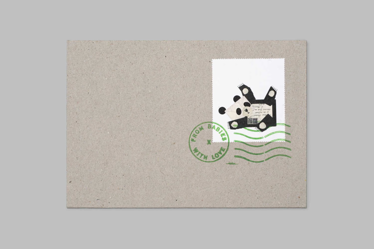
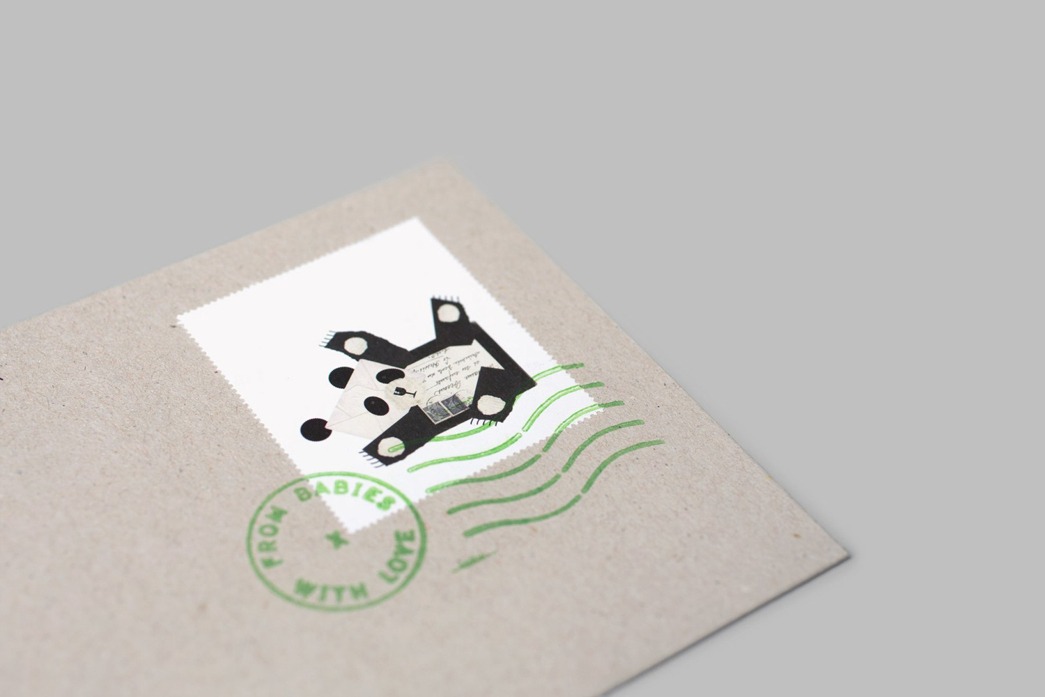
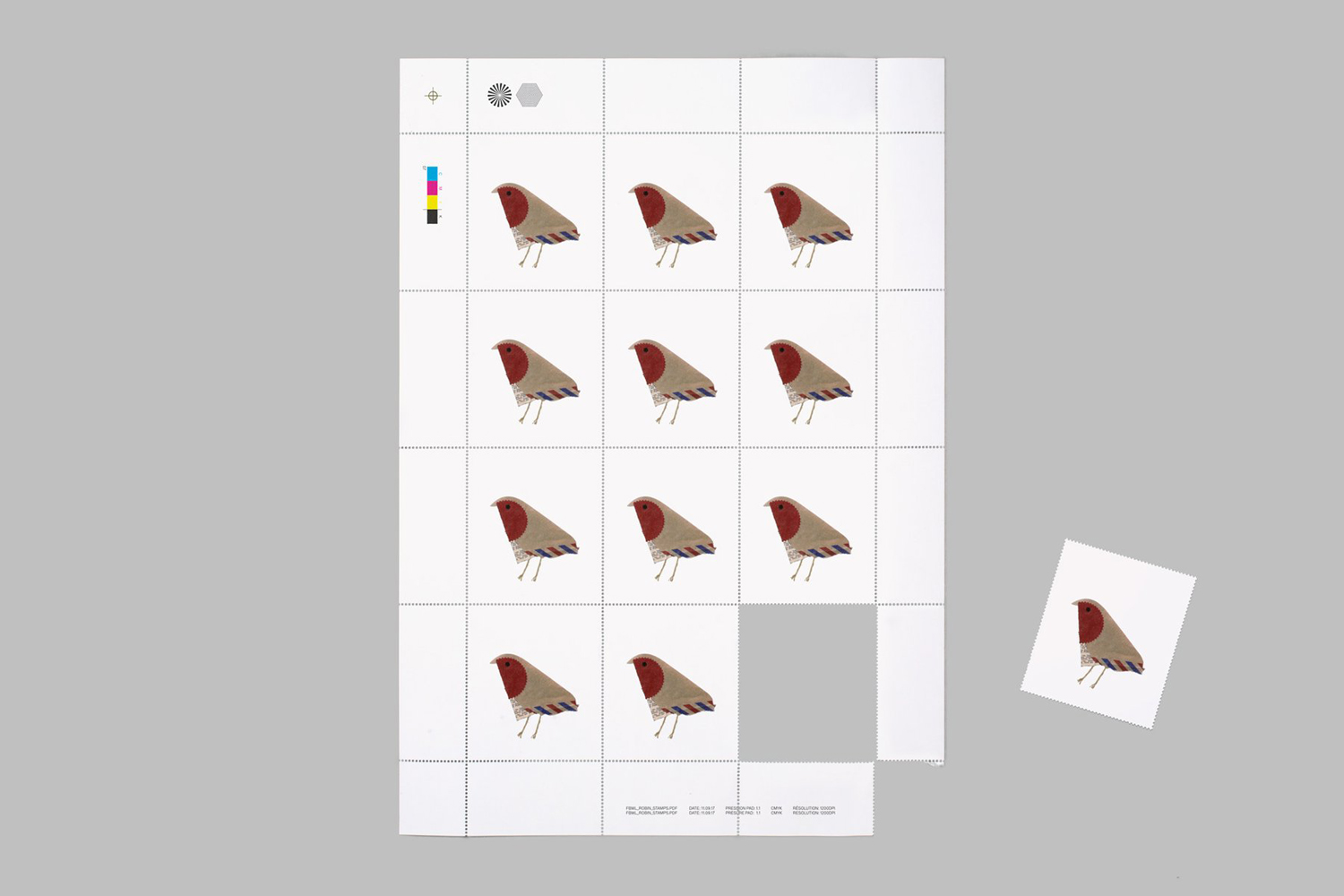
London based Paul Belford Ltd. worked with From Babies With Love to develop a brand identity treatment that, through a simple postmark device and a series of animal collages created from recycled postal materials, finds a way to bridge online shopping and the aid sent abroad, and draws a playful and distinctive character from utility. This runs across envelopes, business cards, tags and website. This post was updated June 2016 and October 2017 with new images.

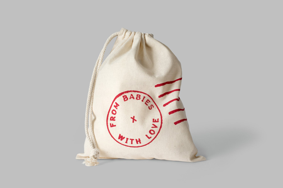
The postmark is a familiar and universal device. Its aesthetic irregularities, the absence of flourish and bright red ink are all testament to its utilitarian and mechanical origins. This makes it an unusual and distinctive choice within this very human context yet finds a connection between online shopping, delivery and the sending of foreign aid.
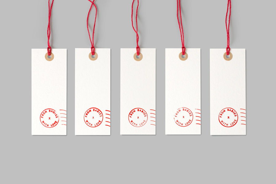
The logo functions as a simple device that connects both practical elements such as business cards, tags and bags, with more compelling and crafted products such as gift cards. Small details such uncoated cream boards, red string, unbleached hole reinforcements and canvas parcel bag are subtle choices but work well to build on the postal aesthetic and the overall sense of quality.
The logo is rendered and applied with an authenticity in its variation, stays true to the utility and functionality of postmarks but used creatively within the context of a variety of handcrafted collages.
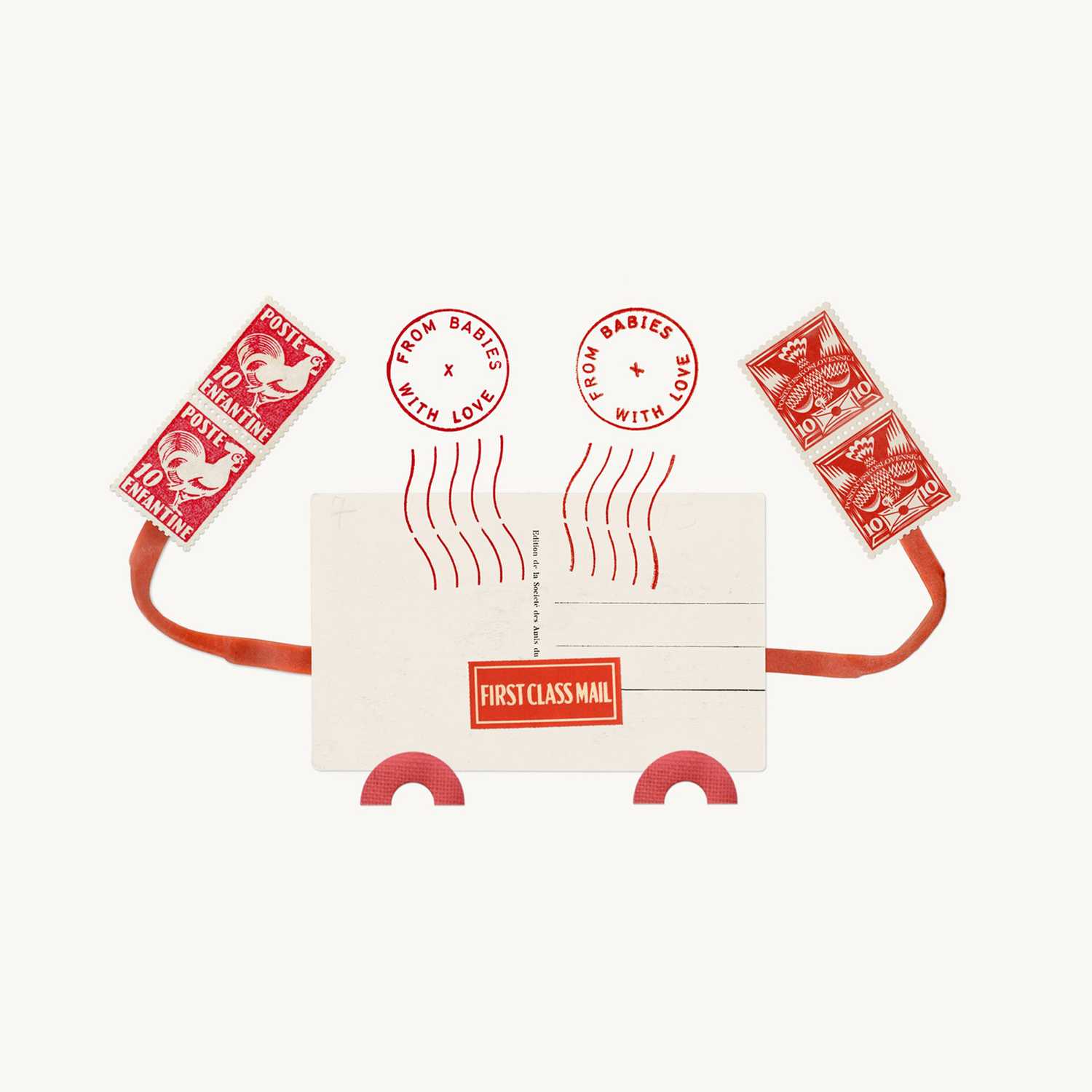

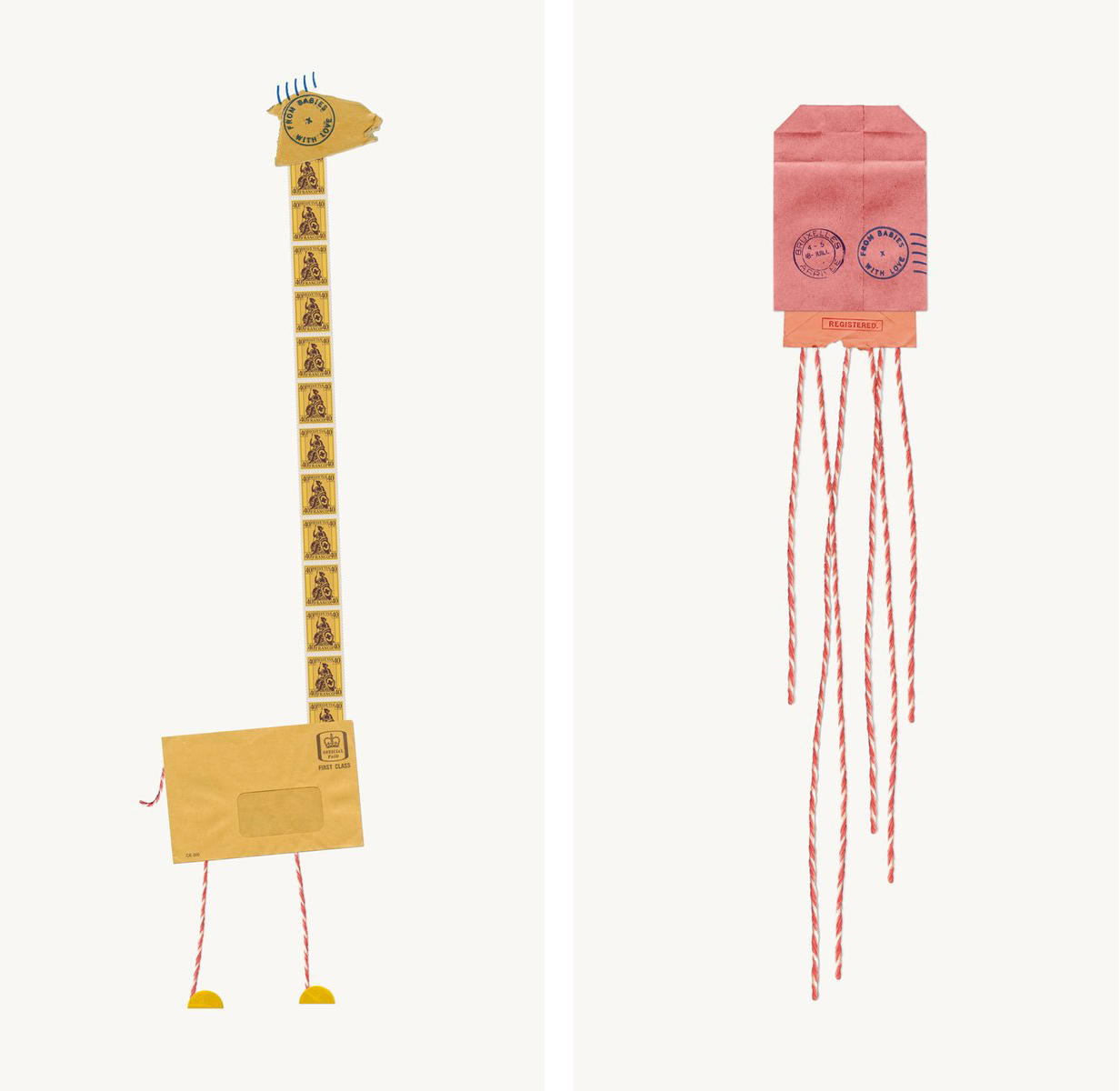
The collages are individually unique with plenty of original character, a high quality in their build, composition and photography. Collectively, these share a craft, creativity, concept in the use of postal paraphernalia, and have a sensitivity in the economic use of recycled materials that appear well-suited to a company based around charitable donations. Particular highlights include the owl’s eye and beak, the lion’s whiskers and the frog’s eyes.
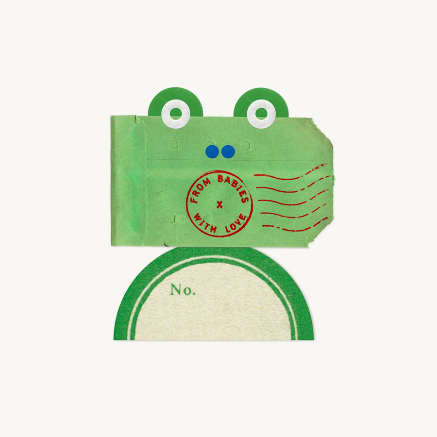
To draw so much character from discarded products of utility and infrastructure, far removed from individuality, short on life-cycle or an emotional quality, whilst also making a connection between delivery and the sending of foreign aid, and infusing these with a sense of play and optimism, is surprising, charming and intelligent. For more collages, check out the Paul Belford Ltd website. See more from Paul Belford on BP&O.
Design: Paul Belford Ltd. Opinion: Richard Baird.
