O by Folch
Opinion by Richard Baird Posted 9 June 2015
O is a Barcelona based studio made up of, and representing, a collective of uniquely talented illustrators, photographers, directors and producers creating visual and editorial content. The studio supports the singularity of each artist by avoiding a homogeneous style and granting each a production capacity that does not make a distinction between personal projects and commercial jobs. While providing insight into each of these, O’s website also functions as a regularly updated platform for debate and enquiry into the communications industry.
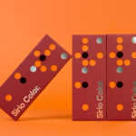
Director Luis Cerveró worked with Spanish graphic design studio Folch to develop a visual identity system for O. Based around spray-painted graphic device, responsive grid-based layouts and Monotype’s Neue Haas Unica across digital and print environments, Folch’s approach establishes an adaptable framework from which to bring together changeable and diverse content online and also extends to business cards and stationery.
“The “O”, is the central point from where everything is built, an underlying root for continual controlled innovation and experimentation. It can evolve and mutate when required to. It has to contain and hold together the content. Taking the O as the core of the system, the communication needed to be simple, straightforward and intelligent, contained within a graphical system that would reflect the ethical and honest attitude of the project.”

“Taking inspiration from the editorial structure and the old advertisements graphic aesthetic, we recovered a design classic, the “Unigrid” by Massimo Vignelli: a direct and simple system based on a uniform grid. We wanted the grid to be the visible skeleton where the shapes and white blocks could reposition and move depending on the context and the content.”

“The main structure of the website is built on a six square grid. The web page content is organised by artists and, on a weekly basis, a new selection is featured on the homepage. Roster presents all the creators featured on the website, where each of their personal pages has a custom colour. The flexible grid allows for continual adaptation of the page dependent on the content. The blocks assemble a white mosaic, a complex canvas where short films, pictures, paintings, and publications are shown.”

“This modern yet old-fashioned structure resembles the 50s newspaper and magazine layout, one of the main inspirations behind the design. The typography is also evoking this aesthetic: Monotype’s Neue Haas Unica gives the identity a bold look and stains the page with personality. The structure of the blocks is completely responsive: the blocks rearrange for all devices, adapting accordingly to the size of the screen. On a phone the grid breaks, conveying the content in a single column allowing for clear reading.” – Folch

Online O blurs the line between the individual and diverse creative work of the studio’s members and editorial content. Within such a broad context, one rich in image, video and comment, it is not surprising to see a grid-based approach utilised alongside an abstract and consistently applied logo.

Originally type-based but finally settling on a circular void picked out with spray paint, the logo makes sense within a content heavy environment, punctuating it with colour, detail and a clear creative handmade association. It also works well as a bold and expressive graphic device across the stationery in contrast to the static uniformity of Unica. As circle, it is abstract enough to appear as a symbol of collective activity but also, in its changing and organic quality, of individual pursuits. While Folch describe the logo as a hole, empty space, an impact and as a gun shot, its strength lies in the absence of an explicit interpretation.

Where grids are often hidden, here they are celebrated, and contribute to visual identity, balancing functionality and aesthetic with a communicative value based around an openness and structure that unites disparate skills sets and aesthetic sensitivities. More from Folch on BP&O.
Design: Folch. Opinion: Richard Baird. Fonts Used: Neue Haas Unica