FS Silas Launch Campaign by Believe In
Opinion by Richard Baird Posted 21 June 2015

FS Silas is a new sans-serif and slab-serif font family from British type foundry Fontsmith, each available in five weights and an italic. The family is described as having a squareness of rounded forms with dynamically angles terminals and slabs capable of offering contemporary brands the opportunity to employ different voices with one typographic system.
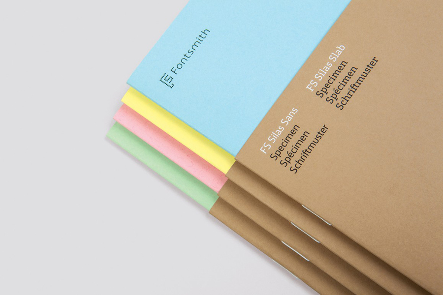
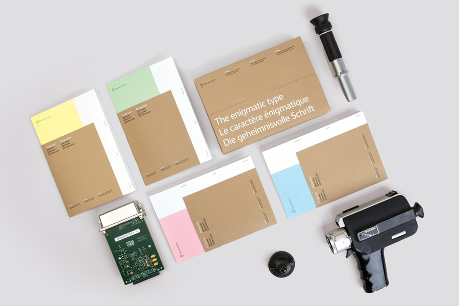
Fontsmith worked with graphic design studio Believe In to develop a name and launch campaign. This included type specimen, social media strategy and a number of short videos created in collaboration with The Space Between. These digital and print artefacts were united by the title FS Silas – The Enigmatic Type, and a concept that draws its inspiration from the dossiers and secret files of espionage, as well as type specimens of the 50’s and 60’s.
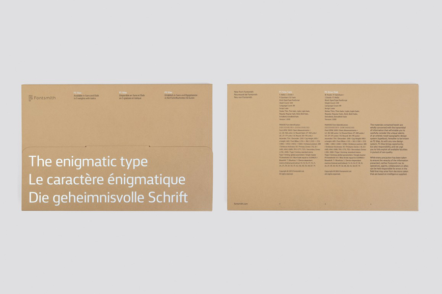
While I have yet to experience either FS Silas Sans and FS Silas Slab as digital typefaces, in print the characters and character sets appear robust in their flat baseline and x height, multipurpose in their restraint and high quality in their rendering. The characters are individually interesting yet cohesive across the two styles, italics and five weights, and, as described by Fontsmith, manage to balance authority, nuance and expression.
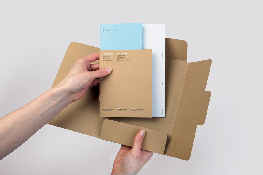
Believe In’s approach to print feels well-suited to a type specimen and this particular typeface, finding a comfortable meeting point between concept and content, visual interest and communicative intention.
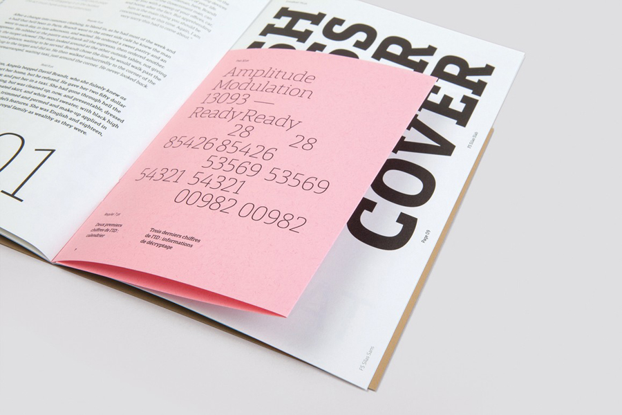
This is achieved in layouts that appear as coded messages, passages from the book Territories of Lies, morse code, field codes, coordinates and international destinations that function to highlight numbers at small sizes, body copy, headlines, differing weights, punctuation styles and character combinations in a cohesive and distinctive fashion, all drawn out using plenty of space.
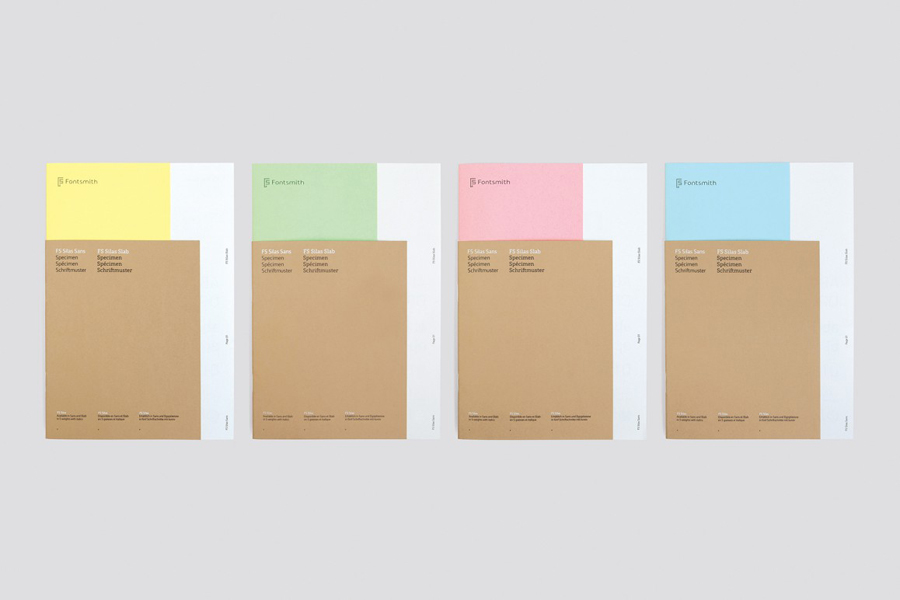
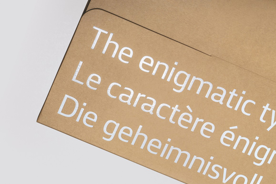
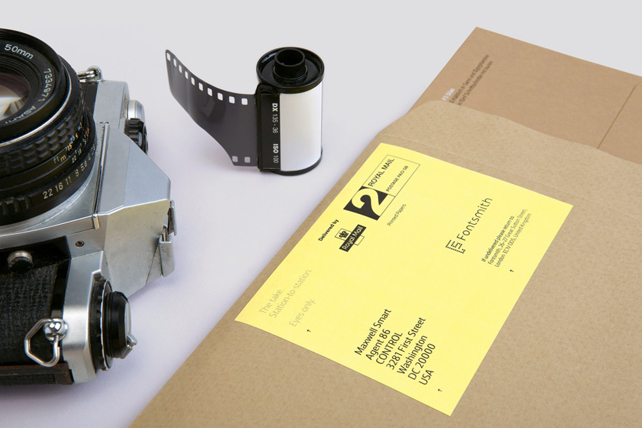
Initial impressions were of material quality and finish, compactness (smaller than expected) and contrast. It effectively utilises a good mix of paper weights, sizes and colour, matt uncoated and unbleached surfaces alongside black ink and glossy foil to secure moments of visual impact and interest. The concept manifests itself well throughout the utilitarian (yet custom) structural qualities of the manila folder and envelope, and the pastel paper colours of officialdom, while Silas comfortably takes the place of what would have probably been something along the lines of typewriter.
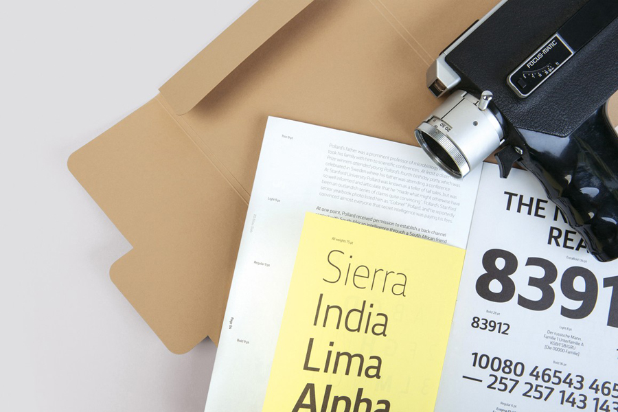
It is a familiar aesthetic well-implemented and developed into a broader concept clearly in service of product. It balances distinction and functionality, works as an appropriate framework in which to convey type style and usage, as a compelling tool from which to generate social buzz, and as a fair reflection of the tone of the font family. While creative and of good quality, concept or aesthetic never overshadows product, and its own unique qualities. More from Believe In on BP&O.
Design: Believe In. Opinion: Richard Baird. Fonts Used: FS Silas Sans & FS Silas Slab
