UAL 2016–17 Campaign by Spy
Opinion by Richard Baird Posted 25 June 2015
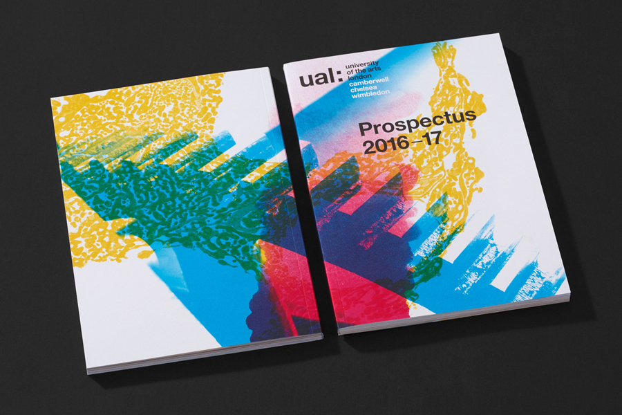
The University of the Arts London is Europe’s largest specialist arts and design university. It is made up of six colleges, each with its own unique character and programme, yet unified in their effort to deliver a high quality creative eduction. This united position is expressed through a visual identity system developed by Pentagram partner Domenic Lippa. Based around a robust, black and white typographic system, UAL’s visual identity affords each college the opportunity to experiment with its own approach to visual communication.
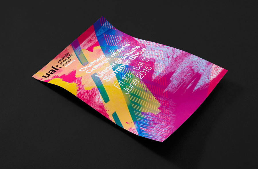
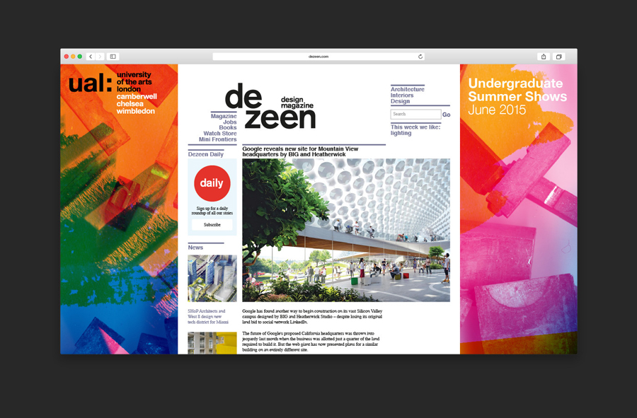
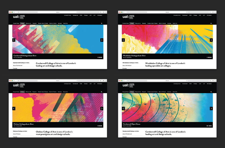
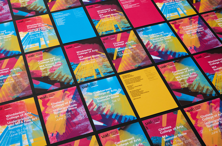
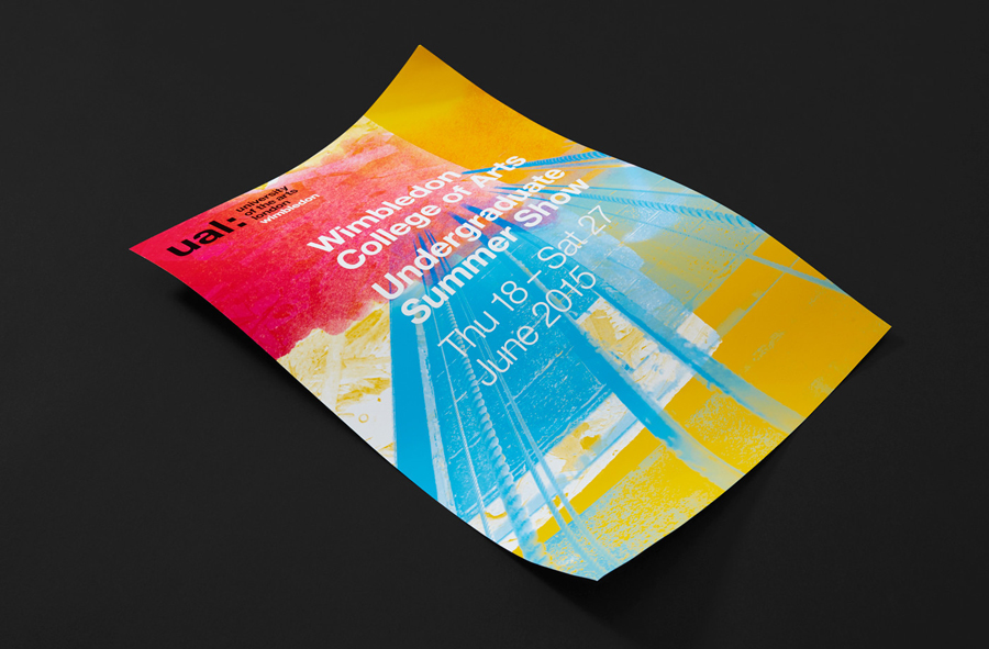
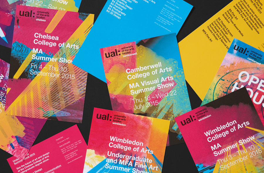
This month sees the launch of the UAL 2015 campaign, developed by London based graphic design studio Spy, for Camberwell, Chelsea and Wimbledon. Spy were commissioned to develop a vibrant, engaging brand campaign to launch in the summer that would drive student recruitment and brand awareness. The campaign included ads, posters, digital banners, brochures, prospectus, e-flyers and way finding around each campus.
“Our campaign strategy focussed on four key areas: capture the experience of attending the most dynamic UK art schools, appeal to a diverse, global student community, drive awareness of degree shows and open days and allow each college to have its own character whilst being part of the umbrella brand.”
“The process began by spending time at the campuses to get a feel for the different artistic environments. Experimentation, a sense of adventure and eclecticism – were key qualities that emerged. Whilst there we began to collect, scan and shoot a range of found materials, textures and objects. The idea was to capture and bottle this spirit.”
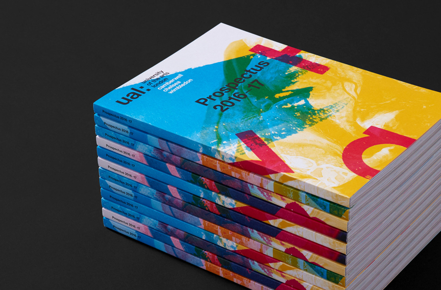
“These materials were used to create unique collages that reflect the spirit of each college. The CMYK print process was employed to great effect, so the collages are fresh and vibrant. The overlaying elements provide a common visual thread but with subtle differences depending on the college being featured.” – Spy
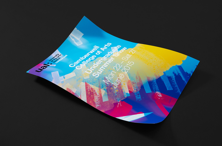
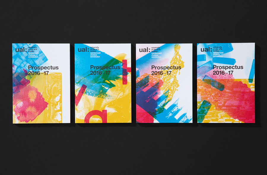
Each panel delivers impact from a distance and provides plenty of detail up close, functioning well as a unifying tool for both print and digital environments, from large format posters to flyers to online banners. These panels confidently mix a variety of visual textures, touches upon an abundance of technique firmly rooted in the practices and eclecticism of each college, and does a good job of blending these using an overprint treatment. Although the techniques are familiar, and easily derived from any number of art and design colleges, there is a sensitivity and gestalt quality in the consideration of colour, balance, direction, proportion, form, contrast and composition that marks these out as unique.
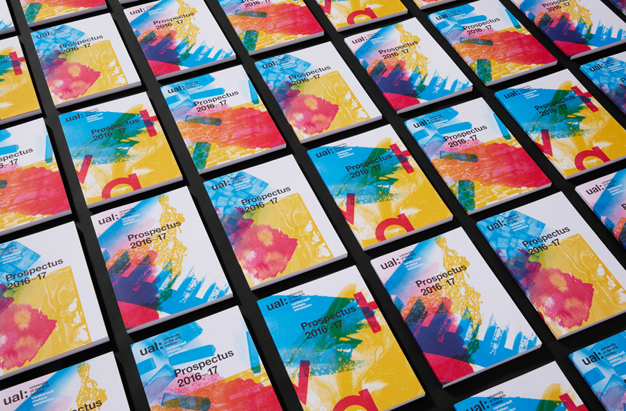
Watercolour, marble, brush, pen, pencil, stamps, letterpress, glitch, bitmap, photography and spray paint are all represented and effectively brought together. There is variety and individuality in the interaction of form and a unity in colour. Together these effectively convey, in a universal but distinctive manner, some of the creativity energy, opportunity and life at a creative institution, but also the chance for individual expression, exploration and experimentation. Although this variation does not go as far as say Absolute Unique, running a number of different covers feels communicatively relevant whilst also being aesthetically compelling.
Fewer inside shots reveal the priorities of the project. These take a more conventional but well-implemented approach. Simple layouts, type over image, appropriate typesetting, white pages punctuated by colour and photography makes sure that an profusion of information is structured, broken up and not overwhelming.
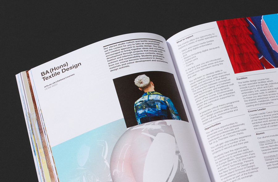
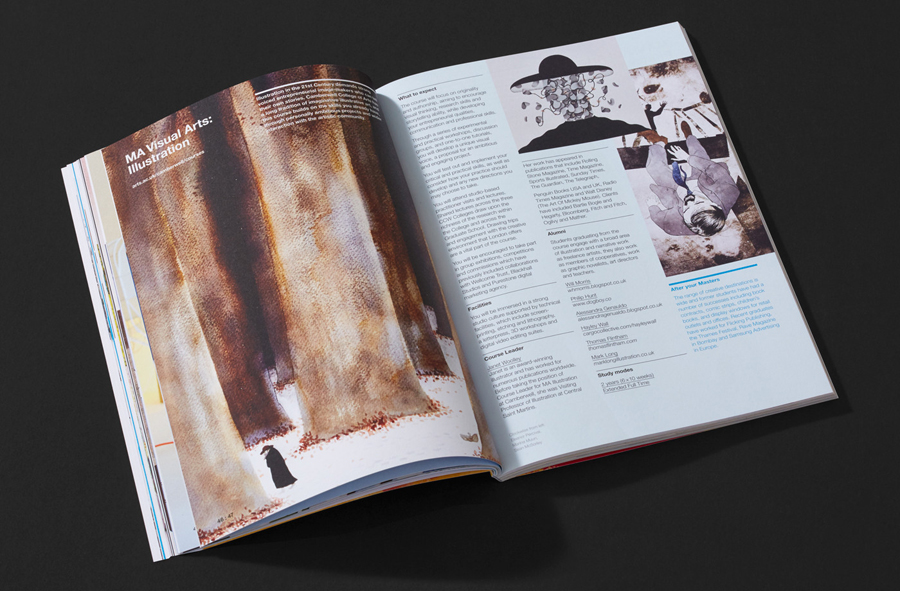
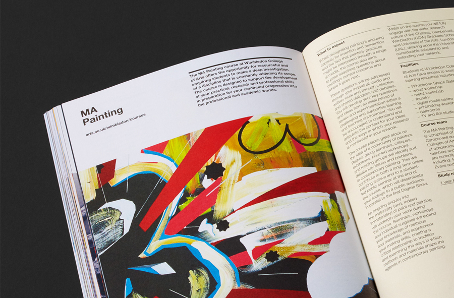
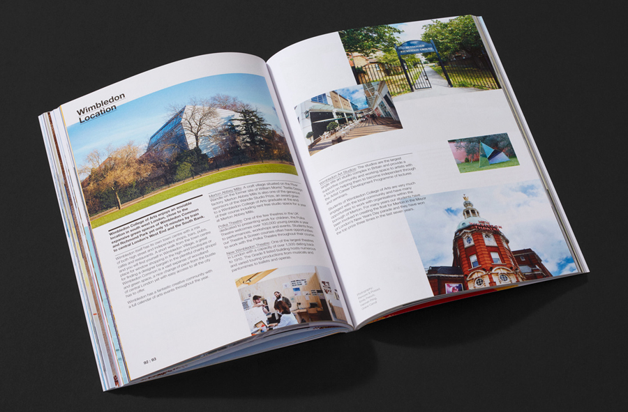
Spy’s work has a bright, lively and textual quality that appears well-suited not only to artistic practice and a creative institution but also to the time of year. It is a testament to the minimal character but practical structure of the UAL visual identity system, and the juxtaposition that arises from the institutional programming of creative endeavour. This acutely manifests itself here as vivd colours and organic crafted textures framed by typographic austerity. Character and individuality meets structure and consistency. This is a common theme throughout the UAL visual language but perfectly characterised by this piece. More from Spy on BP&O.
Design: Spy. Opinion: Richard Baird. Fonts In Use: Helvetica
