Designed by Spy
Boundless Theatre by Spy
Boundless Theatre, led by Artistic Director Rob Drummer, is a UK based theatrical group that creates plays for 15 to 25 year olds, “as well as curious others”, that respond to a diverse global culture and empowers young people to collaborate and find their voice. In the spirit of the name, Boundless Theatre tours both nationally and internationally. With the intention of...

London School of Hygiene & Tropical Medicine by Spy
The London School of Hygiene & Tropical Medicine (LSHTM) was founded in 1899 and has established itself as a world leader in the fields of research and postgraduate education in public and global health. The university is made up of more than 4,000 students and 1,000 staff across 100 countries, and is one of the highest-rated research institutions in the United Kingdom....

H+J by Spy
H+J is a UK independent catering business, established in 2004, that has provided food and catering solutions to venues such as The Cutty Sark, Moët & Chandon, Abbey Road, RIBA and Selfridges. Their services include working lunches and private dining rooms, large scale food courts, cafes and deli bars. London-based graphic design studio Spy worked with H+J to develop a new brand identity that would...
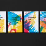
UAL 2017–18 Campaign by Spy
The University of the Arts London is Europe’s largest specialist arts and design university. It is made up of six colleges, each with its own unique character and programme, yet unified in their effort to deliver a high quality creative eduction. This united position is expressed through a visual identity system developed by Pentagram partner Domenic Lippa. Based around Helvetica, UAL’s visual identity affords each...

Royal West of England Academy by Spy
Royal West of England Academy brings world-class visual art from around the world to Bristol. It is the city’s first art gallery, the UK’s only regional Royal Academy of Art, and is located in a grand Grade II listed building. RWA worked with London-based graphic design studio Spy to develop a visual identity that would feel relevant and engaging, and re-establish confidence...
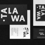
Talawa by Spy
Talawa, Jamaican patois for “small but feisty”, is an all black theatre company that looked to address the lack of opportunities for minorities and their marginalisation at the time of its founding in 1986. Since then it has established itself as one of the most successful theatres of its type in the United Kingdom. “Our work is informed by the wealth...

Goldsmiths, University of London by Spy
Goldsmiths is a world-renowned public research university founded in 1891 and located in south-east London. It provides a diverse programme of study, but specialises in creativity, and covers the arts, design, humanities, and social sciences. Goldsmiths’ heritage, which was reflected in its previous identity in a familiar and conventional manner, makes way for a far more current visual expression created by...
UAL 2016–17 Campaign by Spy
The University of the Arts London is Europe’s largest specialist arts and design university. It is made up of six colleges, each with its own unique character and programme, yet unified in their effort to deliver a high quality creative eduction. This united position is expressed through a visual identity system developed by Pentagram partner Domenic Lippa. Based around a robust, black and white...
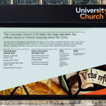
University Church by Spy
Located at the heart of Oxford, University Church of St Mary the Virgin, abbreviated to University Church, has been a site of worship and debate for over 700 years and is the “spiritual home” of the oldest university in Britain. The church recently received a grant from the Heritage Lottery Fund to raise awareness of the historical nature of the site...
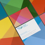
Theatre Royal Plymouth by Spy
Theatre Royal Plymouth (TRP) is the largest and best attended regional producing theatre in the UK and leading promoter of theatre in the South West. It runs a diverse programme of performances, activities and events, and has a 1300 seat auditorium capable of delivering West End musicals, opera and ballet, as well as a smaller 175 seat theatre for experimental productions. The building,...

Haverstock by Spy
Haverstock is a UK based architectural practice that specialises in public-sector projects with a strong humanistic approach that enables “clients and the people who use the buildings to have a voice, and to shape the way their building ends up”. Following the retirement of Haverstock’s founding partners design studio Spy was commissioned to develop a new brand identity for the firm—which included a...