BOL by B&B Studio
Opinion by Richard Baird Posted 26 June 2015
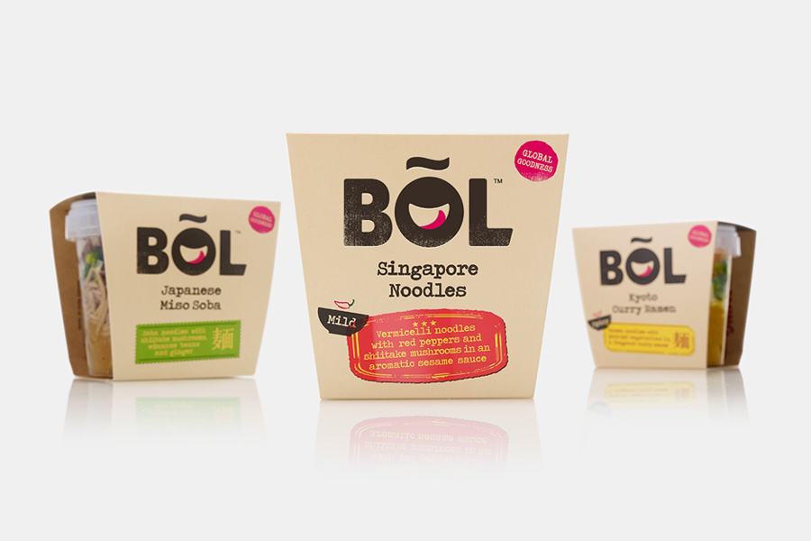
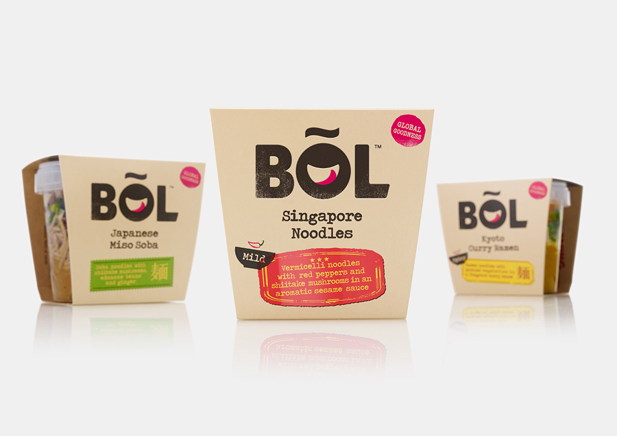
BOL is a range of vegetable pots made from fresh natural ingredients using recipes inspired by local chefs and street market stalls from a variety of international destinations, packed and presented with a modern on-the-go convenience in mind. BOL was created by Paul Brown, the former general manager of Innocent’s food division, following the company’s exit from the category, and features brand identity and packaging created by UK based graphic design agency B&B Studio.
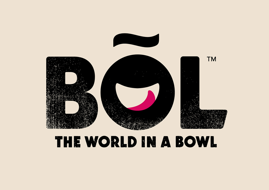
B&B Studio manage to distil down BOL’s key propositions of simple, tasty and filling food, and the concept of global made local, into just a few assets whilst establishing identifiable brand character. Each asset has a communicative intention and contributes to a compelling aesthetic whole.
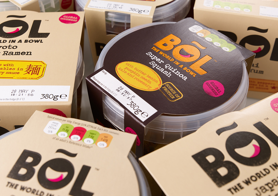
The logotype does a good job of touching upon bold flavour, a filling and wholesome experience, locality and enjoyment through heavy uppercase sans-serif characters, a rough stamp texture and a neat smile/bowl detail set within the counter of the O. It leverages the familiar and understandable yet is distinctive in its resolution of these.
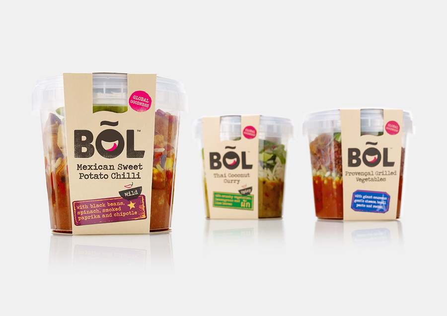
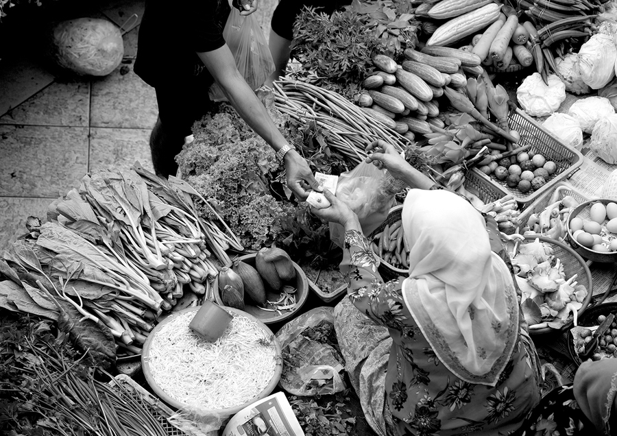
A global connection is made through the diacritic above the O, the strapline, the association between mechanical font and international telegrams of the past, straightforward language choices, rich market photography online, and in the leveraging of the colour, iconography and form language of airmail stickers, export declarations and passport stamps — a particular highlight. Like the smile, tongue and bowl of the logotype, there is a moment of play in the variety of these stamps alongside a clear communicative function.
The natural quality of BOL’s ingredients and the simplicity of its recipes feels directly tied to the number of assets and colours used across the packaging, while the composition of these makes good use of the tapered panels of a custom sleeve. The result is a simple, playful aesthetic character underpinned by a clear communicative intention that leverages familiar and universal devices, and effectively balances the implicit and the explicit. More from B&B Studio on BP&O.
Design: B&B Studio. Opinion: Richard Baird
