Fundació Joan Miró 40th Anniversary by Mucho
Opinion by Richard Baird Posted 3 August 2015

Fundació Joan Miró is a cultural centre located on Barcelona’s Montjuïc hill. It was opened in 1975 as a place to encourage young artists to experiment with and exhibit contemporary art, and would allow the general public better access to new work of the time, which it continues to do today.
Fundació Joan Miró has a distinctive exterior structure of modular geometric prefabricated surfaces, extrusions, recesses and voids designed by Josep Lluis Sert. Although imposing in form it has at its heart a natural path that guides visitors through its spaces.
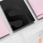
Graphic design studio Mucho worked with Anna Noëlle to develop an identity and campaign material that would help celebrate 40 years of Fundació Joan Miró. Drawing on the building’s structure, its cultural agenda and history, whilst also acknowledging its permanent brand identity through contrast, Mucho created a system based around a bold number set, picking out key dates within the history of the building, and derives visual impact through a juxtaposition of austerity and moments of celebratory expression. This extends across business cards, packaging, event invitations, banners, badges and posters.
With such a significant and unmistakable appearance it is pleasant to see this not dominating Fundació Joan Miró’s permanent identity. Where you might expect a silhouette, the centre favours a signature component alongside Bau Bold, a typeface rooted in Bauhaus and 20th century modernism. The restraint of the permanent identity and the temporary nature of an anniversary makes for an interesting context, one that has afforded Mucho the opportunity to revel in form and structure where such a treatment could have been perceived as literal and limited.


The centre’s forms are broken down and reassembled into a unique set of numbers. Mucho finds a comfortable intersection between architectural and period references, distinction and legibility, with some characters serving one particular intention over the other yet remaining cohesive in concept and aesthetic.
The visual vernacular and principles of architecture such as fills and voids, light and shadow, proportion and contrast — which appear to be exaggerated across the structure of Fundació Joan Miró — permeate Mucho’s identity system through large signage and a pop-up invitation, heavy letters with fine lines, small copy alongside huge dates, and a use of white and grey to place emphasises on form.


The meeting of imposing structure and an accessible and broad social agenda is reflected in the contrast of typographic form, weight and oversized use in print, and the use of colour and image across posters and signage. Print communication take on a celebratory quality, and to some degree, the aesthetic sensitivities and preferences of mid-20th century Olympics in their reduction in print, which is expanded upon in motion.

Each piece of campaign communication, although divided by period and their references to exhibitions decades apart, is effectively anchored by the typographic form and bold application of Mucho’s identity.
Typographic size and shape function to mark out a clear association with the structure of Fundació Joan Miró and its history, while the introduction of colour and image, often in contrast to type, work well to expose the diversity of content that make a permanent, unchanging and dominate structure continually relevant and its exhibitions accessible. This is explored more explicitly within a timeline video.
Much of this is subtext, however, colour, shape and contrast, at their most fundamental level, deliver the necessary visual impact from a distance, detail up close and are cohesive across the city. More from Mucho on BP&O.
Design: Mucho. Opinion: Richard Baird. Fonts Used: Bau