Nicholas Architects by Strategy
Opinion by Richard Baird Posted 10 August 2015
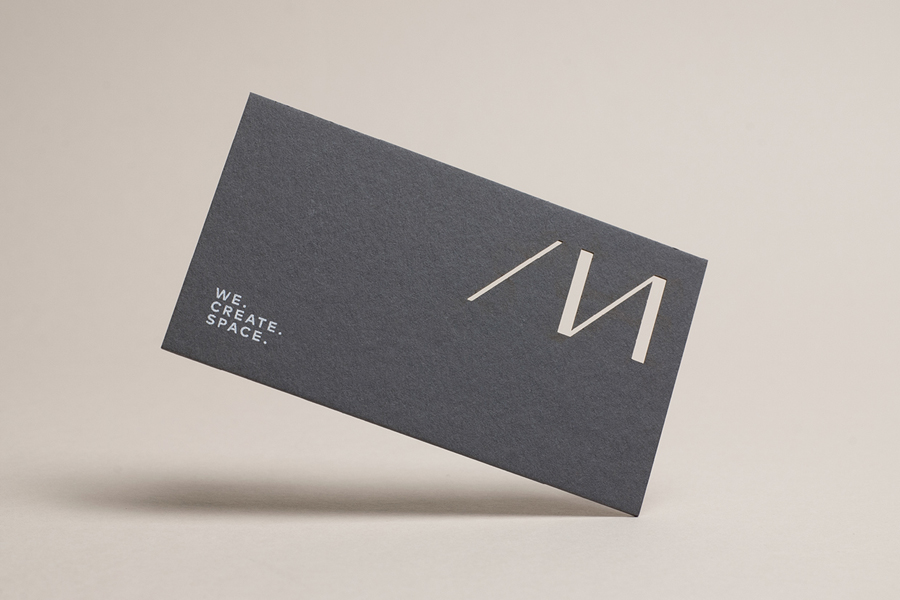
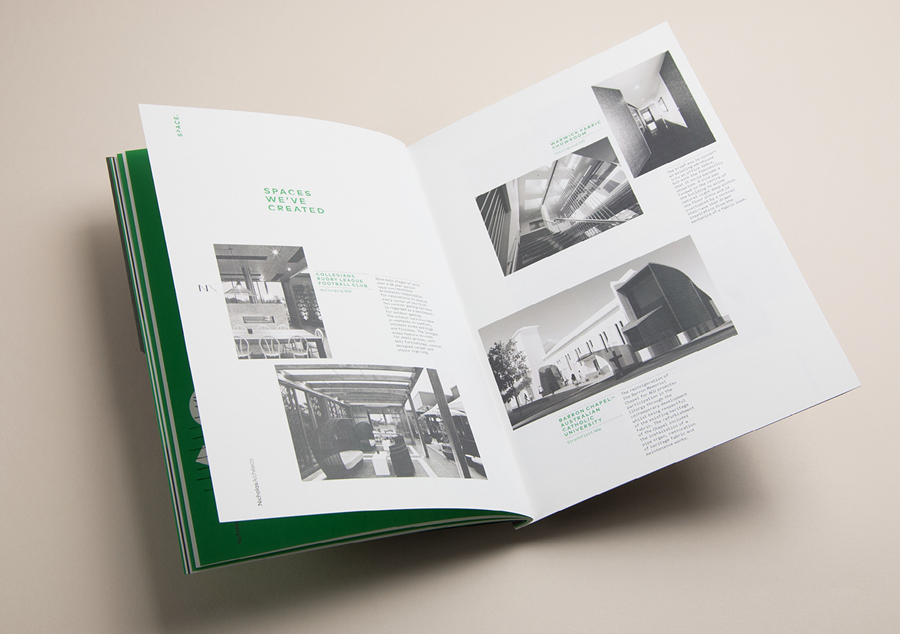
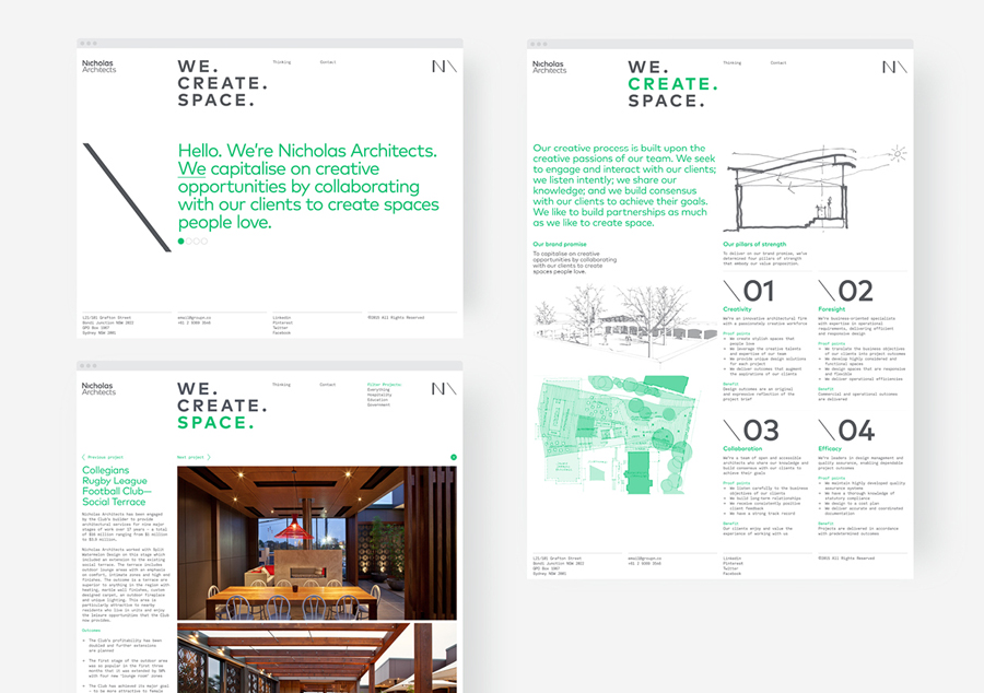
Nicholas Architects is an Australian architecture studio working within both the private and public sectors from its offices in the city of Sydney. The studio has a portfolio of community centres, golf clubs, ambulance stations, sports terraces and university campuses, amongst a variety of other structures and spaces. Nicholas Architects commissioned Strategy to develop a new visual identity treatment—which was recently announced as a finalist in this year’s Best Awards—that included monogram and logotype design, business cards, brand guidelines, brochure and website.
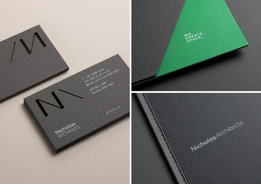
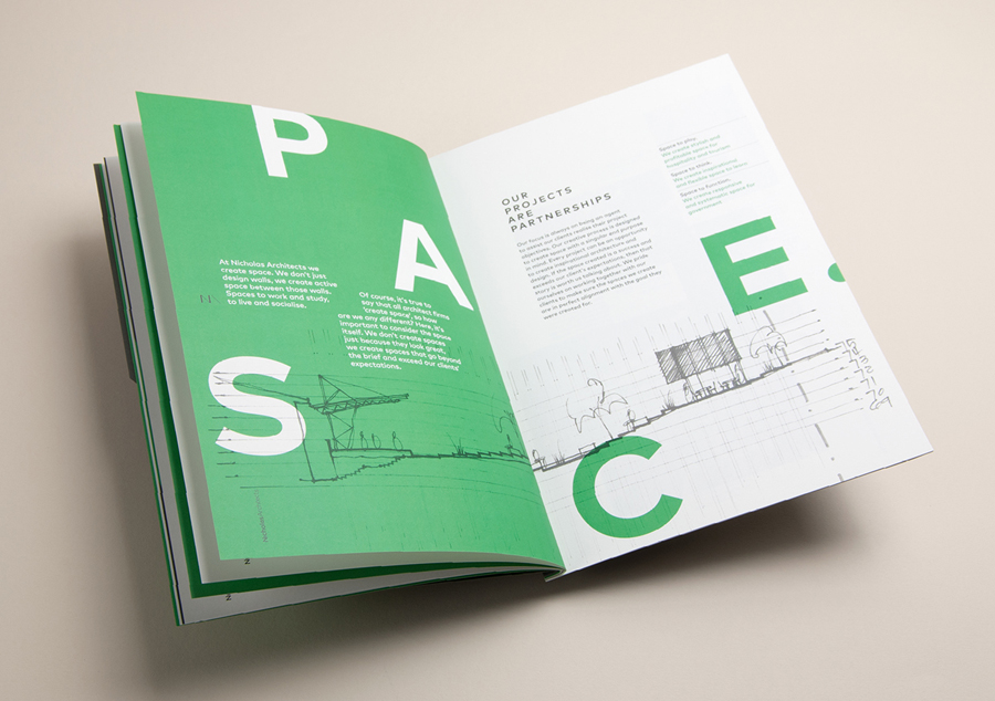
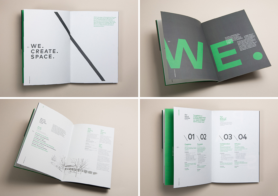
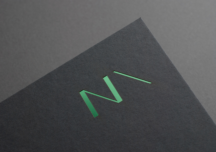
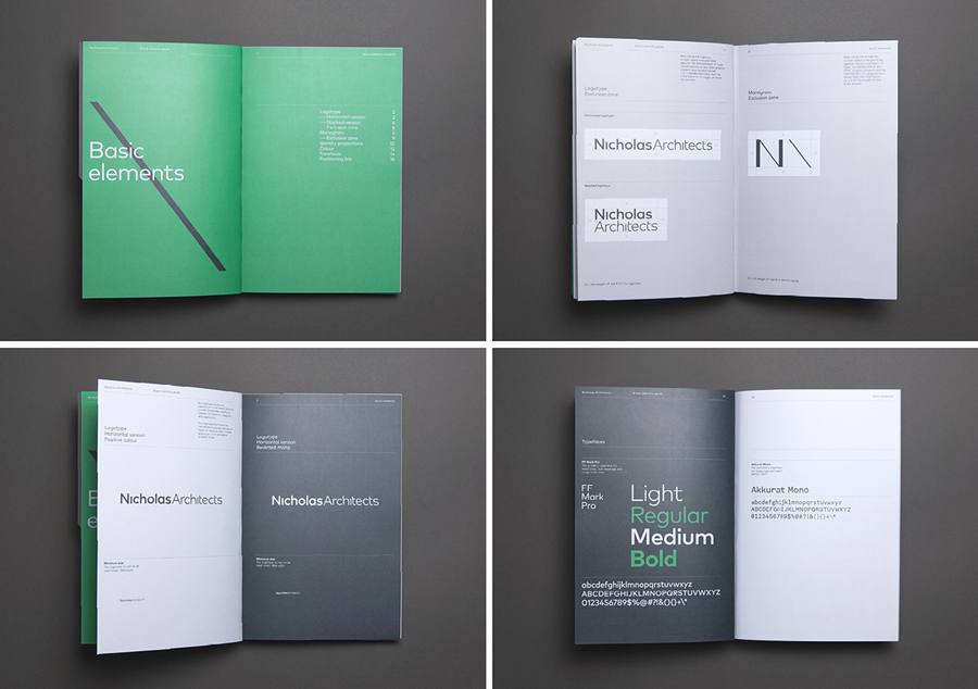
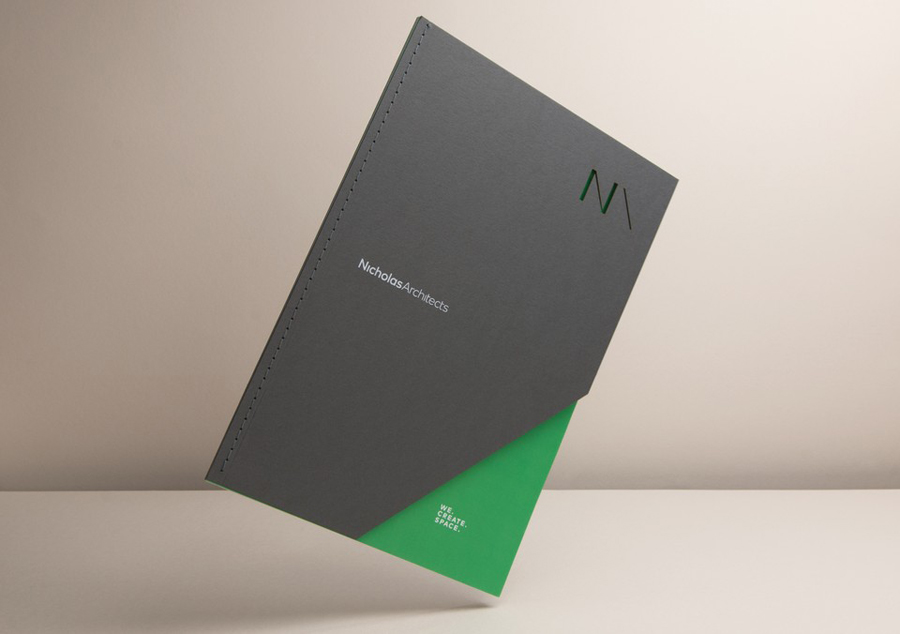
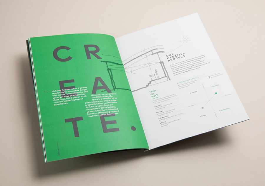
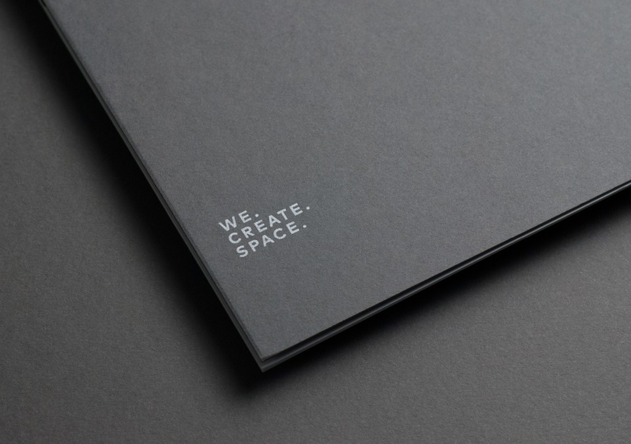
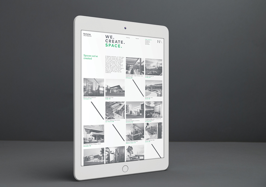
Strategy’s solution plays with many of the themes of contemporary architecture. These include, but are not limited to, light and shade, solid form and voids, robust structure and materials, space, reduction and an element of the technical, think floor plans and elevation drawings. These manifest themselves within Nicholas Architects’ identity as light ink across heavy, uncoated, dark grey boards, a geometric monogram, the tension within this and its use of triangles, grid based layouts, plenty of white space online, a stacked and single line logotype of sans-serif characters absent tittles, die cut detail and the use of a monospaced type choice.

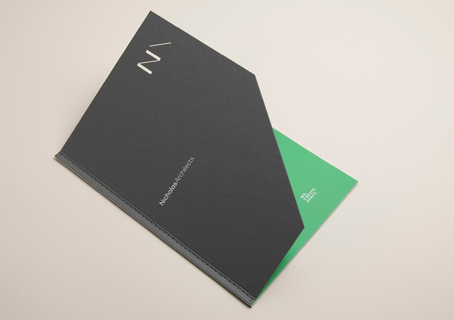
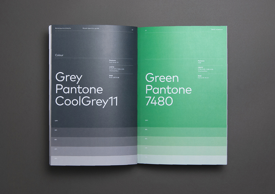
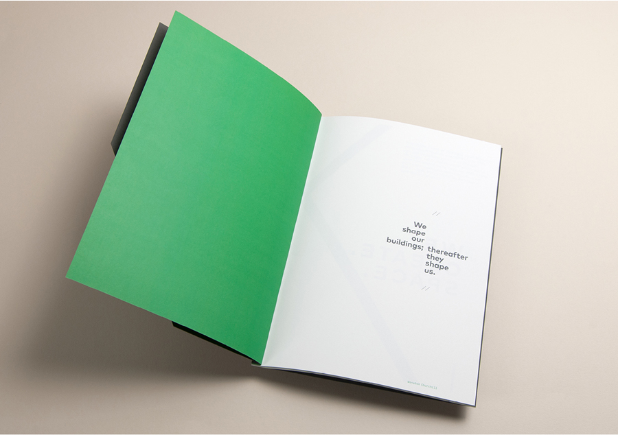
Although familiar in their architectural reference points, and frequently utilised within the branding of architecture business, these forms and finishes are clear in their communicative intention. Alongside a green highlight—an unusual deviation from expectation, introducing what could be perceived as an environmental component—and in conjunction with colour contrast and an emphasis on typographic proportion, bold geometric letterforms next to light hand drawn sketches, manages to also secure visual interest and distinction. This is expanded upon with a die cut monogram, diagonal cuts and unusual binding across brand guidelines and brochure. More from Strategy on BP&O.
Design: Strategy. Via: Best Awards. Opinion: Richard Baird
