Springs’ Smokery by Distil Studio
Opinion by Richard Baird Posted 13 August 2015

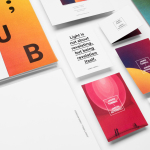
Springs’ Smokery has been producing high quality smoked salmon for three generations from its location in South Downs, UK, using Sussex oak and a traditional dry-salting process which has remained unchanged for 50 years. Springs’ recently worked with graphic design studio Distil to develop a new visual identity and package design. Distil’s treatment is an exercise in aesthetic impact derived from colour and form contrast, and a conceptual and communicative simplicity that makes a connection with the traditional craft and process of smoking salmon but also draws on the themes of heritage and the sea.

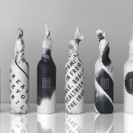
Using the charcoal from Springs’ brick kilns, Distil Studio developed a series of striking, hand drawn, black and white illustrations firmly rooted in the art and craft Springs’ process. The linear strokes and radial imagery, their loose, organic and textured qualities, are expressive and individually distinctive, yet have a clear cohesive quality. These move between the rings of an old oak tree — there is a neat heritage subtext inherent to this — and a connection to the sea, made through what look like undulating waves, crashing waves and sea shore, as well as to charcoal and chopped oak. This dual notion feels intentional in its reference but visceral in its aesthetic.


Contrast has been used to good effect, working from a distance to differentiate and providing some nice detail up close. This is achieved through the black and white of the illustrations and the bright pink of the salmon, the organic strokes and texture of the charcoal and natural lines of the fish alongside the geometry of type and die cut window. A silver block foil reinforces the product’s premium positioning in a familiar and reassuring way.
The concept is implemented with confidence and restraint in print and online, and given a layer of contextual detail using a small storytelling component, provided by Peter Dunkley, while product photography finds a comfortable meeting point between convention (chopping boards and seasoning) and the simplicity that underpins the packaging. These images also introduce earthy colour. There are a variety of other assets that make up Springs’ brand identity, so do take a look at Distil Studio’s project page.
Design: Distil Studio
Opinion: Richard Baird
Fonts Used: Lulo Clean One