Basement Theatre by Studio Alexander
Opinion by Richard Baird Posted 24 August 2015
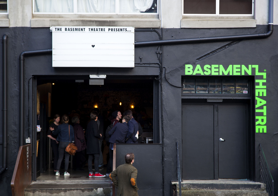
Basement Theatre is an independent, underground, community theatre located on Auckland’s Lower Greys Avenue. It was established in 2008 as a place to showcase new voices, fresh perspectives and emerging young talent, and to provide these with the space to develop their performances. The theatre has played host to dancers, visual artists, poets, musicians, comedians and everything in between.
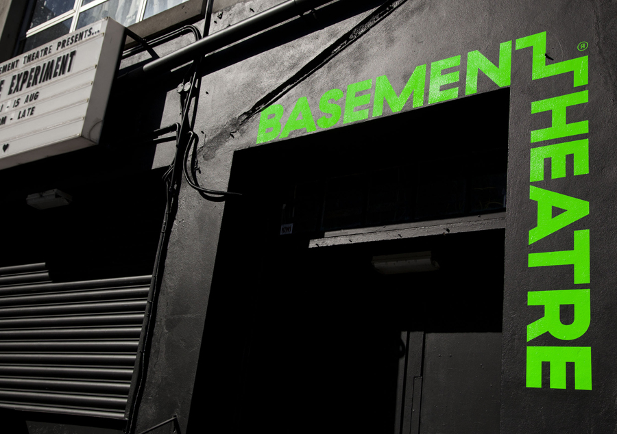
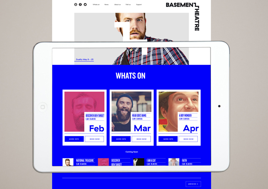
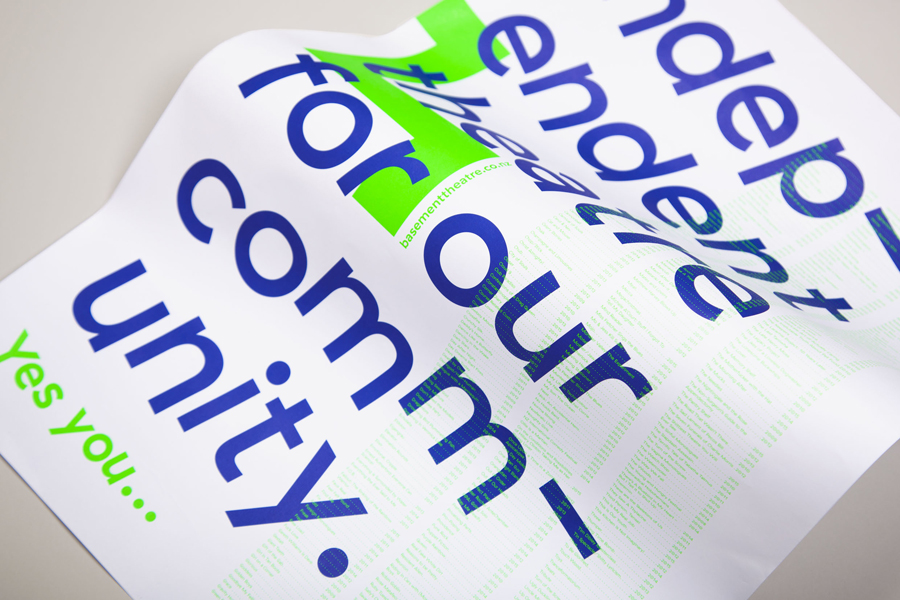
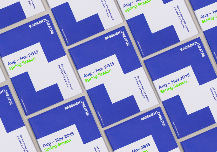
Taking their cues from the unique basement location, and a brief that called for a bold, playful and edgy identity, Studio Alexander built a system around a simple but smart logotype with a step component, the impact of fluorescent inks, tinted photography, rotalics and plenty of contrast.
Studio Alexander’s approach is thoroughly current. This runs throughout their choice of font and typesetting, their treatment of image, the mix of orientation and the use of neon spot colours. The studio effectively uses these to secure visual impact from a distance, detail up close, and addresses the bold, youthful and convivial qualities set out in the brief.
The logotype is a neat and memorable visual trick that plays out well as a framing device in print and online—think floor space, while the steps that link the two words, although not particularly own-able as a logo, makes a simple yet appropriate connection to the unique underground location of the venue. This step motif is then used to punctuate and break up image and type with heavy blocks of colour.
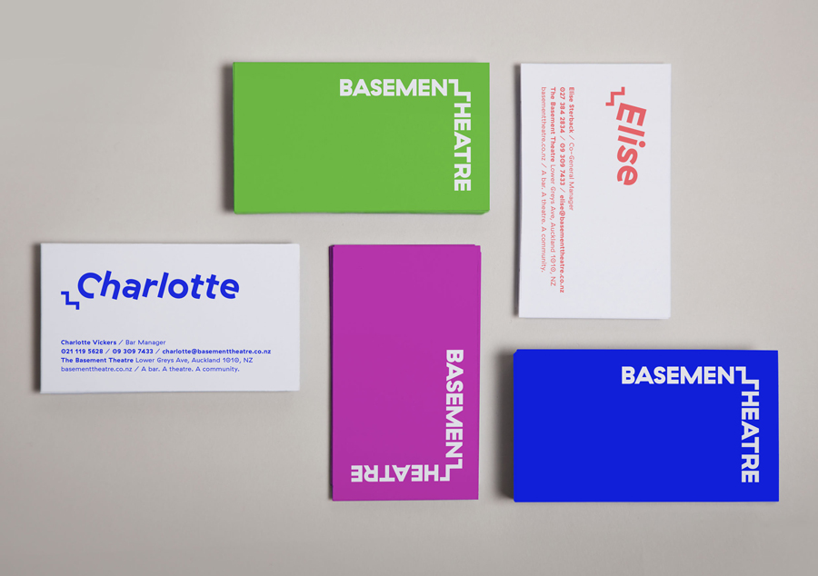
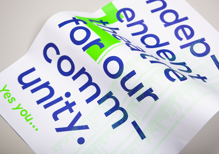
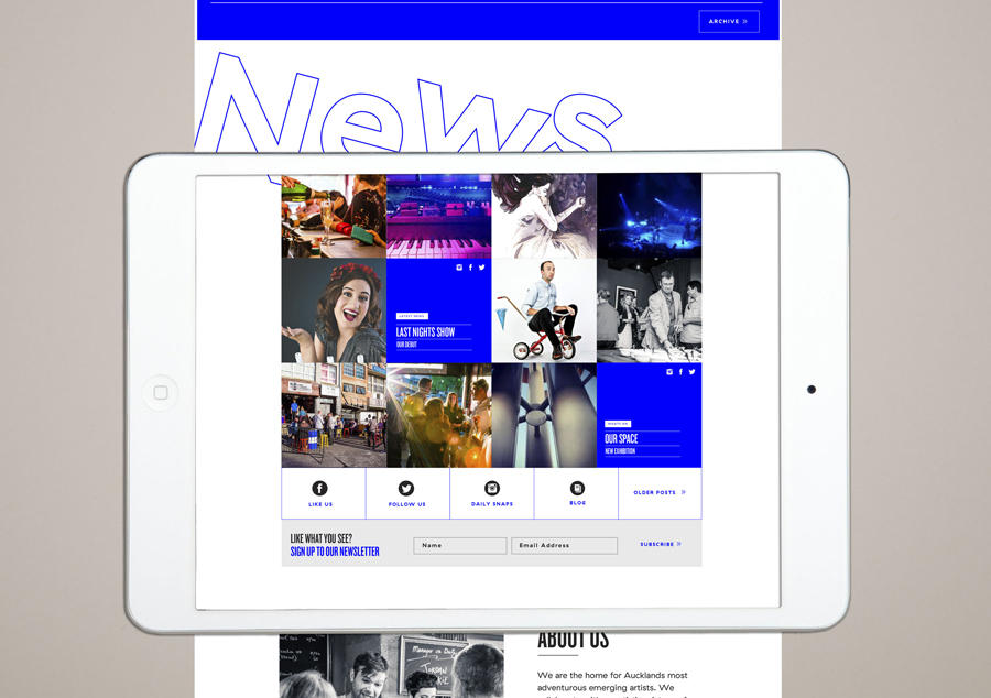
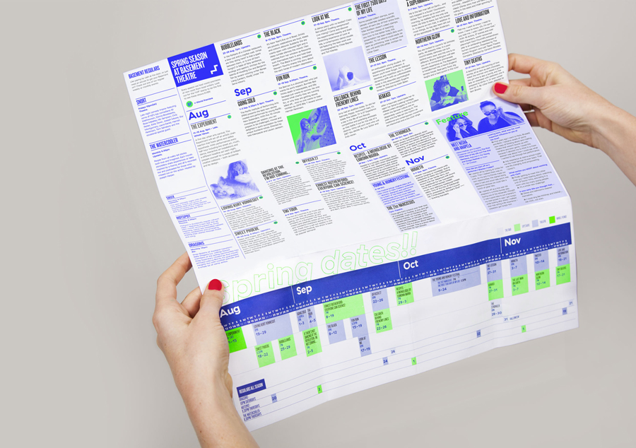
The business cards, posters and programme play with typographic proportion and orientation, flow and juxtaposition, bright fluorescent fills alongside white space, structured layouts and the light and shade of monochromatic photography in a way that makes a connection with the use of coloured lighting, staging, movement and the arrangement of objects within a theatre space. This also manifests itself online, but to less of a degree.
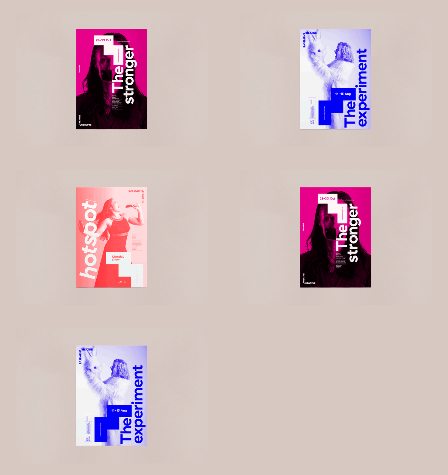
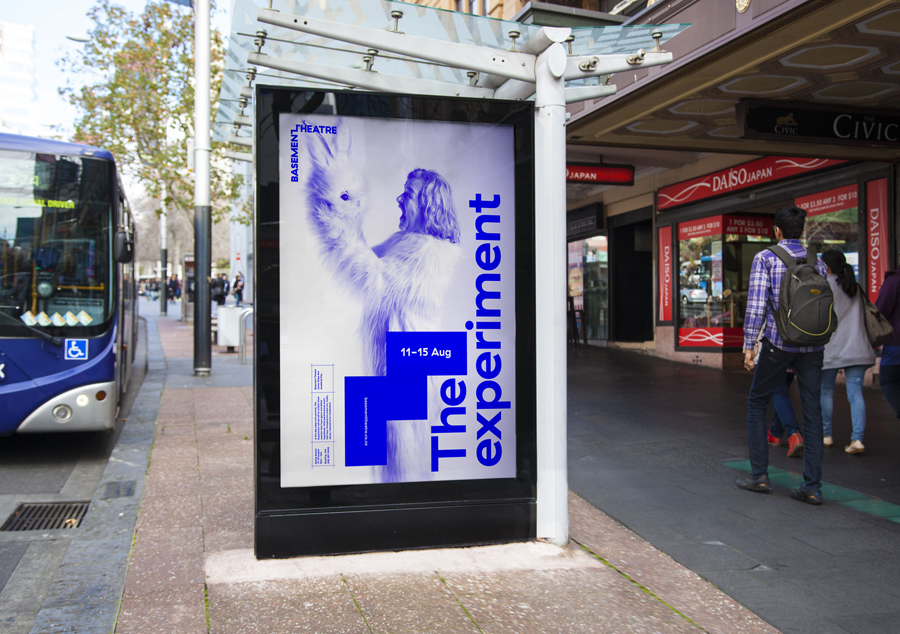
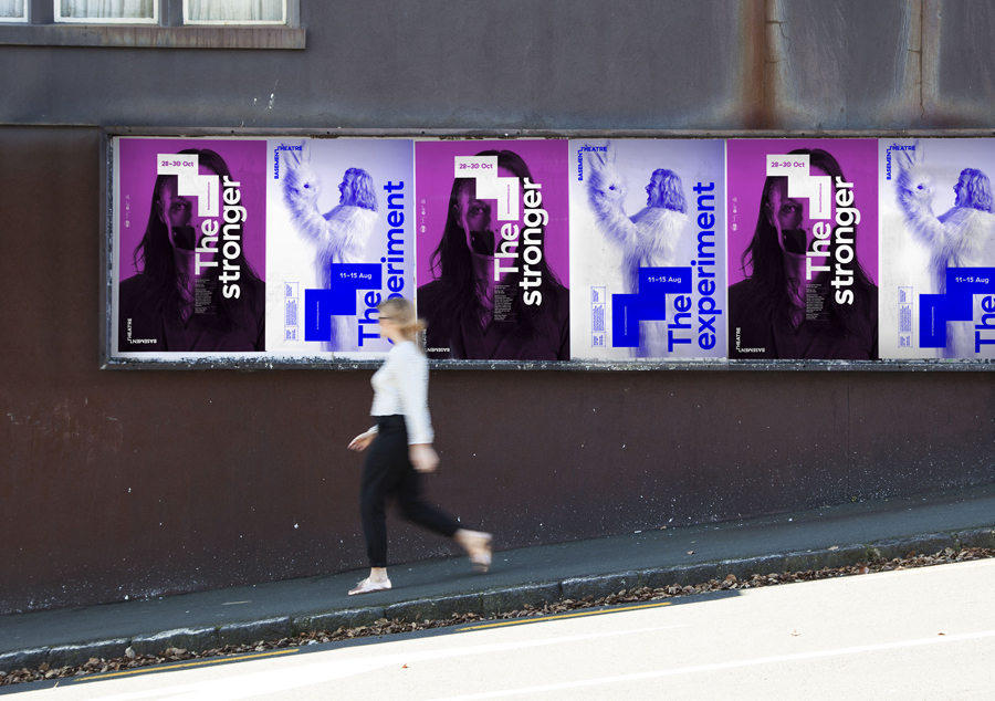
The connection made between theatre space and its flexibility, and the modularity inherent to visual identity systems, is most acutely seen across the posters. The layouts, blocks of colour, the few but impactful elements available and the straightforward tinting of image, establish an easily replicable set of assets with room for play and communicative diversity whilst remaining stylistically cohesive. This also acknowledges the varying skill level of those implementing the system without undermining the concept or appearing rudimentary.
The photography, as seen in the examples above, are perhaps the weakest element. While offering a layer of detail next to reductive type and geometric form, these fall a little short, but do have a small independent theatre quality to them.
Various weights and styles of Grilli Type’s Haptik secures moments of character and a current on-trend quality. Rotalics, emphasised first names across the business cards, and oversized type cross the posters makes sure that the youthful energy and the variety of contemporary performance that makes up the theatre’s programme is clearly communicated, and emphasised using bright colour and white space.
The result successfully mixes a youthful, playful and contemporary energy with a professional and consistent structure easily implimented by independent designers with room for variation. It effectively draws aesthetic impact from clear communicative intentions and references the unique underground characteristic of the space. More from Studio Alexander on BP&O.
Design: Studio Alexander. Opinion: Richard Baird. Fonts Used: GT Haptik
