Bregenzer Festspiele by Moodley
Opinion by Richard Baird Posted 22 September 2015
Bregenzer Festspiele is a performing arts festival and opera venue with a 7,000 seat open-air amphitheatre. The festival is held each year in July and August and features a unique set built on top of a floating stage on Lake Constance in the Austrian city of Bregenz. Notable set designs include a giant book and skeleton for Giuseppe Verdi’s Aida, the twisted metal of West Side Story, and the giant eye of Giacomo Puccini’s Tosca, which was also used as a location for the James Bond film Quantum of Solace.
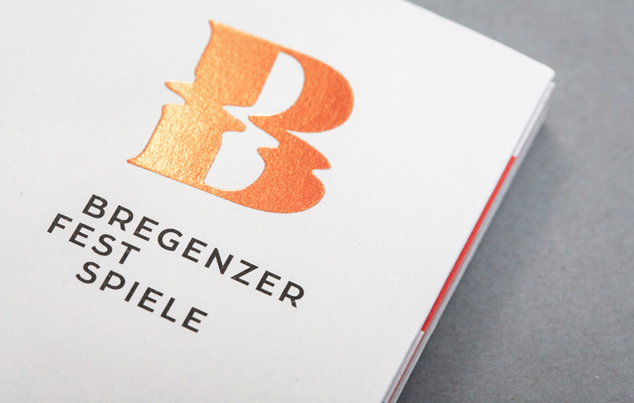
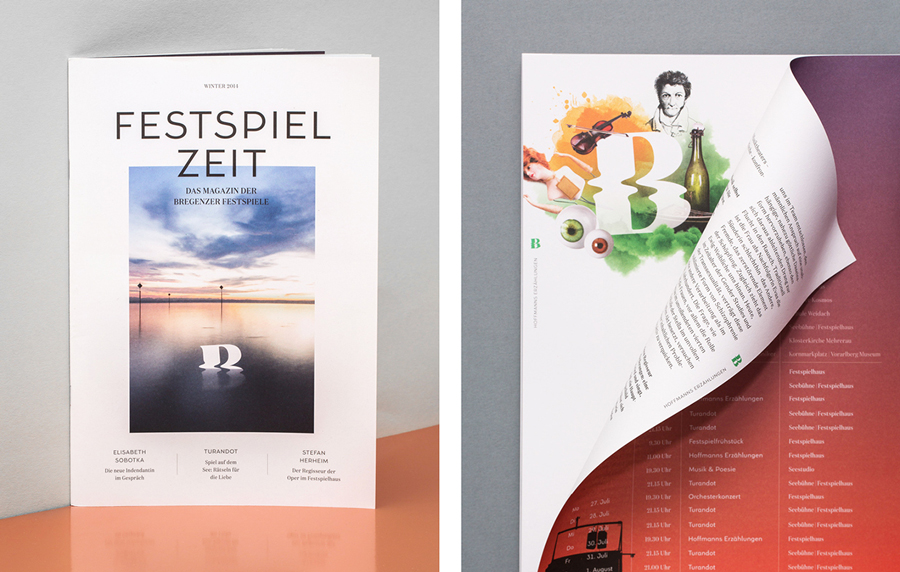
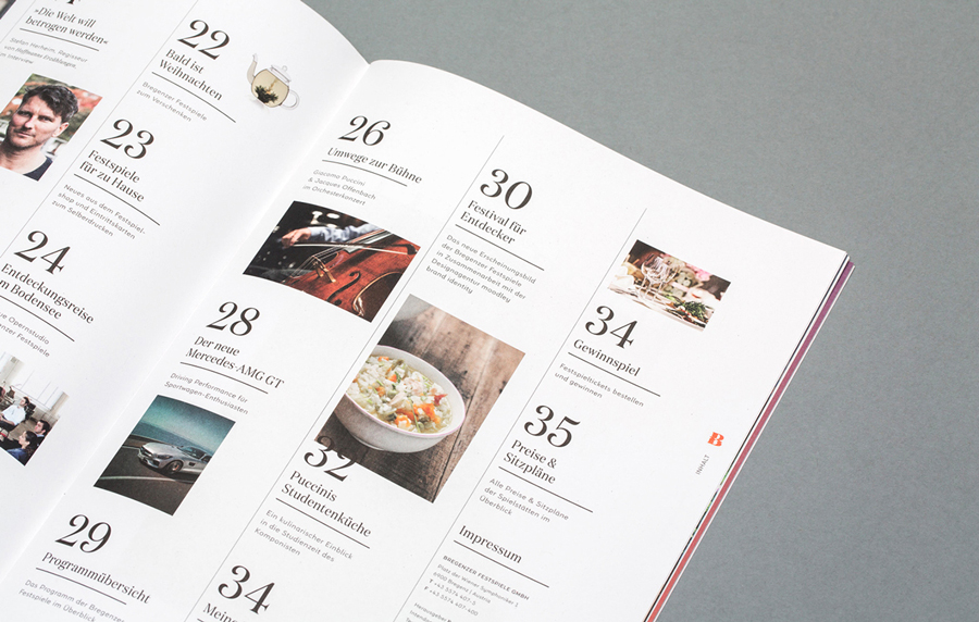
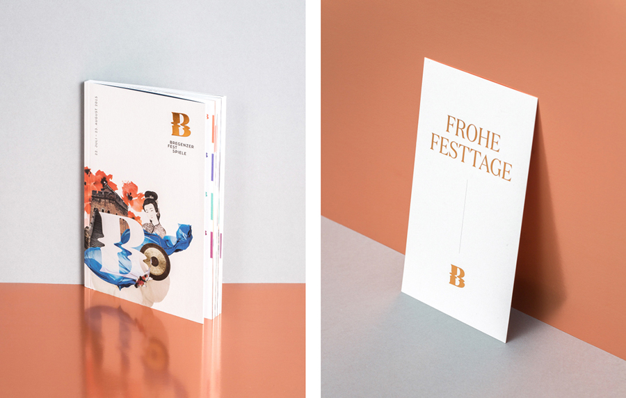
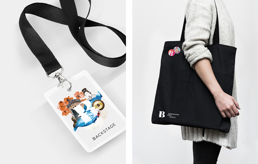
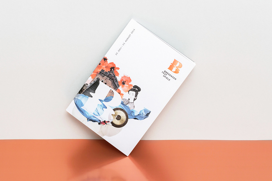
To capture the unique qualities of Bregenzer Festspiele, the diversity of its performances, and position opera as more accessible, the festival worked with Graz and Vienna based graphic design studio Moodley to develop a new brand identity. This went on to include logo, logotype and collage design, and extended across programmes, playbills, sales packages and outdoor campaigns.
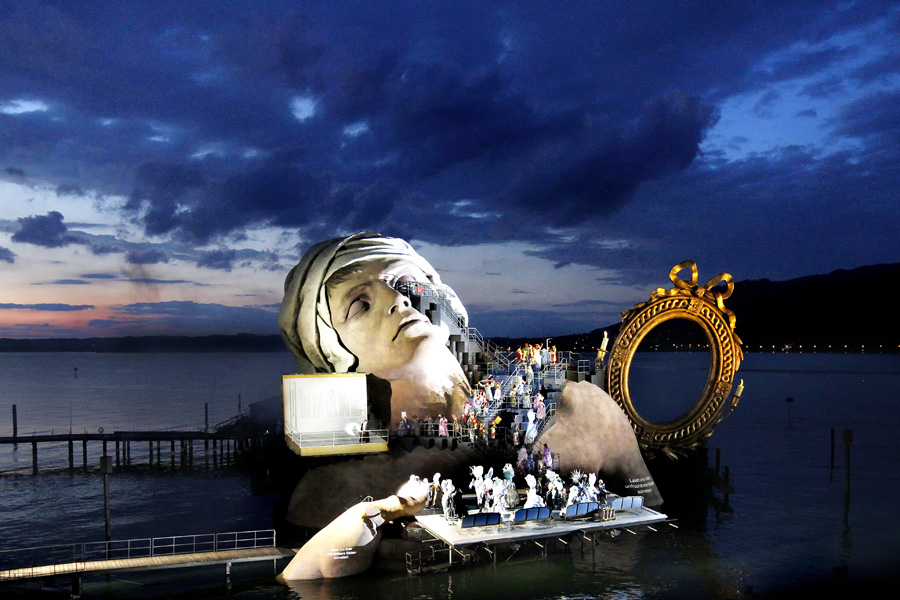
Image: Anja Koehler / © Bregenzer Festspiele
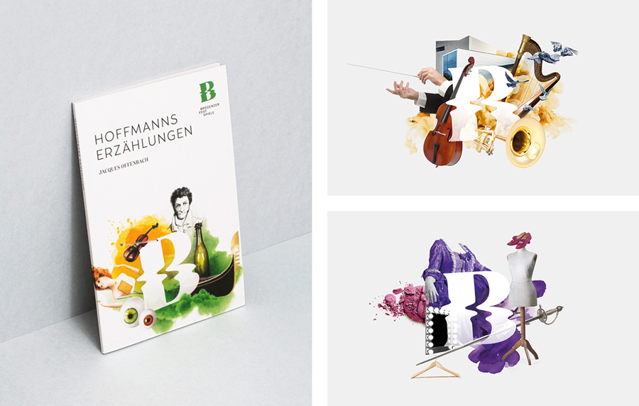
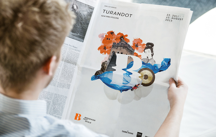
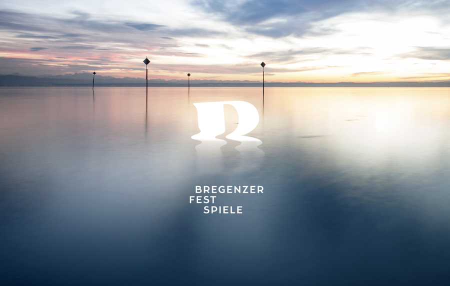
Moodley’s approach makes a clear connection with the theatre’s unique location, captures the distinctive character of its set design, and both classic and contemporary performance through a contrast of a simple rippled logo alongside rich photographic and illustrative collages, typographical flourish and sans-serif reduction, bright colour and plenty of unprinted space.
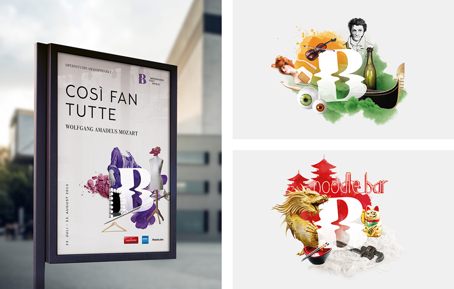
Collage—in its juxtaposition of texture, colour and objects—works well to mirror the structural qualities of the sets, communicate a little of the themes/tone of performance, as well as their variety, and deliver visual impact in a variety of contexts and from a distance. This is further emphasised through plenty of white space and simple layouts.
The collages are bright, dynamic and compelling, appear accessible in their convivial mix and composition of objects, interesting in their diversity of content yet cohesive in their structure around the logo and implementation. Serif flourishes and sans-serif reduction layer aesthetic impact with more direct communicative layer but also a duality that draws on and expresses a classic and contemporary programme. More from Moodley on BP&O.
Design: Moodley. Opinion: Richard Baird
