Norwegian Presence by Bielke&Yang
Opinion by Richard Baird Posted 23 September 2015

Norwegian Presence was an exhibition of handcraft and design, past and present, from Norway. It was held at Fuorisalone, which makes up part of Milan Design Week, and moved on to The Gifts & Interior trade fair in Oslo and 100% Norway in London. The exhibition featured 51 different products from 46 designers, with the intention of showcasing a diversity of approaches, innovations, skills and materials.
Norwegian Presence was made possible through a collaboration between Klubben (Norwegian Designers Union), contemporary craft proponent Norwegian Crafts, and Norwegian Icons, an organisation dedicated to raising the international awareness of Norway’s contribution to Scandinavian mid-century design. Other partners included paint manufacturer Jotun, stylists Kråkvik & D’Orazio, and graphic design studio Bielke&Yang, who were responsible for visual identity and print communication.

Milieu Grotesque’s Maison Neue, its clear typesetting, lots of space, white board framing product shots, underlined by black text, take a contemporary gallery-like approach. These stand out from an industrial, utilitarian, retrofitted space, its warm yellow lighting and screens of modern desaturated colour inspired by the Norwegian mountains, woods and sea.
The space, its lighting, the colour of plinths and panels, the choice of type and use of ligatures appear collectively distinctive and contribute to a sense of identity, but also appear to balance functionality (illuminating, dividing and categorising space) with moments of craft, much like the furniture and products on display.


A series of black and white illustrative panels, inspired by some of the material patterns and products of the exhibition, alongside a grotesque sans-serif described as contemporary but with a classic touch, and its typesetting across brochures and print, provide striking visual impact and contrast to the colour, texture and detail of the exhibits.
These draw on a current favour for the reductive and modernistic, typefaces from small foundries, and what is likely to be perceived to be a Scandinavian restraint. Each choice feels well-suited to an exhibition of the simple forms and fine craftsmanship of Norwegian furniture, past and present.


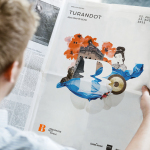
The brochure layouts play with a contrast of type size and orientation, reduction of form and product detail, and blocks of type surrounded by plenty of space. Alongside panels of colour, close up shots and still life photography that mix coloured panels and plinths with concrete backdrops, the catalogue effectively makes a connection with the exhibition space, the furniture on display and the principles and values that continue to underpin Norwegian design. More from Bielke&Yang on BP&O.
Design: Bielke&Yang
Styling: Kråkvik & D’Orazio
Colours: Jotun
Images from Milano: Espen Grønli
Images from Lillestrøm: Birgit Fauske
Studio Images: Lasse Fløde.
Opinion: Richard Baird
Fonts Used: Maison Neue