Team Impression by Design Project
Opinion by Richard Baird Posted 5 October 2015
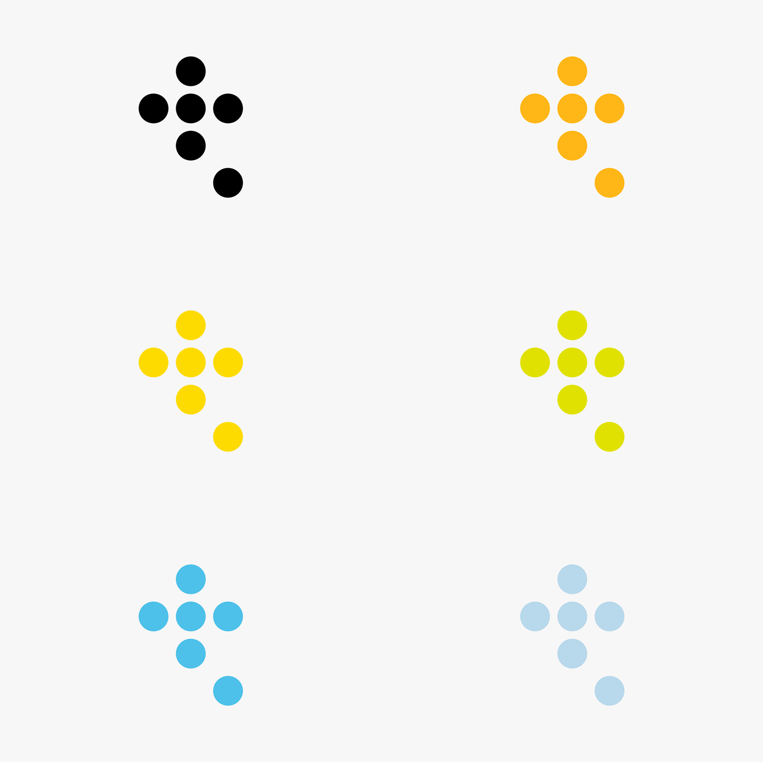
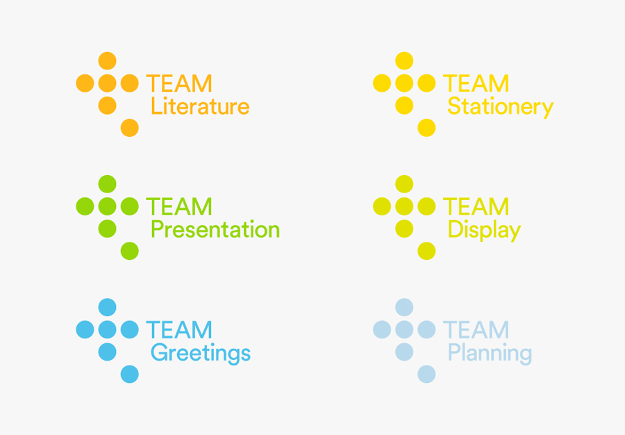
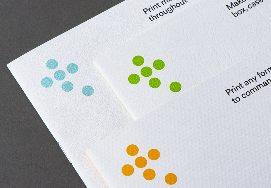
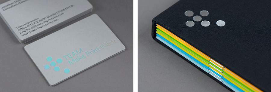
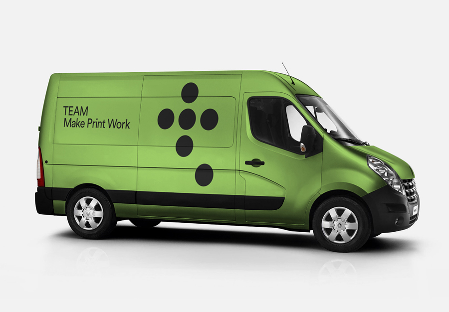
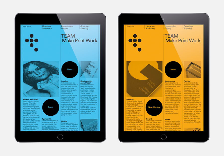
Team Impression is a UK print production studio with a national reach, a 50,000 sq ft production plant and experience working within the culture, creative, fashion and finance sectors. Drawing on the six key services of the business—litho, digital, display, finishing, presentation and reprographics—Leeds based graphic design studio Design Project worked with Team Impression to develop a new visual identity concept and system. This included a new logo, typography and colour palette that extended across brochure, van livery, business card and digital touchpoints.
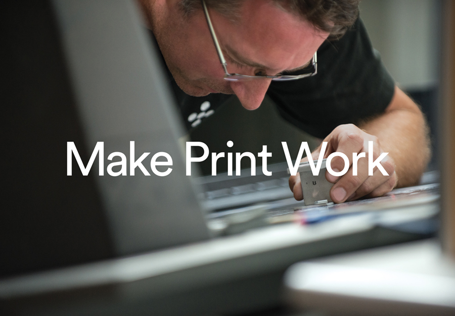
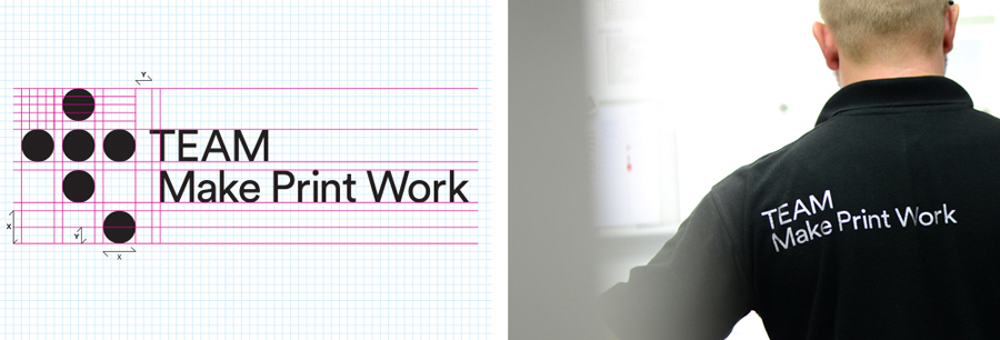
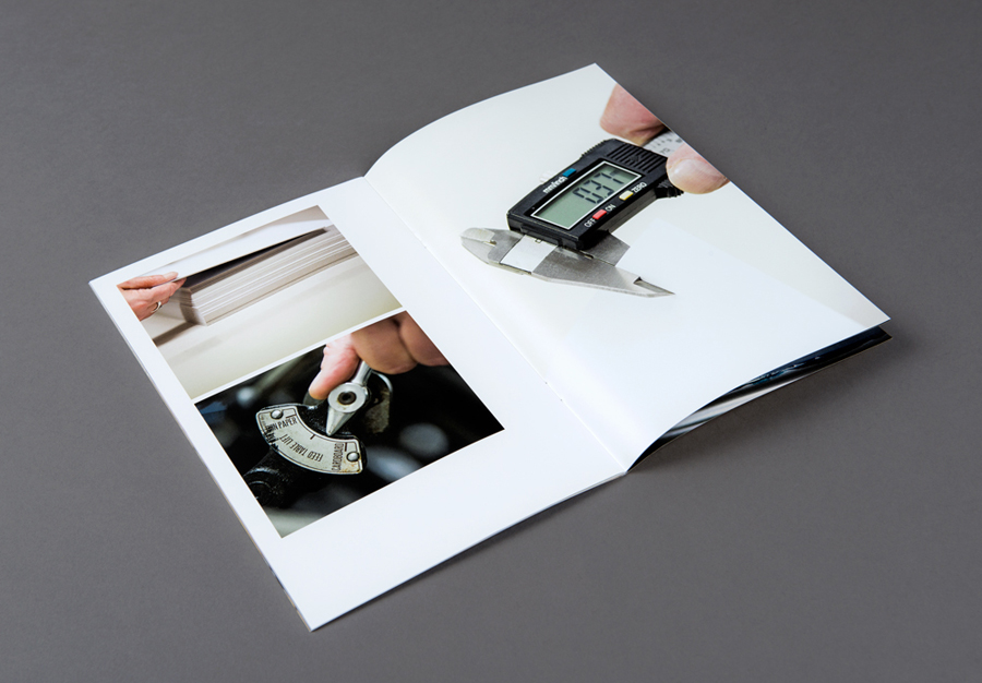
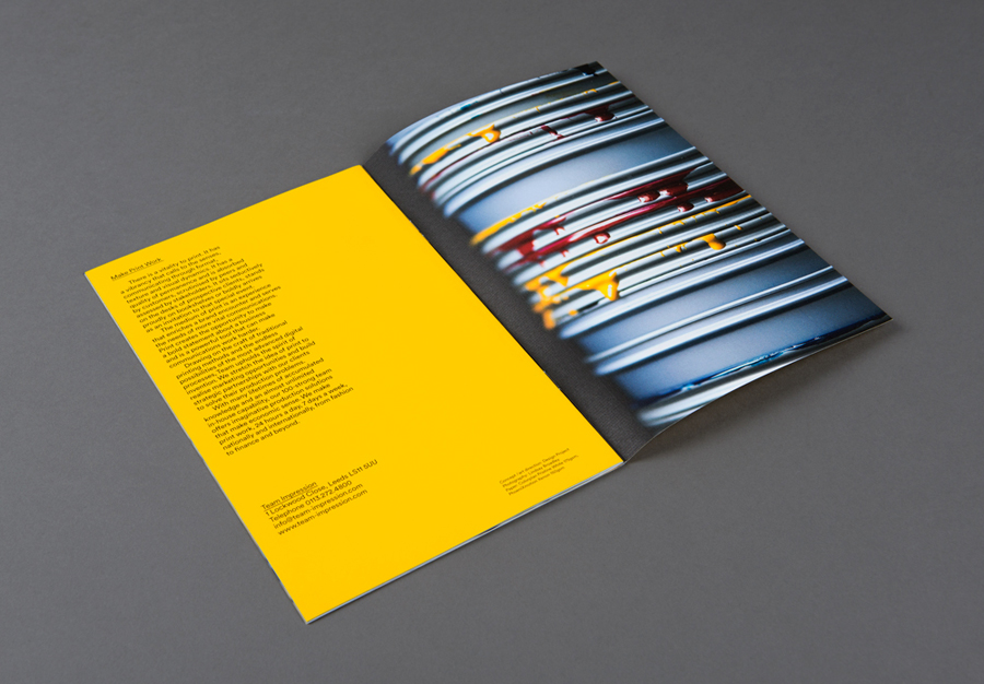
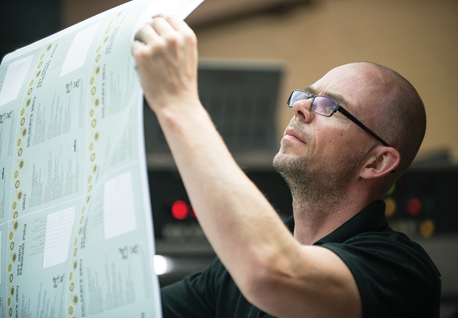
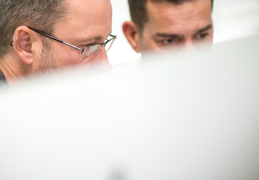
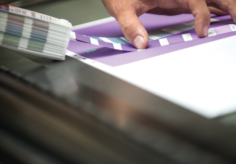
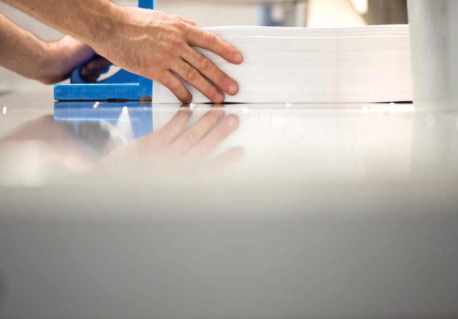
If you can get past the similarities it has with Belkin, the logo concept is a neat idea that humanises, through soft shape, bright colour and an association with the human form, what is often perceived as impersonal and mechanical processes. This is further explored through the sans-serif type choice choice and photography, which covers both the Team Impression team and tools of the trade.
These, while perhaps not as compelling or as distinctive in tone or character as Made Thought’s team images for the paper merchant G.F Smith, work well to also introduce moments that convey a sense of rigour and personal responsibility.
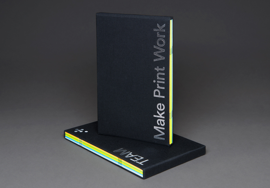
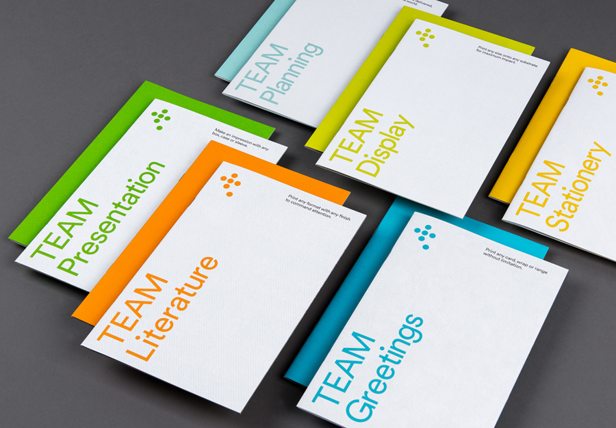
Alongside this, and as you might expect from a print production studio, the identity effectively touches upon and showcases materials, surface texture, colour and print finishes, and secures visual interest and impact using embossed papers, block foils, dyed boards and contrast. More from Design Project on BP&O.
Design: Design Project. Opinion: Richard Baird.
