Designed in Leeds
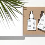
Tulura by Build
Tulura is an independent luxury botanical skincare brand created Eileen Feighny, a former professional model brought up in Korea and now working from New York. The first of Tulura’s products is a two-step moisturising program that includes a vitamin peptide serum and a botanical facial oil made from seasonal ingredients hand picked and custom-blended. Ingredients are chosen for their effectiveness, and formulations created without the use...
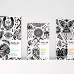
Electric Ink by Robot Food
With the rise in the popularity of tattoos and the lack of credible long-term care products, Leeds-based design studio Robot Food formulated, branded and packaged Electric Ink, a tattoo care range for the mainstream market. The range includes a serum that enhances colour, an oil that delivers a freshly-inked look, and a daily moisturiser. Each feature distinctive packaging design that draws on...
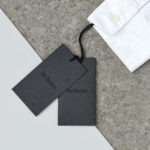
Helbers by Only
Helbers is a Parisian menswear label created by Paul Helbers, the former Head of Menswear at Maison Margiela and ex-Menswear Director at Louis Vuitton. The label has a carefully curated lookbook of garments and footwear with an unpolished elegance, and feature a subtle contrast of materials. Helbers has secured early acclaim for his AW16 collection, and is due to appear in stores around the world in the coming weeks. Paul worked with Leeds-based...
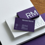
Richard Moran by Journal
Richard Moran is a lifestyle and portrait photographer with over 25 years of experience. He has worked with international businesses such as GSK, Pizza Express and Grey Goose Vodka, and secured a reputation as a passionate, straight-talking professional with a meticulous attention to detail and a portfolio of high-quality and emotive work. With a desire to communicate this and with the intention of...
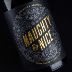
Vocation Brewery Limited Edition by Robot Food
Vocation is a UK microbrewery, established and run by John Hickling, with a range of craft beers described as having distinctive and punchy flavour profiles. Communicating the brewery’s unique personality and the crafted quality of its range rested in the hands of UK based graphic design studio Robot Food. Drawing on the beer’s tropical, fruity, floral and hoppy characteristics, the brewery’s fearless, daring and renegade attitude, and the...
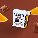
Naughty But Rice by Robot Food
Naughty But Rice is a rice pudding range created by The Hain Daniels Group in response to an increase in the dessert’s popularity in the United Kingdom. Unlike the product’s of established and mainstream brands, Naughty But Rice, as the name suggests, offers consumers a modern and indulgent twist on the traditional favourite, with flavours that include Coconut & Raspberry, Salted Caramel and Chocolate...
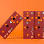
Fedrigoni Sirio Color by Design Project
Leeds based studio Design Project were commissioned by Fedrigoni, one of Europe’s leading paper manufacturers, to develop a material sample solution that would help them to promote their flagship paper brand ‘Sirio Color’ within the UK market. With the intention of allowing customers to experience the tactile characteristics and diverse colour palette of the range first-hand, Design Project developed a flat-pack...
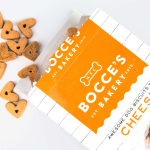
Bocce’s Bakery by Robot Food
Bocce’s Bakery creates nutritious handcrafted dog treats from natural, nutritious, locally sourced and seasonal ingredients from its premises in the New York borough of Brooklyn. Each of the bakery’s treats are batch-produced from four or less ingredients, brought together using simple wheat-free recipes, and born of a passion for conscientious organic cookery and inspired by Bocce, a biscuit loving dog who was carrying a few extra pounds. Bocce’s reached out...
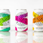
Vocation Brewery by Robot Food
Vocation is a UK microbrewery, established and run by John Hickling, with a range of craft beers that have distinctive and punchy flavour profiles, and a visual identity, packaging design and naming convention created by Leeds-based studio Robot Food. This draws on the tropical, fruity, floral and hoppy characteristic of the range, and the brewery’s fearless, daring and renegade attitude. This post was updated March...
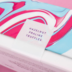
Costèllo + Hellerstein by Robot Food
Yvonne Costello and Ori Hellerstein are a husband and wife team making artisanal chocolate truffles using high quality ingredients and the processes acquired by Ori working as a pastry chef at well-respected restaurants. These skills were then refined whilst running his business The Artisan Bakery creating and supplying fine patisserie and chocolates to trade. Costello + Hellerstein’s philosophy is built around the complete sensory experience,...
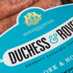
Duchess & Rover by Robot Food
The raw meat sector within the dog food industry continues to grow and innovate, reflecting owner’s increasing support and understanding that it can provide a fresh, natural and convenient way for their dogs to receive the nutrients they need. Recognising how unpleasant raw meat can be and looking to take advantage of the expanding market, design studio and now product development specialist Robot...
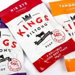
Kings Biltong by Robot Food
Capitalising on the increasing demand for healthy protein-rich snacks and sports supplements Kings Biltong, a business established by three former England rugby professionals, have launched a three flavour, cured and sliced, grass-fed British-beef range that offers athletes an “alternative to chalky protein bars and other supplement snacks that miss the mark in terms of both taste and quality perceptions.” Designed...