Bruce Juice by Marx Design
Opinion by Richard Baird Posted 8 October 2015
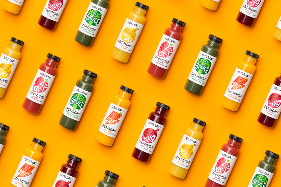
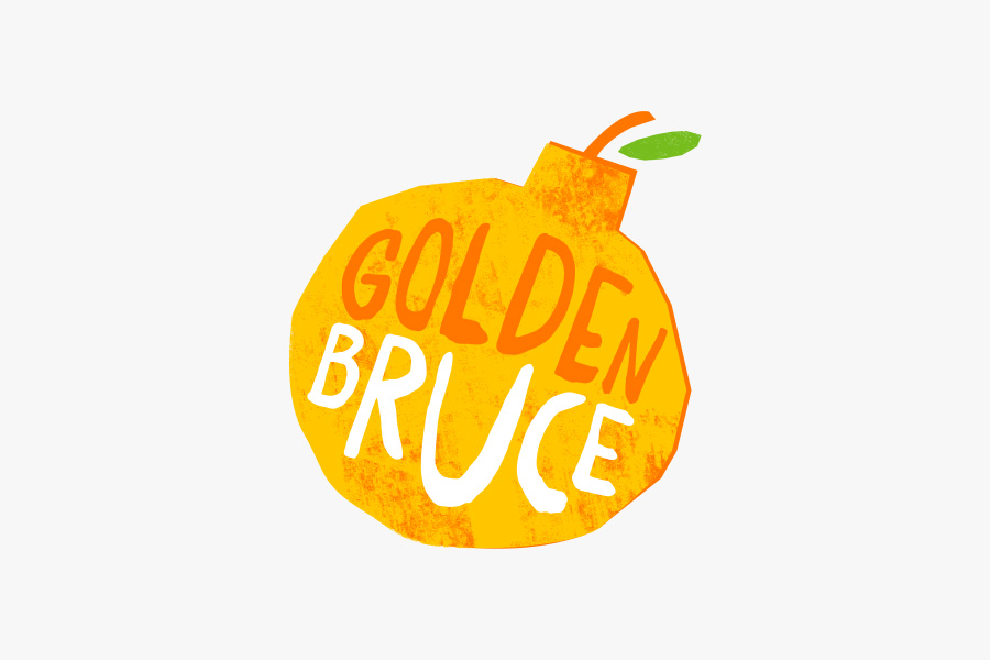
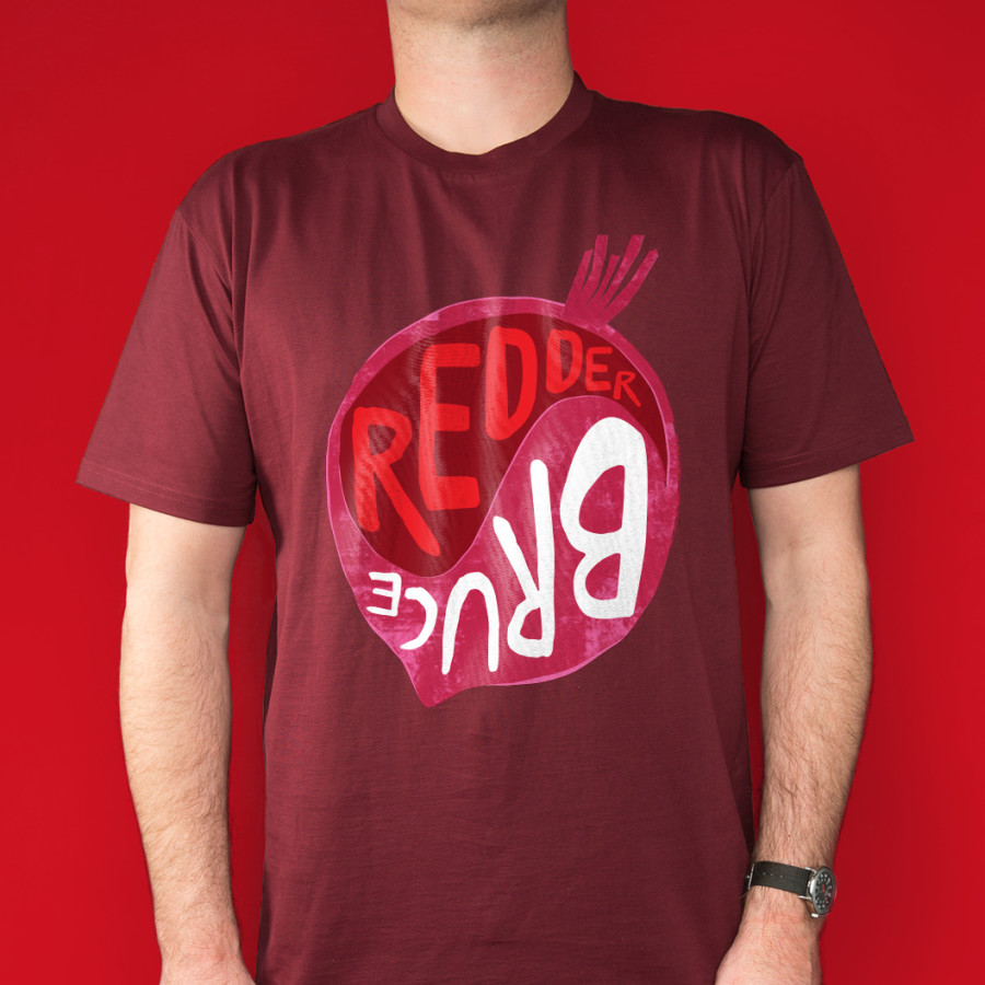
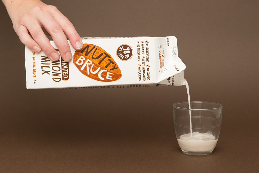
Bruce Juice is a 100% raw, cold pressed, fruit juice and plant milk brand new to the Australian market. It launched this year with five juice and vegetable blends, Red, Redder, Orange, Greener, Golden and Nutter, an almond milk, and a packaging and visual identity treatment by New Zealand based graphic design studio Marx Design.
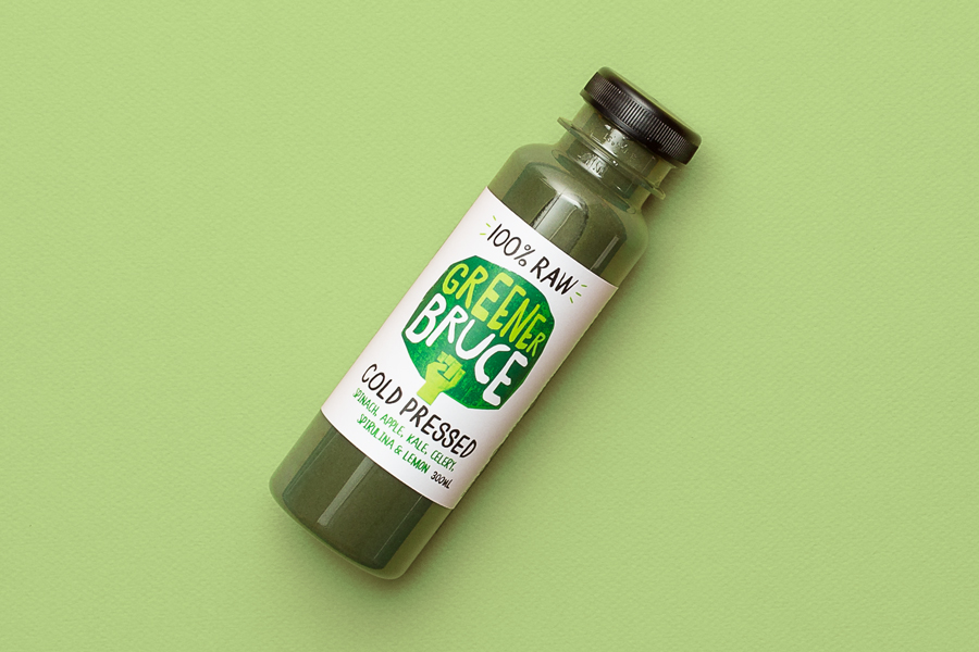
Using a mix of illustration and texture, loose hand drawn logotype and custom typography, bright but natural colour and plenty of white space, and by balancing visual impact and communicative clarity, familiarity and originality, Marx Design helped Bruce Juice to realise their desire to establish a contemporary and playful brand personality that would also secure a strong health-focused market positioning.
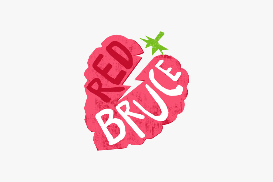
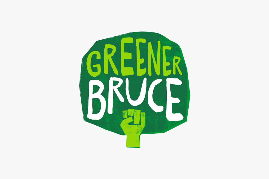
Marx Design take a familiar crafted quality, delivered effectively through illustrative simplicity and texture—somewhere between paper cut and hand stamped—and gives it distinctive personality and further communicative value. This is achieved by fusing the universal, frequently utilised and often unavoidable imagery of fruit and vegetables with details such as a fist, lightening bolt, bomb, and what looks like a wave. These work well to convey the natural “power” of raw fruit and vegetables, alongside craft, in a unique way that is youthful but not childish. Only the almond lacks an obvious second layer, although its shell does have some association with strength.
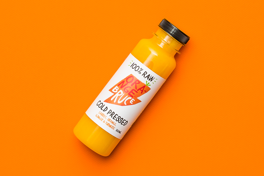
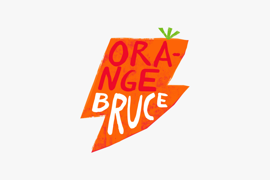
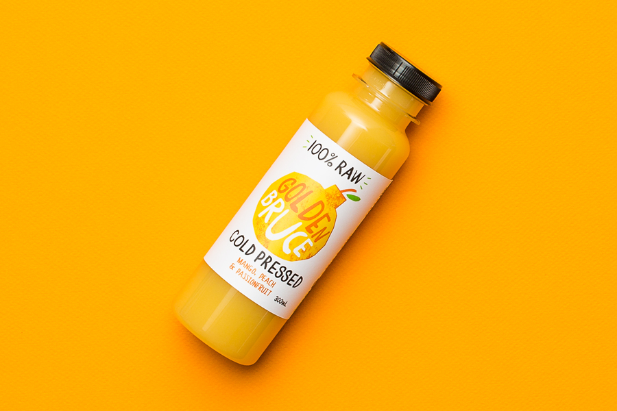
Although there is plenty of detail in the illustration’s texture and overprint detail, the simple but recognisable shape of each fruit and vegetable, and the use of a single iconic image, does a good job to convey purity. This is aided by plenty of surrounding space and the premium qualities associated with a kitchen white. This white space also functions to emphasis illustrative form and colour—which is bright but avoids the synthetic—in the contemporary manner (established by other juice brands), whilst also delivering impact from a distance and detail up close using high contrast.
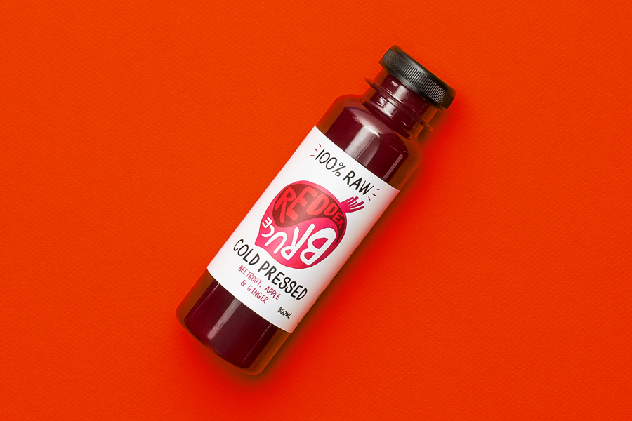
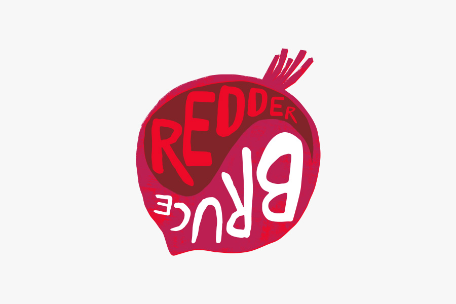
The loose, irregular strokes, uppercase characters, mix of orientation, direction, and the adaptive quality of the logotype maintain the energy and quirky qualities of the illustrative work. The characters are well-drawn and find a balance between a youthful exuberance, expressive brand character, legibility and personality. There is variety in the application of type within illustration across each flavour, yet each variation is anchored by a clear focus on, and the consistent typesetting of, 100% Raw and Cold Pressed. Hierarchy is helped by the use of negative space (Brand), illustrative colour (Flavour) and black ink (Positioning).
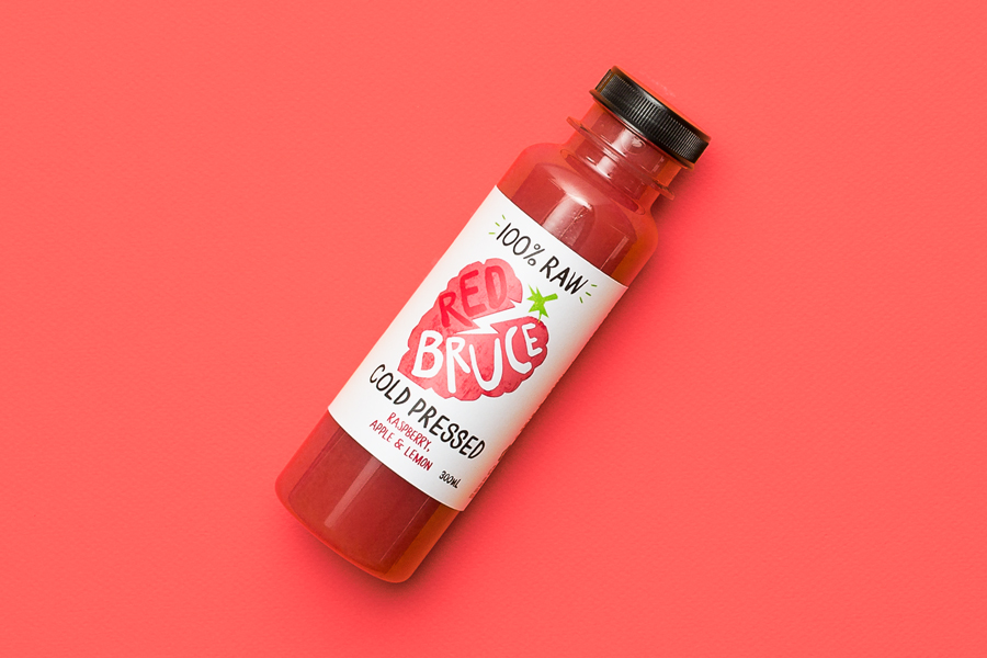
The result is a good balance of convention (fruit imagery, its hand crafted rendering, bright but natural colour, and the contemporary quality and perceived value of plenty of white space) and an element of creativity, play and uniqueness (lightening, bomb and fist). It draws distinction and further value from a familiar approach, while custom type, typesetting and layout provides communicative clarity alongside a lively and personable brand character. More from Marx Design on BP&O.
Design: Marx Design. Opinion: Richard Baird.
