Unoco Raw Coconut Water by B&B Studio
Opinion by Richard Baird Posted 19 October 2015
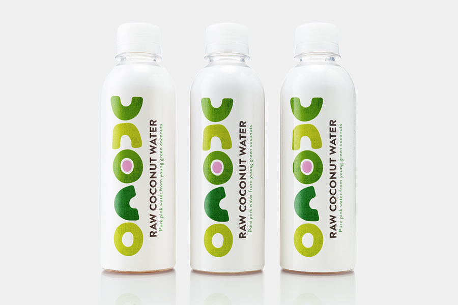
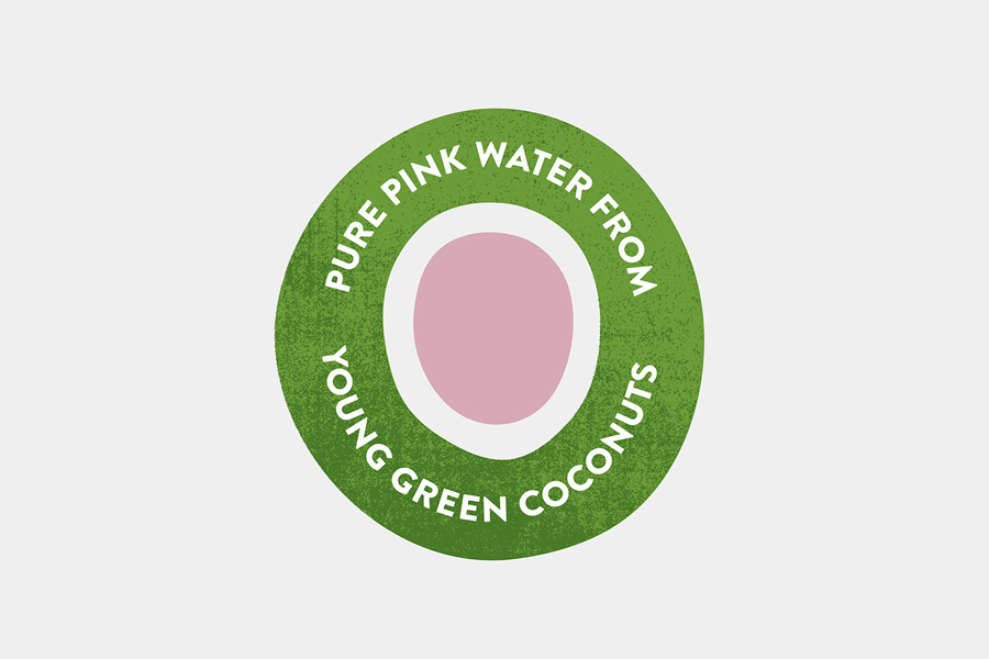
UK based Unoco works with a community of smallholders in the Philippines to produce an unrefined, unpasteurised and untreated raw coconut water. This is drawn from young coconuts, characterised by their green rather than brown colour, picked at their nutritional prime and placed into bottles rather than tetra pak or cans using HPP. This process gives the water a distinctive pink colour, a result of oxidisation, which is said to be confirmation that all the natural goodness of the water has been retained.
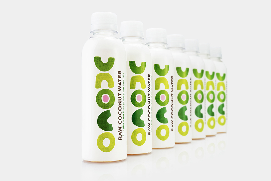
Graphic design agency B&B Studio recently worked with Unoco to reinvent its brand identity and package design, and embraced an approach that favours bold organic typography, bright colour and plenty of white space as a way to express the rawness of product within a category dominated by processed alternatives.
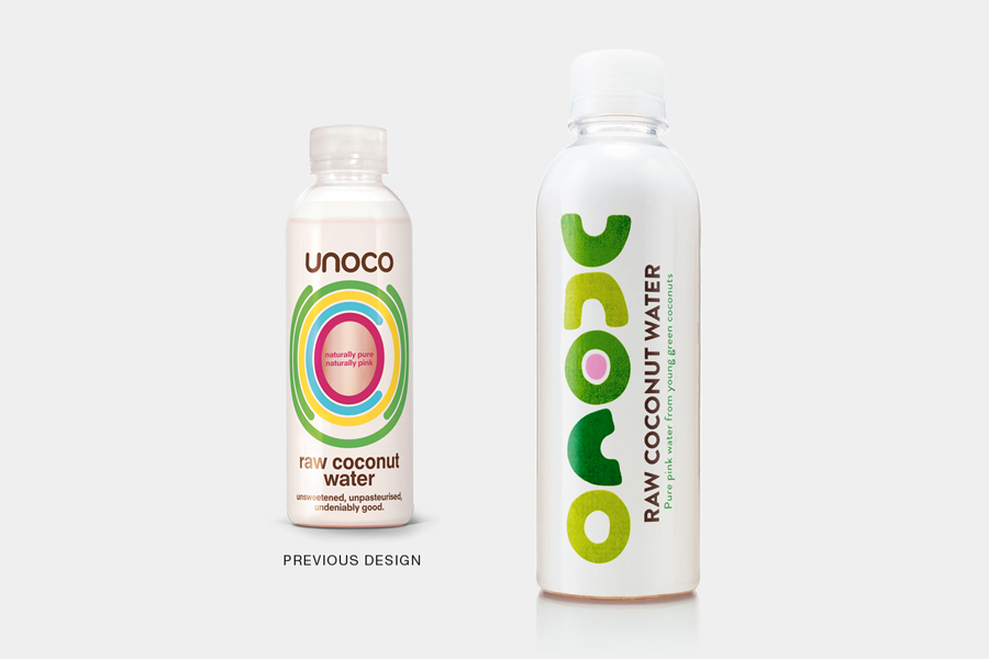
Purity and simplicity, much like the product, are the foundation of B&B Studio’s brand identity and packaging work for Unoco. The monolinear radial lines and typography of the previous design, one that borrows a little from the sport tech industry, perhaps fostering a connection with performance (there is talk of electrolytes and body chemistry online), is replaced with a treatment that favours the natural and irregular. An immediate and significant change.
The studio retains the structure but makes far better use of its tall slender shape through layout. Bold organic letterforms appear to draw on the robustness and cross-section of coconuts, with a loose raw quality, while a set of greens—bright and eye catching but not synthetic—and a small pink detail reference coconuts picked early. There is plenty of distinctive character in the logotype, a flexibility in its vertical and horizontal use, and relevance in its form and colour.
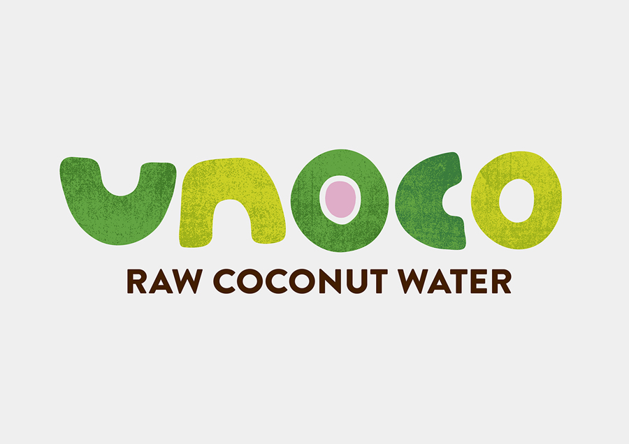
Plenty of white space pulls out the finer texture of the logotype, leverages its association with purity and freshness, and modern in its restraint. This is mirrored in the concise and straightforward language and the clarity of what looks like Brandon Grotesque. Unfortunately, this makes way for Lunch Box and The Hand online. Although both personable in their loose and light letterforms, these feel far too familiar for a relatively new category, and not particularly easy to read.
Contrast is used to good effect throughout. From the fine texture held within bold shapes, the organic alongside the geometric, to bright colour surrounded by white. This manages to find a balance between communicative simplicity, impact from a distance, and detail up close.
The result is visually interesting, founded on clear understandable ideas, does a good job of touching upon the natural untreated quality of the product, draws on the age of the coconut and the relationship this has with its goodness (reinforced by straightforward copywriting), and is likely to be much broader in its appeal. More from B&B Studio on BP&O.
Design: B&B Studio. Fonts Used: Brandon Grotesque. Opinion: Richard Baird.
