The Hyundai Department Store by Studio fnt
Opinion by Richard Baird Posted 30 October 2015
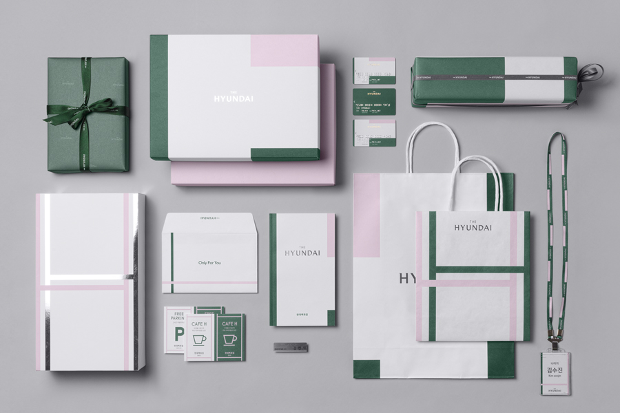
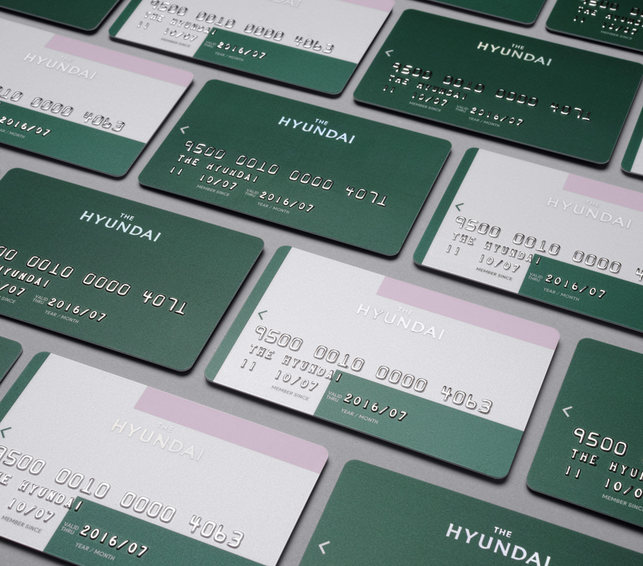
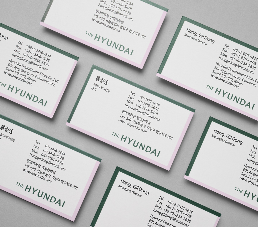
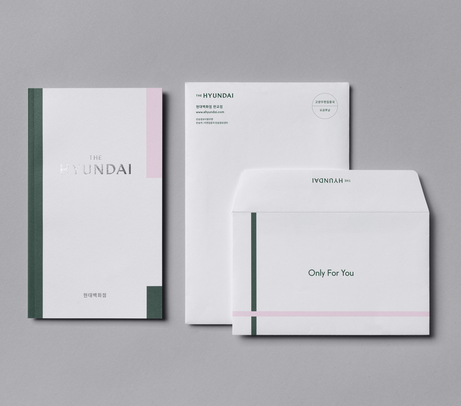
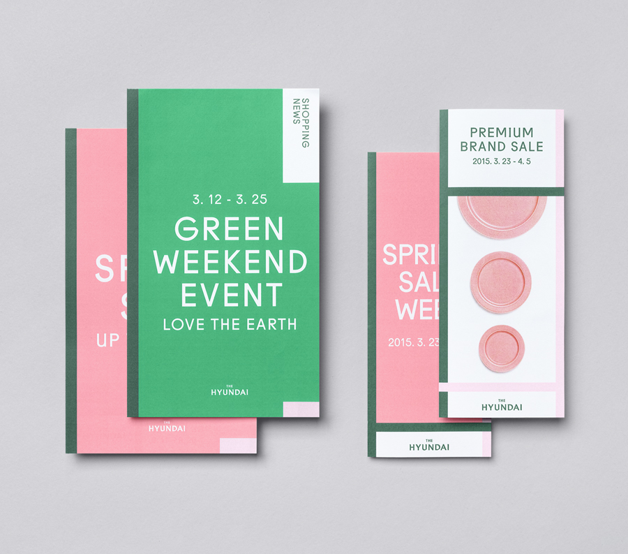
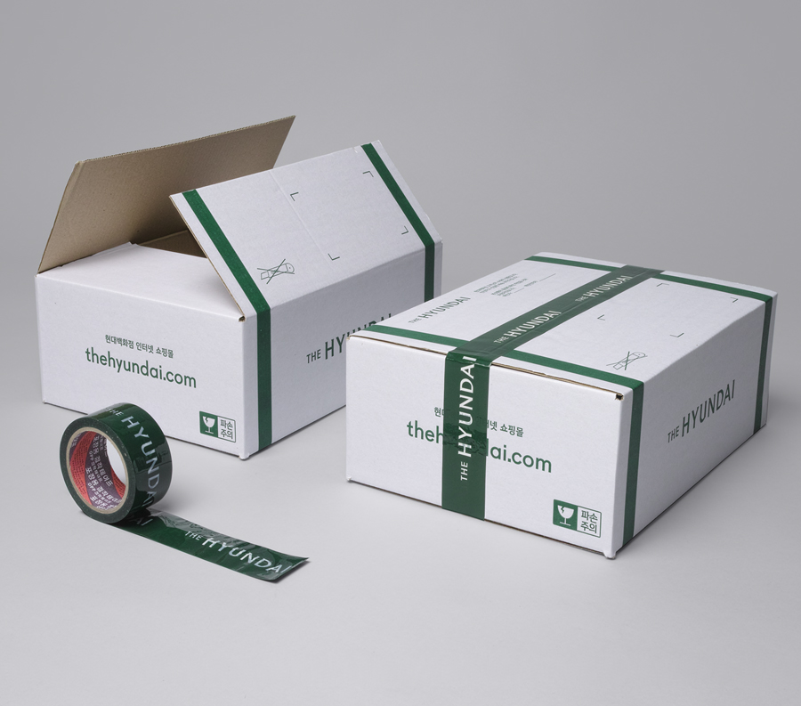
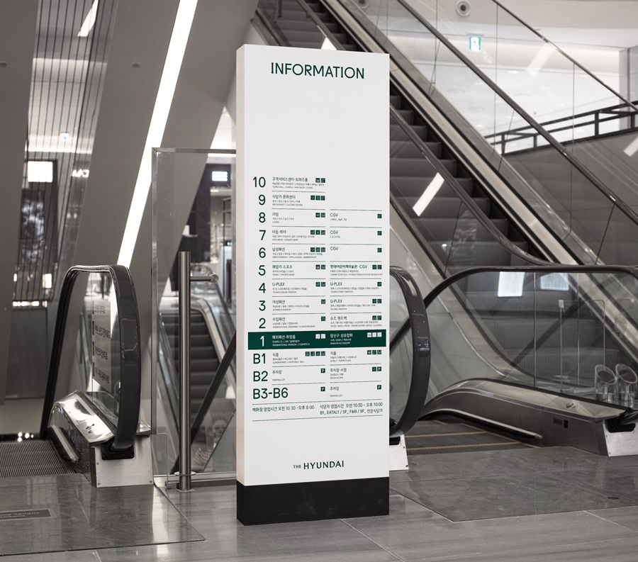
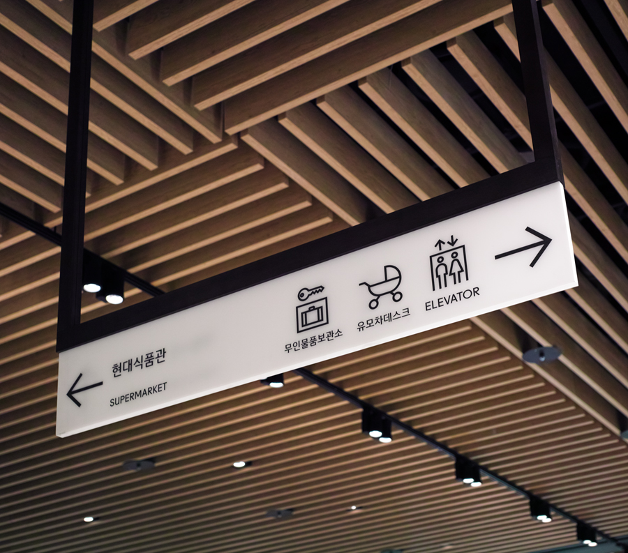
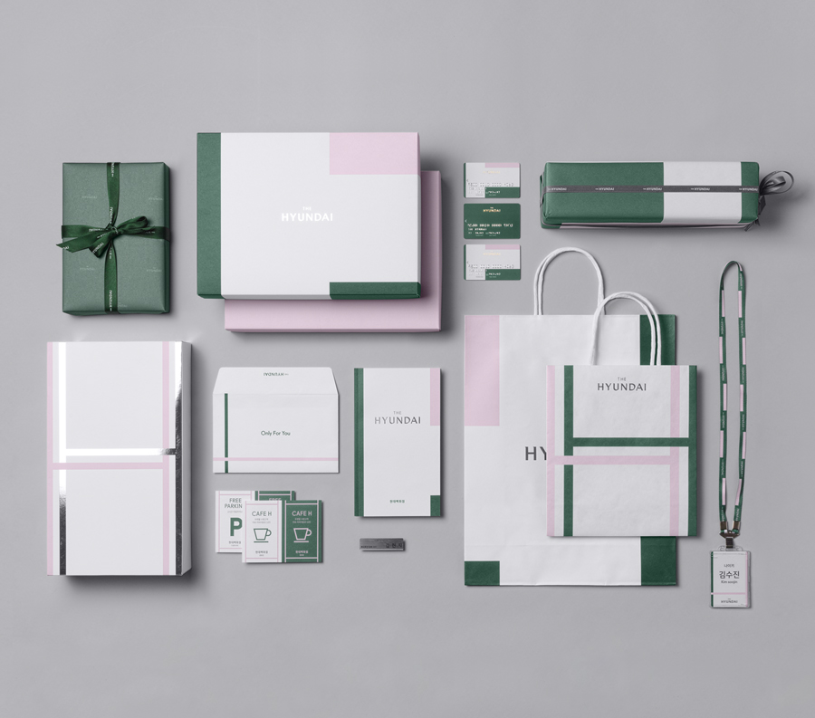
The Hyundai is a well-known, well-thought-of and well-established South Korean department store that this year will celebrate its 44th anniversary. To coincide with this, The Hyundai launched a new brand identity system developed by Seoul graphic design company Studio fnt. This builds on the logotype and colour palette created by New York’s Base Design earlier in 2015, and introduces a Korean logotype, patterns, geometric sans-serif typography, monolinear iconography and foil print finishes across business cards, price tags, stationery, packaging, store cards and print communication. The project also included signage and wayfinding.
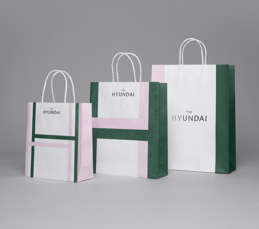
Studio fnt’s approach is based around the concept of duality, a connection between store and its customers, and the tension between tradition and modernity, with the intention of securing an identifiable brand character, a system that effectively links and communicates information, and is flexible and easy to implement.
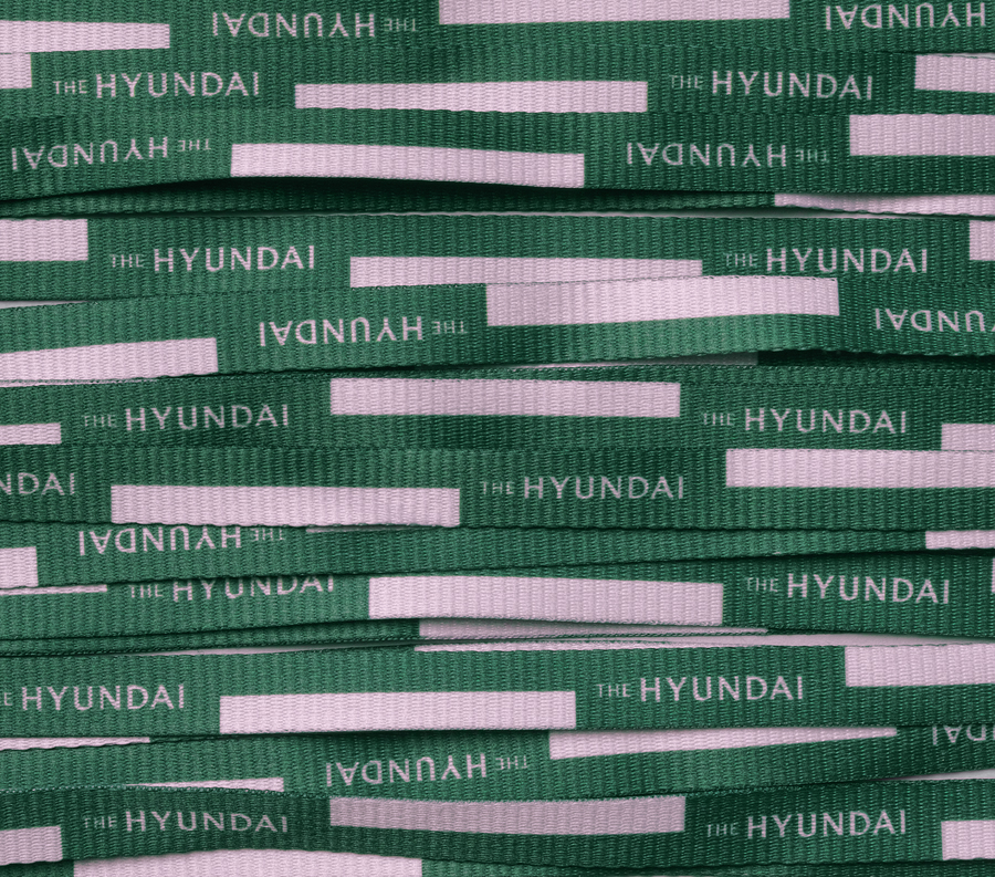
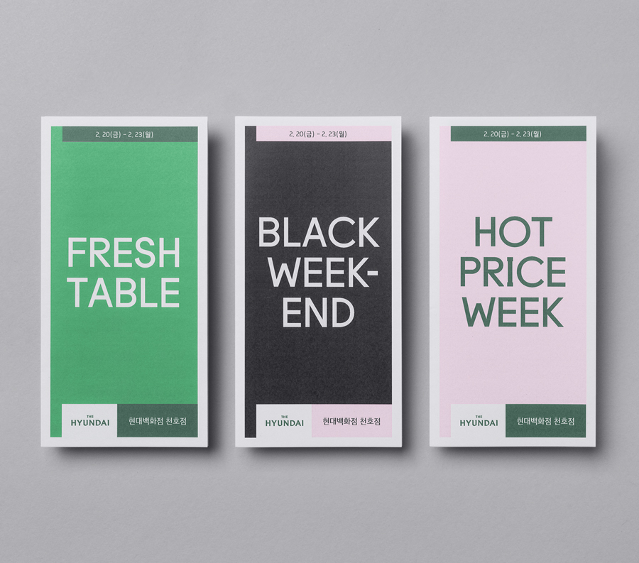
This concept plays out through a colour palette of lilac and deep green, white and the flourish of silver, the use of Korean and English, a dual H motif that weaves together and forms the basis of patterns in print, and the contrast of glossy block foil and uncoated papers. This also continues in the juxtaposition of a current geometric and monolinear sans-serif and similarly styled iconography, and the serifs of the logotype, blocks of colour and finer lines that intersect unprinted space. These are linked by a strict grid system.
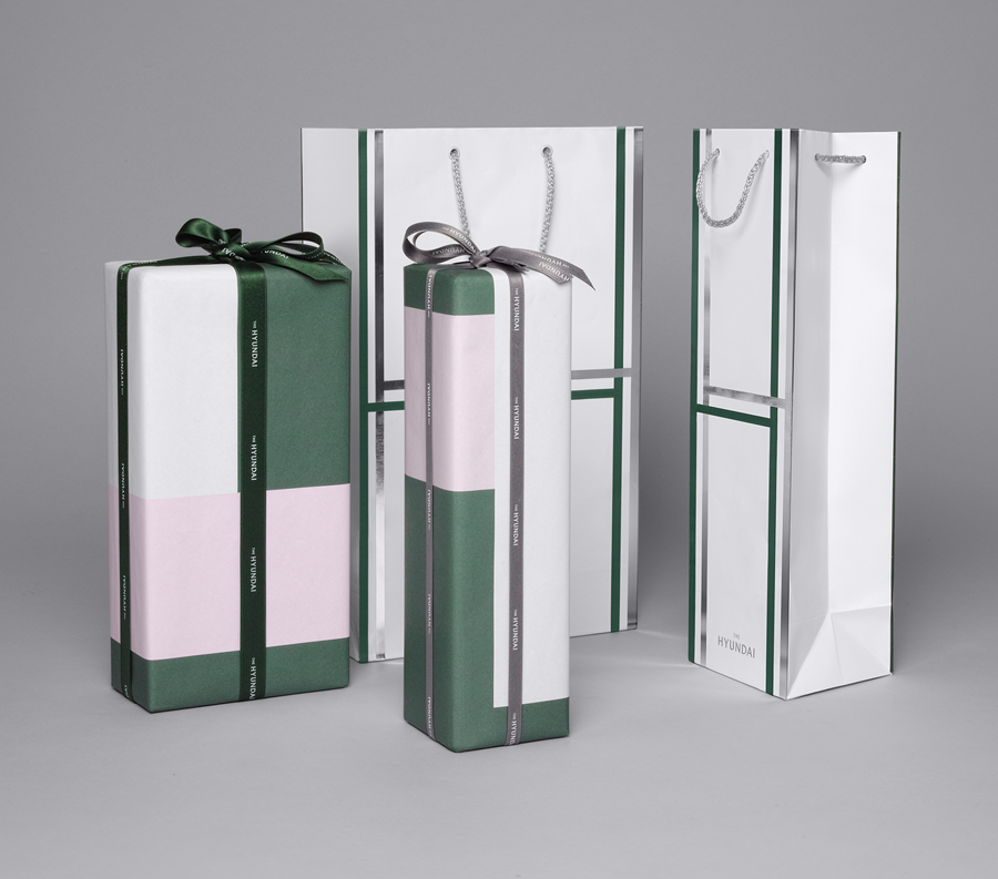
Although the concept is implicit rather than explicit, the history of the store, and its continued relevance to today’s shoppers through a modern interior and stock, is a strong foundation from which to build a compelling and distinctive aesthetic. Even more so if this history is not shared by competitors.
Contrast has been used to good effect, in colour, form and type. There is visual interest and variety in the system, yet it remains cohesive. It has a lovely colour palette and an approach to typography that both clearly play with heritage and modernity, and a material and print finish choice that conveys a general sense of value but also secures an identifiable and memorable visual character that should stand up well outside of the store.
The use of a brighter green and pink, black, red and blue, alongside larger typography, functions well to pick out campaign and seasonal material but remains tightly bound to the grid system and the patterns derived from the double. The website does, however, fall a little short. More from Studio fnt on BP&O.
Design: Studio fnt & Base Design NY. Opinion: Richard Baird.
