Bearleader Chronicle by The Studio
Opinion by Richard Baird Posted 19 November 2015
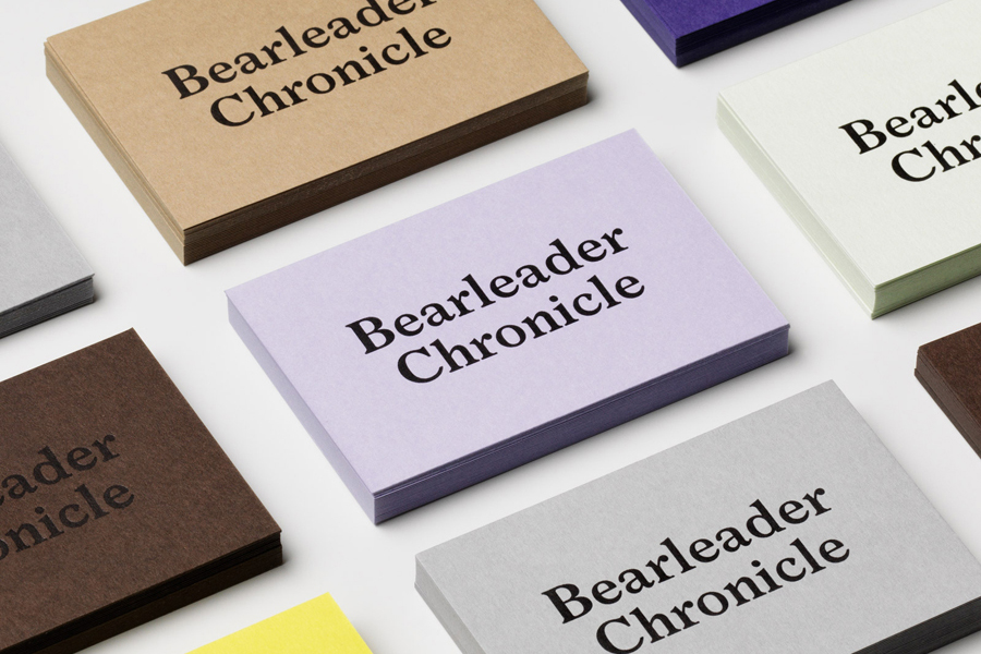
Bearleader describes itself as being dedicated to seeking out spectacular events, simple pleasures, awe-inspiring landscapes, hidden gems, and regions where traditions are meticulously maintained. They share these with their readers through an online magazine, which also includes insight into the people they meet and places they come across, with the intention of inspiring others to follow in their footsteps and chart their own adventures.
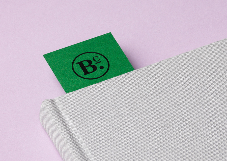
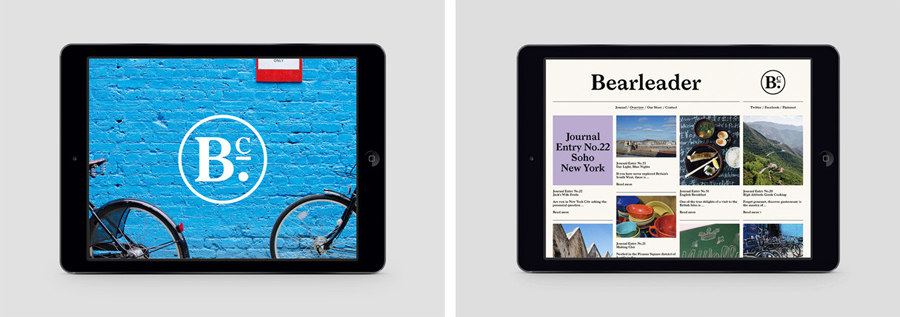
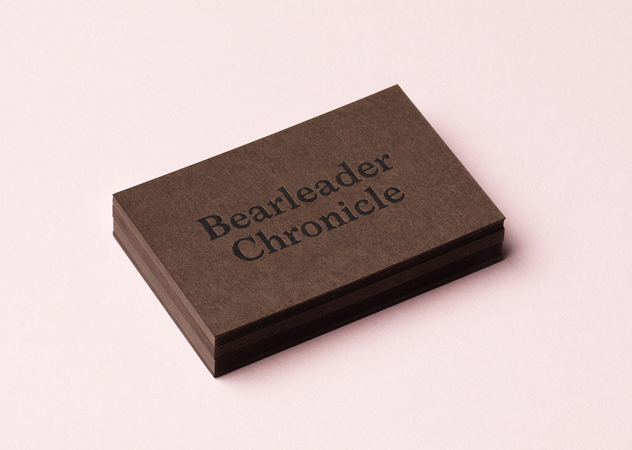
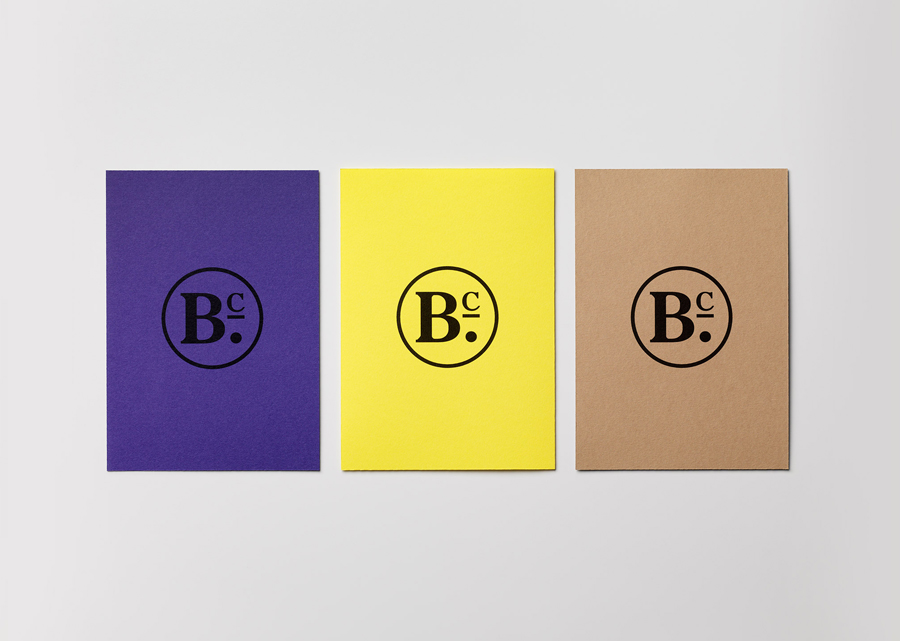
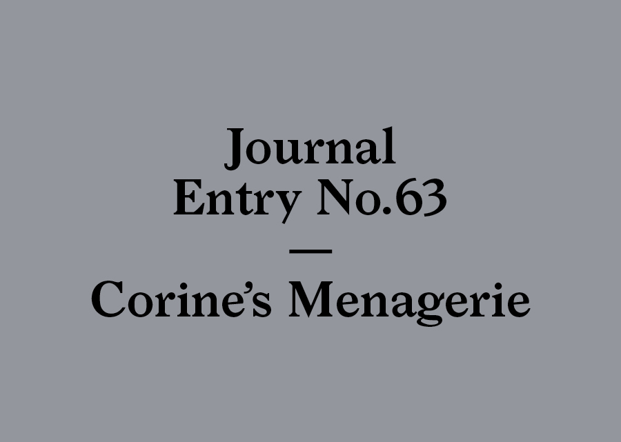
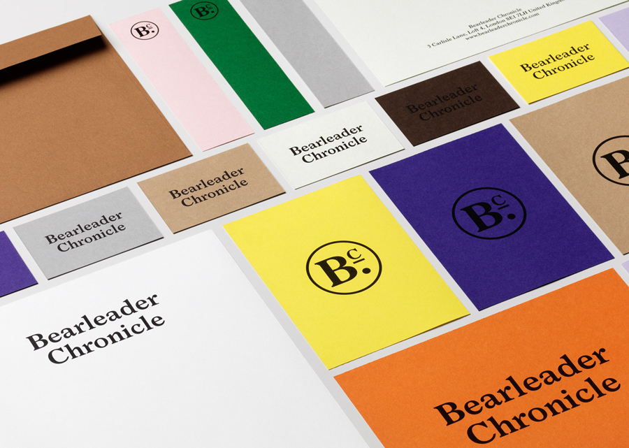
Bearleader draws its name from the leading of the inexperienced on risky adventures and the rise of foreign travel in the 18th and 19th century, while its content addresses the current favour for slow living (diverse and fulfilling experiences over possessions). This is conveyed through a brand identity treatment of traditional serif typography, a varied colour palette and simple layouts created by Scandinavian graphic designers The Studio. This extended across business cards, stationery, bookmarks and Bearleader’s online magazine.
“In order to meet Bearleader’s goals of communicating the essential character of their destinations, and make it easy for readers to actively pursue the experiences on their own, an engaging and visually compelling style coupled with a simple straightforward graphic format was required.”
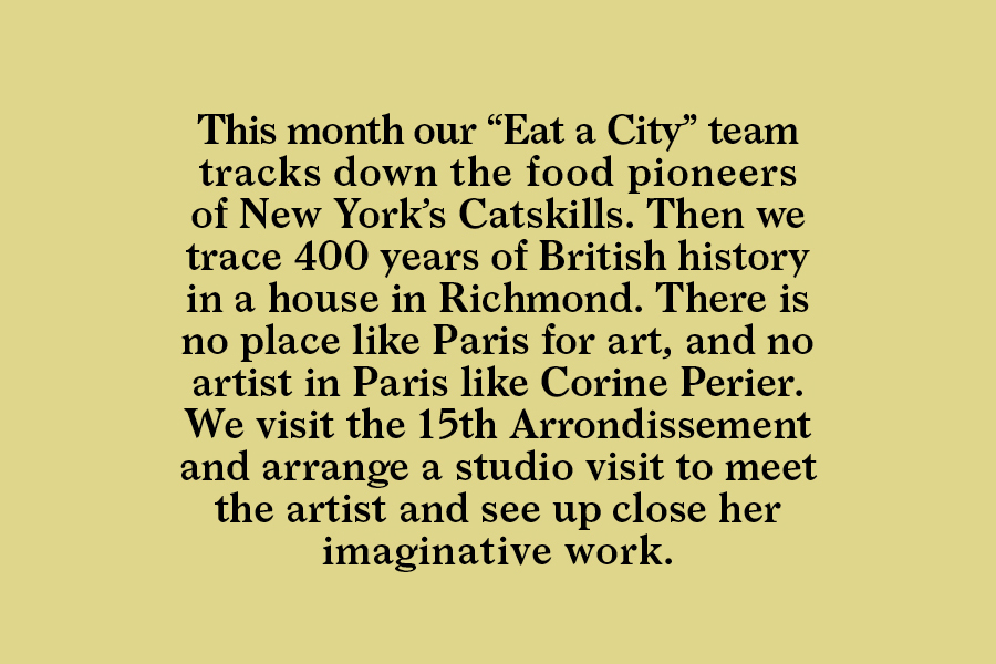
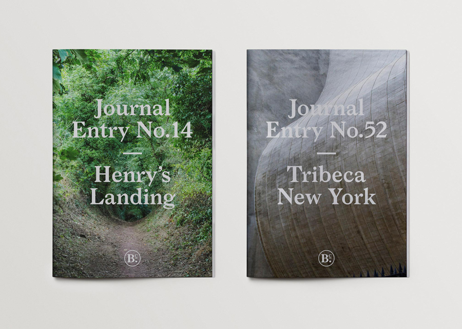
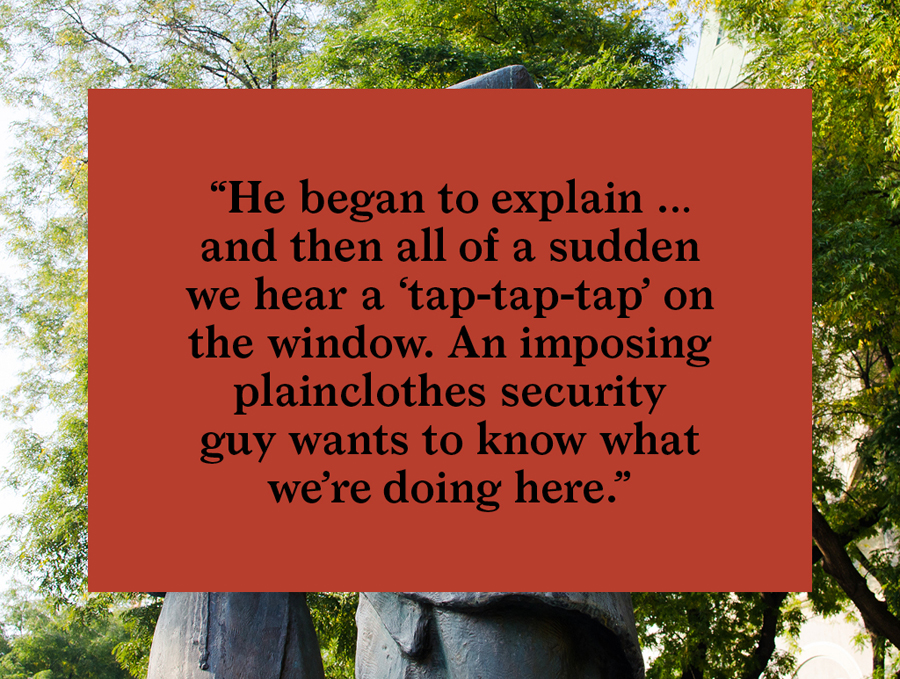
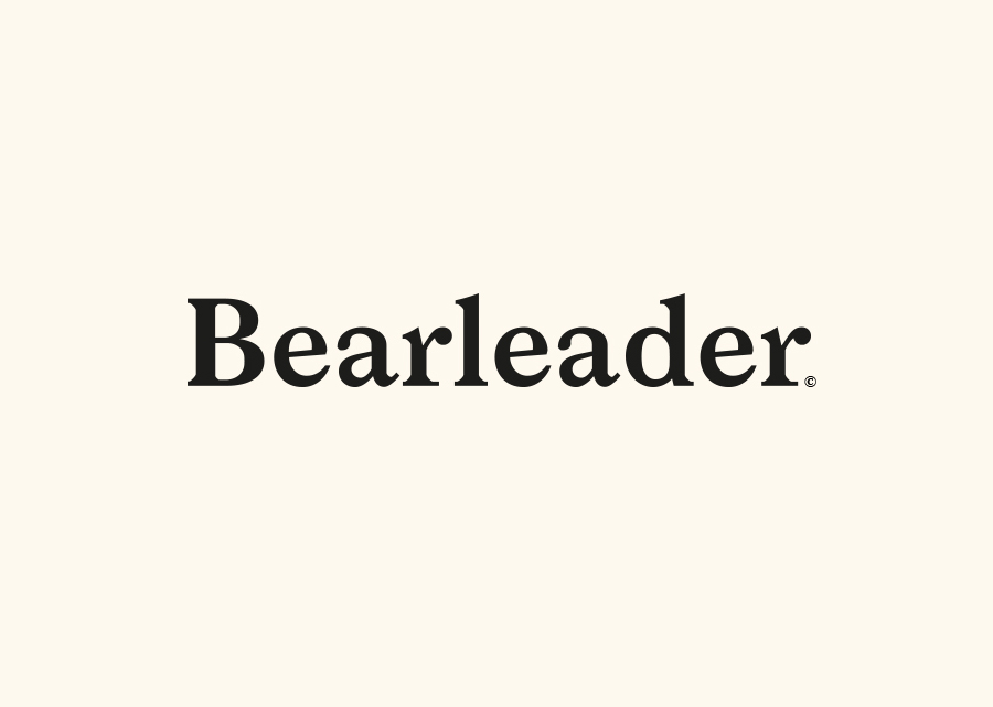
“With the online magazine as the main communication medium, we made this the brand centrepiece. We developed a modern, easy-to-read design using typography based on an old world newspaper expression to tie in with Bearleader’s 18th century-explorer brand story. Block colour and bold type worked with the photography to build a recognizable identity. Great flexibility was built into the design so Bearleader could continually update and expand their content within the brand guidelines. A logotype, symbol and stationery program were designed to support the online magazine.” – The Studio
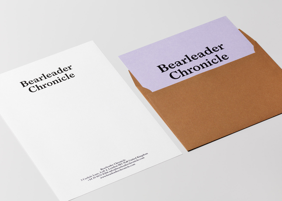
Although typography sets a very traditional tone, pairing this with a bright and varied colour palette secures a thoroughly current brand expression. Much like their work for Netsurvey, The Studio effectively utilise colour as an impactful and compelling stylistic tool that also manages to touch upon relevant themes, in this case, those that that proliferate Bearleader’s magazine such as the rural and urban (green, brown and grey), the traditional and contemporary (brown and white, yellow and lilac). The use of a variety of dyed uncoated rather than ink covered boards means that each has a familiar craft quality but collectively are distinctive.

The Studio’s treatment is very much in keeping with the slow lifestyle trend, in its simplicity, material choices and typography, yet still manages to carve out a striking visual personality rooted in the content of the magazine and its straightforward layout. More from The Studio on BP&O.
Design: The Studio. Opinion: Richard Baird.
